In a sentence: the best eyeshadow for your eye color is almost always its opposite on the color wheel, copper and bronze for blue eyes, plum and aubergine for green and hazel, teal and gold for brown, and matching shadow to your iris flattens more than it flatters. Skip to the shade palette or find your season.
Best Eyeshadow for Your Eye Color
By ToneLalaUpdated July 8, 2026
Contents
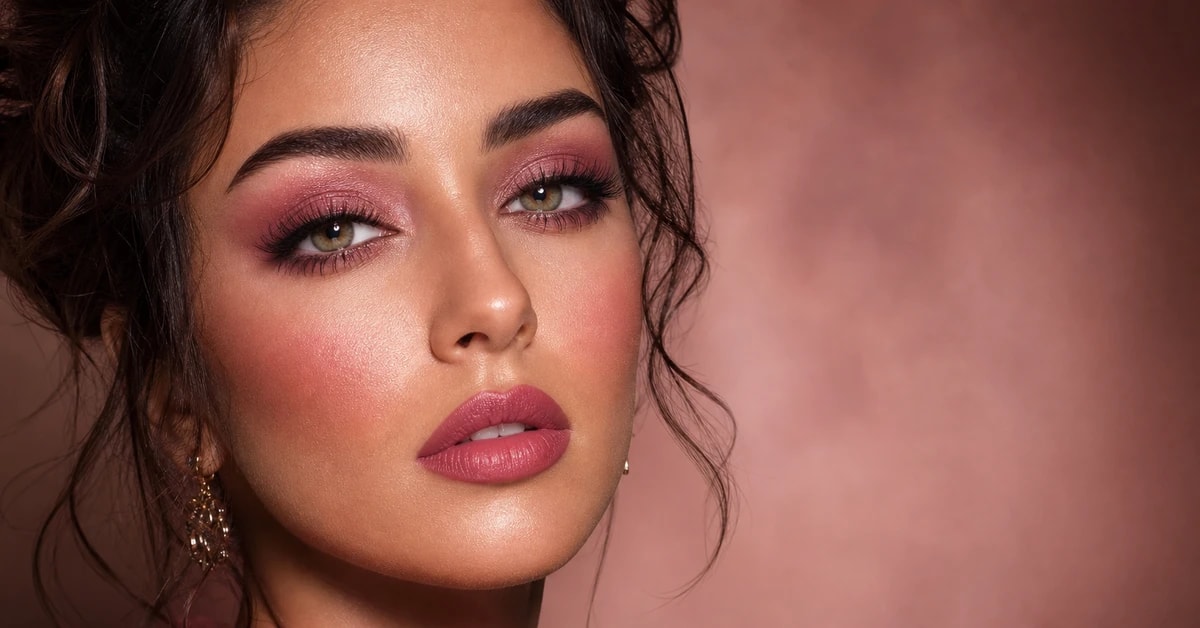
Hold a copper shadow up to a blue eye and a navy shadow up to the same eye, and watch which one wins. The copper makes the blue leap forward, cleaner, brighter, almost backlit, while the navy quietly swallows it, blue lost in blue. Most people instinctively reach for the navy, because it feels like a safe match. It's the wrong instinct, and it's the single most common eyeshadow mistake I see.
Here's the thing about eyeshadow and eye color: your iris isn't a flat block of one color, it's a small, complicated thing full of flecks and rings, and the shadow you put around it decides which of those flecks the eye notices. Choose the right shade and you turn the saturation up; choose a matching one and you fold the color into itself. There's one rule that does most of the work, a second that fine-tunes it, and then the part everyone forgets, the shade you actually buy depends on your skin, not just your eyes. Let me walk through all three.
The contrast rule that works for every eye color
Color theory hands you a single, reliable lever, and for eyeshadow it's the whole game: wear the complement. Every color has an opposite on the wheel, and complementary pairs make each other vibrate. Put the opposite of your eye color on the lid and your iris is thrown forward by contrast, it reads brighter and clearer than it is on its own.
It maps cleanly. Blue sits opposite orange, so copper, bronze, terracotta and warm peach make blue eyes pop hardest. Green sits opposite purple, so plum, aubergine and mauve push green and hazel eyes brighter. Brown, being a deep, warm orange at heart, sits opposite blue-green, so teal, forest and navy contrast it, while warm gold lights its amber. Gray reads as cool and neutral, so it behaves like a soft blue eye and lifts under warm browns and dusty plum. Contrast is exactly what the eye is built to notice, which is why the opposite shade does so much more visible work than a matching one.
The second, gentler lever is to echo your iris, wear a shade in the same family, blue on blue, green on green. It doesn't pop the eye; it deepens it, for a quiet, tonal look. Useful for effect, but if your goal is for your eyes to be the first thing someone sees, lead with contrast and keep the echo for low-key days.
Why your skin sets the exact shade
Now the part that trips people up. Eyeshadow sits on your lid, which means it's read against your skin as much as your eye. Your eye color points you at a family of shades, but your undertone decides whether the flattering version of that family runs cool and clear or warm and earthy.
This matters because eye colors don't sit on one kind of skin. Blue eyes turn up on cool, rosy faces and warm, golden ones in roughly equal measure; hazel lands on warm, neutral and cool complexions alike. Two people with near-identical green eyes can suit two different plums, one cool and bright, one warm and dusty, purely because their skin differs. So treat it as a two-step read: get the direction from your eyes, get the exact shade from your skin. Skip the second step and you'll buy the right color in the wrong version, which is why so many "eyeshadow for X eyes" lists feel hit-and-miss.
The best eyeshadow shades for every eye color
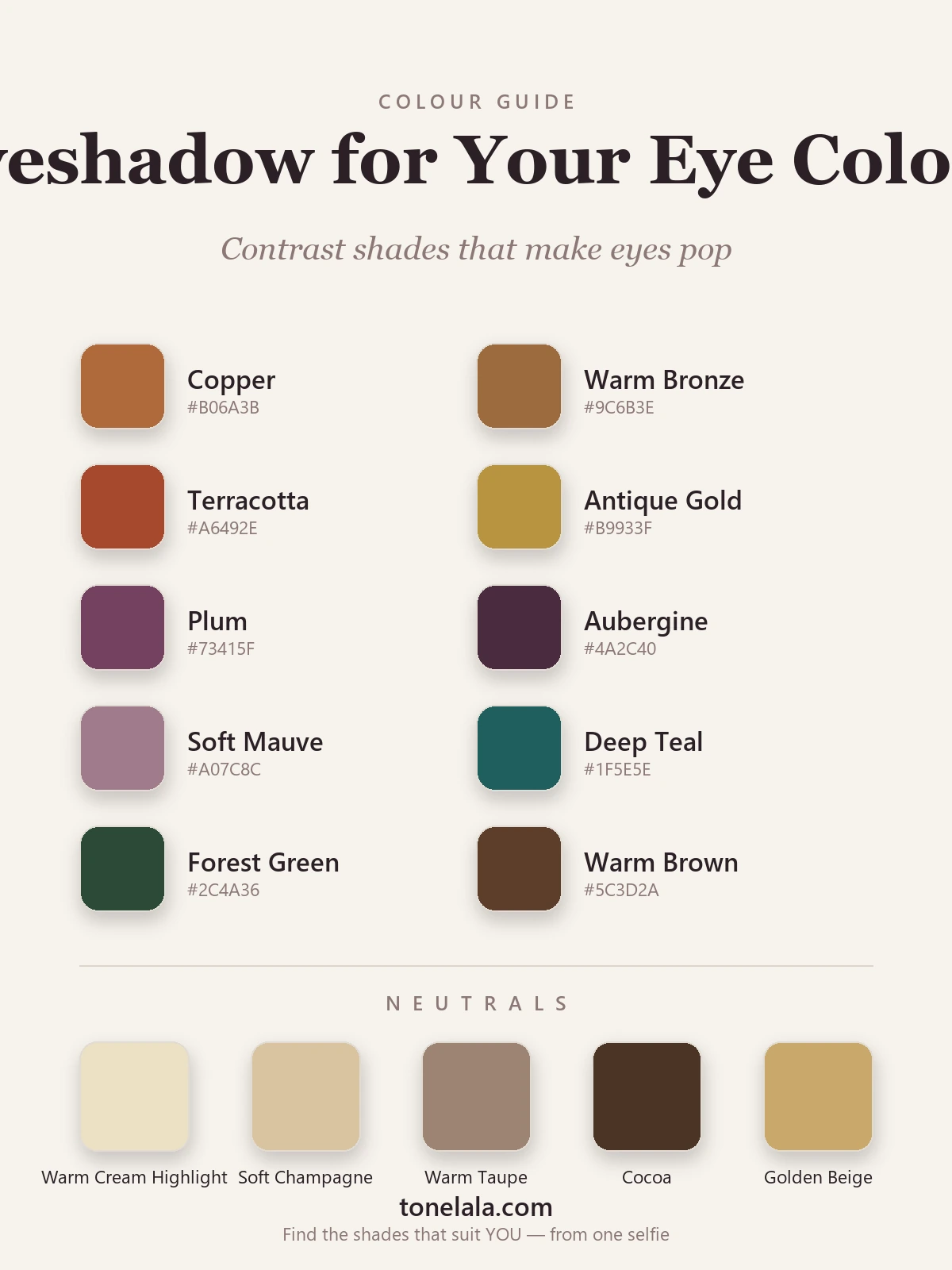
These ten are the shades I build a kit around when the goal is making eyes pop, a warm contrast group for blue and gray eyes, a purple group for green and hazel, and cool-and-warm tones for brown, with neutrals to blend them.
| Shade | Hex |
|---|---|
| Copper | #B06A3B |
| Warm Bronze | #9C6B3E |
| Terracotta | #A6492E |
| Antique Gold | #B9933F |
| Plum | #73415F |
| Aubergine | #4A2C40 |
| Soft Mauve | #A07C8C |
| Deep Teal | #1F5E5E |
| Forest Green | #2C4A36 |
| Warm Brown | #5C3D2A |
A little more on what each is for, and which eyes it serves:
- Copper
#B06A3B: the blue-eye hero. A warm, glowing orange-metallic that sits opposite blue and throws it forward harder than any other shade. Also lights the amber in hazel and brown. - Warm Bronze
#9C6B3E: the all-rounder. Flatters every eye color, pops blue, warms hazel and brown, which makes it the safest single shadow to own. - Terracotta
#A6492E: eye. A redder, earthier take on the orange trick. Smudged through the socket it makes blue and gray eyes read startlingly clear. - Antique Gold
#B9933F: eye/highlight. The inner-corner glow and warm lid wash. Wakes the gold in brown and hazel and lifts almost any eye; softer than a bright frost. - Plum
#73415F: the green & hazel hero. The complement to green, so it makes green and hazel irises jump forward. The single most flattering shadow for those eyes. - Aubergine
#4A2C40: eye/liner. The deeper purple for definition and evening. Smudged along the upper lash line it pops green and replaces black far more kindly. - Soft Mauve
#A07C8C: eye. The daytime version of the purple trick, a wash soft enough for everyday that still lifts green and hazel. - Deep Teal
#1F5E5E: eye/liner. A blue-green that contrasts the warmth in brown eyes and deepens hazel's green. A teal lower liner is a fresh alternative to brown. - Forest Green
#2C4A36: eye. A rich, cool green that frames brown eyes beautifully and adds depth for blue. Reads luxe rather than icy. - Warm Brown
#5C3D2A: the workhorse. Crease depth and soft liner for every eye color, the shade that does black's job without the harshness.
Base & neutral tones: Warm Cream Highlight #EDE0C4 for the brow bone and inner corner, Soft Champagne #D9C3A0 as a low-frost lid wash, Warm Taupe #9C8472 for soft transition and definition, Cocoa #4A3526 as your warm "deep" for the outer corner (kinder than black), and Golden Beige #C9A86A for a warm shimmer that flatters rather than flattens.
Want eyeshadow matched to YOUR exact coloring?
Find your color season →Best eyeshadow by eye color
The contrast rule plays out a little differently depending on what you're working with. Here's the short version for each, with where to go deeper.
Blue eyes. Warm is the magic, copper, bronze, terracotta and warm peach sit opposite blue and make it leap out. Antique gold and a soft champagne lid keep it everyday. Skip flat navy and icy silver, which fold the blue into itself. Full detail in my makeup for blue eyes guide.
Green eyes. Purple is the secret weapon, plum, aubergine and mauve push the green brighter than any green shadow could. Warm bronze and copper add a glow without competing. See the makeup for green eyes guide.
Brown eyes. Far from "anything goes", brown eyes truly pop in cool jewel tones, deep teal, forest, navy and plum, that contrast their warmth, plus bronze, copper and gold to light the amber. More in makeup for brown eyes.
Hazel eyes. The chameleon, because hazel layers green, gold and brown. Plum and aubergine pop the green; bronze, copper and gold wake the amber. The classic look pulls both, a plum socket with a gold center. See makeup for hazel eyes.
Gray eyes. Treat these like cool blue eyes. Warm browns, dusty plum and soft mauve add gentle lift and warmth; copper works for a clearer, brighter result. Gray flattens fast under muddy, dull shades, so keep colors clean and a little warm.
Placement, finish and liner
A few practical notes that matter as much as the color.
Placement. Keep the contrast shade where it does the most work, through the socket and along the upper lash line, framing the eye. Drop a warm gold or champagne shimmer into the inner corner whatever your eye color; it catches the light and opens everything up. For a soft daytime eye, a single wash of bronze or mauve with that inner-corner glow is plenty.
Finish. Matte shades blend and define; shimmer reflects light and draws the eye to wherever you place it. A common, flattering formula is a matte transition shade in the crease, a shimmer on the center of the lid, and a soft matte in the outer corner for depth.
Liner. Lead with warm brown, bronze, deep plum or teal rather than jet black for everyday, black can read hard and quietly flatten the eye, while a warm liner softens it and lets the color show. A plum or aubergine liner smudged along the upper lash line is the under-used trick that pops green and hazel eyes especially. Save true black for a deliberate evening eye.
How your eye color maps to your season
Here's the honest caveat most eyeshadow pieces skip: eye color alone doesn't pick your colors. Seasonal analysis sorts your coloring by three dials, undertone (warm or cool), depth (light or deep) and chroma (soft or clear), and the same eye color shows up across several seasons depending on those dials. Two women with the same eyes and different undertones suit genuinely different versions of every shade above.
Warm, golden coloring of any eye color tends towards Spring or Autumn, where copper, bronze, terracotta and warm gold come into their own. Cool, rosy coloring leans Summer or Winter, happiest in clear plum, teal and crisp aubergine. Then depth and clarity refine it: high-contrast, clear coloring sits in the brighter seasons, soft and low-contrast coloring in the muted ones. My color analysis guides walk through how warmth, depth and contrast play out season by season, and my best colors for your eye color guide takes the same echo-and-contrast logic to your wardrobe, so you can see which camp your coloring is closest to.
Putting it together
If you take one thing from this, take the contrast rule: the best eyeshadow for your eye color is its opposite on the wheel, copper and bronze for blue and gray, plum and aubergine for green and hazel, teal and gold for brown, and matching shadow to your iris flattens far more than it flatters. Build around a warm bronze that suits nearly everyone, keep your contrast shade close for the days you want your eyes to lead, line with warm brown instead of black, and add a gold inner corner to lift the lot. That alone changes how lit-up your eyes look in every photo. The only question left is which version of each shade is yours, clear and cool, or warm and earthy, and that comes down to your undertone, which is exactly what a personal analysis is for.
Frequently asked questions
What is the best eyeshadow for your eye color?
The best eyeshadow for any eye color is usually the shade sitting opposite it on the color wheel, because contrast is what makes the iris pop. Blue eyes light up in warm copper, bronze and terracotta; green and hazel eyes glow against plum, aubergine and mauve; brown eyes deepen beautifully in teal, forest green and warm gold; gray and clear blue eyes lift with soft plum and warm browns. Matching shadow to your iris, blue on blue, tends to flatten rather than reveal it, so reach for the opposite shade first.
What eyeshadow makes your eyes pop the most?
The complement, the color directly opposite your eye color on the wheel, makes your eyes pop hardest, because complementary pairs intensify each other. Orange sits opposite blue, so copper, bronze and terracotta throw blue eyes forward. Purple sits opposite green, so plum and aubergine push green and hazel eyes brighter. Blue-green tones like teal and forest contrast the warmth in brown eyes. A warm gold or champagne shimmer in the inner corner lifts almost any eye on top of that.
Should I match my eyeshadow to my eye color?
Generally no, matching shadow to your iris tends to mute the eye rather than reveal it, because there's nothing for the color to contrast against. Blue shadow on blue eyes, green on green, can read flat and slightly tired. Echoing your iris works as a soft, deepening effect for a low-key look, but if you want your eyes to stand out, the opposite shade does far more visible work. Use a matching shade for mood and a contrasting one for impact.
What eyeshadow color goes with brown eyes?
Brown eyes are flattered by almost everything, but they truly come alive in cool jewel tones that contrast their warmth, deep teal, forest green, navy and rich plum, alongside warm metallics like bronze, copper and antique gold that light the amber many brown irises carry. Espresso and cooler browns can carry teal and aubergine crisply, while warmer, lighter browns glow in copper and gold. For everyday wear, a warm bronze lid with a gold inner corner is the easy win.
Should I use gold or silver eyeshadow for my eye color?
Metals follow your warmth more than your eye color itself. Warm eyes carrying amber or gold flecks, most brown and hazel eyes, and warmer blues, glow in gold, bronze and copper, which echo that warmth. Cooler, clearer eyes on cool skin look crisp in silver, pewter and white-gold. If your eye carries both, let your skin's undertone be the tie-breaker: warm skin leans gold, cool skin leans silver, and neutral skin can wear either, often softened to antique gold or warm pewter.
Related guides
Makeup for Blue Eyes
The eyeshadow, liner and lip shades that make blue eyes pop, a color analyst's guide to copper, bronze, warm browns and the tones to skip.
Makeup for Hazel Eyes
A color analyst's guide to makeup for hazel eyes, the eyeshadow, liner and lip shades that bring out the green and gold, with hex codes.
Makeup for Green Eyes
A color analyst's makeup guide for green eyes, the eyeshadow, liner, lip and blush shades that make green pop, with hex codes and what to skip.
Makeup for Brown Eyes
Makeup for brown eyes: the eyeshadow, eyeliner and mascara shades that bring out brown eyes, with hex codes, five looks, light vs dark brown eyes, and where the advice disagrees.
True Winter Makeup: Best Shades for Lips, Eyes & Cheeks
A color analyst's True Winter makeup guide, best lip, blush and eye shades with hex codes, foundation undertone tips, and the warm shades to avoid.
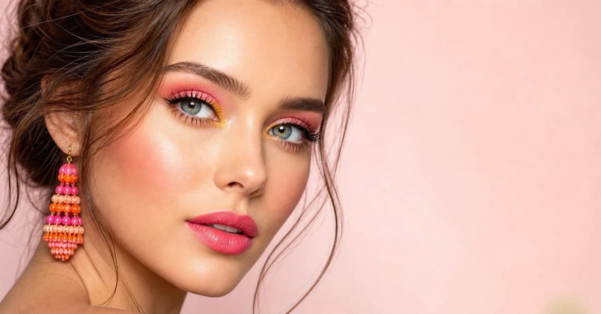
Bright Spring Makeup: Best Shades for Lips, Eyes & Cheeks
A makeup artist's Bright Spring guide, the best lip, blush and eye shades with hex codes, the right foundation undertone, and what to avoid.
Prefer in person? Find color analysis near you
Browse local color analysts by city, or get the same season, palette and best-colors breakdown online from one selfie.
See your colors on a photo of you
Upload one selfie and ToneLala reveals your season, your full palette, and your best hair, makeup, jewelry and outfits, styled on you.