The best color combinations aren't universal, they're the pairings built from shades that already suit your skin, hair and eyes. Start by knowing your palette, then find your season.
Best Color Combinations for Outfits
By ToneLalaUpdated July 9, 2026
Contents
I keep a photo on my phone of a client who came in convinced she "couldn't do color". She'd arrived in head-to-toe black, holding a mustard scarf she loved but never wore because, in her words, it "looked wrong with everything". It didn't look wrong with everything. It looked wrong with black. Beside a soft olive coat and a camel bag, that same scarf turned into the best thing she owned.
That's the part most people miss. A color combination doesn't succeed or fail on its own, it succeeds or fails in relationship. Two shades that share an undertone or a level of softness will almost always sit well together, and two that pull against each other will fight no matter how lovely each one is alone. Once you can see those relationships, you stop guessing and start assembling. Below are the pairings I reach for again and again, the logic behind why they work, and how to rebuild every one of them from colors that genuinely suit you.
Start with the four combination types
Almost every outfit pairing you'll ever wear belongs to one of four families. Learn these and you've learned the whole game.
Complementary combinations use colors from opposite sides of the wheel, teal with terracotta, cobalt with mustard, plum with sage. They're high-contrast and lively, which makes them brilliant for an outfit you want noticed. The trick is to let one color lead and the other support, rather than splitting an outfit fifty-fifty.
Analogous combinations use neighbours: sage, olive and forest green, or rust, terracotta and mustard. Because the colors sit next to each other, they blend into a calm, expensive-looking gradient. This is the easiest family to get right and the hardest to get wrong.
Monochromatic combinations use one color at different depths, a dusty rose blouse over a deeper plum trouser. Tonal dressing like this always reads considered, and it's a quiet way to wear a color you adore without it shouting.
Neutral-anchored combinations pair one clear color with a steadying neutral, cobalt with charcoal, terracotta with ivory, teal with navy. This is the backbone of a real-world wardrobe, because the neutral does the heavy lifting and the color does the talking.
The pairings I trust most
Here are the specific duos and trios I find myself recommending week after week. Each one balances warmth against coolness, or depth against lightness, so the eye has somewhere to rest.
- Navy and camel: the most forgiving pairing in fashion. Crisp, warm, seasonless, and flattering on nearly everyone.
- Teal and terracotta: a complementary pair that feels modern rather than loud, because both shades are slightly muted.
- Forest green and ivory: deep and fresh at once; the ivory keeps the green from going heavy.
- Charcoal and dusty rose: the soft pink stops charcoal looking severe, and the charcoal stops the pink looking sweet.
- Mustard and cobalt: proper complementary energy; wear the mustard small if bold color makes you nervous.
- Olive, sage and rust: an analogous-plus-accent trio that looks like autumn in the best way.
- Plum and stone gray: quietly luxurious, and a lovely way to wear a rich color to work.
Notice that none of these is a random clash. Every pairing either shares a temperature or deliberately contrasts a warm with a cool while keeping both at a similar softness. That balance is the whole secret.
Build combinations from your own palette
This is where it gets personal. The colors below are a representative palette, ten outfit-friendly shades plus five neutrals, chosen because they pair beautifully with one another. They're a starting point, not a prescription. Your own best versions might run warmer, cooler, softer or brighter.
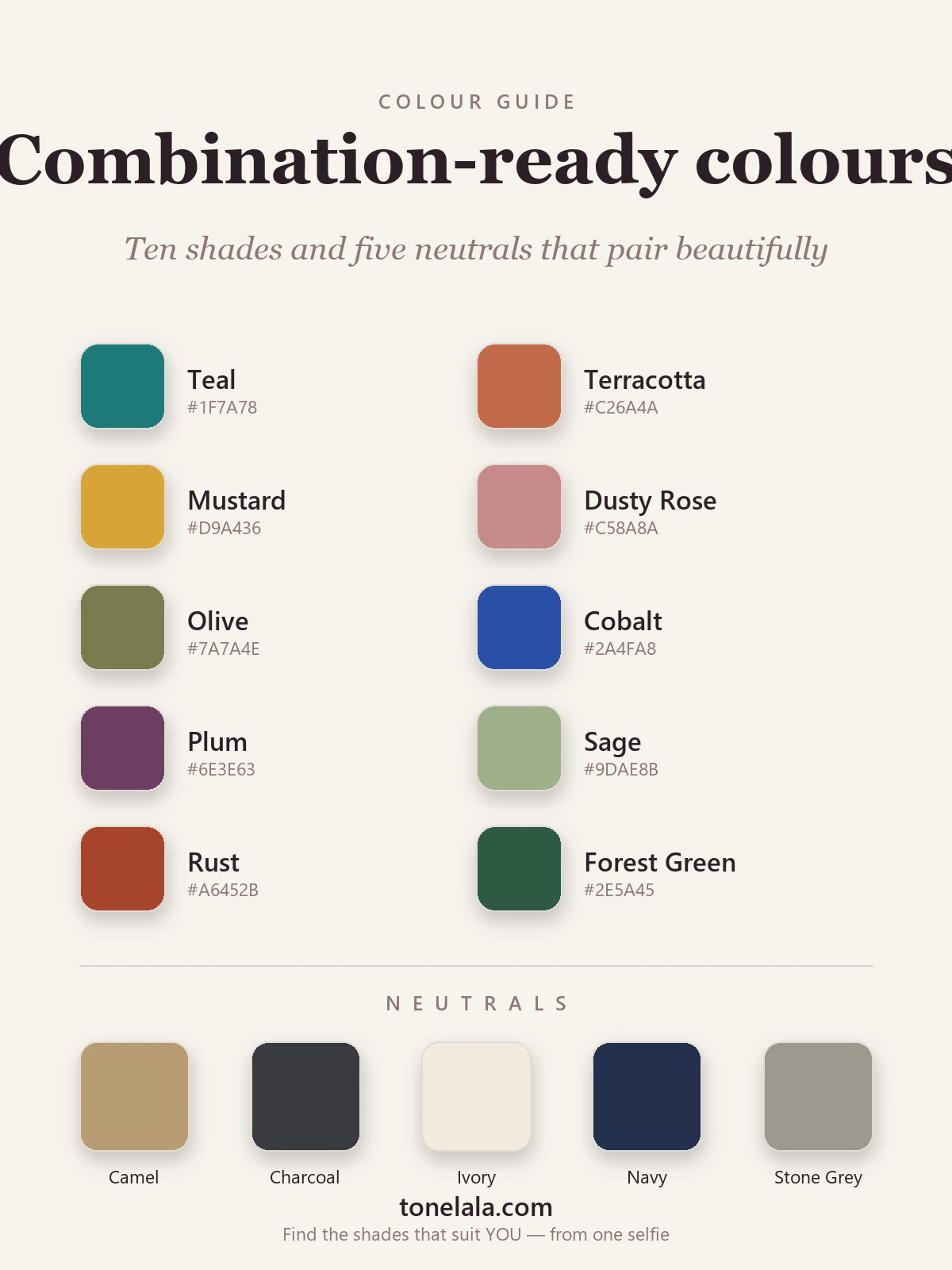
To turn any swatch grid like this into outfits, I use three quick moves:
- Pick a hero. Choose the one color you most want to wear today, say, rust.
- Add a partner. Reach across to its complement (a soft teal) for contrast, or to a neighbour (mustard or terracotta) for harmony.
- Ground it with a neutral. Camel, ivory or charcoal will settle the pairing and make it wearable anywhere.
The reason a personalized palette matters so much is undertone. Two people can both "wear green", but one suits the warm, golden olive on this grid while the other comes alive in a cooler forest green. Wear the right version near your face and your skin looks clearer and more even; wear the wrong one and you'll reach for more makeup without quite knowing why. That single shift, matching the color's undertone and depth to your own, is what separates a combination that's merely correct from one that's genuinely yours.
Not sure whether you're warm, cool or somewhere in between?
Find your color season →Getting the proportions right
Picking the colors is only half of it; how much of each you wear matters just as much. A combination that looks garish at equal amounts often looks elegant at the right ratio.
I lean on a loose 60-30-10 split. Roughly sixty per cent of the outfit is your anchor, often a neutral or your softest color. Thirty per cent is your hero shade. The last ten per cent is an accent: a belt, a shoe, a lip, a piece of jewelry. Cobalt and mustard sounds alarming until you make it a navy outfit, a cobalt knit, and one small flash of mustard in a bag, suddenly it's chic.
Two more things I'd whisper in your ear. First, keep your softness level consistent: muted colors want other muted colors, and clear, saturated colors want company that's equally clear. Mixing a dusty sage with an electric cobalt is what makes an outfit feel slightly off even when the colors "should" match. Second, let texture carry some of the contrast. A tonal plum outfit in a chunky knit and a satin trouser reads far richer than the same two shades in identical fabric.
Where to go from here
If you take one idea away, make it this: stop asking whether two colors go together in the abstract, and start asking whether they go together on you. The four families give you the structure, the proportions give you balance, and your own palette tells you which version of each shade to buy.
For more on the color theory behind all this, and how the seasonal system sorts shades into warm, cool, soft and bright, browse the full set of color analysis guides. When you're ready to know exactly which combinations were made for your coloring, the fastest route is a proper analysis: find your color season and let the pairings build themselves.
Frequently asked questions
What are the best color combinations for outfits? The most reliable outfit combinations fall into four families: complementary (opposites like teal and terracotta), analogous (neighbours like sage, olive and forest green), monochromatic (one color at different depths), and any color anchored by a neutral such as navy, camel or charcoal. The best ones for you are the versions of these built from colors that match your own skin, hair and eyes.
How do I know which colors go together? Colors go together when they share an undertone or a level of intensity. A warm rust sits happily with a warm mustard because both lean golden; a soft sage pairs with a soft dusty rose because both are muted. Clashes usually happen when you mix a clear, bright color with a dusty, grayed one, or a warm shade with a cool one of equal strength.
What two colors look best together? Navy and camel is the most foolproof two-color pairing in any wardrobe, it reads polished, works across seasons, and flatters nearly everyone. Other dependable duos include teal and terracotta, charcoal and dusty rose, and forest green with ivory. Each balances a deeper anchor against a lighter or warmer counterpart.
How many colors should one outfit have? Two or three colors is the sweet spot for most outfits: one or two main shades plus a neutral to ground them. A fourth color, usually small, can come in through a shoe, bag or piece of jewelry. More than three competing colors tends to look busy rather than considered.
Can I wear colors that aren't in my color season? Yes, your season tells you which version of a color flatters you most, not which colors are off-limits. Almost every shade exists in a warm and a cool, a bright and a muted variant. If a combination you love sits outside your palette, look for the nearest match in your own depth and undertone and wear it near your face.
Frequently asked questions
What are the best color combinations for outfits?
The most reliable outfit combinations fall into four families: complementary (opposites like teal and terracotta), analogous (neighbours like sage, olive and forest green), monochromatic (one color at different depths), and any color anchored by a neutral such as navy, camel or charcoal. The best ones for you are the versions of these built from colors that match your own skin, hair and eyes.
How do I know which colors go together?
Colors go together when they share an undertone or a level of intensity. A warm rust sits happily with a warm mustard because both lean golden; a soft sage pairs with a soft dusty rose because both are muted. Clashes usually happen when you mix a clear, bright color with a dusty, grayed one, or a warm shade with a cool one of equal strength.
What two colors look best together?
Navy and camel is the most foolproof two-color pairing in any wardrobe, it reads polished, works across seasons, and flatters nearly everyone. Other dependable duos include teal and terracotta, charcoal and dusty rose, and forest green with ivory. Each balances a deeper anchor against a lighter or warmer counterpart.
How many colors should one outfit have?
Two or three colors is the sweet spot for most outfits: one or two main shades plus a neutral to ground them. A fourth color, usually small, can come in through a shoe, bag or piece of jewelry. More than three competing colors tends to look busy rather than considered.
Can I wear colors that aren't in my color season?
Yes, your season tells you which version of a color flatters you most, not which colors are off-limits. Almost every shade exists in a warm and a cool, a bright and a muted variant. If a combination you love sits outside your palette, look for the nearest match in your own depth and undertone and wear it near your face.
Related guides

Colors That Go With Charcoal
A stylist's guide to the colors that go with charcoal gray, 10 pairings plus 5 neutrals with hex codes, outfit combinations and what to avoid.
Colors That Go With Khaki
A stylist's guide to the best colors that go with khaki, navy, rust, burgundy, white and more, with hex codes, outfit combinations and what to avoid.
Colors That Go With Peach
The best colors to pair with peach, neutrals, complementary shades and combinations that flatter, with a ready-to-use palette and stylist tips.

Colors That Go With Mint Green
A stylist's guide to the colors that go with mint green, coral, navy, blush, gold and more, with hex codes, outfit combinations and shades to avoid.

Colors That Go With Maroon
A stylist's guide to the colors that go with maroon, 10 pairings and 5 neutrals with hex codes, outfit combinations, what to avoid, and how to wear it.

Colors That Go With Turquoise
A stylist's guide to the colors that go with turquoise, 10 pairings and 5 neutrals with hex codes, outfit ideas, what to avoid
Prefer in person? Find color analysis near you
Browse local color analysts by city, or get the same season, palette and best-colors breakdown online from one selfie.
See your colors on a photo of you
Upload one selfie and ToneLala reveals your season, your full palette, and your best hair, makeup, jewelry and outfits, styled on you.