
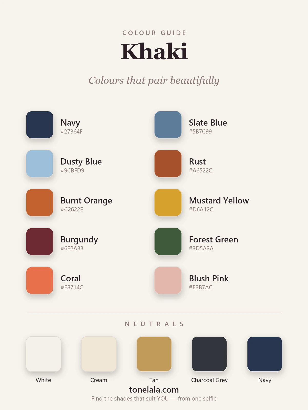
In a sentence: the colours that go best with khaki are navy, slate and dusty blue, rust, burnt orange and mustard, burgundy and forest green, plus coral and blush — anchored by white, cream, tan, charcoal and navy. Skip to the pairing palette or find your most flattering colours.
The fastest way to make khaki look cheap is to wear it head to toe with nothing to push against — a flat, sludgy block that drains the wearer. I see it most on khaki utility jackets bought for the colour and then never styled. The same jacket over a clean white tee, with navy trousers and a flash of gold, suddenly looks like money rather than military surplus. Khaki is a warm neutral that behaves like a colour, which means what you put next to it does almost all the work.
The other thing worth knowing: khaki is not one colour. It runs from pale, sandy stone through dusty olive-tan to deep, greenish field-khaki, and the partners that flatter the lightest version aren't always the ones that flatter the darkest. Pick the right khaki for your colouring and pair it with intent, and it does something black never quite manages — it warms you up and looks relaxed and expensive at the same time.
What kind of colour khaki is
Khaki started life as a dye colour — the word comes from the Urdu for "dust" — and that's still the best way to picture it: a dusty, sun-bleached tan with a quiet green-yellow cast. On the colour wheel it sits as a low-chroma yellow-green, heavily greyed and browned down. That single fact explains how it behaves.
Because khaki is fundamentally warm and yellow-based, its natural opposite is blue — which is why navy, slate and dusty blue look so right beside it, lifting the warmth instead of letting it sit flat. It plays easily with other warm earth tones (rust, burnt orange, mustard) because they're siblings on the same side of the wheel. And because it's muted rather than vivid, it pairs best with colours that carry either real depth (burgundy, forest, chocolate) or a little softness of their own (coral, blush) — clean, screaming brights tend to bully it.
One more nuance: "khaki" covers a real range. Lighter, sandier khakis behave like soft neutrals you can build a whole outfit around; deeper, greener field-khakis act more like a colour and want a confident partner to balance them. The pairings below work across that range — you just dial the partner lighter or deeper to match your khaki.
The best colours to go with khaki
These are the ten I reach for again and again — cool counterpoints to lift the warmth, warm earth siblings to keep it tonal, and a couple of depths and soft tones to round it out.
| Colour | Hex | Why it works |
|---|---|---|
| Navy | #27364F |
Khaki's most reliable partner. Deep and cool, it gives khaki a backbone and makes the warmth glow — my desert-island pairing. |
| Slate Blue | #5B7C99 |
The everyday version of that blue-khaki magic. Dusty, faded blue beside khaki is effortless and suits almost everyone. |
| Dusty Blue | #9CBFD9 |
A lighter, airier blue that keeps a khaki outfit feeling fresh rather than heavy or earthbound. |
| Rust | #A6522C |
A warm sibling on the wheel. Earthy and burnt, it makes khaki look sunlit and grounded — peak autumn. |
| Burnt Orange | #C2622E |
Tonal and confident. Orange shares khaki's warmth, so the pairing reads deliberate and modern rather than loud. |
| Mustard Yellow | #D6A12C |
Golden and earthy, mustard is khaki's natural relative — together they look rich, warm and a little vintage. |
| Burgundy | #6E2A33 |
A deep wine red that shares khaki's warmth but adds the depth it lacks — instant evening richness. |
| Forest Green | #3D5A3A |
Khaki and green is nature's own pairing. Deep forest gives a luxe, woodland depth without clashing. |
| Coral | #E8714C |
A brighter warm note for when you want energy. Khaki grounds it so it never tips into garish. |
| Blush Pink | #E3B7AC |
A warm, dusty pink that softens khaki's utility edge — proof it can do pretty, not just rugged. |
Neutrals that go with khaki: White #F4F1E9 (a soft, warm white that lifts khaki and looks crisp), Cream #EFE7D4 (the gentlest, warmest light partner), Tan #C19A5B (keeps a look tonal and expensive), Charcoal Grey #33363B (a dark anchor that's kinder than black), and Navy #27364F (the smart modern stand-in for black).
Which shade of khaki actually suits YOU?
Find your colour season →Khaki outfit combinations
- Khaki + white + navy (everyday). A khaki jacket or chinos, a clean white tee, navy trousers or a navy bag. Fresh up top, anchored below — the look that reads polished with zero effort.
- Khaki + rust + cream (weekend). Khaki trousers, a rust knit and a cream tee or scarf. Relaxed, earthy and warm — made for autumn walks and long lunches.
- Khaki + burgundy + gold (evening). A khaki slip skirt or relaxed trousers with a burgundy top and gold jewellery. The depth of the burgundy is what turns daytime khaki into something for after dark.
- Khaki + dusty blue + tan (smart-casual). A khaki blazer, a dusty-blue shirt and tan loafers. Soft, tonal and quietly grown-up — the office version of utility.
Colours and styling to avoid with khaki
- Pure black — a hard, cool black can make warm khaki look slightly dingy and the black itself read faded beside it. Reach for navy or charcoal when you want a dark; both have enough depth without the clash.
- Cool dove grey — a blue-toned grey beside warm khaki drains both colours and the outfit goes flat and joyless. Swap in warm tan or charcoal, which have enough warmth or depth to hold up.
- Hot neon brights — electric pink, acid lime, vivid cobalt. Khaki is quiet and dusty, so screaming brights overpower it and the pairing reads costume-y. If you want brightness, use coral or mustard, which carry their own warmth.
None of these are forbidden — they're simply the combinations that most often disappoint, so treat them as "handle with care".
How to wear khaki for your colouring
Khaki is universal in theory and personal in practice. The version of khaki that flatters you — and the exact partner colours that sing beside it — depends on your own undertone, depth and contrast.
If you're warm and deep (a True or Deep Autumn, say), rich olive and golden field-khakis are made for you, and they'll happily carry the deeper partners like burgundy and forest. If you're light and warm, softer sandy and stone khakis with cream and blush will feel more like you. If you're cool, you're better in greyer, greige-leaning khakis paired with cooler partners — navy, slate, dusty blue — and you'll want to keep golden-green khakis to a minimum, since they can sallow cool skin. And if you're light and cool, the deepest army khakis can overwhelm; a pale, soft stone is far kinder near your face.
That's the bit a generic chart can't do for you. Our colour analysis guides walk through each season, and if you want to go deeper on khaki's close cousins, my guides to how to wear olive green and how to wear beige cover the same warm-neutral territory. A personal analysis reads your photo to tell you the exact khaki — and the exact navy, the exact rust — that lights your face up rather than draining it.
Putting it together
Build a small khaki capsule and the rest looks after itself: pick one khaki you love, one soft neutral (white or tan), and two or three of the colours above — say navy, rust and burgundy. Everything mixes, because warm khaki is one of the steadiest bases in the wardrobe and these partners were all chosen to flatter it. Stop thinking of khaki as the safe, sludgy option and start treating it as the warm, grown-up backdrop it really is — then let one well-chosen colour beside it carry the look.