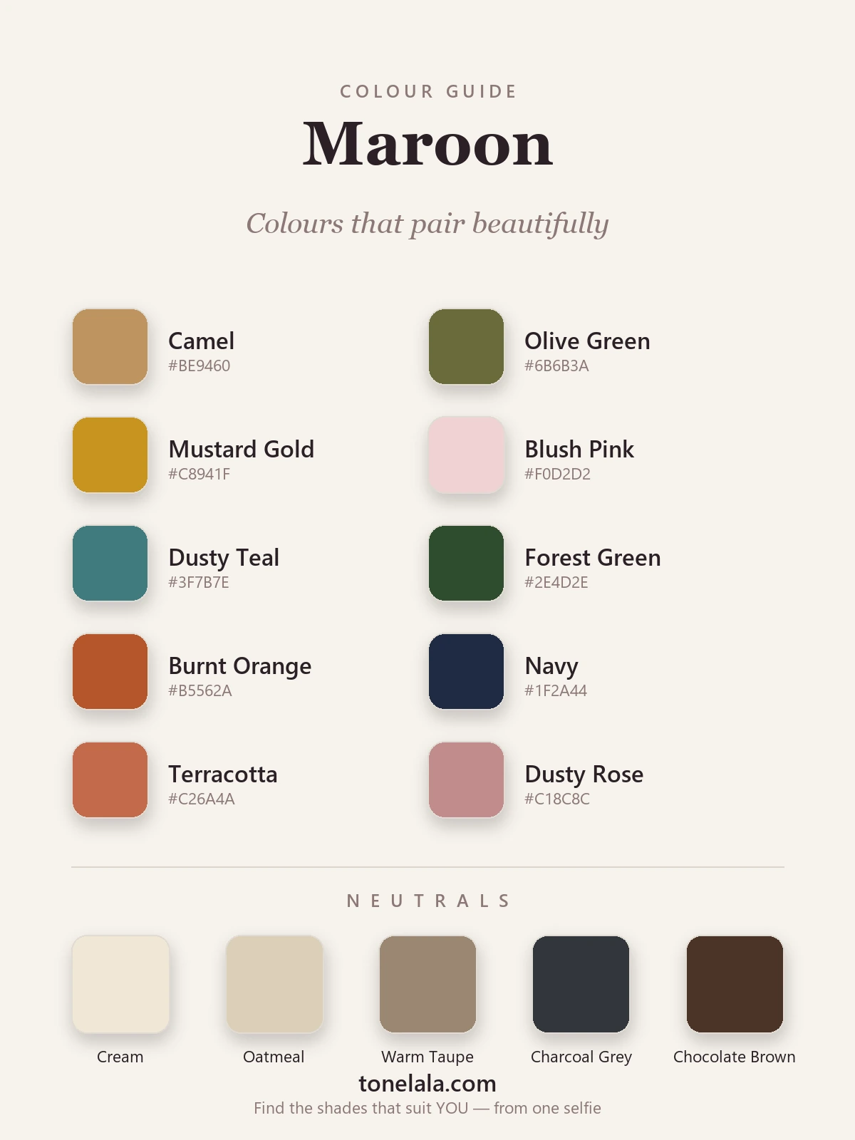
In a sentence: The colours that go with maroon are camel, olive green, mustard gold, blush pink, dusty teal, forest green, burnt orange, navy, terracotta and dusty rose — with cream, oatmeal, warm taupe, charcoal and chocolate doing the neutral work. Skip to the full pairing palette or find your most flattering colours.
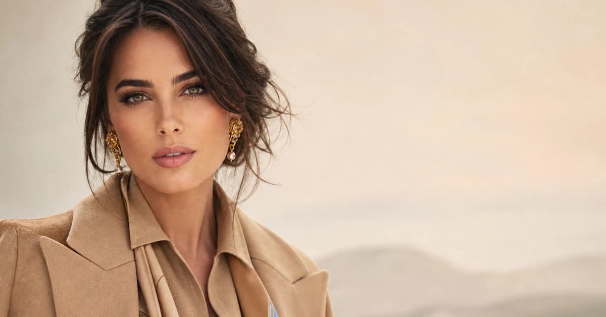
Maroon is the colour I see most often mislabelled in a wardrobe. A client pulls out what she calls her "burgundy" jumper, holds it to the light, and it's clearly browner and warmer than wine — that's maroon, and it wants a different set of partners. The confusion matters, because the colours that flatter a cool, purple burgundy are not quite the colours that make an earthy maroon glow.
Once you see maroon for what it actually is — a deep red with brown folded into it — the styling stops being guesswork. It behaves like a warm, dark neutral, which means it can sit quietly under camel and cream, or strike a proper contrast against olive and forest green. Most people only ever wear it with black. This guide is about everything else: the real shades, with hex codes, that make maroon look considered rather than accidental.
What kind of colour maroon is
Maroon is a dark, brownish red with a distinctly warm undertone — red mixed with brown rather than the purple you find in burgundy, sitting somewhere around #800000 to #5C2A2A. That brown is the whole story. It's what separates maroon from a cool wine and decides which colours look at home beside it.
Because it's a dark, muted, warm colour, maroon works a little like a neutral with the lights dimmed. Two things follow. First, its complement on the colour wheel lives in the green family — so olive, forest green and dusty teal give you the most satisfying contrast. Second, anything that shares its warm, earthy quality — camel, mustard, terracotta, burnt orange — blends in almost automatically, while clean, cool, blue-based brights tend to fight it.
It also helps to remember maroon isn't a single shade. There's a warmer, brick-leaning maroon at one end and a deeper, near-chocolate oxblood at the other, and where your particular maroon sits nudges its best partners. The principle holds either way: keep the warm undertone in mind and the pairings practically choose themselves.
The best colours to go with maroon
Here's the palette I actually reach for — a few easy, warm "wins" you can wear tomorrow, plus braver options for when you want maroon to do more than behave.
| Colour | Hex |
|---|---|
Camel #BE9460 |
The single most flattering partner. Warm tan makes maroon glow and reads instantly expensive. |
Olive Green #6B6B3A |
Maroon's earthy near-complement — muted green against muted red, deeply autumnal and elegant. |
Mustard Gold #C8941F |
Warm ochre lifts maroon out of seriousness; the pairing that always looks rich and intentional. |
Blush Pink #F0D2D2 |
A soft, tonal partner from the same red family. Reads romantic and modern, never twee. |
Dusty Teal #3F7B7E |
A muted blue-green that gives cool contrast without shouting — unexpected and quietly chic. |
Forest Green #2E4D2E |
Deep green against deep maroon is the most classic contrast there is. Festive, considered. |
Burnt Orange #B5562A |
Earthy, analogous warmth — sits beside maroon like it was always meant to. Very seasonal. |
Navy #1F2A44 |
A softer, smarter "dark" than black. Two deep tones that hold hands instead of clashing. |
Terracotta #C26A4A |
Warm clay-orange that echoes maroon's brown base — tonal, sun-baked and effortless. |
Dusty Rose #C18C8C |
The grown-up blush; muted enough to live in maroon's world without competing. |
Neutrals that go with maroon: Cream #EFE7D4 and Oatmeal #DBCFB8 for warm, flattering light tones; Warm Taupe #9A8772 to sit quietly beside it; Chocolate Brown #4A3327 for a rich tonal anchor; and Charcoal Grey #33363B as your best "dark" — kinder and more flattering than black.
Which shade of maroon actually suits YOU?
Find your colour season →Colours to avoid with maroon
- Cool, blue-based brights. Fuchsia, icy pastels and electric blue sit on the opposite side of the undertone line from maroon's warm base, so they jar rather than harmonise. If you want a pop, keep it warm — mustard or terracotta, not magenta.
- Muddy mid-browns. A flat, greyish brown can dissolve into maroon until the outfit reads as one murky block. Lift it with camel or a clearly warmer chocolate instead.
- Pure jet black, head to toe. It's not wrong, but it deadens maroon's warmth and can age the pairing. Chocolate, charcoal or navy gives you the same anchoring effect while letting the colour breathe.
The quick test: if a colour makes the maroon look browner or muddier, it's working against you. If the maroon looks more like a rich, warm red, you've found a friend.
Maroon outfit combinations
A pairing on paper is one thing; a whole outfit is another. Here are four I come back to again and again, built so you can copy them straight off the page.
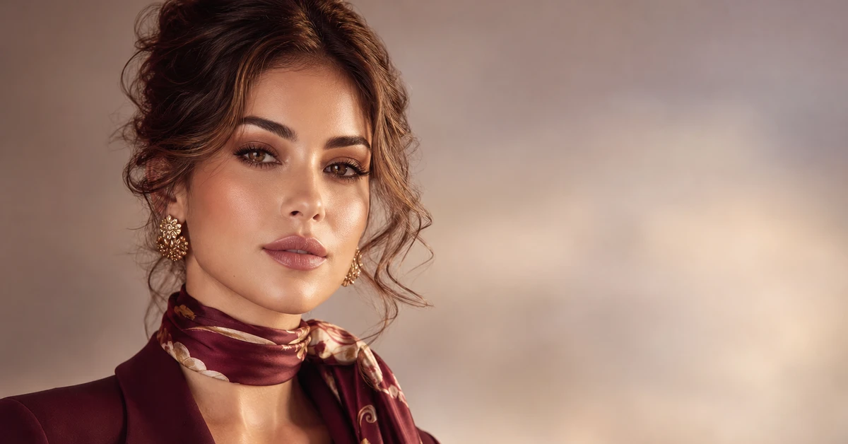
- Maroon + camel + cream. A maroon knit, a camel coat, cream trousers. The failsafe — warm, polished, the kind of outfit that looks like you tried without trying. Gold jewellery finishes it.
- Maroon + olive green. A maroon skirt with an olive jumper, or the reverse. Earthy-on-earthy contrast that feels rich rather than loud — my favourite cool-weather pairing.
- Maroon + blush + oatmeal. Maroon trousers, a blush blouse, oatmeal knit or coat. Tonal and unexpectedly soft, it takes maroon somewhere lighter and more romantic.
- Maroon + navy + gold. Maroon and navy together with a gold buckle, watch or chain. Quietly sharp, brilliant for work, and proof you never needed black.
How to wear maroon for your colour season
Here's the part most pairing guides skip: there isn't one maroon. The shade that lights you up depends on your own colouring, and getting it right matters more than any pairing.
Warm, deep types — think True Autumn or Deep Autumn — wear an earthy, brick-leaning maroon beautifully; it echoes the warm depth in their colouring, and they can lean their pairings further into camel, mustard, olive and terracotta. Deep, cool-toned people like True Winter or Deep Winter usually look crisper in a slightly cooler, more wine-tinged version closer to burgundy, worn with navy and forest green rather than orange. Softer, lighter seasons tend to do best in a muted, lighter maroon closer to a deep dusty rose, kept away from the face if it's very dark.
If you've ever held a maroon top up and felt it either glowed or quietly drained your face, that's undertone talking — and it's almost impossible to judge reliably in your own bathroom mirror. Our colour analysis guides walk through how each season reads, and a personal analysis tells you the exact version of maroon — and the pairings — built for your skin, hair and eyes.
Maroon vs burgundy: a quick note
Because the two get muddled so often, it's worth pinning down. Burgundy is the cooler, more purple wine red; maroon is browner and warmer. They share most of their green and neutral partners, but maroon especially loves earthy warmth — camel, mustard, terracotta — where burgundy can also carry cooler companions like plum and clear teal. If you'd like the full treatment for the cooler cousin, my colours that go with burgundy guide covers it, and colours that go with red is useful if your shade sits brighter and more true-red than either.
Putting it together
Treat maroon as a warm, rich neutral and you've already won half the battle: pair it with camel and cream for ease, navy and charcoal for sharpness, then bring in olive, forest green or mustard when you want it to genuinely sing. The one rule worth keeping is undertone — match maroon to warm, slightly earthy partners rather than clean, cool brights, and the whole outfit clicks into place. Get your shade right, lean on these ten colours, and you'll never default to maroon-and-black again.