In a sentence: The best colors to wear on camera are saturated mid-tones in your own undertone, teal, sapphire, cobalt, emerald, ruby, plum and burgundy, plus warmer terracotta and mustard, worn over soft neutrals and never pure white, black or a busy print. Skip to the full palette or find your exact shades.
Best Colors to Wear on Camera
By ToneLalaUpdated July 7, 2026
Contents
A webcam is not a mirror. It sees a narrower range of brightness than your eye does, it compresses the image to send it down a wire, and it quietly drains the life out of whatever color you put in front of it. So the jumper that looks rich and considered in your hallway can turn flat and slightly gray by the time it reaches a meeting, a recording or a thousand strangers on a feed. The color didn't change. The camera did.
I get asked about this constantly now, by clients prepping for interviews, by people who present for a living, by anyone who's caught themselves looking tired on a call and wondered if it was the lighting or them. The honest answer is that it's usually neither. It's the color, and the way a lens handles it. Get that right and you look awake, grounded and like the most vivid thing in the frame, even on a cheap webcam in afternoon gloom. Here's how to choose.
Why color behaves differently on camera
Three things happen between you and the screen, and each one nudges your color choices.
First, dynamic range. Your eye copes effortlessly with bright and dark in the same scene; a camera can't, so it picks an exposure and sacrifices the rest. Wear pure white and the camera exposes for the shirt, which means it darkens everything else, including your face. Wear pure black and it does the reverse, lifting the exposure until the black turns muddy and your features lose definition. Mid-tones sit comfortably in the middle of what a lens can capture, so nothing gets blown out or crushed.
Second, compression. Video is squeezed hard to travel over the internet, and the first casualty is saturation. Colors arrive on the other end a notch duller and grayer than they left. That's why a color that's already a bit muted or pastel can look washed out on screen, while a richer, more saturated version of the same hue still reads as colorful after the feed has had its way with it. On camera, you generally need to go one step more saturated than feels natural in the room.
Third, fine detail. Codecs struggle with high-frequency patterns, thin stripes, small checks, herringbone, tight polka dots. The pattern interferes with the compression grid and produces a shimmering, dancing distortion called moiré. A solid block of color has none of that problem, which is why the best on-camera wardrobe is mostly plain.
The best colors to wear on camera
These ten are my reliable on-screen performers, saturated enough to survive compression, deep enough to hold detail, and chosen across warm and cool so there's something here whatever your coloring.
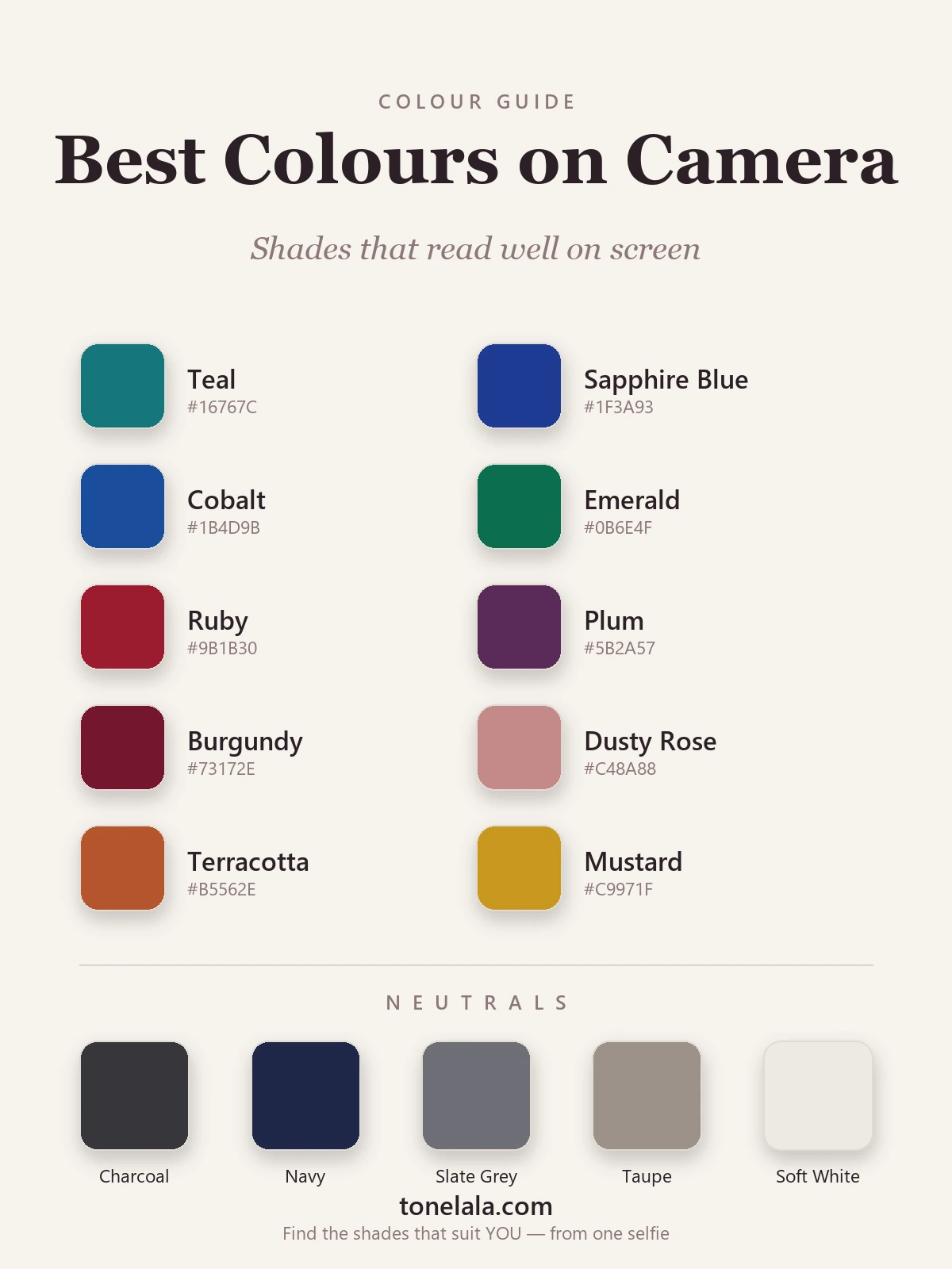
| Color | Hex |
|---|---|
Teal #16767C |
The single most camera-friendly color I know, rich, blue-green, flattering on almost everyone and beautifully separated from most backgrounds. |
Sapphire Blue #1F3A93 |
Deep, true blue that reads as calm and credible on a call; holds its richness through compression and never washes out. |
Cobalt #1B4D9B |
A brighter, punchier blue for when you want presence on screen, vivid enough to survive the feed, not so bright it buzzes. |
Emerald #0B6E4F |
A jewel green that makes skin look luminous on camera and stands cleanly forward against a pale wall. |
Ruby #9B1B30 |
A deep, slightly cool red with real authority, far kinder on screen than a bright pillar-box red, which can bleed and vibrate. |
Plum #5B2A57 |
Muted purple with depth; sophisticated on camera and a quiet way to add color without shouting. |
Burgundy #73172E |
Wine-dark and dressy, my go-to deep tone for presentations, all the gravitas of black with none of its flatness. |
Dusty Rose #C48A88 |
A soft, grounded rose for warmer coloring; gentle near the face but saturated enough not to disappear on a webcam. |
Terracotta #B5562E |
An earthy warm orange that flatters golden skin on screen and reads rich rather than garish under most lighting. |
Mustard #C9971F |
A deep golden yellow, the warm season's best on-camera color, lively without tipping into a neon that bleeds. |
Best neutrals on camera: Charcoal #36363B for depth where black would go flat; Navy #1E2749 as a softer, more flattering dark; Slate Gray #6E7076, the safest neutral on any feed; Taupe #9C9189 for a warm, low-contrast base; and Soft White #EDEAE2 instead of optic white, so you get brightness near the face without blowing out the exposure.
Which of these is YOUR most flattering on camera?
Find your color season →What not to wear on camera
A handful of choices consistently work against you on screen, and most of them are about how a lens behaves, not whether the color suits you:
- Pure white. It pushes the camera's exposure down to compensate, which darkens your face and can leave you looking shadowed and tired. Swap it for soft white, ivory or light gray for the same fresh effect without the blow-out.
- Pure black. On a webcam, black tends to collapse into a flat, detail-free shape and can read as severe close to the face. Charcoal or navy gives you the same anchoring depth while keeping texture and softness.
- Neon and fluorescent brights. Electric lime, hot pink and acid orange bleed and vibrate on a compressed feed, and they throw colored light up onto your skin. Choose the saturated-but-grounded version, emerald over neon green, ruby over fluorescent red.
- Fine repeating patterns. Thin stripes, small checks, herringbone and tight dots produce that shimmering moiré distortion. Keep prints large and sparse, or wear a solid color near your face and save any pattern for below the shoulders.
- A color that matches your background. Wear the same near-white as the wall behind you and you flatten into it; the camera reads one big bright field and pulls the light off your features. Step away from your background in tone.
Choosing on-camera colors for your coloring
Here's the part most camera advice skips: a webcam can tell you which colors survive on screen, but only your own coloring tells you which ones flatter you on screen. The list above works because those shades hold up technically, but the single most camera-friendly color for you is the one that also matches your undertone, because that's what stops your skin reading sallow or gray under a lens.
In seasonal color analysis, your palette is built from three dials: undertone (warm or cool), depth (light or deep) and chroma (soft/muted or bright/clear). If you're cool and high-contrast (a Winter), the clear, saturated end of this palette is made for you on camera, sapphire, cobalt, emerald, ruby, crisp against charcoal or navy. If you're cool and soft (a Summer), the muted members flatter you most on screen, plum, dusty rose, slate, teal in its gentler form, and you want to steer clear of anything too electric, which a feed exaggerates. Warm coloring (a Spring or Autumn) lights up in terracotta, mustard, warm teal and a softer white rather than a stark one. Same camera, genuinely different best colors, which is exactly why I never stop at a generic "wear jewel tones." The color analysis guides walk through how each season reads if you want to place yourself, and the Winter palette and Summer palette are good starting points for cool coloring.
Lighting, background and a few practical fixes
Color never works alone on camera, it works with your light and your background, so a couple of quick adjustments make any of these shades land better.
Light yourself from the front, not above or behind. A window facing you, or a soft lamp behind the camera, fills in shadows and lets your color show its true richness; a window behind you forces the exposure down and turns everything to silhouette. Keep some contrast between you and your backdrop, a deeper color against a pale wall, a lighter solid against a dark room, so you sit forward in the frame rather than melting into it. And let a metal do quiet work near your face: warm gold lifts golden skin on screen, while silver keeps cooler coloring crisp. None of this is fussy. It's the difference between a color looking like it does in your mirror and looking like a dull, slightly gray version of itself on the call.
Putting it together
The trick to looking good on camera is to dress for the lens, not just the room: choose a saturated mid-tone over anything pale, washed-out or stark, keep it solid rather than finely patterned, and let a soft neutral, gray, navy, soft white, do the work right at your collar. Build a small on-screen capsule around two or three of the colors above in your own temperature, light yourself from the front, and step away from your background in tone. From there, the only thing left is precision: pinning down whether your best on-camera teal is cool and clear or warm and soft, and which exact red, blue or rose lights your face up rather than draining it. That's what a personal analysis is for, it reads your undertone, depth and contrast together and hands you the palette, so you never have to guess at what the camera will do to a color again.
Frequently asked questions
What are the best colors to wear on camera?
Saturated mid-tone colors read best on camera, teal, sapphire, cobalt, emerald, ruby, plum and burgundy hold their richness through compression and changing light, while dusty rose, terracotta and mustard flatter warmer coloring. The shared trait is a color that's deep enough to have presence but not so dark it loses all detail, and saturated enough to survive a webcam's habit of dulling everything. Above all, the most flattering camera color is one that matches your own undertone, so your skin looks lit rather than washed out.
What colors should you avoid on camera?
Avoid pure white, pure black and bright neon on camera. White blows out under most webcam exposure and pulls the brightness off your face; black collapses into a flat shape with no detail and can look severe; neons buzz and bleed on a compressed video feed. Tiny stripes, checks and herringbone are the other trap, fine repeating patterns confuse the codec and produce a shimmering moiré effect. Swap white for soft white or gray, black for charcoal or navy, and busy prints for a solid block of color.
What color should I wear for a video interview or presentation?
Reach for a confident, saturated mid-tone in your own temperature, navy, teal, sapphire or burgundy for a credible, grounded look, with a soft white or gray underneath rather than stark white. These colors read as competent and calm on screen without overpowering your face, and they sit well against most office and home backgrounds. Keep the busiest color below the shoulders and let a flattering solid tone do the work nearest your face, where the camera is focused.
What colors look good against a white or neutral background on camera?
Against a white or pale wall, you want enough contrast that you don't blend into the background, so a deeper, saturated color like teal, sapphire, emerald, plum or burgundy makes you stand forward in the frame. Avoid wearing the same near-white as the wall behind you, which flattens the image and lets the exposure wash your face out. If your background is dark, the opposite applies: a mid-tone or lighter solid keeps you from disappearing into it.
How do I find the exact best colors to wear on camera for me?
The camera-friendly families here are the starting point; your most flattering on-screen shades depend on your undertone, depth and contrast. A personal color analysis reads all three together and gives you a tailored palette, the precise teal, blue, red or rose that lights your face up on a webcam rather than draining it. You can start one at tonelala.com/onboarding.
Related guides
What Colors Look Good on Me
A color analyst explains how to find what colors look good on you, read your undertone, value and chroma, with a sample palette
Best Colors for Your Eye Color
How your eye color points to flattering wardrobe shades, echo and contrast tricks for blue, green, brown and hazel eyes, with hex codes and neutrals.
Best Colors for Red Hair And Green Eyes: Your Best Shades (with Hex Codes)
A color analyst's edit of the best colors for red hair and green eyes, 10 flattering shades and 5 neutrals with hex codes, what to avoid
Best Colors for Brown Hair And Brown Eyes: Your Best Shades (with Hex Codes)
The best colors for brown hair and brown eyes: teal, rust, emerald, plum and more with hex codes, colors that make brown eyes stand out, best neutrals and shades to avoid.
Best Colors for Gray Hair: Your Best Shades (with Hex Codes)
A color analyst's guide to the best colors for gray hair, 10 flattering shades and 5 neutrals with hex codes, what to avoid, and how to find your season.
Best Colors for Dark Skin And Brown Eyes: Your Most Flattering Shades (with Hex Codes)
A color analyst's guide to the best colors for dark skin and brown eyes, jewel tones, bright clears and the neutrals that glow, with hex codes.
Prefer in person? Find color analysis near you
Browse local color analysts by city, or get the same season, palette and best-colors breakdown online from one selfie.
See your colors on a photo of you
Upload one selfie and ToneLala reveals your season, your full palette, and your best hair, makeup, jewelry and outfits, styled on you.