In a sentence: the colors that look good on you are the ones that share your coloring's undertone (warm or cool), value (light or deep) and chroma (soft or bright), read those three things, test shades against your bare face, and you've found your palette. Skip to the sample palette or find your season.
What Colors Look Good on Me
By ToneLalaUpdated July 8, 2026
Contents
There's a moment I see in nearly every first session. A client tries on a color she's always avoided, glances in the mirror, and goes quiet, because her face suddenly looks rested, like she's had a good night's sleep she didn't actually get. That's the whole thing in one reaction. The right colors don't just "suit" you in some abstract way; they make your skin look even, your eyes look brighter, and the shadows under them recede. The wrong ones do the opposite, no matter how lovely the color is on the hanger.
So when someone asks me what colors look good on them, I never start with a list. I start with them, because flattering color isn't a fixed set of pretty shades, it's whatever harmonizes with your own coloring. The good news is that your coloring can be read, and it comes down to three questions you can mostly answer yourself. Get those three right and you stop guessing forever. Let me walk you through them in the order I use them.
It starts with you, not the color
Here's the mechanism, because once you understand it the rest is easy. A garment sits right next to your face, and anyone looking at you is constantly comparing the two. When a color matches your coloring, your skin and the fabric harmonize, and your face reads as the freshest, most even thing in view. When a color clashes, wrong temperature, wrong depth, the fabric "borrows" qualities from your skin and throws them back at you: it pulls out the yellow, or the redness, or drains the color entirely so you look gray and tired.
That's why "what colors look good on me" has nothing to do with your favorite color, the season's trend, or what suited your friend. It's about three measurable things in your own face. Read them in this order, undertone first, then value, then chroma, and each one narrows the field.
Question one: what's your undertone?
Undertone is the quiet color underneath your skin, and it's the single most important reading. It doesn't change with a tan or a bad night's sleep. There are three:
- Warm: gold, peach or yellow underneath. Gold jewelry flatters you more than silver, your veins tend to look greenish, and you probably tan rather than burn.
- Cool: pink, red or blue underneath. Silver suits you better than gold, your veins look blue or purple at the wrist, and pure white looks crisp on you while cream looks a touch dull.
- Neutral: a balance of the two. Gold and silver both look fine, and warm and cool tops both seem "okay", which is its own kind of puzzle, because when everything works a little, nothing works brilliantly.
The fastest home test: hold a piece of gold jewelry to one side of your face and silver to the other, in daylight, no makeup. Watch which side makes your skin look clean and even and which makes it look slightly muddy or gray. Warm skin wants warm, golden colors (coral, tomato red, golden yellow, olive); cool skin wants blue-based ones (fuchsia, blue-red, emerald, sapphire, icy pastels); neutral skin sits happily in balanced, slightly muted shades. If you'd like to go deeper on each, I've written full guides for warm, cool and neutral undertones.
Question two: how light or deep are you?
Value is how light or dark your overall coloring is, taking your skin, hair and eyes together, not your skin alone. This is the step most people skip, and it's why two women with the same undertone can need quite different palettes.
Picture yourself in a black-and-white photo. If you'd read as soft and pale overall, light hair, light eyes, fair skin, you're light-valued, and you'll glow in lighter, gentler versions of your colors. If you'd read as a strong dark-and-light contrast, deep hair, deep eyes, you're deep-valued, and you can carry rich, saturated shades that would swallow a lighter person. Most people sit somewhere on that scale. The practical effect: a light-valued warm person lives in peach and soft gold, while a deep-valued warm person carries rust and forest green. Same undertone, very different depth.
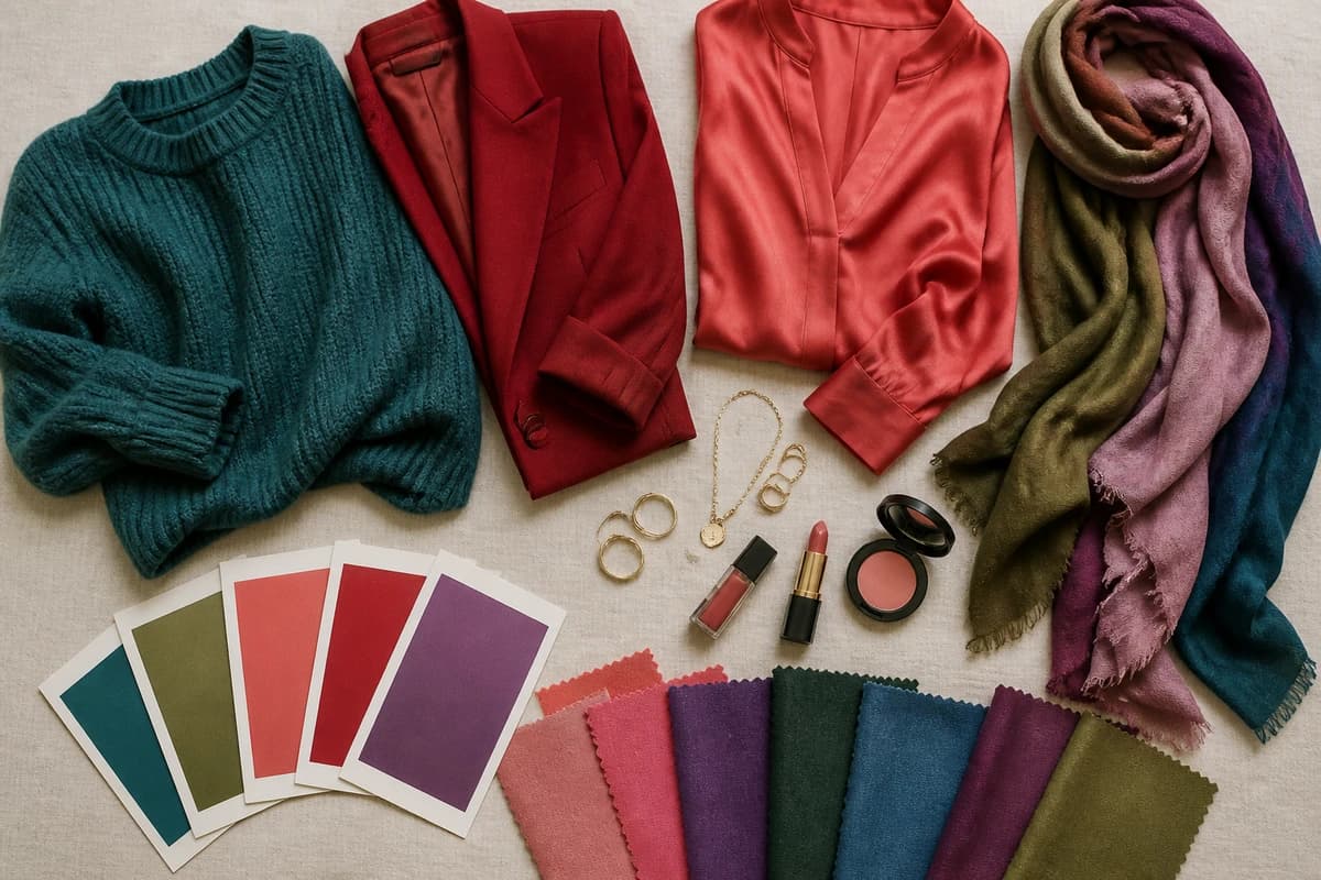
::img:palette:: {#the-palette}
The sample above isn't your palette, it's a balanced spread to show what a finished palette looks like: a few flattering colors with real hex codes, anchored by neutrals. Yours will be a tuned version of these once you know your undertone, value and chroma.
| Color | Hex | Why it's here |
|---|---|---|
| Teal | #1F7A8C |
A balanced blue-green that flatters across undertones, proof a color can be neither aggressively warm nor cool. |
| True Red | #C13B33 |
A near-neutral red that sits between blue and orange; almost everyone has a flattering red, the question is which way it leans. |
| Soft Coral | #E8836F |
The warm end of the spectrum, what a warmer or lighter palette reaches for. |
| Dusty Rose | #C68B8B |
A softened, muted pink for lower-chroma coloring. |
| Amethyst | #8E6FA8 |
A mid purple that shows how value shifts a color up or down. |
| Emerald | #0B6E4F |
A cooler, jewel-rich green for cool or bright coloring. |
| Denim Blue | #4A6FA5 |
An easy, wearable mid-blue, a safe place to start for most people. |
| Soft Plum | #6E3D54 |
A deeper berry for richer, deeper palettes. |
| Warm Olive | #76753F |
The earthy, golden green warm and neutral coloring loves. |
| Aqua | #5FB3B3 |
A lighter, fresher blue-green for lighter coloring. |
The neutrals: Cream #EFE7D5 and Soft White #F4F1E9 as your off-whites, Taupe #9C8E7C and Stone Gray #A7A299 as flexible mid-tones, and Soft Navy #33415C as a flattering dark anchor that's gentler than black. Neutrals are the quiet background your colors sing against, getting these right matters as much as the brights.
Want to see YOUR exact palette instead of a sample?
Find your color season →Question three: soft or bright?
Chroma is how clear or muted your coloring is, and it's the subtlest of the three to judge, but it's what separates two people who share both undertone and value. Look at your features and ask whether they're blended or defined. If your coloring is soft, hair, skin and eyes all close in tone, edges that melt into each other, bright, saturated colors tend to overwhelm you, and you look best in dusty, muted shades (think soft plum, dusty rose, warm olive). If your coloring is bright, clear eyes, crisp contrast between features, muted colors look muddy on you, and you come alive in clear, vivid versions (true red, emerald, cobalt).
This is the dial that turns "a flattering color" into "the flattering color." A cool, deep person who is also bright wants sharp fuchsia and vivid sapphire; a cool, deep person who is soft wants the dusty cousins of those same hues. Same temperature, same depth, different chroma, different palette.
Putting the three together: your season
Read all three at once, undertone, value, chroma, and you've described a color season. That's all the twelve-season system is: a tidy map of those three dials. Warm-light-bright lands you in Spring; cool-deep-bright in Winter; cool-soft in Summer; warm-deep-muted in Autumn, and so on through the finer divisions. Your season is your answer to "what colors look good on me", it's a ready-made palette of the exact reds, blues, greens and neutrals that flatter your specific combination, plus the ones to leave on the rail.
If you'd like to place yourself, our color analysis guides walk through every season in detail, the Soft Summer palette is a good read if you suspect you're cool and muted, and the True Autumn palette if you're warm and deep. Read a couple and you'll usually feel one of them describing you.
A quick mirror test you can do today
You don't need any kit to make a real start. Stand at a window in daylight, tie your hair back, take off your makeup, and hold different colored fabrics up under your chin one at a time. Look only at your face, never at the fabric. Work through it in order:
- Gold versus silver to read undertone, which metal leaves your skin clean and even?
- A light version versus a deep version of one color to read value, which one your face can carry without being washed out or overpowered.
- A bright versus a muted version of one color to read chroma, which looks rich, which looks muddy.
A flattering color smooths your skin, lifts your eyes and softens the shadows; an unflattering one casts gray, yellow or pinkness into your face and ages you a little. It's a genuinely useful shortlist. Where it gets hard is the fine print, telling neutral from a soft warm, or deciding between two neighbouring seasons, because those are the readings your own eyes are worst at making about your own face.
So, what colors look good on you?
The honest, complete answer: the colors that match your undertone, your value and your chroma, and the precise version of each that suits your particular combination. The three questions in this guide get you most of the way, and the mirror test will confirm your instincts. The last mile is precision, and it's the part worth not guessing at. A personal color analysis reads all three dials from your photos, places you in your season, and hands you the exact palette, so the next time you put on a color and your face looks rested for no reason, you'll know precisely why, and you'll be able to do it on purpose every morning.
Frequently asked questions
How do I know what colors look good on me?
Read three things about your own coloring, in order: your undertone (warm-gold, cool-pink or neutral), your value (how light or deep you are overall), and your chroma (whether your features look soft and blended or bright and clear). Then test colors against your bare face in daylight and watch your skin, not the fabric, the right ones make you look rested and even, the wrong ones add shadows, sallowness or a tired gray cast. Those three readings together point you to a color season, which is your tailored palette.
What colors suit my skin tone?
It depends far less on how light or dark your skin is than on its undertone. Warm, golden skin glows in coral, tomato red, golden yellow, olive and warm teal; cool, pink-based skin lifts in fuchsia, blue-red, emerald, sapphire and icy pastels; neutral skin sits happily in balanced, slightly muted shades like teal, dusty rose and true red. Depth then decides how light or deep your version of each color should be, so two people with the same undertone can still need different palettes.
How can I find my best colors at home?
Stand at a window in daylight with no makeup on, tie your hair back, and hold different colored fabrics up under your chin one at a time. Look only at your face. A flattering color smooths your skin, brightens your eyes and softens shadows; an unflattering one drags color into the wrong places, gray, yellow or pink, and makes you look tired. Do gold versus silver first to read undertone, then light versus deep, then bright versus muted. It's a reliable shortlist, though it won't give you the precision of a full analysis.
Does my hair and eye color change which colors suit me?
Yes, your colors come from your whole coloring, not your skin alone. Hair depth and eye color shape your overall value and your contrast level, which is why warm chestnut hair, cool ash hair and silver-gray hair each pull your palette in a different direction even on similar skin. That combined picture, skin, hair and eyes read together, is exactly what a color season captures and a single 'skin tone' chart misses.
What's the most accurate way to find what colors look good on me?
A personal color analysis. The home tests get you most of the way, but undertone and chroma are genuinely hard to judge in your own mirror, especially if you're neutral or close between two seasons. A proper analysis reads your undertone, value and chroma together, places you in one of the twelve seasons, and hands you the exact reds, blues and neutrals that flatter you. You can start one at tonelala.com/onboarding.
Related guides

Which Skin Tones Suit Copper Hair? A Color Analyst's Guide
Copper hair flatters warm skin, but which depths and undertones exactly? A color analyst explains who suits copper, which copper shade to choose, and how to wear it if you're cool.
Which Skin Tones Suit Auburn Hair? A Color Analyst's Guide
Auburn is the most wearable red, but who does it flatter? A color analyst explains which skin tones and undertones suit auburn, which shade to pick, and how cool skin can wear it.

Gold vs Silver: Which Suits You
A color analyst on whether gold or silver jewelry suits you, three quick undertone tests, why one metal lifts your face, and what to wear if you're neutral.
Hair Color for Your Skin Tone: The Complete Match Chart
A color analyst's chart of the most flattering hair colors for every skin tone and undertone, fair, medium, olive, tan and deep, warm and cool, plus the shades that wash you out.
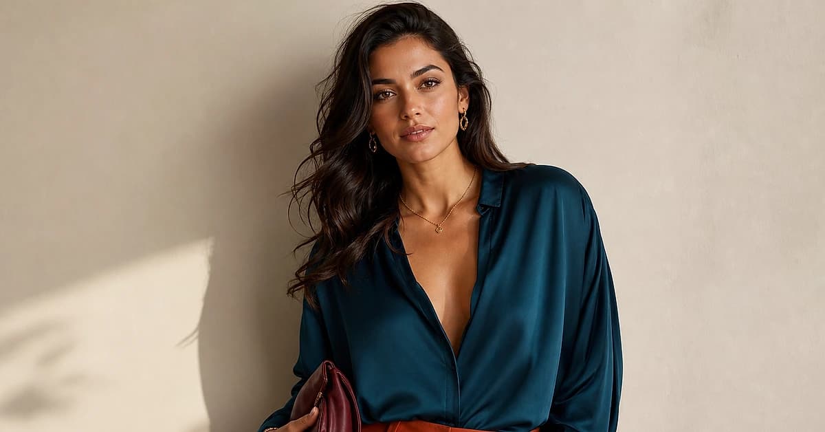
Olive Skin Color Palette: The Best Colors to Wear (with Hex Codes)
The olive skin color palette with hex codes: 10 best colors, 5 neutrals and metals, grouped by light, medium and deep olive and by undertone, plus what to avoid.
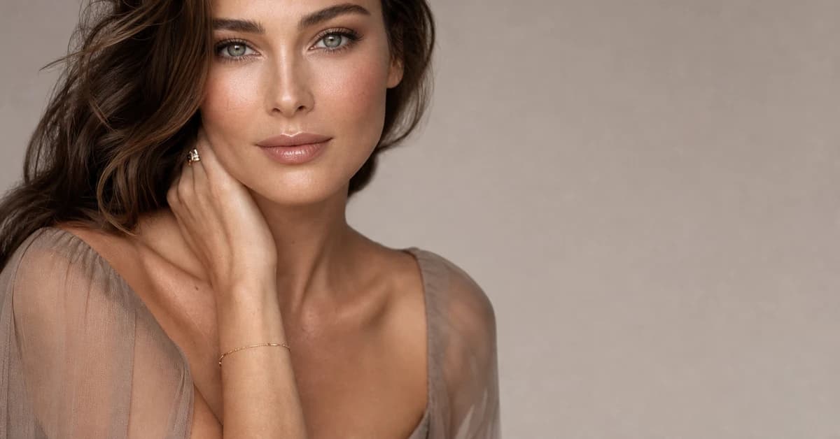
Best Jewelry Metal for Your Skin Tone
A color analyst's guide to the best jewelry for your skin tone, when gold, silver or rose gold flatters your undertone, with the metal test and hex codes.
Prefer in person? Find color analysis near you
Browse local color analysts by city, or get the same season, palette and best-colors breakdown online from one selfie.
See your colors on a photo of you
Upload one selfie and ToneLala reveals your season, your full palette, and your best hair, makeup, jewelry and outfits, styled on you.