In a sentence: Clear Spring is the warm, medium, very high-contrast season, and it's the same season other systems call Bright Spring. Your palette is built from vivid, crystal-clear colors, clear coral, warm true red, bright turquoise, emerald-leaf green, golden yellow, with warm white and warm taupe neutrals. Skip to the full palette with hex codes or find your own season.
Clear Spring Color Palette (a.k.a. Bright Spring)
By ToneLalaUpdated July 7, 2026

Contents
A client emailed me last month in a small panic: one analyst had called her a Clear Spring, a quiz had said Bright Spring, and she was sure she'd been typed twice and gotten two different answers. She hadn't. Those are two names for the same season, same warm undertone, same vivid chroma, same palette down to the hex code. The naming clash trips up almost everyone who reads about this season, so before the colors, the plain truth: Clear Spring and Bright Spring are identical. One name comes from the Sci\ART tradition, the other from the four-seasons-expanded system, and both land on the brightest, clearest version of warm coloring.
The coloring itself is unmistakable once you've draped it a few times. Warm, clear skin; eyes that catch the light and look almost lit from behind; hair with a glint of gold or warm depth; the whole face reading as though someone nudged the contrast up a notch. Lay a clear coral or a bright warm turquoise against the jaw and the face sharpens, eyes brighter, skin warmer, any grayness gone. A Clear Spring doesn't want toning down. The coloring is high-energy, and it asks for color that keeps pace.
Why "Clear Spring" and "Bright Spring" are the same season
Seasonal color analysis grew out of a few different schools, and they didn't all agree on names. The Sci\ART system labels the high-chroma warm season Clear Spring, leaning on the word that best describes it, clarity, the absence of any gray or mute. The four-seasons-expanded system calls the very same season Bright Spring, leaning on the word for its intensity. Different vocabulary, one coloring.
So if a draping session, a quiz or a friend with a good eye has handed you either label, you're in the right place, and the dedicated Bright Spring palette guide is written for you too, with the same colors pulled apart in more detail. I'll use "Clear Spring" through the rest of this piece, but read "Bright Spring" beside it every time.
What "Clear Spring" actually means
Clear Spring is one of the twelve seasons in personal color analysis. Every season sits on three dials, and a Clear Spring color analysis lands the same way each time:
- Undertone: warm or cool. Clear Spring is warm, but warm-leaning-neutral: there's a slight neutral edge, which is exactly what lets it go so vivid rather than heavily golden.
- Value: light or dark. Clear Spring is medium: neither pale nor deep.
- Chroma: bright or muted. This is the dial that names you: Clear Spring is one of the clearest, brightest seasons of all, sitting at very high chroma on the wheel.
Add it up and you get high contrast: warm, clear, high-energy coloring flattered by warm, clear, high-energy color. Where True Spring is sunlit and lively, Clear Spring is that same warmth turned right up: a charged, almost-electric brightness with a warm core. That high-chroma clarity is the heart of the whole palette, and it's the single trait that should steer every choice you make.
The palette
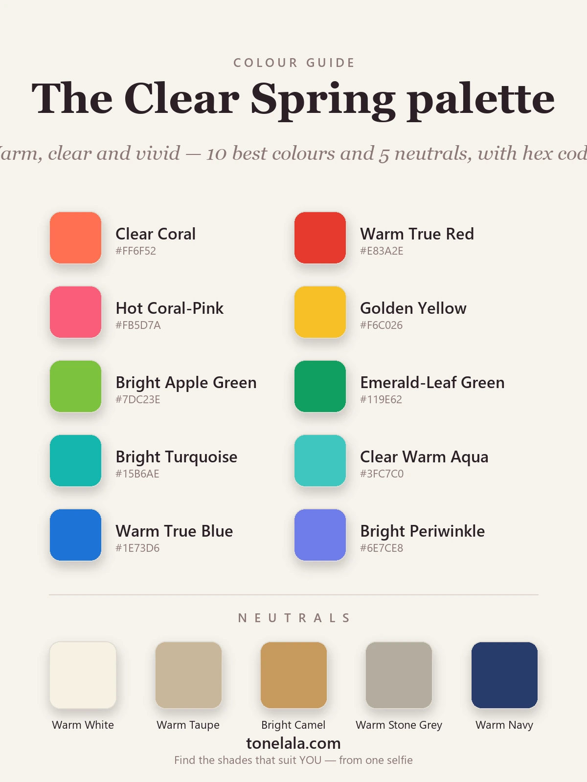
Warm, clear and vivid. Every color carries a charged, high-energy intensity, no grayed-down softness, no heavy darkness anywhere.
Your best colors
| Color | Hex |
|---|---|
| Clear Coral | #FF6F52 |
| Warm True Red | #E83A2E |
| Hot Coral-Pink | #FB5D7A |
| Golden Yellow | #F6C026 |
| Bright Apple Green | #7DC23E |
| Emerald-Leaf Green | #119E62 |
| Bright Turquoise | #15B6AE |
| Clear Warm Aqua | #3FC7C0 |
| Warm True Blue | #1E73D6 |
| Bright Periwinkle | #6E7CE8 |
Your neutrals: warm and clear rather than stark: Warm White #F6F1E3 (your "white", since a true cold white reads a touch chalky on you), Warm Taupe #C9B79A, Bright Camel #C79A5E, Warm Stone Gray #B5ADA0 for a softer option, and Warm Navy #283B6B when you want depth without reaching for black. There's no black here on purpose, a warm navy or deep teal always serves you better near the face.
Your metals: gold is your natural match, yellow and bright warm gold sit beautifully, and rose gold is lovely too. Silver works only in its warmer, brighter forms; a cool, hard silver pulls slightly gray against your warmth, so choose the brighter version if you love the look.
Been typed as both Clear and Bright Spring and still unsure?
Find your color season →Colors to avoid (and why)
These don't just underwhelm, they actively fight your coloring:
- Muted & dusty tones: sage, dusty rose, mushroom, grayed mauve. On the clearest warm coloring there is, anything softened reads as "tired" and flattens the skin.
- Deep, heavy darks: black, charcoal, burgundy, espresso. They're too heavy for your medium value and cast shadow where your face wants light and warmth.
- Cool, icy tones: icy pink, powder blue, true plum. Your brights work because they're warm and clear; cool, weak versions pull against you and turn the skin sallow.
The mirror test: if a color makes your features look softer, grayer or heavier than the garment itself, it's too muted, too dark or too cool for you.
How to know you're actually a Clear Spring
Clear Spring borders a few seasons that fool people constantly:
- Clear Spring vs Clear Winter: both extremely clear and bright, so chroma won't separate them. Undertone is the whole game: Clear Spring is warm, Clear Winter is cool. Clear corals, golden yellow and warm true red flatter you on the Spring side; icy pastels, electric blue, hot pink and black-and-white flatter the Winter side.
- Clear Spring vs True Spring: both warm and clear, but Clear Spring is brighter and higher in contrast. True Spring runs a step calmer and a touch more golden. If the most saturated, high-energy colors feel right rather than overwhelming, you're the Clear one.
- Clear Spring vs Light Spring: both warm and clear, but Light Spring is much softer and lighter. If pale, delicate colors suit you and the vivid brights begin to wear you, you lean Light.
One more: if warm colors clearly suit you but the very brightest ones consistently overpower you, you may belong to the cooler, equally vivid Clear Winter, the two are mirror twins, identical in clarity and split only by undertone. The reliable way to settle any of these is a draping session or a photo-based analysis that reads your undertone, value and contrast for you, rather than guessing in changeable bathroom light.
Clear Spring makeup
Clear Spring makeup can go vivid, and it should. For lips, reach for coral, warm red, bright coral-pink and clear warm orange-red: saturated and warm, never muddied or cooled down. Blush wants a clear coral or warm pink that mirrors the lip rather than a dusty rose. On the eyes, golden bronze, warm green, teal, peach and clear warm browns make warm eyes glow, and a warm brown or teal liner flatters far more than a flat black. What to skip: muddy taupes, cool berries and dusty mauves, they smudge out the warmth and clarity that are your whole signature.
Clear Spring hair colors
Clear Spring hair is warm and clear, with natural brightness: golden brown, warm chestnut, rich honey, or a bright warm copper for the right person. Coolness and heaviness are what fight this season, ashy, smoky tones turn warm skin gray, and a flat jet black drops far too much weight onto a medium-value face. The most common mistake I see is a Clear Spring who's gone "cool and expensive-looking" with an ashy tone, and it does the opposite of expensive: it just dulls the glow. If you want depth, ask your colorist for warm, clear, bright dimension rather than ashy lowlights or a heavy dark base.
Putting it to work
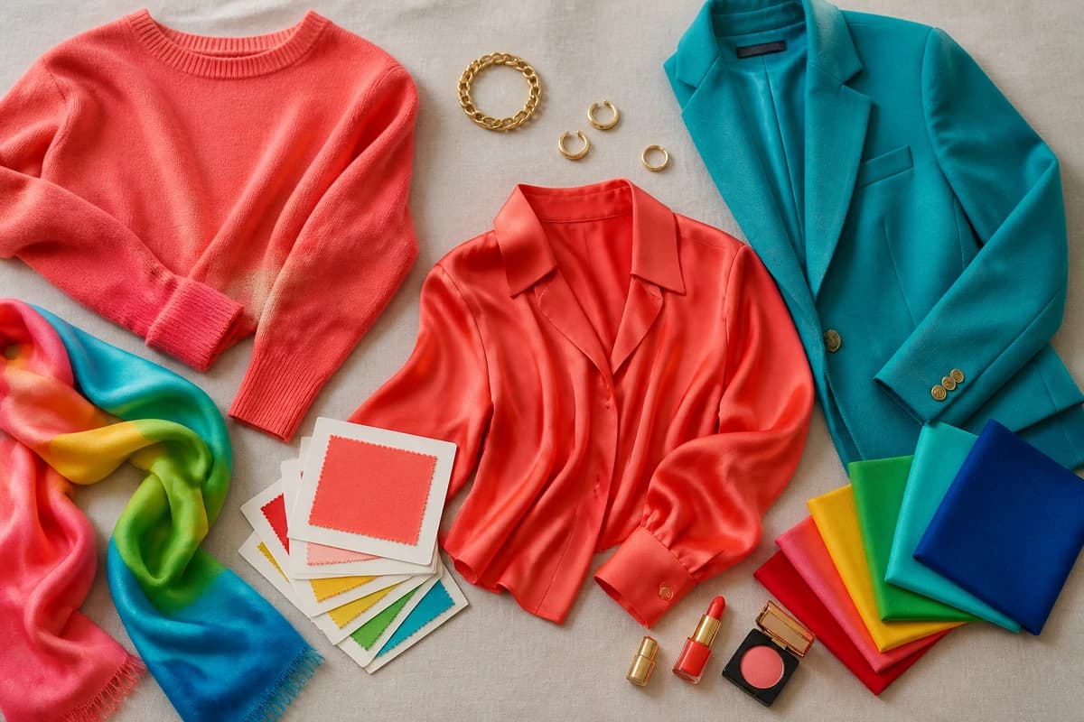
Build a small capsule from two neutrals + three colors you genuinely love, say warm white and warm navy, with clear coral, bright turquoise and emerald-leaf green. Everything mixes, because everything shares the same warm, clear, high-energy DNA. Let one vivid color carry the outfit against a warm neutral and you're done: warm navy with coral, warm white with turquoise, camel with emerald-leaf green. And when you want a "dark", you reach for warm navy or deep teal instead of black, and the outfit stays in your warmth.
If you'd like the same colors explored further, the Bright Spring guide is its companion, and our wider color analysis guides walk through every neighbouring season. However you arrive at the name, the work is the same, lean into the clarity instead of fighting it, because on you, that brightness reads as effortless rather than loud.
Frequently asked questions
What is the Clear Spring color palette?
Clear Spring is a warm, medium-value, very high-chroma palette, one of the two clearest, brightest seasons. Think clear coral, warm true red, bright turquoise, emerald-leaf green and golden yellow, with warm white and warm taupe neutrals. Everything reads vivid and crystal-clear; nothing dusty, smoky or earthy belongs here.
Is Clear Spring the same as Bright Spring?
Yes, they're two names for one season. 'Clear Spring' comes from the Sci\ART tradition and 'Bright Spring' from the four-seasons-expanded system, but both describe the same warm, high-chroma, high-contrast coloring with the same palette. If you've been typed as one, the other guide applies to you too.
Is Clear Spring warm or cool?
Warm, though warm-leaning-neutral rather than deeply golden. The undertone reads warm, with a slight neutral edge, and that edge is exactly what lets Clear Spring carry the most vivid versions of warm colors without tipping earthy or heavy.
How do I know if I'm a Clear Spring and not a Clear Winter?
Both are extremely clear and bright, so chroma won't separate them, undertone decides it. Clear Spring is warm (clear coral, warm turquoise, golden yellow and warm true red flatter you), while Clear Winter is cool (icy pastels, electric blue, hot pink and crisp black-and-white suit you better). Warm and vivid points to Spring; cool and electric points to Winter.
What colors should a Clear Spring avoid?
Muted and dusty tones, sage, dusty rose, mushroom, grayed mauve, go flat on you, and so do heavy darks like black, charcoal and burgundy. Cool, icy pastels drain you too. Your coloring wants warmth, clarity and contrast, not softness or weight.
Related guides

Bright Spring Color Palette: The Complete Guide (with Hex Codes)
A color analyst's complete Bright Spring guide, your exact palette with hex codes, best neutrals and metals, colors to avoid

Bright Spring Celebrities
A color analyst on Bright Spring celebrities, who likely fits the warm, clear, high-energy season, why the lists disagree

Bright Spring Makeup: Best Shades for Lips, Eyes & Cheeks
A makeup artist's Bright Spring guide, the best lip, blush and eye shades with hex codes, the right foundation undertone, and what to avoid.

Bright Spring vs Light Spring: How to Tell the Difference
Bright Spring vs Light Spring: one runs on saturation, the other on lightness. Learn the undertone, value and chroma tells, and how to know which you are.

Bright Winter vs Bright Spring: How to Tell the Difference
A color analyst on Bright Winter vs Bright Spring, how undertone, value and chroma differ, the colors that separate them, and how to tell which one you are.

Bright Spring Outfits: Capsule Wardrobe & Outfit Ideas
A stylist's Bright Spring wardrobe guide, capsule building blocks, casual, work and evening outfit formulas
Prefer in person? Find color analysis near you
Browse local color analysts by city, or get the same season, palette and best-colors breakdown online from one selfie.
See your colors on a photo of you
Upload one selfie and ToneLala reveals your season, your full palette, and your best hair, makeup, jewelry and outfits, styled on you.