In a sentence: Bright Winter and Bright Spring are equally, dazzlingly bright, they split on undertone and value, with Winter running cool and medium-deep and Spring running warm and medium. Skip to the distinguishing palette or find out which you are.
Bright Winter vs Bright Spring: How to Tell the Difference
By ToneLalaUpdated July 10, 2026

Contents
I've watched two women hold the exact same electric fuchsia scarf up to their faces and get opposite results, on one it looked like the color had switched a light on behind her skin, on the other it dragged a faint gray across her jaw. Same scarf, same window, same brightness of coloring. The only thing different was undertone, and that single dial is what separates Bright Winter from Bright Spring.
These two get mixed up more than any other pair on the wheel, and the reason is simple: brightness is the loud trait, and they share it completely. Both are the clearest, most saturated seasons there are. So people lay a vivid color against the skin, see it sing, and assume the season is settled, when all they've confirmed is that the person is bright, not whether they're warm-bright or cool-bright.
Bright Winter vs Bright Spring: the core difference
Every season sits on three dials, undertone, value and chroma, and these two are identical on one of them and opposite on the other two.
- Chroma (the trait they share). Both are at the very top of the brightness scale. High, clear, electric saturation with no dust or grayness anywhere. This is why chroma alone is useless for telling them apart, and why so many people get stuck.
- Undertone (the deciding dial). Bright Winter is cool: cool-leaning-neutral, to be exact, which is what lets it go so electric rather than icy. Bright Spring is warm: warm-leaning-neutral, vivid rather than heavily golden. This is the split that does the work.
- Value (the supporting dial). Bright Winter runs medium-deep, so it can carry black, true white and dramatic contrast. Bright Spring runs medium, lighter and more buoyant, so heavy darks sink it.
Put plainly: picture the same charged, high-voltage brightness lit by two different bulbs. Winter's bulb is cool and a touch deeper, blues, pinks, crisp black-and-white. Spring's bulb is warm and a touch lighter, corals, golden tones, warm greens. They're mirror twins, identical in wattage and opposite in temperature.
The colors that tell them apart
A shared bright like a clear turquoise will flatter both, so it tells you nothing. The colors below are chosen to force the difference, cool brights only Winter can carry comfortably, warm brights only Spring can.
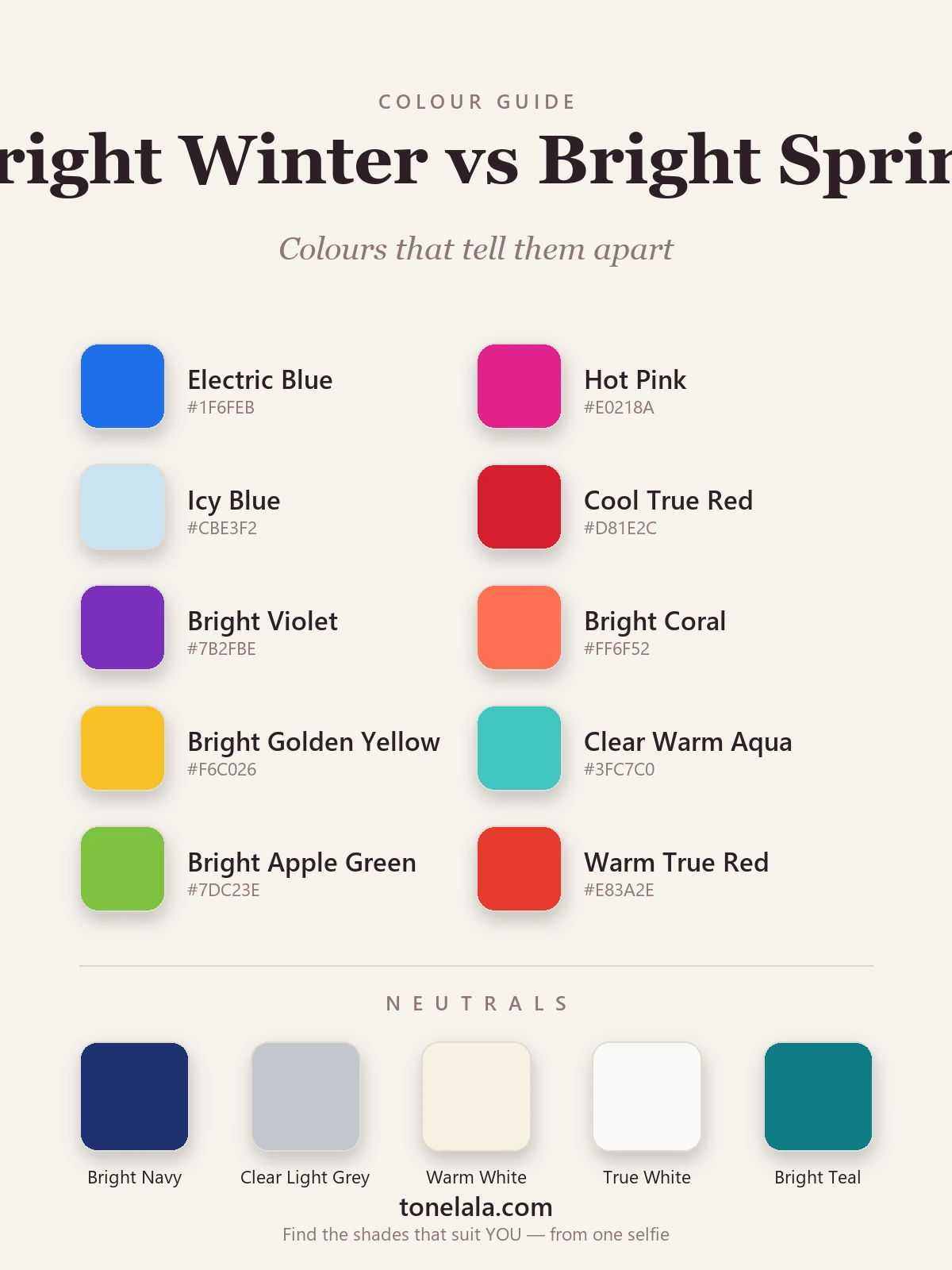
| Color | Hex | Flatters |
|---|---|---|
| Electric Blue | #1F6FEB |
Bright Winter, cool and charged |
| Hot Pink | #E0218A |
Bright Winter, cool blue-pink |
| Icy Blue | #CBE3F2 |
Bright Winter, cool, crisp pastel |
| Cool True Red | #D81E2C |
Bright Winter, red with a blue base |
| Bright Violet | #7B2FBE |
Bright Winter, cool, electric purple |
| Bright Coral | #FF6F52 |
Bright Spring, warm orange-pink |
| Bright Golden Yellow | #F6C026 |
Bright Spring, clear, warm gold |
| Clear Warm Aqua | #3FC7C0 |
Bright Spring, aqua tipped warm |
| Bright Apple Green | #7DC23E |
Bright Spring, warm, leafy green |
| Warm True Red | #E83A2E |
Bright Spring, red with a warm base |
Notice the pattern: the reds, blues and pinks split by temperature, not by how loud they are. Bright Winter's red is cool and clean; Bright Spring's red carries warmth. Hold the two side by side and your skin will pick a favorite.
Shared neutrals: Bright Navy #1F3270, Clear Light Gray #C3C7CC, Warm White #F6F1E3, True White #F8F8F5 and Bright Teal #0E7C84. Both seasons can wear these, though Winter leans on the cooler true white and Spring leans on the warmer ivory.
Still not sure, Bright Winter or Bright Spring?
Find your color season →How to tell which you are
You don't need a studio. You need a window and a few honest minutes.
- The warm-versus-cool drape. Hold a bright coral and an electric fuchsia or blue up to your bare face in daylight, no makeup. Don't look at the fabric, look at your skin and the whites of your eyes. The color that clears the skin and brightens the eye is your temperature. The one that adds gray, sallowness or a flushed-orange cast is fighting you.
- Gold versus silver. Rest a gold chain on one side of your jaw and a silver one on the other. On Bright Spring, gold melts in and silver looks slightly hard. On Bright Winter, silver looks crisp and gold pulls faintly muddy. Whichever metal makes your skin look more even wins.
- The black-and-white test. Put on a stark black-and-white top. Bright Winter wears it beautifully, crisp, intentional, the contrast matching the face. On Bright Spring it tips slightly severe, and a warm white or navy would sit easier. If black near your face reads heavy rather than chic, you're probably Spring.
- What washes you out. Pay attention to which brights leave a shadow. A warm golden yellow that turns your skin lovely versus one that makes you look tired tells you as much as any drape, Spring glows in warm gold, Winter goes a touch jaundiced.
If you're Bright Winter / If you're Bright Spring
If you're Bright Winter, your brights run cool and your value can take depth. Electric blue, hot pink, cool true red and bright violet are yours, and you're one of the few people who genuinely wears black and true white as flattering neutrals rather than safe defaults. Silver and white gold sit better on you than yellow gold. The full breakdown, every shade with hex codes, makeup and what to avoid, is in the Bright Winter guide.
If you're Bright Spring, your brights run warm and your value stays lighter. Bright coral, golden yellow, warm aqua and warm true red light you up, while heavy darks like black weigh you down, reach for warm white or warm navy instead. Yellow and rose gold flatter more than hard silver. The complete palette, neutrals, makeup and styling notes live in the Bright Spring guide.
The reliable way to settle it
Home tests get you close, but undertone is genuinely hard to judge on your own face, it shifts with the light in your room, the color of your walls and whatever you wore yesterday. The cleanest way to settle a Bright Winter versus Bright Spring question is a photo-based analysis that reads the three dials for you: undertone first, then value, then contrast. From a clear photo of your bare face, those three together place you on one side of the line without the second-guessing. If you want to read more before deciding, our color analysis guides walk through every season and the traits that separate the look-alikes.
Frequently asked questions
What's the difference between Bright Winter and Bright Spring?
Brightness is identical, both are the clearest, highest-chroma seasons, so saturation won't tell them apart. The split is undertone and value. Bright Winter is cool and medium-deep: electric blue, hot pink, true red and crisp black-and-white flatter it. Bright Spring is warm and medium: coral, golden yellow, warm aqua and warm true red flatter it. Cool and electric points to Winter; warm and vivid points to Spring.
Am I Bright Winter or Bright Spring?
Drape one warm bright and one cool bright against your face in daylight, say a bright coral and an electric blue. If the cool color clears your skin and brightens your eyes while the coral makes you look flushed or orange, you're Bright Winter. If the coral lights you up and the electric blue looks harsh or draining, you're Bright Spring. The color that adds clarity rather than shadow is on your side.
Which is warmer, Bright Winter or Bright Spring?
Bright Spring is the warmer of the two. Its undertone reads warm-leaning-neutral, so golden, coral and warm-green brights suit it. Bright Winter is cool-leaning-neutral, so its brights run blue, pink and icy. Both sit close to neutral, which is exactly why they get confused, but Spring tips warm and Winter tips cool.
Which is cooler or deeper, Bright Winter or Bright Spring?
Bright Winter is both cooler and deeper. It carries a medium-deep value and a cool undertone, so it can wear black, true white and icy pastels. Bright Spring is medium in value and warm, so heavy darks like black and charcoal weigh it down and cool icy shades drain it. If deep, cool, crisp colors suit you, you lean Winter.
Can you be both Bright Winter and Bright Spring?
No, you have one season, though you can sit near the border between them. They're mirror twins: identical brightness, opposite undertones. Many people read as one with a slight lean toward the other, which is why a careful undertone read matters. You may love colors from both palettes, but only one set will consistently clear and brighten your skin in daylight.
How can I tell which one I am at home?
Three quick tests in natural light: try gold versus silver jewelry near your jaw and see which makes your skin look clearer; drape a warm coral against a cool fuchsia and watch which brightens your eyes; and check whether black-and-white looks crisp on you or slightly harsh. Gold, coral and a warm glow point to Bright Spring; silver, fuchsia and crisp black-and-white point to Bright Winter.
Related guides

Bright Spring vs Light Spring: How to Tell the Difference
Bright Spring vs Light Spring: one runs on saturation, the other on lightness. Learn the undertone, value and chroma tells, and how to know which you are.

Deep Winter vs Bright Winter: How to Tell the Difference
A color analyst on Deep Winter vs Bright Winter, how they differ on undertone, value and chroma, the colors that separate them

True Winter vs Bright Winter: How to Tell the Difference
A color analyst on True Winter vs Bright Winter, how undertone, value and chroma differ, the colors that tell them apart, and how to decide which you are.

Bright Spring vs True Spring: How to Tell the Difference
A color analyst on Bright Spring vs True Spring, how they differ on undertone, value and chroma, the colors that separate them

Bright Spring Color Palette: The Complete Guide (with Hex Codes)
A color analyst's complete Bright Spring guide, your exact palette with hex codes, best neutrals and metals, colors to avoid

Deep Winter vs True Autumn: How to Tell the Difference
A color analyst on Deep Winter vs True Autumn, how they differ on undertone, value and chroma, the colors that separate them, and how to tell which you are.
Prefer in person? Find color analysis near you
Browse local color analysts by city, or get the same season, palette and best-colors breakdown online from one selfie.
See your colors on a photo of you
Upload one selfie and ToneLala reveals your season, your full palette, and your best hair, makeup, jewelry and outfits, styled on you.