In a sentence: Bright Spring and Light Spring share a warm spring undertone, but Bright Spring is defined by high chroma and contrast while Light Spring is defined by lightness and softness. Skip to the distinguishing palette or find out which you are.
Bright Spring vs Light Spring: How to Tell the Difference
By ToneLalaUpdated July 10, 2026
Contents
I once draped two clients back to back who, on paper, looked almost identical, both fair, both warm, both with that golden-spring glow. One lit up the moment I held a saturated coral under her chin. The other went flat in the same swatch and only came alive when I swapped in a tinted peach. Same family, opposite needs. That pair is exactly why this comparison exists.
Bright Spring and Light Spring get confused because they sit next to each other on the warm side of the color wheel, and both belong to the spring group. People read "warm and pretty" and assume they're interchangeable. They're not. One is built on saturation, the other on lightness, and dressing a Light Spring in Bright Spring colors (or the reverse) is the fastest way to look slightly off without knowing why.
Bright Spring vs Light Spring: the core difference
Seasonal analysis describes coloring on three axes: undertone (warm vs cool), value (light vs deep), and chroma (clear/saturated vs soft/muted). The trick with these two is that they barely differ on the first axis. Both are warm springs with a sliver of cool flexibility. So you can't separate them on temperature alone, and that's where most home guesses go wrong.
The split shows up on the other two axes.
Bright Spring leads with chroma. Its defining quality is clarity, color at or near full saturation, nothing dusty. Bright Springs also carry more natural contrast: dark or richly colored eyes against fair-to-medium skin, hair with real depth. Because the features already contrast, the coloring can carry vivid, high-energy color without being overpowered. Bright Spring borders Bright Winter, and it shares that winter love of a clean, punchy hue.
Light Spring leads with value. Its defining quality is lightness, everything is delicate, tinted, and low in contrast. Hair tends to be light blonde to soft golden-brown, eyes are clear and light (often blue, green or soft hazel), and skin is fair with a warm glow. The features blend into one another rather than standing apart. Light Spring borders Light Summer, and it shares that summer softness, just kept on the warm side.
So the one-line test: if your coloring is vivid and contrasted, you lean Bright. If it's pale and gentle, you lean Light. Chroma vs value. That's the whole game.
The colors that tell them apart
These ten are the ones I actually reach for when I need to break a tie. Each leans toward one season, so watching which swatches flatter you and which fight you is genuinely diagnostic.
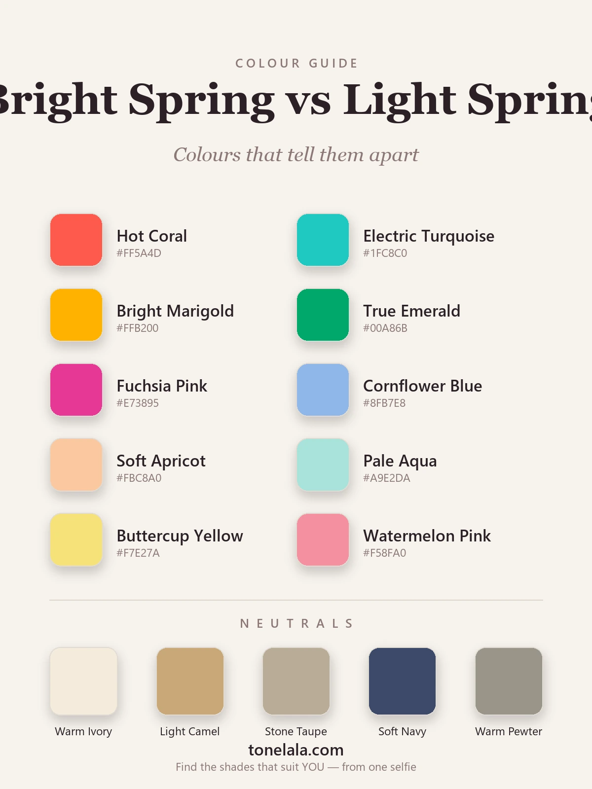
| Color | Hex | Flatters |
|---|---|---|
| Hot Coral | #FF5A4D |
Bright Spring, full saturation, needs contrast to carry it |
| Electric Turquoise | #1FC8C0 |
Bright Spring, clear and vivid, overwhelms Light |
| Bright Marigold | #FFB200 |
Bright Spring, high-energy warm that Light can't match |
| True Emerald | #00A86B |
Bright Spring, rich green with depth and clarity |
| Fuchsia Pink | #E73895 |
Bright Spring, saturated pink that reads sharp, not soft |
| Cornflower Blue | #8FB7E8 |
Light Spring, tinted, airy blue that lifts soft coloring |
| Soft Apricot | #FBC8A0 |
Light Spring, warm pastel, the heart of the Light palette |
| Pale Aqua | #A9E2DA |
Light Spring, turquoise dialled down with white |
| Buttercup Yellow | #F7E27A |
Light Spring, gentle warm yellow, no glare |
| Watermelon Pink | #F58FA0 |
Light Spring, pink softened toward pastel |
The first five sit at high chroma and want a face that can hold its own against strong color, that's Bright Spring. The last five are the same warm hues tinted with white and dropped in saturation, which is precisely what Light Spring needs. Hold a Bright swatch and a Light swatch of the same family (the coral and the watermelon, say) under your chin in daylight and the difference is usually obvious within seconds.
Shared neutrals: Warm Ivory #F4ECDD, Light Camel #C9A877, Stone Taupe #B9AC97, Soft Navy #3C4A6B, Warm Pewter #9A958A. Both seasons lean on light, warm-leaning neutrals rather than anything heavy or stark, keep black off the list for both.
Still not sure, Bright Spring or Light Spring?
Find your color season →How to tell which you are
Four tests, in the order I'd run them:
1. The contrast check. Take a phone photo in daylight, no makeup, then desaturate it to black and white. Look at the gap between your hair, skin and eyes. A clear range from light to dark, high contrast, points to Bright Spring. Everything reading in a similar light-to-mid tone, low contrast, points to Light Spring. This single test resolves most cases.
2. The saturation drape. Hold a fully saturated color (the hot coral or electric turquoise above) under your chin, then a pastel version of the same hue. Bright Spring sharpens under the saturated swatch and can look faintly washed by the pastel. Light Spring glows under the pastel and looks swamped by the saturated one, the color starts wearing you.
3. The wash-out test. Notice what drains you. If pure white and pale pastels leave your face looking blank and undefined, you probably need the energy of Bright Spring colors. If strong, vivid color makes your features recede and the clothing takes over, you're likely Light Spring and need it softened.
4. Jewelry. Both wear gold beautifully, so metal won't crown a winner here, but it's a useful sanity check. If polished, high-shine gold suits you and bright silver also works, that flexibility fits Bright Spring. If softer, lighter gold feels more harmonious than anything high-gloss, that's a Light Spring lean.
If two tests disagree, trust the contrast check and the saturation drape over the others. They carry the most weight.
If you're Bright Spring / If you're Light Spring
If you're Bright Spring, your wardrobe should run on clarity. Saturated coral, clear turquoise, true emerald, warm marigold, colors that match the natural punch in your own features. Avoid anything dusty or grayed; muted tones flatten you faster than wrong colors do. Build outfits with visible contrast and let the color be loud. The full story is in the Bright Spring guide.
If you're Light Spring, lightness is your through-line. Apricot, cornflower, pale aqua, buttercup, warm hues tinted soft. Keep contrast low: pair a pastel with a light warm neutral rather than against anything dark, which would overpower your gentle coloring. Skip the heavily saturated brights; they compete with you instead of flattering you. Everything you need is in the Light Spring guide.
The reliable way to settle it
Home tests get you close, but lighting, screens and a single off-day swatch can all mislead you, and these two seasons are close enough that "close" sometimes isn't enough. A photo-based analysis reads undertone, value and contrast together, in proper conditions, rather than relying on one drape under your bathroom light. That combined read is what cleanly separates a vivid spring from a light one.
If you want to stop second-guessing, a color analysis measures all three axes from your photos and tells you which season you actually are. You can also browse the rest of the color analysis guides to see how every season relates to the two we've compared here.
Frequently asked questions
What is the difference between Bright Spring and Light Spring?
Both are warm spring seasons, so the undertone is similar. The difference is what each one leads with. Bright Spring leads with chroma, color at full saturation, with noticeable contrast between hair, skin and eyes. Light Spring leads with value, everything sits a few shades lighter, and the contrast is gentle. Put simply, Bright Spring is vivid; Light Spring is delicate.
Am I Bright Spring or Light Spring?
Look at two things: your natural contrast and how you react to saturated color. If your features stand apart from each other and a fully saturated coral or turquoise makes you look sharper, you lean Bright Spring. If your coloring is soft and low-contrast and that same saturated color overpowers you while a tinted pastel lifts you, you lean Light Spring. A photo-based analysis settles it by measuring undertone, value and contrast together.
Which is warmer, Bright Spring or Light Spring?
They sit at almost the same point on the warm-cool axis, both are warm with a touch of cool flexibility, which is part of why people mix them up. Neither is meaningfully warmer than the other. The real split is chroma and value, not temperature.
Which is deeper, Bright Spring or Light Spring?
Bright Spring is deeper. Its palette holds richer, more saturated colors and tolerates more contrast, so the overall effect reads stronger. Light Spring is the lightest, airiest member of the spring family, its colors are tinted with white and stay pale.
Can you be both Bright Spring and Light Spring?
You land in one as your home season, but it is normal to borrow from the other where they overlap. Bright Springs who sit near the boundary can wear the clearer pastels of Light Spring, and Light Springs near the line can handle the cleaner brights in small doses. Your best season is the one whose core qualities flatter you most consistently.
How can I tell Bright Spring and Light Spring apart at home?
Drape a saturated color and a pastel version of the same hue side by side in daylight, with no makeup. Bright Spring comes alive in the saturated swatch and can look slightly washed by the pastel. Light Spring glows in the pastel and gets overwhelmed by the saturated one. Then check your contrast in a black-and-white photo, high contrast points to Bright, low contrast to Light.
Related guides

Bright Winter vs Bright Spring: How to Tell the Difference
A color analyst on Bright Winter vs Bright Spring, how undertone, value and chroma differ, the colors that separate them, and how to tell which one you are.

Light Summer vs Light Spring: How to Tell the Difference
A color analyst on Light Summer vs Light Spring, how they differ on undertone, value and chroma, the colors that separate them

True Spring vs Light Spring: How to Tell the Difference
True Spring vs Light Spring, explained by a color analyst: how undertone, value and chroma differ, the colors that separate them

Bright Spring vs True Spring: How to Tell the Difference
A color analyst on Bright Spring vs True Spring, how they differ on undertone, value and chroma, the colors that separate them
True Spring vs True Autumn: How to Tell the Difference
True Spring vs True Autumn, explained by a color analyst, how they differ on value and chroma, the colors that separate them, and how to tell which you are.

Deep Winter vs Bright Winter: How to Tell the Difference
A color analyst on Deep Winter vs Bright Winter, how they differ on undertone, value and chroma, the colors that separate them
Prefer in person? Find color analysis near you
Browse local color analysts by city, or get the same season, palette and best-colors breakdown online from one selfie.
See your colors on a photo of you
Upload one selfie and ToneLala reveals your season, your full palette, and your best hair, makeup, jewelry and outfits, styled on you.