In a sentence: Clear Winter is the cool, medium-deep, very high-contrast season, and it's the same season most systems now call Bright Winter. Your palette is built from electric, crystal-clear colors, hot pink, electric blue, true red, bright emerald, plus the crisp neutrals most seasons can't wear: black and true white. Skip to the full palette with hex codes or find your season.
Clear Winter Color Palette (a.k.a. Bright Winter)
By ToneLalaUpdated July 7, 2026

Contents
The first thing that throws people about "Clear Winter" is the name itself. They've been typed as a Clear Winter by one quiz, a Bright Winter by another, and they assume they've been given two different answers. They haven't. It's one season wearing two labels, and the confusion is the most useful place to start, because once you know that, everything about the palette clicks into place.
I can usually spot this coloring before anyone says a word about quizzes. There's a clarity to it: bright eyes against a clean skin tone, often dark hair, the whole face reading like someone nudged the contrast slider up. And almost every Clear Winter I drape has spent years being told to "soften it down," collecting dusty roses and muted taupes that quietly swallow them. Then I lay an electric blue or a true red against the jaw, and the face snaps into focus, eyes brighter, skin clearer. Clear Winter isn't loud for the sake of it. Your coloring is electric, and it wants color that keeps up.
Clear Winter and Bright Winter are the same season
Here's the bit no one explains plainly. Seasonal color analysis grew out of more than one system, and they don't all use the same words. The older sixteen-season approach named this one Clear Winter: "clear" pointing to the high chroma, the absence of any gray haze. The twelve-season method that most analysts and quizzes use today calls the identical season Bright Winter. Same undertone, same value, same chroma, same palette. Just a different vocabulary.
So if your result came back as Clear Winter, you can read every Bright Winter guide as your own. I've written the long version of all of this, the full breakdown of neutrals, makeup, hair and the borderline cases, in the Bright Winter color palette guide, and it applies to you line for line. This page covers what "Clear Winter" specifically means and gives you the palette; that one goes deeper on putting it to work.
What "Clear Winter" actually means
Every season sits on three dials, and a Clear Winter reading lands the same way each time:
- Undertone: cool or warm. Clear Winter is cool, but cool-leaning-neutral, there's a faint neutral edge, which is exactly what lets it go so vivid rather than purely icy.
- Value: light or dark. Clear Winter is medium-deep.
- Chroma: bright or muted. This is the dial that names the season: Clear Winter is the clearest, brightest of the winters. The very highest chroma on the wheel.
Add it up and you get very high contrast: clean, electric, dramatic coloring that's flattered by clean, electric, dramatic color. Where Deep Winter is a jewel box turned dark and rich, Clear Winter is that same coolness lit from within: a charged, electric brightness. That high-chroma quality is the whole heart of the palette, and it's the single trait that should guide every choice you make.
The Clear Winter palette
Clear, electric, cool. Every color has a charged, almost-glowing intensity, no grayed-down softness anywhere.
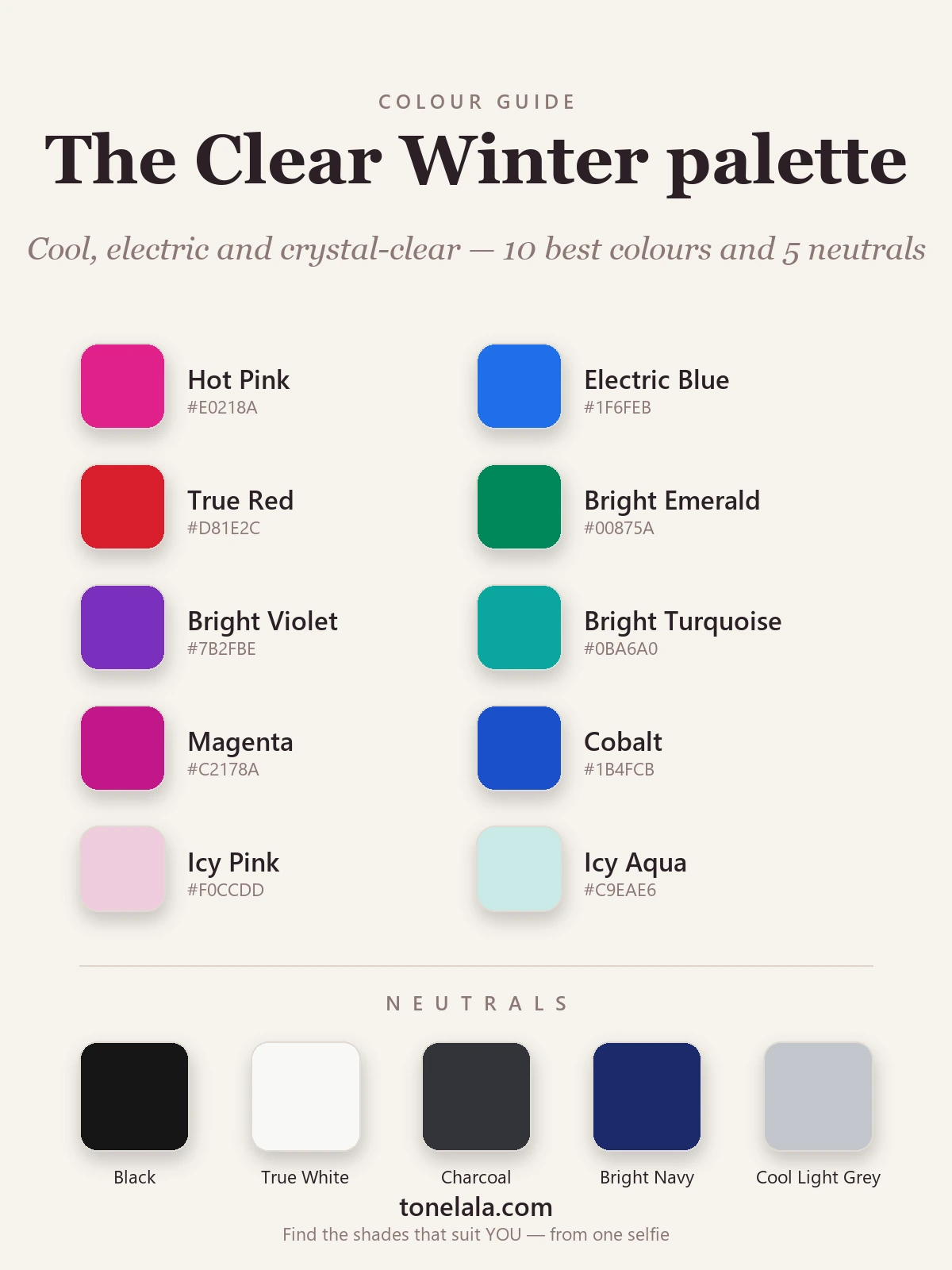
Your best colors
| Color | Hex |
|---|---|
| Hot Pink | #E0218A |
| Electric Blue | #1F6FEB |
| True Red | #D81E2C |
| Bright Emerald | #00875A |
| Bright Violet | #7B2FBE |
| Bright Turquoise | #0BA6A0 |
| Magenta | #C2178A |
| Cobalt | #1B4FCB |
| Icy Pink | #F0CCDD |
| Icy Aqua | #C9EAE6 |
Your neutrals: and here's the Clear Winter superpower: black #161616 and true white #F8F8F5 genuinely flatter you, and the two worn together make a high-contrast pairing that looks effortless on you and overwhelming on softer seasons. Round it out with Charcoal #33343A, Bright Navy #1B2A6B and Cool Light Gray #C3C7CC when you want something quieter near the face.
Your metals: silver, white gold and platinum, cool and bright, to match your clarity. Yellow gold pulls warm and slightly muddy against you.
Not sure Clear Winter is actually your season?
Find your color season →Colors to avoid (and why)
These don't just underwhelm, they actively fight your coloring:
- Muted & dusty tones: sage, dusty rose, mushroom, anything grayed-down reads as "tired" on the clearest coloring there is.
- Warm earthy tones: camel, mustard, olive, terracotta and warm gold belong to Autumn; on you they turn flat and muddy.
- Soft, warm pastels: butter yellow, peachy nude, hazy lilac. Your icy pastels work because they're cool and crisp; warm, weak ones collapse next to your contrast.
The mirror test: if a color makes your features look softer or hazier than the garment, it's too muted or too warm for you.
How to know you're actually a Clear Winter
Clear Winter borders three seasons that fool people constantly:
- Clear Winter vs Deep Winter: both cool and high-contrast. Clear Winter is lighter and more electric, living on the most saturated brights; Deep Winter is darker and richer, owning the deepest jewel tones. If the very brightest colors start to wear you, lean Deep.
- Clear Winter vs True Winter: both cool and very clear. Clear Winter is a touch warmer-neutral and, surprisingly, even brighter; True Winter is the purest, iciest cool. If pure icy coolness suits you better than electric vividness, lean True.
- Clear Winter vs Clear Spring: both extremely bright and clear, so chroma won't separate them. Undertone is the whole game: Clear Winter is cool, Clear Spring is warm. Cool electrics flatter you, pointing to Clear Winter; warm corals and golden brights point to Clear Spring.
The reliable way to settle any of these is a draping session or a photo-based analysis that reads your undertone, value and contrast for you, rather than a quiz that only counts your answers. You can browse the rest of our color analysis guides for the neighbouring seasons, and the Bright Winter palette guide is the deeper companion to this one.
Putting it to work
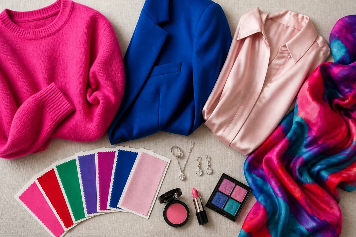
Build a small capsule from two neutrals + three colors you actually love, say black and true white, with hot pink, electric blue and bright emerald. Everything mixes, because everything shares the same cool, electric DNA. Let one clear color carry the outfit against a crisp neutral and you're done: black with hot pink, true white with cobalt, charcoal with emerald. Lean into the brightness instead of fighting it, on you, that clarity reads as effortless, not loud. And whether your result said Clear Winter or Bright Winter, you're styling the same season, so trust the palette and stop second-guessing the label.
Frequently asked questions
What is the Clear Winter color palette?
Clear Winter is a cool, medium-deep, very high-chroma palette, the brightest and clearest of the winter seasons. Think hot pink, electric blue, true red, bright emerald and bright violet, plus icy pastels and the crisp neutrals black and true white. Every color is clean and saturated; nothing muted, dusty or earthy belongs here.
Is Clear Winter the same as Bright Winter?
Yes, they're two names for the same season. 'Clear Winter' is the older term and 'Bright Winter' is the more common one today, but both describe a cool, high-contrast season defined by very high chroma. If a quiz or analyst calls you Clear Winter, treat it as identical to Bright Winter.
Is Clear Winter warm or cool?
Cool, but cool-leaning-neutral rather than icy. The undertone reads cool, yet there's a faint warm-neutral edge, and that's exactly what lets Clear Winter carry the most electric, vivid versions of cool colors without tipping fully icy.
How do I know if I'm a Clear Winter and not a Clear Spring?
Both are extremely bright and clear, so chroma alone won't separate them. Undertone decides it: Clear Winter is cool (electric blue, hot pink, true red and black-and-white look striking on you), while Clear Spring is warm (coral, warm turquoise and golden tones suit you better). Cool and electric points to Clear Winter.
What colors should a Clear Winter avoid?
Muted, dusty and earthy tones, sage, dusty rose, camel, mustard, olive and warm browns, go flat on you. Soft, grayed pastels and warm-gold tones also drain a Clear Winter. Your coloring wants clarity and high contrast, not softness or warmth.
Related guides

Bright Winter Color Palette: The Complete Guide (with Hex Codes)
A color analyst's complete Bright Winter guide, your exact palette with hex codes, best neutrals and metals, colors to avoid

Bright Winter Celebrities
A color analyst's hedged take on likely Bright Winter celebrities, the cool, clear, high-contrast traits that signal this season, plus how to find your own.

Bright Spring Color Palette: The Complete Guide (with Hex Codes)
A color analyst's complete Bright Spring guide, your exact palette with hex codes, best neutrals and metals, colors to avoid

Bright Winter Makeup: Best Shades for Lips, Eyes & Cheeks
A color analyst's Bright Winter makeup guide, the best cool, vivid lips, blush and eyeshadow with hex codes, plus base tones and what to skip.

Bright Winter vs Bright Spring: How to Tell the Difference
A color analyst on Bright Winter vs Bright Spring, how undertone, value and chroma differ, the colors that separate them, and how to tell which one you are.

Deep Winter vs Bright Winter: How to Tell the Difference
A color analyst on Deep Winter vs Bright Winter, how they differ on undertone, value and chroma, the colors that separate them
Prefer in person? Find color analysis near you
Browse local color analysts by city, or get the same season, palette and best-colors breakdown online from one selfie.
See your colors on a photo of you
Upload one selfie and ToneLala reveals your season, your full palette, and your best hair, makeup, jewelry and outfits, styled on you.