In a sentence: Deep Winter and Bright Winter are both cool, clear and high-contrast, the split is depth versus electricity. Deep Winter is darker and richer; Bright Winter is the brightest season of all. Skip to the distinguishing palette or find out which you are.
Deep Winter vs Bright Winter: How to Tell the Difference
By ToneLalaUpdated July 10, 2026

Contents
These two get muddled more than almost any other pair I analyze, and it makes complete sense. Both are Winters, so both are cool, both are clear, and both carry that striking high-contrast quality where black and true white actually flatter the face. Stand them next to each other and the family resemblance is obvious. Hand someone a true red or a sapphire and it sings on either one.
The confusion starts because depth and brightness can look like the same thing at a glance. A Deep Winter and a Bright Winter both read as "vivid, dramatic coloring," so people split the difference, call themselves "a Winter" and stop there. But the two dials underneath, how dark the color goes, and how electric it gets, pull in different directions, and getting them right is what stops half your wardrobe from feeling slightly off.
Deep Winter vs Bright Winter: the core difference
Every season sits on three dials: undertone (cool or warm), value (light or dark), and chroma (muted or bright). On the first one, these two are twins, both cool. Deep Winter carries a whisper of neutral-depth; Bright Winter a faint cool-leaning-neutral edge. Close enough that undertone alone won't separate them. So forget undertone as your test. The answer lives in the other two dials.
Value is the first real divider. Deep Winter is genuinely dark: its coloring and its best colors both sit deep, which is why it can wear the very darkest cool shades near the face without being swallowed. Bright Winter sits medium-deep. It's still contrasty, but it doesn't reach as far down into darkness, and the deepest jewel tones can start to weigh it down rather than lift it.
Chroma is the second, and it's where Bright Winter takes the lead. Bright Winter is the brightest, clearest season on the whole wheel: the highest chroma there is. Its colors look almost lit from within. Deep Winter is clear and saturated too, but it spends some of that intensity on depth instead of pure electricity. Picture it this way: Deep Winter is a jewel box turned dark and rich, garnet, deep emerald, sapphire. Bright Winter is the same coolness with the contrast slider pushed all the way up, electric blue, hot pink, a charged glow.
So the headline: same coolness, same clarity, but Deep Winter wins on depth and Bright Winter wins on brightness. Almost every styling decision between them traces back to that one sentence.
The colors that tell them apart
Most Winter colors suit both seasons, that's exactly why they don't help you choose. The shades below are the ones that lean, pulling clearly toward one season or the other.
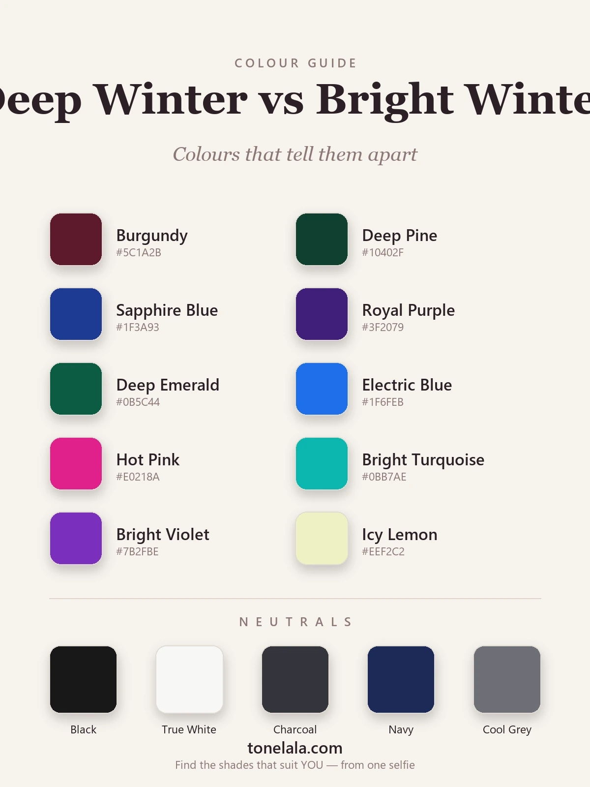
| Color | Hex | Flatters |
|---|---|---|
| Burgundy | #5C1A2B |
Deep Winter, deep, cool wine; too dark for most Brights |
| Deep Pine | #10402F |
Deep Winter, the darkest cool green, needs real depth |
| Sapphire Blue | #1F3A93 |
Deep Winter, rich and ink-deep rather than electric |
| Royal Purple | #3F2079 |
Deep Winter, saturated but low in value |
| Deep Emerald | #0B5C44 |
Deep Winter, jewel-green with weight behind it |
| Electric Blue | #1F6FEB |
Bright Winter, charged, glowing, maximum chroma |
| Hot Pink | #E0218A |
Bright Winter, clear and electric, not muted |
| Bright Turquoise | #0BB7AE |
Bright Winter, vivid and lit, lighter in value |
| Bright Violet | #7B2FBE |
Bright Winter, brighter and lighter than royal purple |
| Icy Lemon | #EEF2C2 |
Bright Winter, a cool icy bright; Deep prefers icy pink/blue |
Shared neutrals: Black #181818, True White #F7F7F4, Charcoal #34353B, Navy #1C2A57 and Cool Gray #6E7076, both seasons wear all five, and both pull off the high-contrast black-and-white pairing that overwhelms softer types. On metals, silver suits each beautifully; a bright, clean gold can work on the cool-neutral edge of either, but yellow-warm gold pulls muddy on both.
Still not sure, Deep Winter or Bright Winter?
Find your color season →How to tell which you are
A few practical tests, in the order I actually use them:
The deep-versus-bright drape. This is the decisive one. Put a very dark cool color, deep pine or burgundy, next to a very bright one, electric blue or hot pink, and hold each near your face in daylight. One will make your features look defined and harmonious; the other will feel slightly off, either heavy or shouty. Deep color flattering you points to Deep Winter; electric brightness flattering you points to Bright Winter.
Watch what overwhelms you. Both seasons handle a lot of intensity, so look for the edge. If the most electric brights start to wear you, you put on hot pink and it feels louder than your face, you're carrying Deep Winter's depth, and the brightness is overshooting. If the darkest jewel tones drag your face down and make you look tired, your coloring wants brightness, not weight: Bright Winter.
The black-and-white sanity check. Both pass this, so use it differently, note how you wear it. Deep Winter loves black as a deep anchor and pairs it with rich color. Bright Winter loves the crisp black-and-white contrast itself, the graphic snap of it. If stark monochrome energizes you more than a deep, moody pairing, lean Bright.
Jewelry is a tie-breaker, not a test. Silver flatters both, so it won't separate them, but it does confirm you're in cool-Winter territory. If clean cool metals look right and warm yellow gold looks muddy, you're somewhere in this pair; then go back to the deep-versus-bright drape to decide which.
If you're Deep Winter / If you're Bright Winter
If you're Deep Winter, your coloring is defined by depth. Build outfits around your darkest shades and let one clear jewel tone carry the look, charcoal with true red, navy with deep emerald, black with sapphire. You can go richer and moodier than a Bright Winter without losing yourself, and the deepest cool colors are yours alone. The full breakdown, with every hex code, is in the Deep Winter guide.
If you're Bright Winter, your coloring is defined by clarity and electricity. Reach for the most saturated colors you can find and pair them with crisp neutrals, black with hot pink, true white with electric blue, charcoal with bright emerald. Where a Deep Winter goes deep, you go bright; the most charged, glowing shades are your territory. The complete palette, with hex codes, lives in the Bright Winter guide.
The reliable way to settle it
Here's the honest part: depth and brightness are genuinely hard to judge on your own face, in your own mirror, under your own lighting. Bathroom bulbs run warm, daylight shifts hour to hour, and a single photo in the wrong light can flip a Deep Winter to Bright or back. Even seasoned analysts drape under controlled, neutral light for exactly this reason.
A photo-based analysis sidesteps all of that. It reads your undertone, value and contrast directly from a clear image of your face, measuring how deep your coloring actually runs and how much chroma it can carry, rather than asking you to eyeball it. That's the difference between guessing and knowing. If you want to go deeper on any single season or the colors that separate the neighbours, the rest of the color analysis guides walk through each one. When you're ready to settle Deep Winter or Bright Winter for good, find out which you are.
Frequently asked questions
What's the difference between Deep Winter and Bright Winter?
Both are cool, clear, high-contrast Winters, the difference is value and chroma. Deep Winter is darker and richer, owning the deepest jewel tones like pine, sapphire and burgundy. Bright Winter is medium-deep and the most electric season of all, built on the most saturated colors like electric blue and hot pink. If a color's depth flatters you, you're Deep; if its brightness does, you're Bright.
Am I Deep Winter or Bright Winter?
Drape a very dark cool color (deep pine or burgundy) against a very bright one (electric blue or hot pink) and watch your face. If the deep shade makes your features look rich and defined while the brightest electrics start to overwhelm you, you're Deep Winter. If the electric brights light your eyes up and the darkest shades feel a touch heavy, you're Bright Winter.
Which is deeper, Deep Winter or Bright Winter?
Deep Winter, depth is its defining trait. Its value sits dark, so it can carry the very deepest cool colors near the face. Bright Winter sits medium-deep; it leans on brightness rather than darkness, so the deepest jewel tones can read slightly heavy on it.
Which is brighter, Bright Winter or Deep Winter?
Bright Winter, it's the highest-chroma season on the entire wheel. Both seasons are clear and cool, but Bright Winter pushes chroma to the maximum with electric, almost-glowing color, while Deep Winter trades a little of that electricity for depth and richness.
Can you be both Deep Winter and Bright Winter?
No, you're one season, though you can sit on the border between the two. Deep and Bright Winter are neighbours, so a borderline person genuinely suits some colors from each. A photo-based or draped analysis pins down whether your coloring is defined more by depth or by brightness, which settles it.
Related guides

Deep Winter vs True Autumn: How to Tell the Difference
A color analyst on Deep Winter vs True Autumn, how they differ on undertone, value and chroma, the colors that separate them, and how to tell which you are.

Bright Winter vs Bright Spring: How to Tell the Difference
A color analyst on Bright Winter vs Bright Spring, how undertone, value and chroma differ, the colors that separate them, and how to tell which one you are.

Deep Autumn vs Deep Winter: How to Tell the Difference
Deep Autumn vs Deep Winter, settled by a color analyst: how they split on undertone, value and chroma, the colors that separate them

True Winter vs Bright Winter: How to Tell the Difference
A color analyst on True Winter vs Bright Winter, how undertone, value and chroma differ, the colors that tell them apart, and how to decide which you are.

Deep Winter vs True Winter: How to Tell the Difference
Deep Winter vs True Winter, explained by a color analyst: how they differ on undertone, value and chroma, the colors that separate them

Bright Winter Color Palette: The Complete Guide (with Hex Codes)
A color analyst's complete Bright Winter guide, your exact palette with hex codes, best neutrals and metals, colors to avoid
Prefer in person? Find color analysis near you
Browse local color analysts by city, or get the same season, palette and best-colors breakdown online from one selfie.
See your colors on a photo of you
Upload one selfie and ToneLala reveals your season, your full palette, and your best hair, makeup, jewelry and outfits, styled on you.