In a sentence: Light Spring is the light, warm, bright season. Your palette is built from fresh, delicate, sunlit colors, peach, warm coral, light golden yellow, light warm aqua, mint, with warm ivory and light camel neutrals. No black, no heavy darks. Skip to the full palette with hex codes or find your own season.
Light Spring Color Palette: The Complete Guide (with Hex Codes)
By ToneLalaUpdated July 2, 2026
Contents
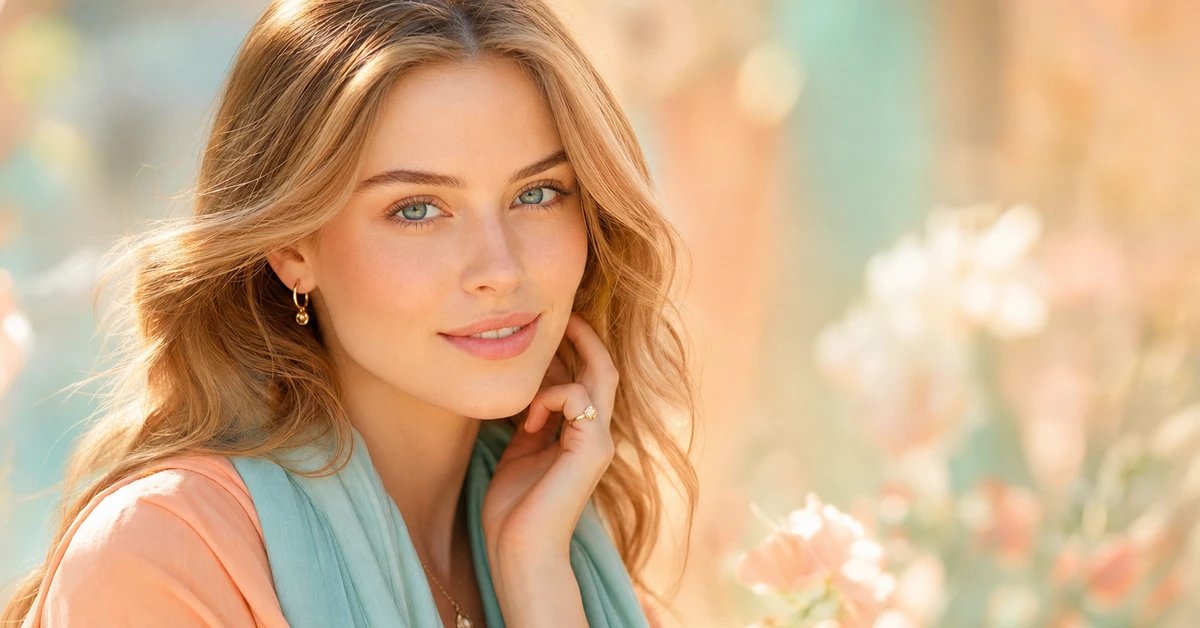
Light Spring clients almost always tell me the same thing in the first five minutes: that bright colors "wash them out." So they've spent years in beige and gray, looking quietly faded, when the real culprit was never brightness, it was depth. The moment I drape a clear peach or a light golden yellow against the face, everything lifts. The skin warms up, the eyes catch the light. What they needed was a color as fresh and light as they are, not a heavier one turned down.
This guide is your Light Spring palette in actual hex codes, the colors that genuinely flatten this season, your best neutrals and metals, and an honest look at how to tell a real Light Spring from the three seasons it borders. I've kept it to what's actually useful at the mirror and the shop rail, no filler, just the shades that work and the ones that quietly let you down.
What "Light Spring" actually means
Light Spring is one of the twelve seasons in personal color analysis. Three dials define it, and a Light Spring color analysis is really just reading where you land on each:
- Undertone: Light Spring is warm (but warm-leaning-neutral, the warmth is fresh and clear, never deep or golden).
- Value: light. This is the loudest of the three for you; everything in the palette sits pale and luminous.
- Chroma: bright/clear. Clean and fresh, never grayed or dusty.
Put together, that makes a low-to-medium contrast coloring, delicate and sunlit, the colors blending softly rather than clashing. The trick that throws people is that "light" and "bright" sound contradictory; in a Light Spring they aren't. Think of early spring sunshine: pale, but unmistakably clear. That balance is the whole heart of the light spring color palette, pale colors that still hold a little brightness.
The palette
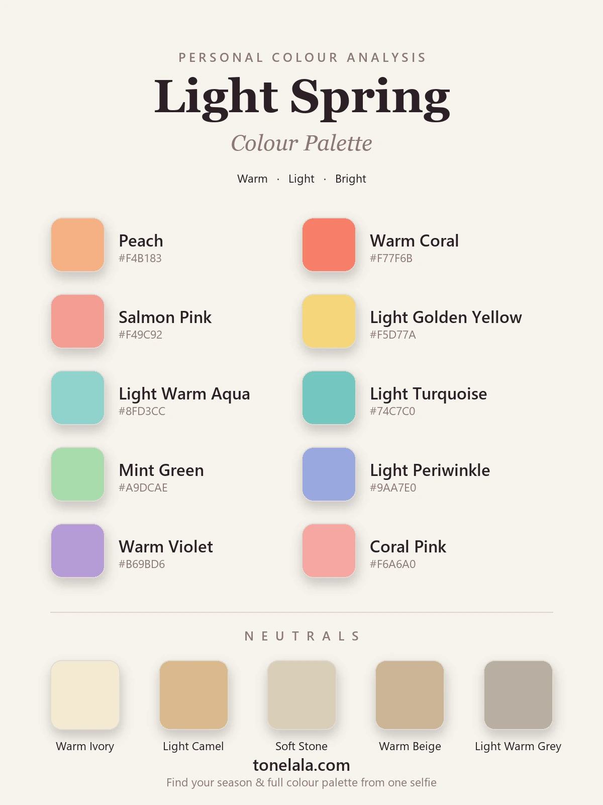
Light, warm and clear. Every color looks like it's been lit from behind by morning sun.
Your best colors
| Color | Hex |
|---|---|
| Peach | #F4B183 |
| Warm Coral | #F77F6B |
| Salmon Pink | #F49C92 |
| Light Golden Yellow | #F5D77A |
| Light Warm Aqua | #8FD3CC |
| Light Turquoise | #74C7C0 |
| Mint Green | #A9DCAE |
| Light Periwinkle | #9AA7E0 |
| Warm Violet | #B69BD6 |
| Coral Pink | #F6A6A0 |
Your neutrals: warm and light, never stark: Warm Ivory #F3E9D2 (your "white"), Light Camel #D8B98C, Soft Stone #D9CFBA, Warm Beige #CBB596, and Light Warm Gray #B8AFA2 for a softer cool option. Notice there's no black, a warm, light neutral always serves you better near the face.
Your metals: light yellow gold and rose gold sit beautifully, and a warm brushed gold is lovely too. Heavy bright silver reads cold and a touch hard against your warmth.
Not sure Light Spring is actually your season?
Find your color season →Colors to avoid (and why)
- Black & heavy darks: charcoal, deep navy, espresso. Far too much depth for light coloring; they swallow your delicate face and create shadows.
- Muted & dusty tones: sage, dusty rose, grayed mauve. Your colors work because they're clear; soften them and they turn your skin flat.
- Cool, icy & burgundy tones: true blue, icy pink, plum, wine. They pull against your warmth and look harsh against fresh, sunlit skin.
The mirror test: if a color makes your face look tired or your features look heavier than the garment, it's too dark, too cool or too muted.
How to know you're actually a Light Spring
- Light Spring vs Light Summer: the #1 mix-up, because both are light, gentle and low-contrast. Undertone is the only thing that separates them: warm, fresh colors flatter a Light Spring; cool, soft ones flatter a Light Summer. Hold peach against your face, then a powder blue, whichever brightens you wins. Warm → Light Spring, cool → Light Summer.
- Light Spring vs True Spring: both warm and clear, but True Spring carries more saturation and a touch more depth. If fully saturated warm colors start to overwhelm you, you're the lighter, softer one.
- Light Spring vs Bright Spring: both warm and clear, but Bright Spring is more intense and higher in contrast. If the very brightest, most vivid colors wear you instead of the other way round, you're the gentler Light Spring.
One more check: if warm tones clearly suit you but bright ones consistently overwhelm you, you may be a warm-but-muted Soft Autumn rather than a Light Spring, they share warmth but sit at opposite ends of the chroma dial. Either way, undertone and chroma are genuinely hard to judge in your own mirror, so the reliable way to settle it is a draping session or a photo-based analysis that reads your undertone, value and contrast for you.
Light Spring makeup
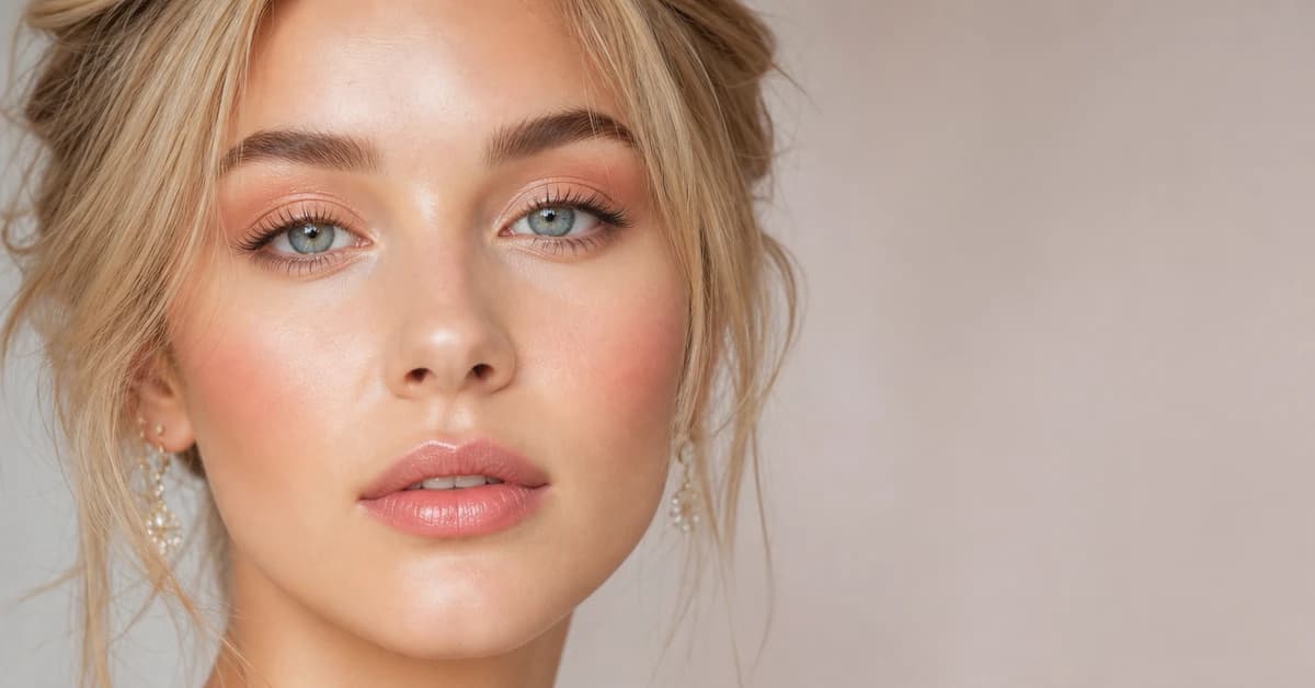
Light Spring makeup is warm, fresh and light-handed, the same logic as the wardrobe. For lips, reach for peach, warm coral, salmon and a clear warm-pink; a sheer wash or a soft satin finish flatters more than a dense matte, and you can skip cool berries, deep plums and anything heavy or dark. Blush wants a peachy or soft coral flush rather than a cool rose, kept light enough to look like a glow rather than a stripe. On the eyes, light warm browns, peach, soft gold and a touch of light warm green or aqua make light eyes sparkle, and a warm brown liner is far gentler than harsh black. Keep the whole face luminous and low-contrast; a heavy dark brow, a smoky eye or a cool-toned base will overpower your delicate coloring faster than you'd expect.
Light Spring hair colors
Light Spring hair is light and warm: golden blonde, honey, light warm caramel, or a soft strawberry blonde for the right person. What fights this season is darkness and coolness, jet black and ashy tones drain your fresh skin and read far too heavy against your light coloring, and very high-contrast color breaks the gentle harmony. If you want depth, ask your colorist for warm, light, low-contrast dimension rather than a bold dark base.
Light Spring celebrities, and why the lists never agree
Search "Light Spring celebrities" and you'll find the same faces typed three different ways across different sites. That's not because anyone's careless, celebrity color analysis is done from photos under wildly different lighting, makeup and dyed hair, all of which shift how someone reads on camera. A naturally Light Spring person shot in cool studio light with ashy hair can easily read Light Summer.
So celebrity examples are fun for inspiration, but a shaky way to type yourself. Light Spring is defined by your own warm undertone, light value and bright chroma, not by whether you resemble a particular star. The only reliable read is a proper analysis on a clear photo of your own face.
Putting it to work
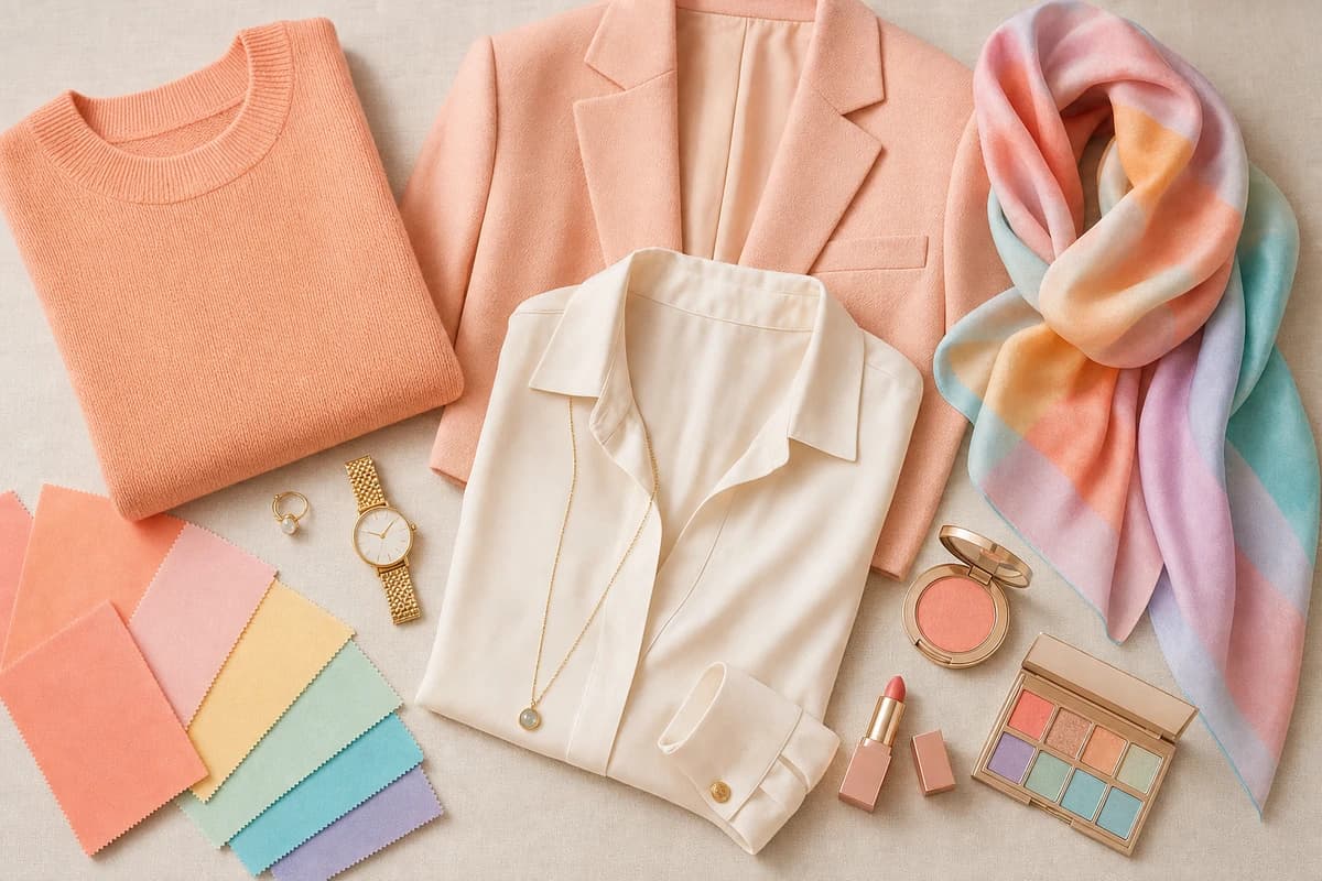
Start small: pick two warm light neutrals you'll wear constantly, say warm ivory and light camel, and add two or three colors from the list you genuinely love, like peach, light warm aqua and warm coral. Let one of those colors sit closest to your face, in a top or a scarf, since that's where the palette does its real work. Everything mixes effortlessly because it all shares the same light, warm, clear DNA, so a handful of pieces quietly becomes a whole wardrobe and getting dressed gets easier rather than harder. Lean into the freshness; on you, it reads as effortless rather than loud.
Frequently asked questions
What is the Light Spring color palette?
Light Spring is a light, warm and bright palette. Think peach, warm coral, light golden yellow, light warm aqua, mint and light periwinkle, fresh, delicate colors with a clear, sunlit quality. No black, no heavy darks and nothing muted or dusty.
Is Light Spring warm or cool?
Warm, but it's the most neutral of the warm seasons, so the warmth is gentle and bright rather than deep and golden. That's why fresh, light, clear colors flatter it more than rich or earthy warm tones.
How do I know if I'm a Light Spring and not a Light Summer?
Both are light and gentle, which is why they're the #1 mix-up. Undertone decides it: warm, fresh colors (peach, coral, light golden yellow) flatter a Light Spring, while cool, soft colors (powder blue, soft rose, lavender) flatter a Light Summer. Warm → Light Spring, cool → Light Summer.
What colors should a Light Spring avoid?
Black and heavy darks, anything muted or dusty, and cool, icy or burgundy-toned colors. They overpower Light Spring's delicate, warm, bright coloring and make the face look heavy or drained.
What makeup is best for Light Spring?
Warm and fresh shades: peach, coral and warm-pink lips; a peachy or coral blush; and light warm browns, peach and soft gold on the eyes. Skip cool berry tones, heavy plums and harsh black liner, a warm brown liner is far more flattering.
Related guides

Light Summer Color Palette: The Complete Guide (with Hex Codes)
A color analyst's complete Light Summer guide, your exact palette with hex codes, best neutrals and metals, colors to avoid
Light Spring Makeup: Best Shades for Lips, Eyes & Cheeks
A makeup artist's Light Spring guide, peach, coral and warm-gold shades for lips, cheeks and eyes, with hex codes, base tones and what to avoid.
Light Summer vs Light Spring: How to Tell the Difference
A color analyst on Light Summer vs Light Spring, how they differ on undertone, value and chroma, the colors that separate them
Light Summer Makeup: Best Shades for Lips, Eyes & Cheeks
A color analyst's Light Summer makeup guide, 10 flattering lip, blush & eye shades with hex codes, base tones, and what to avoid.
True Spring Color Palette: The Complete Guide (with Hex Codes)
A color analyst's complete True Spring guide, your palette with hex codes, best neutrals and metals, colors to avoid
Bright Spring vs Light Spring: How to Tell the Difference
Bright Spring vs Light Spring: one runs on saturation, the other on lightness. Learn the undertone, value and chroma tells, and how to know which you are.
Prefer in person? Find color analysis near you
Browse local color analysts by city, or get the same season, palette and best-colors breakdown online from one selfie.
See your colors on a photo of you
Upload one selfie and ToneLala reveals your season, your full palette, and your best hair, makeup, jewelry and outfits, styled on you.