In a sentence: Light Summer and Light Spring share the same light, gentle value, what separates them is undertone and chroma, with Light Summer reading cool and soft and Light Spring reading warm and bright. Skip to the distinguishing palette or find out which you are.
Light Summer vs Light Spring: How to Tell the Difference
By ToneLalaUpdated July 13, 2026

Contents
These two land on my table mixed up more often than any other pair. Someone arrives certain they're a Light Spring because they're fair and blonde and "definitely not dark," and the draping says Light Summer. Or the reverse: a person who's worn cool grays for years, sure they're a Summer, lights up the moment a warm peach goes near the face. The confusion is fair, because at a glance these seasons look like twins.
They genuinely are close. Both are light, both are delicate, both are low-contrast, no heavy darks, no jarring clashes, nothing that overpowers a soft face. The single thing that tells them apart is which way the undertone leans, and that's exactly the thing that's hardest to read on yourself. So let me lay out where they actually diverge, and how to settle it without second-guessing the mirror.
Light Summer vs Light Spring: the core difference
Every season is really a position on three dials, undertone, value and chroma, so the cleanest way to compare these two is dial by dial.
- Undertone, this is the whole ballgame. Light Summer is cool (cool-leaning-neutral, so gentle rather than icy). Light Spring is warm (warm-leaning-neutral, so fresh rather than golden-deep). They sit on opposite sides of the same line.
- Value, identical, and that's the trap. Both are light. Everything in either palette sits pale and luminous, which is precisely why people assume the two seasons are interchangeable. Value won't separate them for you.
- Chroma, the quiet tie-breaker. Light Summer is soft: very lightly muted, a touch hazy. Light Spring is bright/clear: clean and fresh, never dusty. So even two colors of the same lightness will feel softer on a Summer and crisper on a Spring.
Put it together: Light Summer is light, cool, soft, like an overcast sky just before it clears. Light Spring is light, warm, bright, like early spring sun. Same brightness of light, different temperature and different clarity.
The colors that tell them apart
Some colors look fine on both because they share that light value. These aren't those. The ten below are the ones that actively pull one way, the shades where a Summer glows and a Spring goes flat, or the reverse.
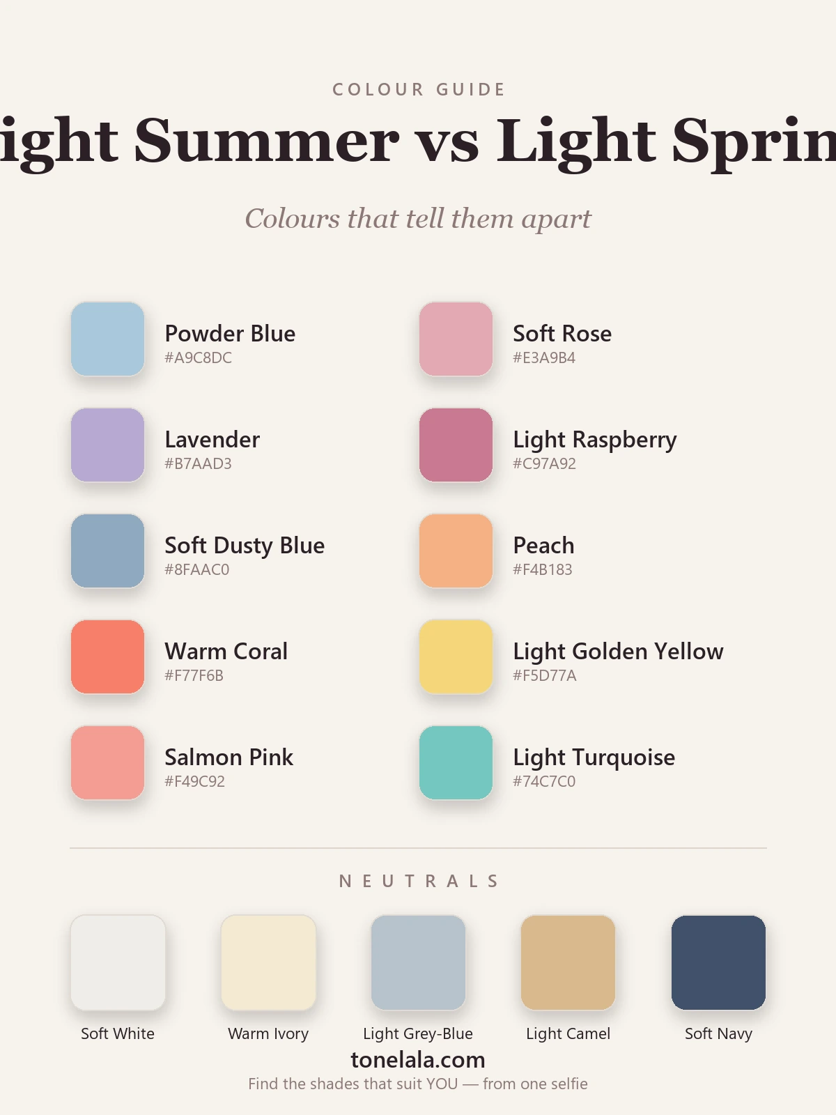
| Color | Hex | Flatters |
|---|---|---|
| Powder Blue | #A9C8DC |
Light Summer, cool and soft |
| Soft Rose | #E3A9B4 |
Light Summer, cool, dusty pink |
| Lavender | #B7AAD3 |
Light Summer, cool, slightly hazy |
| Light Raspberry | #C97A92 |
Light Summer, cool berry |
| Soft Dusty Blue | #8FAAC0 |
Light Summer, muted and cool |
| Peach | #F4B183 |
Light Spring, warm and fresh |
| Warm Coral | #F77F6B |
Light Spring, warm, clear |
| Light Golden Yellow | #F5D77A |
Light Spring, sunlit warmth |
| Salmon Pink | #F49C92 |
Light Spring, warm, peachy |
| Light Turquoise | #74C7C0 |
Light Spring, clear, warm aqua |
The top five carry a cool, slightly muted hand; the bottom five carry warmth and clarity. Hold a powder blue beside a peach and you can almost feel the temperature change. That swing, cool-and-soft against warm-and-clear, is the entire difference between these seasons in a single row.
Shared neutrals: the light, low-contrast neutrals that work on both, leaning a touch cool or warm to taste, Soft White #EFEDE8, Warm Ivory #F3E9D2, Light Gray-Blue #B6C2CB, Light Camel #D8B98C, and Soft Navy #41506B as the most useful dark for either (no black for either season).
Still not sure, Light Summer or Light Spring?
Find your color season →How to tell which you are
The dials are the theory; here's what actually works at the mirror.
- The two-color drape. Hold a cool powder blue under your chin in good daylight, then a warm peach. Watch your skin, not the fabric. The right temperature evens your complexion and softens any shadows; the wrong one leaves you gray, sallow or slightly blotchy. Cool wins → Light Summer. Warm wins → Light Spring.
- Silver against gold. Lay a silver chain and a gold one side by side on your skin. Silver that looks clean and flattering points to Light Summer; gold that makes you glow points to Light Spring. If one clearly disappears into your skin while the other sits well, you've found your side.
- What washes you out. A Light Summer goes dull and faintly gray in warm orange-corals and golden yellows. A Light Spring goes flat and tired in cool dusty roses and grayed mauves. Whichever family drains you tells you which season you aren't.
- The blush check. Notice how your cheeks flush naturally. A cool, rosy-pink flush leans Summer; a warm, peachy flush leans Spring. It's a small tell, but it's one the mirror rarely fakes.
No single test is gospel, do two or three and look for agreement.
If you're Light Summer / If you're Light Spring
If you're Light Summer, your colors are cool, soft and light, powder blue, soft rose, lavender, mint, soft dusty blue, with soft white and light gray-blue neutrals and silver jewelry. The watchword is softness: clear pastels and gentle cool tones flatter you, while warmth and heavy darks both drain you. The full breakdown, with hex codes and what to avoid, is in the Light Summer guide.
If you're Light Spring, your colors are warm, bright and light, peach, warm coral, light golden yellow, light warm aqua, salmon, with warm ivory and light camel neutrals and gold jewelry. The watchword is freshness: clear, sunlit colors bring you alive, while muted, dusty and cool tones flatten you. The full palette, neutrals and colors to avoid live in the Light Spring guide.
The reliable way to settle it
Here's the honest part. Value is easy to see, you can tell you're light. But undertone and chroma, the two dials that actually decide Summer from Spring, are genuinely hard to judge on your own face. Bathroom lighting skews warm or cool, the wall behind you bounces color onto your skin, and we're all quietly biased about ourselves. I've watched people drape themselves and reach the wrong conclusion three times in a row simply because the lamp over the mirror was warm.
A photo-based analysis sidesteps all of that. It reads your undertone, value and contrast from a clear, neutral-light image of your own face, measuring what's actually there rather than what the mirror suggests, and places you firmly on the cool or warm side. If you'd like the certainty, that's what our color analysis guides and a proper read are for. Find out which you are and stop guessing between the two.
Frequently asked questions
What is the difference between Light Summer and Light Spring?
Both are light, gentle and low-contrast, so they share a value. The difference is undertone and chroma: Light Summer is cool and soft, flattered by powder blue, soft rose and lavender, while Light Spring is warm and bright, flattered by peach, coral and light golden yellow. Cool and soft means Light Summer; warm and clear means Light Spring.
Am I Light Summer or Light Spring?
Hold a cool powder blue against your face, then a warm peach. Whichever makes your skin look rested and even, rather than gray or sallow, points to your season. If the cool color wins you're a Light Summer; if the warm one wins you're a Light Spring. Silver flattering you leans Summer, gold leans Spring.
Which is warmer, Light Summer or Light Spring?
Light Spring is the warm one. It sits on the warm side of the neutral line, so its colors have a fresh, sunlit, golden quality. Light Summer sits on the cool side, so its colors read soft and slightly blue rather than golden, though its coolness is gentle, never icy.
Which is brighter, Light Summer or Light Spring?
Light Spring is brighter and clearer. Its colors stay clean and fresh, like early spring sunshine. Light Summer is softer and very lightly muted, as though seen through a thin morning haze. So the dividing line is chroma as well as undertone, clear points to Spring, soft points to Summer.
Can you be both Light Summer and Light Spring?
No, you have one true season, though you can sit close to the border between the two. They share a light value, so a borderline person may flatter a few colors from each. But your undertone ultimately leans one way, and a proper analysis will place you on the cool (Summer) or warm (Spring) side rather than both.
How do you tell Light Summer from Light Spring?
Test undertone three ways: drape a cool color against a warm one and see which evens your skin; check whether silver or gold flatters you more; and notice whether warm colors make you glow or look slightly orange. Cool wins and silver suits you means Light Summer; warm wins and gold suits you means Light Spring.
Related guides

Bright Spring vs Light Spring: How to Tell the Difference
Bright Spring vs Light Spring: one runs on saturation, the other on lightness. Learn the undertone, value and chroma tells, and how to know which you are.

Soft Summer vs Light Summer: How to Tell the Difference
Soft Summer vs Light Summer, explained by a color analyst, how they differ on value and chroma, the colors that separate them

True Summer vs Light Summer: How to Tell the Difference
A color analyst on True Summer vs Light Summer, how they differ on value and chroma, the colors that separate them, and how to tell which one you are.

True Spring vs Light Spring: How to Tell the Difference
True Spring vs Light Spring, explained by a color analyst: how undertone, value and chroma differ, the colors that separate them

Light Summer Color Palette: The Complete Guide (with Hex Codes)
A color analyst's complete Light Summer guide, your exact palette with hex codes, best neutrals and metals, colors to avoid

Light Spring Color Palette: The Complete Guide (with Hex Codes)
A color analyst's complete Light Spring guide, your exact palette with hex codes, best neutrals and metals, colors to avoid
Prefer in person? Find color analysis near you
Browse local color analysts by city, or get the same season, palette and best-colors breakdown online from one selfie.
See your colors on a photo of you
Upload one selfie and ToneLala reveals your season, your full palette, and your best hair, makeup, jewelry and outfits, styled on you.