In a sentence: Soft Autumn and True Summer are both medium in value, which is why they get mixed up, but they split on two dials, not one: Soft Autumn is warm and muted (earthy camel, terracotta, olive) while True Summer is cool and soft-clear (blue-based slate, rose pink, cool raspberry). Skip to the distinguishing palette or find out which you are.
Soft Autumn vs True Summer: How to Tell the Difference
By ToneLalaUpdated July 10, 2026
Contents
A client once arrived in a beautiful soft caramel jumper and a slate-blue scarf, and asked me to settle a years-long argument between two online quizzes, one kept calling her Soft Autumn, the other True Summer. When I draped her, the answer wasn't subtle at all: the caramel pulled the color straight out of her cheeks, and the slate blue lifted her whole face. She'd been wearing both, hedging her bets, never quite sure why half her wardrobe felt off.
That hedging is the heart of this mix-up. People land between these two because both are mid-toned and neither is loud, so a quick quiz reads "not bright, not dark" and stalls. But these seasons disagree on more than the muted pairs do, and once you see where, the choice gets a lot easier.
Soft Autumn vs True Summer: the core difference
Every season sits on three dials, undertone (cool/warm), value (light/dark) and chroma (bright/muted). Soft Autumn and True Summer match on only one:
- Value: both are medium. Neither is pale, neither is deep. This is the whole reason they get confused: in a snapshot, both just read "mid-toned and gentle," and people assume that means the same season.
They part on the other two, and that's what makes this pair different from the classic muted mix-ups:
- Undertone: Soft Autumn is warm; True Summer is cool. Opposite sides of the wheel.
- Chroma: Soft Autumn is muted (grayed-down, hazy); True Summer is soft-but-clear (gently calmed, but still obviously color).
So you're not splitting hairs over a single dial here, you're separating warm-and-hazy from cool-and-clear. Picture two soft-focus photographs at the same mid brightness. Soft Autumn is an autumn field through morning mist, everything warmed half a stop, a little brown-gold in the shadows, edges dissolved. True Summer is a cool coastline just after the haze lifts, everything blue-based and calm, the color softened but still crisp enough to name. Same value, opposite temperature, different amounts of clarity.
The colors that tell them apart
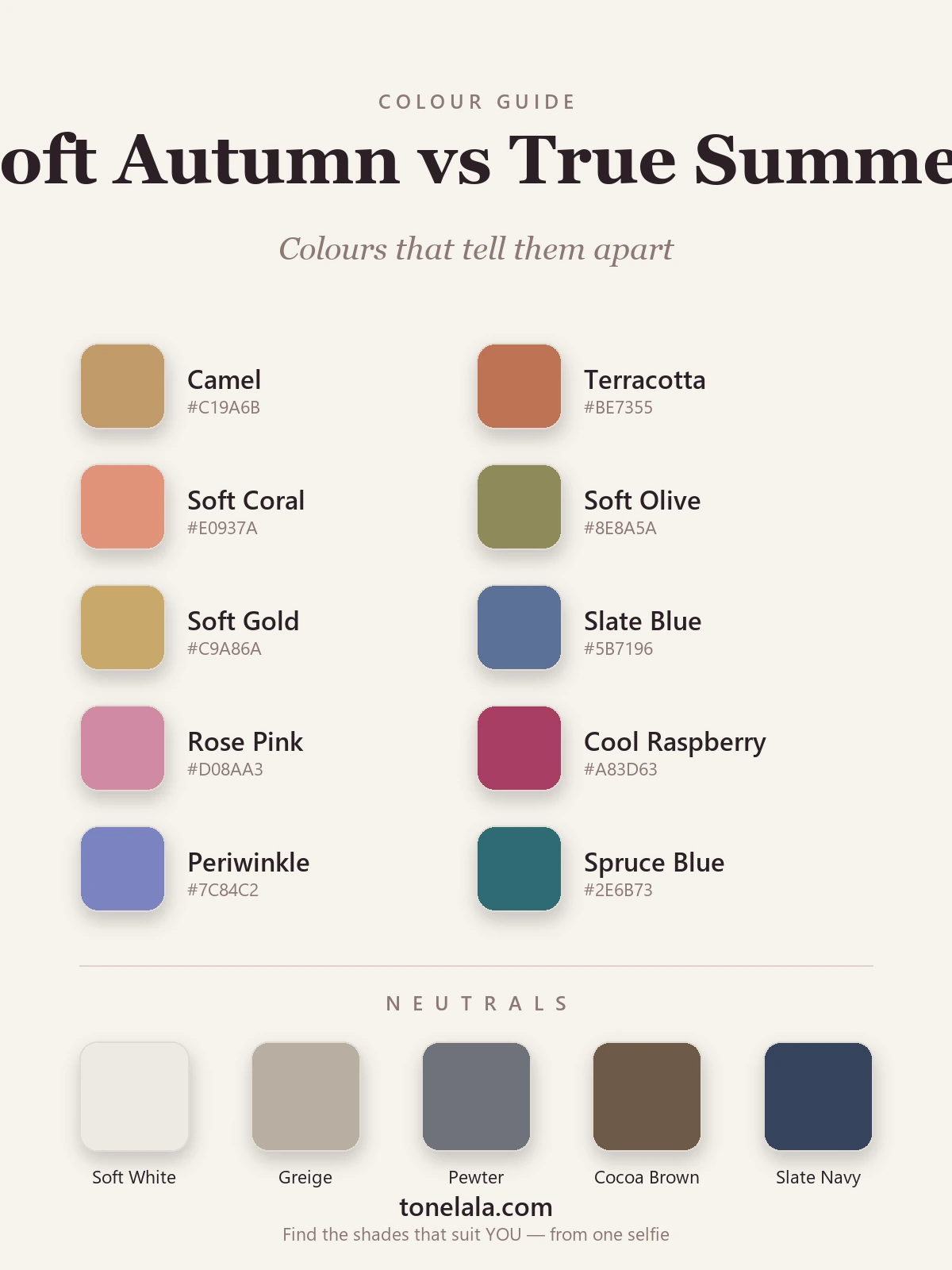
These aren't full palettes, they're the dividing line. Warm, earthy, slightly hazy colors pull toward Soft Autumn; cool, blue-based, soft-clear colors pull toward True Summer.
| Color | Hex | Flatters |
|---|---|---|
| Camel | #C19A6B |
Soft Autumn, warm golden-brown, the clearest Soft Autumn tell |
| Terracotta | #BE7355 |
Soft Autumn, earthy warm orange-brown; True Summer goes ruddy in it |
| Soft Coral | #E0937A |
Soft Autumn, warm peachy coral, no blue in it |
| Soft Olive | #8E8A5A |
Soft Autumn, warm, dusty green-gold |
| Soft Gold | #C9A86A |
Soft Autumn, muted warm gold; True Summer prefers pewter |
| Slate Blue | #5B7196 |
True Summer, cool, soft-clear blue, a reliable True Summer tell |
| Rose Pink | #D08AA3 |
True Summer, cool blue-based pink; Soft Autumn can't cool down to it |
| Cool Raspberry | #A83D63 |
True Summer, clear cool berry; on Soft Autumn it reads too sharp |
| Periwinkle | #7C84C2 |
True Summer, cool blue-violet, soft yet clear |
| Spruce Blue | #2E6B73 |
True Summer, cool blue-teal; Soft Autumn's teals lean warmer and softer |
Shared neutrals: Soft White #EDEAE3, Greige #B8AEA1, Pewter #6E727A, Cocoa Brown #6F5A48 and Slate Navy #36435C. These sit close enough to neutral that both seasons can wear a version of one or two, Soft Autumn leans on the warmer greige and cocoa, True Summer on the cooler pewter and slate navy. Because they overlap, they're no help in telling the two apart. Judge by the colors above, not the basics.
Still not sure, Soft Autumn or True Summer?
Find your color season →How to tell which you are
Four tests, in roughly the order I trust them:
- The camel-vs-slate-blue drape. Take a warm camel and a cool slate blue, scarves, jumpers, whatever's to hand, to a window in daylight, no makeup. Hold each under your chin. One will warm and even out your skin; the other will turn it gray, sallow or ruddy. On a Soft Autumn, camel lifts and slate blue drains. On a True Summer, slate blue clears and camel turns the face yellow. This single drape settles undertone, which is most of the answer.
- Gold vs silver. Rest a gold chain on one wrist and a silver one on the other in daylight. Gold that looks warm and harmonious leans Soft Autumn; silver that looks crisp and clean leans True Summer. If gold reads brassy and a little harsh on you, you're cool, that's True Summer.
- The clarity test. Hold a clear cool raspberry or a true rose pink to your face. If it looks elegant and your features sharpen pleasantly, you can carry clarity, that's True Summer. If the same color seems to shout over your soft, gentle coloring and you instinctively want to mute it, you belong in Soft Autumn's hazier world.
- What washes you out. Soft Autumns go gray and drained in cool, clear colors, icy blue, cool berry, anything with a blue snap and a hard edge. True Summers go sallow and tired in warm earthy colors, camel, mustard, terracotta near the face. Notice which family makes strangers ask if you're unwell. That family isn't yours.
If you're Soft Autumn / If you're True Summer
If you're Soft Autumn, your home base is warm and gently hazy, camel, terracotta, soft coral, soft olive and soft gold, with warm greige and cocoa brown as your darks instead of black. Gold flatters; cool slate and clear berry drain you. Every color should look like it has a little brown or gold folded in and the edges softened. The full breakdown, with every hex code, is in the Soft Autumn guide.
If you're True Summer, your home base is cool and soft-clear, slate blue, rose pink, cool raspberry, periwinkle and spruce blue, with pewter and slate navy as your darks. Silver flatters; warm camel and terracotta turn you sallow. Your colors look blue-based and elegant, calmed but never muddy. The full palette and hex codes are in the True Summer guide.
The reliable way to settle it
This pair asks you to read two dials at once, temperature and clarity, and both are slippery in a bathroom mirror. Lighting warms or cools your skin, dyed hair throws the read, and the color you happen to have on changes everything; we're all biased about our own faces besides. When two seasons differ on more than one dial but still share a mid value, people often correct one mistake by making another, which is how they end up bouncing between warm-soft and cool-clear for years.
A photo-based analysis takes that guesswork out: it reads your undertone, value and contrast from a clear picture and shows you which family genuinely lifts your face. That's what ToneLala does, you upload a photo, and your palette is built on an image of you, not a generic swatch card. If you want to go deeper on either result, the rest of the color analysis guides cover every season in full.
Frequently asked questions
What is the difference between Soft Autumn and True Summer?
They share one dial, both are medium in value, so neither is pale or deep, and differ on two. Soft Autumn is warm and muted: gentle earthy color like camel, terracotta and soft olive. True Summer is cool and soft-but-clear: blue-based color like slate blue, rose pink and cool raspberry, softened but never hazy. Warm-and-hazy versus cool-and-clear is the whole distinction.
Am I Soft Autumn or True Summer?
Hold a warm camel and a cool slate blue against your bare face in daylight. If the camel warms and lifts your skin while the slate blue makes you look gray, you're Soft Autumn. If the slate blue clears your skin while the camel turns it sallow or yellow, you're True Summer. The color that rests your face, rather than the one you simply like, points to your season.
Which is warmer, Soft Autumn or True Summer?
Soft Autumn is the warmer of the two by a clear margin. It sits on the warm side of the color wheel, with a little brown-gold folded into every shade. True Summer is the most purely cool of the three Summers, blue-based, with no warm hedge. If gold jewelry and earthy colors flatter you, you lean Soft Autumn.
Which is cooler and clearer, Soft Autumn or True Summer?
True Summer. Its undertone is unmistakably cool, and its chroma is soft-but-clear rather than muted, a cool raspberry or rose pink still reads as color, not dust. Soft Autumn is both warmer and hazier; its colors look grayed-down and earthy. If clear cool berries and slate blues sit elegantly on you, that's True Summer.
Can you be both Soft Autumn and True Summer?
No, you have one season. These two aren't direct neighbours on the seasonal wheel, so a true border between them is unusual; if you can't decide, it usually means undertone is being misread in your mirror, or you're actually sitting next to one of them (Soft Summer is the muted cool season that bridges the gap). A photo-based read of undertone and chroma clears it up fast.
How do I tell Soft Autumn and True Summer apart?
Test two dials at once. For undertone, drape warm camel against cool slate blue and see which clears your skin; check whether gold or silver flatters more (gold leans Soft Autumn, silver leans True Summer). For chroma, hold a clear cool raspberry to your face, if it looks elegant you lean True Summer, if it overwhelms your softness you lean Soft Autumn. Warm-soft versus cool-clear is what you're looking for.
Related guides

Soft Summer vs Soft Autumn: How to Tell the Difference
A color analyst on Soft Summer vs Soft Autumn, the one difference that separates them, the colors that tell them apart, and how to decide which you are.

Soft Summer vs True Summer: How to Tell the Difference
Soft Summer vs True Summer, explained by a color analyst: how they differ on undertone, value and chroma, the colors that separate them

Soft Autumn vs True Autumn: How to Tell the Difference
Soft Autumn vs True Autumn, explained by a color analyst, how they differ on undertone, value and chroma, the colors that separate them

Soft Autumn Color Palette: The Complete Guide (with Hex Codes)
A color analyst's complete Soft Autumn guide, your exact palette with hex codes, best neutrals and metals, colors to avoid
Deep Winter vs True Autumn: How to Tell the Difference
A color analyst on Deep Winter vs True Autumn, how they differ on undertone, value and chroma, the colors that separate them, and how to tell which you are.
True Spring vs True Autumn: How to Tell the Difference
True Spring vs True Autumn, explained by a color analyst, how they differ on value and chroma, the colors that separate them, and how to tell which you are.
Prefer in person? Find color analysis near you
Browse local color analysts by city, or get the same season, palette and best-colors breakdown online from one selfie.
See your colors on a photo of you
Upload one selfie and ToneLala reveals your season, your full palette, and your best hair, makeup, jewelry and outfits, styled on you.