In a sentence: Deep Winter is cool, deep and high-contrast; True Autumn is the warmest season of all, golden, earthy and slightly muted. They get confused because both read as rich and dramatic, but undertone splits them cleanly: cool blue-based jewel tones versus warm gold-based spices. Skip to the distinguishing palette or find out which you are.
Deep Winter vs True Autumn: How to Tell the Difference
By ToneLalaUpdated July 10, 2026

Contents
A client sat down last month convinced she was a Deep Winter. She had dark hair, dark eyes, a striking face, the kind of coloring that looks like Winter on paper. Then I held a true red to her jaw and her skin went faintly gray under it; swapped in a rust and she warmed up like someone had turned a lamp on behind her face. She wasn't a Deep Winter at all. She was a True Autumn who'd been miscast by her own hair color for fifteen years.
That mix-up happens constantly, and it's an honest one. Deep Winter and True Autumn can both carry deep, rich color, so people see "dramatic" and "intense" and assume the two seasons are neighbours. They're not. They sit on opposite ends of the most important dial in color analysis, undertone, and once you see that, the whole thing stops being confusing.
Deep Winter vs True Autumn: the core difference
Every season sits on three dials: undertone (cool or warm), value (light or dark), and chroma (muted or bright). With most season pairs that get confused, two of those dials match and you hunt for the one that differs. Deep Winter and True Autumn are the opposite case, they differ on the dial that matters most, and the family resemblance is almost an optical illusion.
Undertone is the whole story here. Deep Winter is cool: blue-based, with just a whisper of neutral-depth to keep it from reading icy-bright. True Autumn is warm: and not warm-ish or neutral-warm, but the single most decisively warm season on the wheel, all gold and no blue. This is why the same red can flatter one and flatten the other: a cool blue-red sings on a Deep Winter and turns a True Autumn sallow, while a warm tomato-red lights up a True Autumn and looks slightly muddy on a Deep Winter. Undertone is your first test, your last test, and usually the only one you need.
Value is where the resemblance creeps in. Deep Winter runs dark: its coloring and its best colors both sit deep, which is why it can wear black and the very darkest cool shades near the face. True Autumn is medium-deep: rich and full-bodied, a little lighter than Deep Winter, never as dark as a Deep Autumn. Both are "deep enough" to read as dramatic, and that shared depth is exactly the trap. Depth makes them look alike; undertone makes them behave like strangers.
Chroma parts ways too. Deep Winter is clear and saturated: jewel-like, crisp, nothing grayed-down. True Autumn is rich but slightly muted: saturated and full, with enough earth folded in that the colors read like spices rather than neon. Picture it: Deep Winter is a jewel box turned dark and cool, sapphire, emerald, true red. True Autumn is a spice market in late-October light, rust, pumpkin, golden olive, mustard.
So the headline: same apparent depth, opposite undertones. Deep Winter is cool, dark and clear; True Autumn is warm, medium-deep and softly rich. Almost every styling decision between them traces back to that one contrast.
The colors that tell them apart
Plenty of deep, rich shades flatter both seasons at a glance, that's exactly why they don't help you choose. The colors below are the ones that lean, pulling clearly cool toward Deep Winter or clearly warm toward True Autumn.
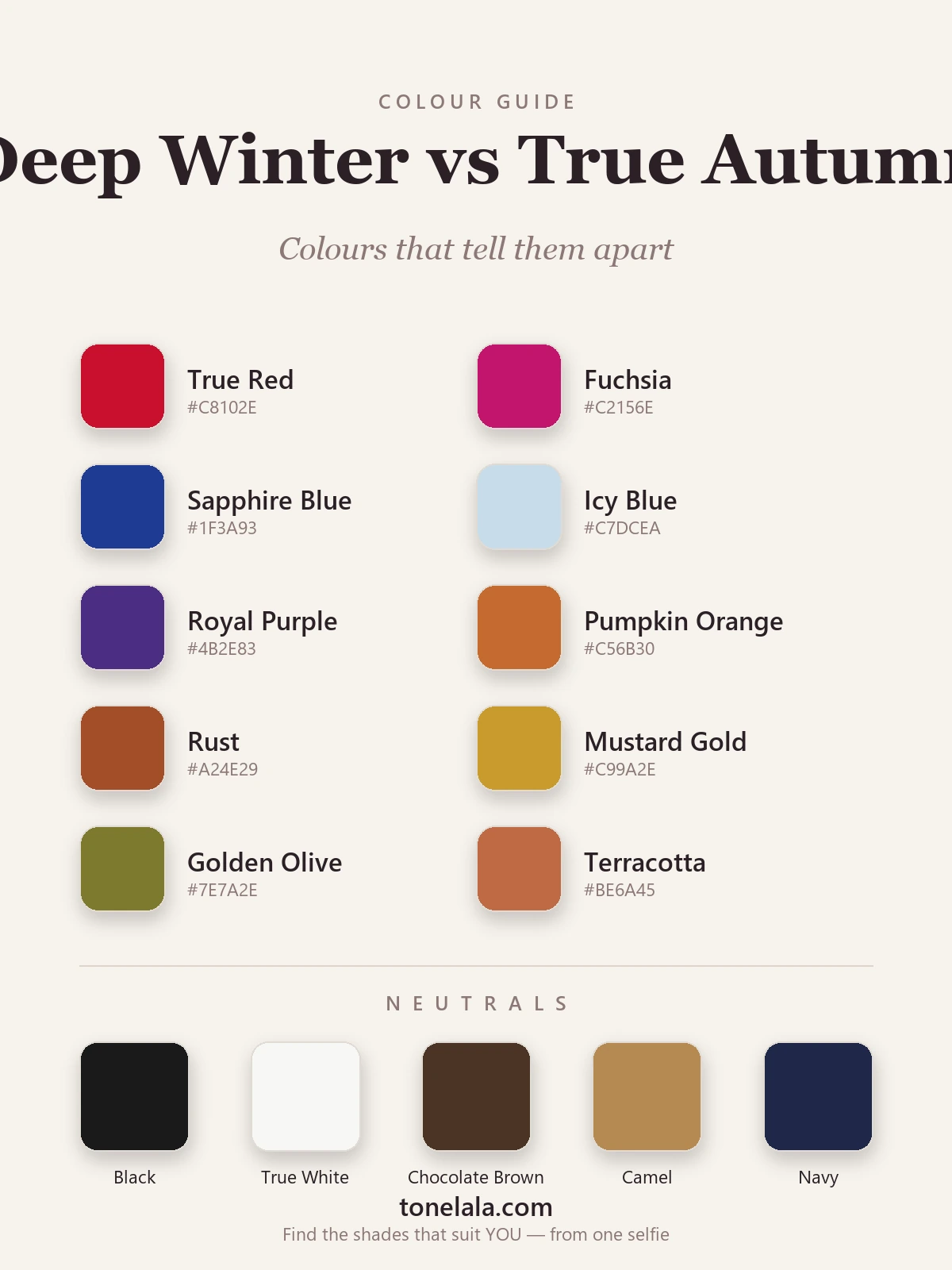
| Color | Hex | Flatters |
|---|---|---|
| True Red | #C8102E |
Deep Winter, cool blue-red, crisp and clear |
| Fuchsia | #C2156E |
Deep Winter, cool, bright and decidedly blue-based |
| Sapphire Blue | #1F3A93 |
Deep Winter, ink-deep cool blue, no warmth in it |
| Icy Blue | #C7DCEA |
Deep Winter, a cool icy pastel; True Autumn has no icy tones |
| Royal Purple | #4B2E83 |
Deep Winter, cool, saturated, low in value |
| Pumpkin Orange | #C56B30 |
True Autumn, warm, golden and earthy |
| Rust | #A24E29 |
True Autumn, the warm autumn signature; muddy on Deep Winter |
| Mustard Gold | #C99A2E |
True Autumn, golden and spiced, pure warmth |
| Golden Olive | #7E7A2E |
True Autumn, warm, earthy green; Deep Winter wants cool pine |
| Terracotta | #BE6A45 |
True Autumn, warm, dusty clay; too soft and warm for Deep Winter |
Shared neutrals: Black #1A1A1A and True White #F7F7F4 belong to Deep Winter, it's one of the few seasons they truly flatter; Chocolate Brown #4A3526 and Camel #B68A52 are True Autumn's warm anchors, far kinder to it than black; and Navy #1E2749 is the closest thing to common ground, sitting cool but deep enough that both can wear it near the face. On metals, silver is Deep Winter's; warm gold is True Autumn's, and which one melts into your skin rather than sitting on top of it is one of the quickest tells you have.
Still not sure, Deep Winter or True Autumn?
Find your color season →How to tell which you are
A few practical tests, in the order I actually use them:
The warm-versus-cool drape. This is the decisive one. Put a cool jewel tone, sapphire or true red, next to a warm earth tone, rust or golden olive, and hold each near your face in daylight. One will make your skin look clear, even and defined; the other will turn it gray, sallow or muddy. Cool color flattering you points to Deep Winter; warm color flattering you points to True Autumn. This single comparison settles most cases on its own.
The gold-and-silver test. Hold a piece of silver jewelry against a piece of warm yellow gold, near your bare face, in daylight. On a True Autumn the gold seems to melt into the skin and the silver looks cold and flat; on a Deep Winter the silver looks clean and right while the warm gold pulls muddy or yellow. Undertone is hard to see directly, but metals make it visible.
Watch what washes you out. Look for the color that does damage. If black and true white look crisp and powerful on you and warm rust or mustard makes your face look tired and yellow, you're Deep Winter. If warm camel and chocolate make you glow and stark black drops a shadow under your eyes and ages you, you're True Autumn, black is one of the surest things to wash a True Autumn out.
The "is it earth or jewel" gut check. Sounds soft, but it's reliable. Picture your most flattering colors. Do they read like gemstones, sapphire, emerald, ruby, clear and cool? Or like spices and earth, rust, pumpkin, olive, gold? Deep Winters live in the jewel box; True Autumns live in the spice market. Which world your best colors come from is usually the answer.
If you're Deep Winter / If you're True Autumn
If you're Deep Winter, your coloring is defined by cool depth and contrast. Build outfits around your darkest cool neutrals and let one clear jewel tone carry the look, charcoal with true red, navy with emerald, black with sapphire. Black and true white are yours to use boldly, and warm earth tones are the one thing to leave on the rail. The full breakdown, with every hex code, is in the Deep Winter guide.
If you're True Autumn, your coloring is defined by golden warmth. Reach for earthy, spiced color and pair it with warm neutrals, camel with rust, chocolate with golden olive, warm cream with pumpkin. You don't reach for black; you let chocolate brown or forest green play the "dark" role so the whole outfit stays in your warmth. The complete palette, with hex codes, lives in the True Autumn guide.
The reliable way to settle it
Here's the honest part: undertone is genuinely hard to judge on your own face, in your own mirror, under your own lighting, and undertone is the entire game with this pair. Bathroom bulbs run warm and can fake a golden glow on a cool Deep Winter; cool daylight can drain a True Autumn and make her look like a Winter. Dyed hair muddies it further, which is how my client spent fifteen years in the wrong half of the color wheel. Even experienced analysts drape under controlled, neutral light for exactly this reason.
A photo-based analysis sidesteps all of that. It reads your undertone, value and contrast directly from a clear image of your face, measuring whether your coloring is genuinely cool or genuinely warm, rather than asking you to eyeball it through a warm bulb. That's the difference between guessing and knowing. If you want to go deeper on either season, or on the colors that separate other neighbours, the rest of the color analysis guides walk through each one. When you're ready to settle Deep Winter or True Autumn for good, find out which you are.
Frequently asked questions
What's the difference between Deep Winter and True Autumn?
Undertone is the headline difference. Deep Winter is cool, its colors are clear, icy and jewel-like, and black and true white flatter it. True Autumn is the most purely warm season there is, golden, earthy and slightly muted, all rust, pumpkin and olive. They can both look deep and rich at a glance, but one is built on cool blue-based color and the other on warm gold-based color, and that is what separates them.
Am I Deep Winter or True Autumn?
Drape a cool jewel tone (true red or sapphire) against a warm earth tone (rust or golden olive) in daylight and watch your skin. If the cool shade makes your face look clear and defined while the warm one turns it sallow or muddy, you're Deep Winter. If the warm shade lights you from within while the cool one drains you or looks harsh, you're True Autumn. Whichever color the skin reaches toward wins.
Which is warmer, Deep Winter or True Autumn?
True Autumn, by a wide margin, it's the warmest of all twelve seasons, with a decisively golden undertone. Deep Winter sits on the opposite side of the undertone dial: it's cool, with only a whisper of neutral-depth. Warmth versus coolness is the single biggest thing that tells these two apart.
Which is cooler or deeper, Deep Winter or True Autumn?
Deep Winter is the cool one and the slightly deeper one. Its value runs dark and cool, so it carries black and the deepest jewel tones near the face. True Autumn is warm and medium-deep, rich and full-bodied, but a touch lighter and softer, leaning on golden color rather than cool darkness.
Can you be both Deep Winter and True Autumn?
No, they sit on opposite sides of the undertone dial, so no one is genuinely both. They get confused because both can look deep and rich, but a person is one season. The mix-up almost always comes down to undertone being hard to read in a home mirror; a photo-based or draped analysis settles it by measuring warmth directly.
How can I tell Deep Winter from True Autumn at home?
Use the gold-versus-silver test and a warm-versus-cool drape. Hold gold jewelry beside silver in daylight: gold sitting flatteringly into the skin points to True Autumn, while clean silver looking right points to Deep Winter. Then drape rust against sapphire, the season is decided by which makes your face look lit rather than tired or gray.
Related guides

True Autumn vs Deep Autumn: How to Tell the Difference
True Autumn vs Deep Autumn explained: undertone, value and chroma, the colors that separate them, and how to tell which season you really are.

Deep Autumn vs Deep Winter: How to Tell the Difference
Deep Autumn vs Deep Winter, settled by a color analyst: how they split on undertone, value and chroma, the colors that separate them

Deep Winter vs True Winter: How to Tell the Difference
Deep Winter vs True Winter, explained by a color analyst: how they differ on undertone, value and chroma, the colors that separate them

Soft Autumn vs True Summer: How to Tell the Difference
A color analyst on Soft Autumn vs True Summer, the two dials that separate them, the colors that tell them apart, and how to decide which you are.

True Spring vs True Autumn: How to Tell the Difference
True Spring vs True Autumn, explained by a color analyst, how they differ on value and chroma, the colors that separate them, and how to tell which you are.

Deep Winter vs Bright Winter: How to Tell the Difference
A color analyst on Deep Winter vs Bright Winter, how they differ on undertone, value and chroma, the colors that separate them
Prefer in person? Find color analysis near you
Browse local color analysts by city, or get the same season, palette and best-colors breakdown online from one selfie.
See your colors on a photo of you
Upload one selfie and ToneLala reveals your season, your full palette, and your best hair, makeup, jewelry and outfits, styled on you.