In a sentence: Soft Summer and Soft Autumn are both muted, medium and low-contrast, they differ on one thing only, undertone: Soft Summer is cool (grayed slate, mauve, plum) and Soft Autumn is warm (earthy camel, terracotta, olive). Skip to the distinguishing palette or find out which you are.
Soft Summer vs Soft Autumn: How to Tell the Difference
By ToneLalaUpdated July 11, 2026
Contents
Two women came to me the same week wearing almost the same dusty cardigan, one in a grayed lilac, one in a soft caramel, and both had been told online they were "muted, can't wear black." They were right about that. They were both also half-right about their season: one was Soft Summer, one was Soft Autumn, and they'd been borrowing each other's palettes for years.
This is the most confused pair in the twelve-season system, and the confusion is fair. They share two of the three things that define a season. The trick is knowing which one thing they don't share.
Soft Summer vs Soft Autumn: the core difference
Every season sits on three dials, undertone (cool/warm), value (light/dark) and chroma (bright/muted). Soft Summer and Soft Autumn read identically on two of them:
- Value: both are medium. Neither is pale, neither is deep.
- Chroma: both are muted. Heavily grayed-down. No brights, no neon, no jewel tones. This shared softness is why people see "I can't wear bright color" and stop, assuming the seasons are interchangeable.
They part on the third dial:
- Undertone: Soft Summer is cool; Soft Autumn is warm. That's the whole split.
Picture the same hazy, soft-focus color story photographed at two times of day. Soft Summer is that scene at dusk, everything cooled down, a little blue-gray in the shadows, like sea mist. Soft Autumn is the same scene in late-afternoon light, everything warmed half a stop, a little brown-gold folded in, like an autumn field through fog. Same softness, opposite temperature. Get the temperature right and the season falls into place.
The colors that tell them apart
These are deliberately not full palettes, they're the dividing line. Cool grayed colors pull toward Soft Summer; warm earthy colors pull toward Soft Autumn.
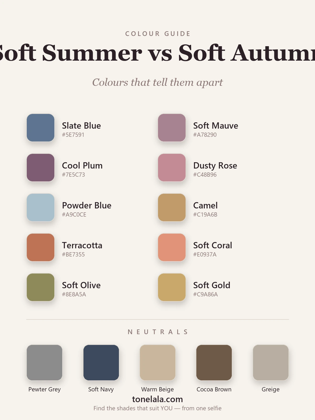
| Color | Hex | Flatters |
|---|---|---|
| Slate Blue | #5E7591 |
Soft Summer, cool blue-gray, the clearest Soft Summer tell |
| Soft Mauve | #A78290 |
Soft Summer, grayed pink-purple, no warmth in it |
| Cool Plum | #7E5C73 |
Soft Summer, muted cool purple; Soft Autumn can't carry it |
| Dusty Rose | #C48B96 |
Soft Summer, cool, slightly blued rose |
| Powder Blue | #A9C0CE |
Soft Summer, soft, cool, airy; reads cold on Soft Autumn |
| Camel | #C19A6B |
Soft Autumn, warm golden-brown, the clearest Soft Autumn tell |
| Terracotta | #BE7355 |
Soft Autumn, earthy warm orange-brown |
| Soft Coral | #E0937A |
Soft Autumn, warm peachy coral; Soft Summer goes ruddy in it |
| Soft Olive | #8E8A5A |
Soft Autumn, warm, dusty green-gold |
| Soft Gold | #C9A86A |
Soft Autumn, muted warm gold; Soft Summer prefers pewter |
Shared neutrals: Pewter Gray #8C8C8C, Soft Navy #3E4A5E, Warm Beige #C9B79C, Cocoa Brown #6F5A48 and Greige #B8AEA1. These sit close enough to neutral that both seasons can wear versions of them, which is precisely why they're no help in telling the two apart. Judge by the colors above, not the basics.
Still not sure, Soft Summer or Soft Autumn?
Find your color season →How to tell which you are
Four tests, in roughly the order I trust them:
- The slate-vs-camel drape. Take a cool gray-blue and a warm camel, scarves, jumpers, anything, to a window in daylight. Hold each under your chin with no makeup on. One will clear your skin and quieten the shadows under your eyes; the other will turn your face slightly gray, sallow or ruddy. The flattering one names your undertone, and your season.
- Silver vs gold. Rest a silver chain on one wrist and a gold one on the other in daylight. Silver that looks crisp and clean against your skin leans Soft Summer; gold that looks warm and harmonious leans Soft Autumn. If gold looks brassy and pushy, you're cool.
- What washes you out. Soft Summers go sallow and tired in warm earthy colors, mustard, rust, camel near the face. Soft Autumns go gray and drained in cool icy colors, icy blue, cool gray, anything with a blue snap. Notice which family makes strangers ask if you're unwell. That family is not yours.
- The black test, in reverse. Neither season suits black, but watch how it fails. On a Soft Summer, black is merely too harsh and cold. On a Soft Autumn, black looks harsh and drains the warmth out, often turning the skin oddly yellow-gray. The second reaction hints warm.
If you're Soft Summer / If you're Soft Autumn
If you're Soft Summer, your home base is cool and grayed, slate blue, soft mauve, cool plum, dusty rose, with pewter and soft navy as your darks. Silver flatters; warm camel and rust fight you. Everything in your wardrobe should look like it has a drop of gray and a whisper of blue in it. The full breakdown, with every hex code, is in the Soft Summer guide.
If you're Soft Autumn, your home base is warm and earthy, camel, terracotta, soft coral, soft olive, with warm beige and cocoa as your darks. Gold flatters; cool slate and icy blue drain you. Your colors look like they have a little brown or gold folded in. The full palette and hex codes are in the Soft Autumn guide.
The reliable way to settle it
Undertone is the one dial you genuinely can't trust yourself to judge in a bathroom mirror. Light shifts it, dyed hair shifts it, the color you happen to be wearing shifts it, and we're all biased about our own faces. Between two seasons that already share value and chroma, that single uncertain dial decides everything, which is why so many people bounce between Soft Summer and Soft Autumn for years.
A photo-based analysis takes that guesswork out: it reads your undertone, value and contrast from a clear picture and shows you which family genuinely lifts your face. That's what ToneLala does, you upload a photo, and your palette is built on an image of you, not a generic swatch card. If you want to go deeper on either result, the rest of the color analysis guides cover every season in full.
Frequently asked questions
What is the difference between Soft Summer and Soft Autumn?
Both are muted, medium in value and low in contrast, that's why they look so alike. The single difference is undertone: Soft Summer is cool, so it's flattered by grayed colors like slate blue, mauve and soft plum. Soft Autumn is warm, so it's flattered by earthy colors like camel, terracotta and soft olive. Cool grayed colors versus warm earthy ones is the whole distinction.
Am I Soft Summer or Soft Autumn?
Hold a cool gray-blue and a warm camel next to your bare face in daylight. If the gray-blue makes your skin look clearer and the camel turns it sallow, you're Soft Summer. If the camel warms and lifts your face and the gray-blue makes you look gray or tired, you're Soft Autumn. The color that calms your skin points to your season; undertone is hard to judge alone, so a photo-based analysis settles it.
Which is warmer, Soft Summer or Soft Autumn?
Soft Autumn is the warmer of the two. It sits on the warm side of the color wheel, gently warm, not golden-bright. Soft Summer is cool, the most neutral of the cool seasons. They meet in the middle at muted, low-contrast coloring, then split on undertone.
Which is cooler, Soft Summer or Soft Autumn?
Soft Summer is the cooler one. Its colors have a drop of gray and a cool blue lean, like slate, mauve and soft plum. Soft Autumn's colors lean warm and earthy. If cool grayed shades flatter you more than warm earthy ones, you're Soft Summer.
Can you be both Soft Summer and Soft Autumn?
No, you have one season. But you can sit right on the border, because both are muted and neutral-leaning, which is exactly why they're the most confused pair in the system. A borderline person often wears a few shared neutrals well, which muddies a quick quiz. The reliable read is undertone, judged from a clear photo.
How do I tell Soft Summer and Soft Autumn apart?
Test undertone three ways: drape a cool gray-blue against a warm camel and watch which clears your skin; check whether silver or gold flatters more (silver leans Soft Summer, gold leans Soft Autumn); and notice which family washes you out, cool icy colors drain a Soft Autumn, warm earthy colors sallow a Soft Summer. The color that makes your face look rested wins.
Related guides
Soft Autumn vs True Summer: How to Tell the Difference
A color analyst on Soft Autumn vs True Summer, the two dials that separate them, the colors that tell them apart, and how to decide which you are.
Soft Summer vs True Summer: How to Tell the Difference
Soft Summer vs True Summer, explained by a color analyst: how they differ on undertone, value and chroma, the colors that separate them
Soft Summer vs Light Summer: How to Tell the Difference
Soft Summer vs Light Summer, explained by a color analyst, how they differ on value and chroma, the colors that separate them
Soft Autumn vs True Autumn: How to Tell the Difference
Soft Autumn vs True Autumn, explained by a color analyst, how they differ on undertone, value and chroma, the colors that separate them
Soft Autumn vs Deep Autumn: How to Tell the Difference
A color analyst breaks down Soft Autumn vs Deep Autumn, how they differ on value and chroma, the tell-tale signs, the colors that separate them

Soft Autumn Color Palette: The Complete Guide (with Hex Codes)
A color analyst's complete Soft Autumn guide, your exact palette with hex codes, best neutrals and metals, colors to avoid
Prefer in person? Find color analysis near you
Browse local color analysts by city, or get the same season, palette and best-colors breakdown online from one selfie.
See your colors on a photo of you
Upload one selfie and ToneLala reveals your season, your full palette, and your best hair, makeup, jewelry and outfits, styled on you.