In a sentence: True Spring and True Autumn are both purely warm, the difference is value and chroma: True Spring is light, bright and clear, while True Autumn is deeper, richer and slightly muted. Skip to the distinguishing palette or find out which you are.
True Spring vs True Autumn: How to Tell the Difference
By ToneLalaUpdated July 10, 2026
Contents
The drape that gives this pair away is a clear leaf green held against the jaw. On a True Spring the skin goes fresh and lit; on a True Autumn the same green looks thin and a little acidic, and you can watch the face ask for something heavier. Same green, opposite verdict, and the only thing that changed was who was standing behind it.
These two confuse people because the first question everyone asks gets them nowhere. "Are you warm or cool?", well, both are warm. Decisively, golden, blue-free warm. So the dial that usually does the sorting is dead on arrival here, and most people don't know where to look next. They read "warm" on both labels, assume the seasons must be close cousins, and then can't work out why their pumpkin jumpers and their coral tops don't seem to belong to the same person.
I had a client last year who'd been buying True Autumn colors, rust, deep olive, chocolate, because a quiz had told her she was warm and earthy. She wasn't wrong about the warm. She was wrong by a couple of notches on depth and brightness. We swapped the rust for a clear warm coral and her face simply woke up; the rust, beside it, had been quietly aging her. She was a True Spring who'd been dressing one season too deep. That gap, light and clear versus deep and roasted, is the whole story.
True Spring vs True Autumn: the core difference
Both seasons sit firmly in the warm half of the color wheel, so I'll set undertone aside and start with the dials that actually separate them.
- Undertone: both are warm, and to a similar degree. True Spring is the most purely warm of the Springs; True Autumn is often called the most purely warm season of all. Neither has any blue in it. Warm versus cool genuinely cannot sort this pair, you have to look past it.
- Value: this is one of the two deciding dials. True Spring is light-to-medium: sunlit, fairly light, never heavy. True Autumn is medium-deep: it carries rust, forest green and chocolate brown comfortably, where those same colors would swamp a Spring.
- Chroma: the other deciding dial. True Spring is bright and clear: vivid, saturated, fresh, like late-April sun on new leaves. True Autumn is rich but slightly muted: full-bodied with a little earth folded in, the way a good curry is deep rather than neon.
Put the two together and you get the real divide. True Spring is warm light at its clearest, fresh, golden, sparkling. True Autumn is warm light gone deep and roasted, golden still, but turned down into spice and earth. Both glow; one glows clear and one glows deep. Get the warmth right but the depth and clarity wrong, and you land squarely in the other season's colors.
The colors that tell them apart
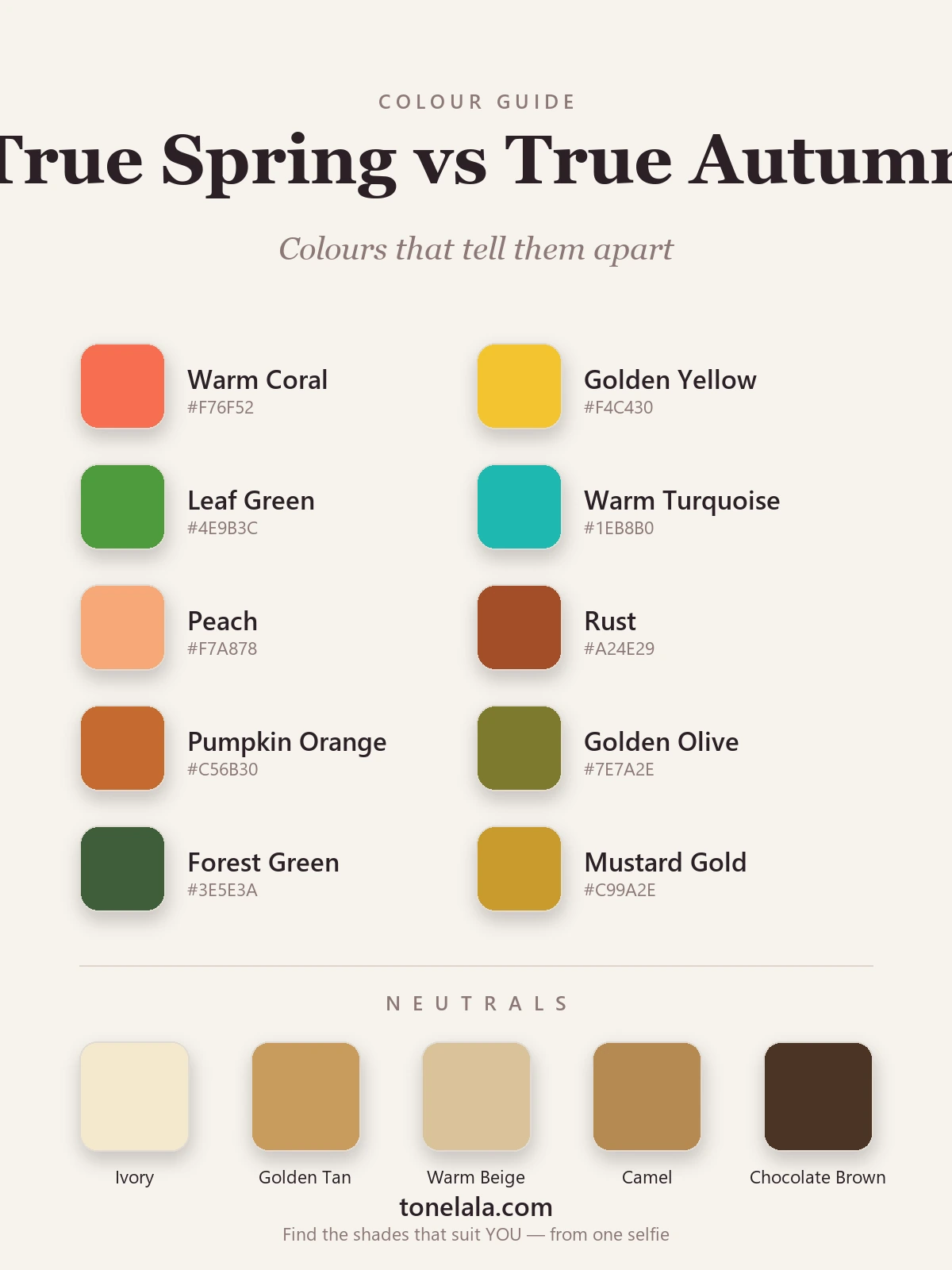
These ten are the ones I reach for when I need to show a client which side of the line they're on, five that lean True Spring, five that lean True Autumn, so the gap in value and chroma does the teaching.
| Color | Hex | Flatters |
|---|---|---|
| Warm Coral | #F76F52 |
True Spring, clear, fresh, lit |
| Golden Yellow | #F4C430 |
True Spring, bright and sunlit |
| Leaf Green | #4E9B3C |
True Spring, vivid, light-to-medium |
| Warm Turquoise | #1EB8B0 |
True Spring, clean, sparkling warmth |
| Peach | #F7A878 |
True Spring, soft but clear and golden |
| Rust | #A24E29 |
True Autumn, deep, roasted, rich |
| Pumpkin Orange | #C56B30 |
True Autumn, saturated and earthy |
| Golden Olive | #7E7A2E |
True Autumn, muted, deep gold-green |
| Forest Green | #3E5E3A |
True Autumn, deep, warm, full |
| Mustard Gold | #C99A2E |
True Autumn, rich, spiced, medium-deep |
Read the table top to bottom and you can feel the temperature stay the same while the depth drops and the colors roast. The first five are clear and sunlit; the last five are deep and earthy. If the top half lights you up and the bottom half looks heavy or muddy against your skin, you're True Spring. If the bottom half makes you glow and the top half reads sharp, thin or unripe, you're True Autumn.
Shared neutrals: Ivory #F4E9CE, Golden Tan #C99B5E, Warm Beige #D9C39A, Camel #B68A52, and Chocolate Brown #4A3526, both seasons live in warm, golden neutrals and skip black entirely, which is exactly why neutrals won't sort them. The lighter end suits Spring better and the deeper end suits Autumn, but the family is shared. You have to look at the colors.
Still not sure, True Spring or True Autumn?
Find your color season →How to tell which you are
Since undertone is shared, you're testing for value and chroma, not warmth. Three things I do with every borderline client:
- Drape clear against deep. Hold a bright warm coral or leaf green to your jaw, then a deep rust or forest green. True Spring skin lifts under the clear color and goes muddy under the deep one. True Autumn does the reverse, the deep color glows and the bright one looks acidic. This single comparison settles most cases.
- Test depth on its own. Try a deep, near-chocolate brown and a rich forest green. If they look balanced and rich on you, you lean True Autumn. If they pull your face down and feel like they're wearing you, you lean True Spring, your value is lighter and wants fresher color.
- Watch what washes you out. A Spring is drained by anything too deep or too dusty, heavy darks make the face look tired and shadowed. An Autumn is let down by anything too light, clear and bright, those colors skim across the skin and read thin. Notice which direction makes you disappear; that's the side you're not on.
One thing that will not help: jewelry. Both seasons wear warm gold beautifully, so the gold-versus-silver test that separates a warm season from a cool one is useless here. Don't waste a drape on it, spend your attention on value and chroma instead.
The trap is reading "muted" as "pale" and "bright" as "neon." True Autumn is muted only in the sense of being deep and complex, never washed-out; True Spring is bright in a clear, golden way, never cool or electric. Both are warm and both glow. The question is depth and clarity, not temperature.
If you're True Spring / If you're True Autumn
If you're True Spring, your magic is in clarity and light. Build from fresh, golden colors, warm coral, golden yellow, leaf green, warm turquoise, peach, kept vivid rather than dusty, with ivory and golden tan doing the everyday work near your face. Deep, roasted earth tones are your one trap; they overshoot your light, clear coloring and cast shadows. The full breakdown, with every hex code and the colors to leave on the rail, is in the True Spring guide.
If you're True Autumn, lean into the richness, rust, pumpkin, golden olive, forest green all light you up, and deep warm neutrals like chocolate brown can play the "dark" role instead of black. Your trap is the opposite: light, clear, sparkling versions look thin and sharp on you, as if someone turned your depth down. Everything you need, including the exact palette and how to wear it, is in the True Autumn guide.
The reliable way to settle it
Here's the honest part: value and chroma are genuinely hard to judge in your own mirror. Lighting lifts or deepens your skin from one room to the next, your hair color skews the read, and years of habit in the wrong depth quietly bias your eye. I've watched people hold up two drapes and talk themselves into the season they already expected rather than the one the color is plainly showing them.
A photo-based analysis sidesteps all of that. It reads your undertone, value and contrast from a clear image of your own face, objectively, without the mirror games, and places you firmly on the Spring or the Autumn side of the line. If you want to go deeper on neighbouring seasons and how the whole system fits together, the rest of our color analysis guides walk through each one. When you're ready to know for certain, find out which you are.
Frequently asked questions
What's the difference between True Spring and True Autumn?
Both are purely warm, so undertone won't separate them, value and chroma do. True Spring is light-to-medium and bright (warm coral, golden yellow, leaf green, fresh and clear). True Autumn is medium-deep and slightly muted (rust, pumpkin, golden olive, rich and earthy). If clear, sunlit colors light you up, you're True Spring; if deep, roasted ones do, you're True Autumn.
Am I a True Spring or True Autumn?
Hold a clear, bright warm color like leaf green or golden yellow to your face, then a deep, earthy one like rust or forest green. If the fresh, vivid color lifts your skin and the deep one drags it down, you're True Spring. If the rich, roasted color lights you up and the bright one looks sharp or thin, you're True Autumn. Value and chroma settle it, the warmth is the same on both.
Which is warmer, True Spring or True Autumn?
They're equally warm, both are golden, blue-free seasons, and True Autumn is often called the most purely warm of all twelve. So warmth won't separate them. The real split is depth and clarity: True Spring is lighter and clearer, True Autumn is deeper and more muted. Asking 'which is warmer' is the wrong question for this pair.
Which is deeper, True Spring or True Autumn?
True Autumn is deeper. Its value runs medium-deep, so it carries rust, forest green and chocolate brown without being swamped. True Spring is light-to-medium and looks best in fresher, lighter color; the deepest True Autumn shades tend to overwhelm a True Spring and pull the face down.
Can you be both True Spring and True Autumn?
No, you're one season. They're neighbours on the warm side, so plenty of people sit near the line and flatter a few colors from each. If light, clear colors look best but a couple of richer ones also work, you're likely a True Spring leaning warm-deep; the reverse means a True Autumn leaning lighter. A proper analysis places you firmly on one side.
How can I tell if I'm True Spring or True Autumn?
Three quick tests: drape a clear bright warm color against a deep earthy one and see which brightens your skin; check whether deep rust and forest green look balanced on you or heavy; and notice whether fresh, vivid colors feel right or a touch sharp. Lighting and habit make value and chroma hard to judge in your own mirror, so a photo-based analysis is the reliable way to settle it.
Related guides
Deep Winter vs True Autumn: How to Tell the Difference
A color analyst on Deep Winter vs True Autumn, how they differ on undertone, value and chroma, the colors that separate them, and how to tell which you are.

Soft Autumn vs True Summer: How to Tell the Difference
A color analyst on Soft Autumn vs True Summer, the two dials that separate them, the colors that tell them apart, and how to decide which you are.

True Autumn vs Deep Autumn: How to Tell the Difference
True Autumn vs Deep Autumn explained: undertone, value and chroma, the colors that separate them, and how to tell which season you really are.

Soft Autumn vs True Autumn: How to Tell the Difference
Soft Autumn vs True Autumn, explained by a color analyst, how they differ on undertone, value and chroma, the colors that separate them

True Spring vs Light Spring: How to Tell the Difference
True Spring vs Light Spring, explained by a color analyst: how undertone, value and chroma differ, the colors that separate them

Bright Spring vs True Spring: How to Tell the Difference
A color analyst on Bright Spring vs True Spring, how they differ on undertone, value and chroma, the colors that separate them
Prefer in person? Find color analysis near you
Browse local color analysts by city, or get the same season, palette and best-colors breakdown online from one selfie.
See your colors on a photo of you
Upload one selfie and ToneLala reveals your season, your full palette, and your best hair, makeup, jewelry and outfits, styled on you.