In a sentence: Soft Summer and Light Summer are both cool and gentle, the difference is that Light Summer is lighter and slightly clearer, while Soft Summer is deeper and more muted. Skip to the distinguishing palette or find out which you are.
Soft Summer vs Light Summer: How to Tell the Difference
By ToneLalaUpdated July 12, 2026
Contents
A client once spread her two favorite jumpers on my table, a powder blue and a smoky slate blue, and asked me which one was "more her." That single question is the whole Soft Summer versus Light Summer problem in miniature. They're neighbours on the color wheel, both cool, both soft, both allergic to anything black or neon. So people read one description, nod along, then read the other and nod just as hard.
The thing that trips everyone up is that the two seasons share an undertone. When undertone matches, you can't lean on the usual warm-versus-cool test to separate them, you have to look at the other two dials instead. Get those straight and the confusion clears up fast.
Soft Summer vs Light Summer: the core difference
Every season sits on three dials: undertone (warm or cool), value (light or dark), and chroma (clear or muted). Here's how these two compare on each.
- Undertone: a tie. Both are cool, and both sit at the most neutral, gentle end of cool. Neither is icy. This is exactly why undertone won't help you choose between them, and why so many quizzes get it wrong.
- Value: this is the first real separator. Light Summer is light; the whole palette stays pale and luminous. Soft Summer is medium: a clear step deeper. Line up the darkest color from each and Soft Summer's reads richer and smokier while Light Summer's stays airy.
- Chroma: this is the deciding dial. Soft Summer is muted, heavily so; every color looks as though a drop of gray was mixed in. Light Summer is soft-to-medium: gently muted but a touch clearer, with a quiet freshness Soft Summer doesn't have.
Put simply: imagine the same cool blue painted three ways. Light Summer is the pale, slightly hazy version. Soft Summer is the same blue knocked back with gray and deepened a shade. The closer a color sits to a clear pastel, the more it belongs to Light Summer. The smokier and more grayed it gets, the more it tips into Soft Summer.
The colors that tell them apart
These are the shades that do the separating, the ones where, side by side, you can actually see which way your face leans.
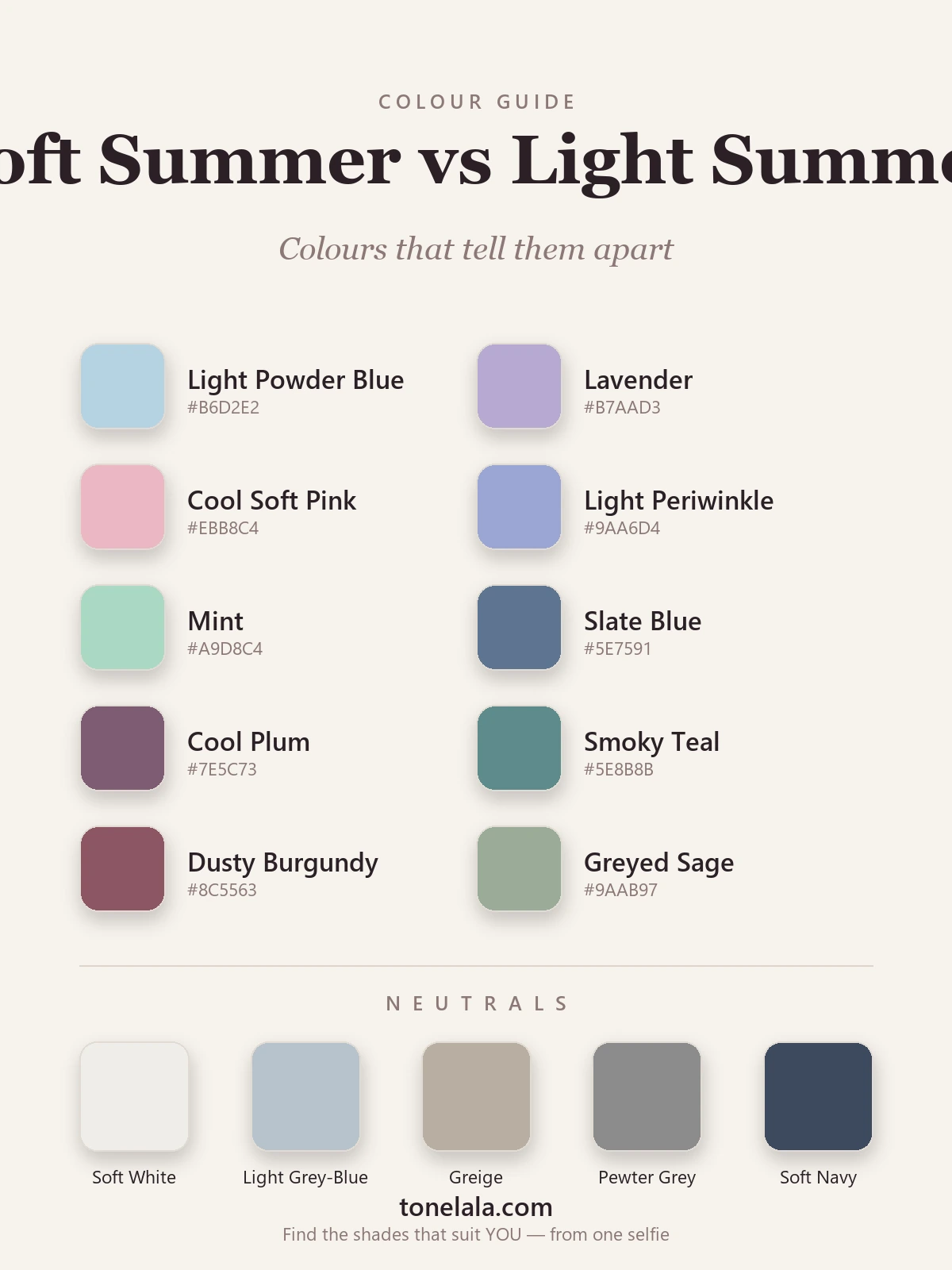
| Color | Hex | Flatters |
|---|---|---|
| Light Powder Blue | #B6D2E2 |
Light Summer, pale and airy |
| Lavender | #B7AAD3 |
Light Summer, soft and luminous |
| Cool Soft Pink | #EBB8C4 |
Light Summer, clear pastel |
| Light Periwinkle | #9AA6D4 |
Light Summer, light and gently clear |
| Mint | #A9D8C4 |
Light Summer, fresh and pale |
| Slate Blue | #5E7591 |
Soft Summer, muted and medium |
| Cool Plum | #7E5C73 |
Soft Summer, deep and grayed |
| Smoky Teal | #5E8B8B |
Soft Summer, hushed, low-saturation |
| Dusty Burgundy | #8C5563 |
Soft Summer, rich and muted |
| Grayed Sage | #9AAB97 |
Soft Summer, soft, drop-of-gray green |
Shared neutrals: Soft White #EFEDE8, Light Gray-Blue #B6C2CB, Greige #B8AEA1, Pewter Gray #8C8C8C and Soft Navy #3E4A5E, both seasons live here happily, with Light Summer leaning to the lighter end and Soft Summer to the deeper.
Still not sure, Soft Summer or Light Summer?
Find your color season →How to tell which you are
The two seasons are close enough that one quick glance won't settle it. These four tests will.
- Drape the same color twice. Take one cool color in a pale clear version and a smoky grayed version, a powder blue and a slate blue work well. Hold each under the chin in daylight. The one that calms your face and evens your skin is pointing at your season: clear pastel means Light, grayed and deeper means Soft.
- See whether bright pastels overwhelm you. A clear lavender or cool pink either lifts a Light Summer or quietly overpowers a Soft Summer. If pastels feel like a shade too much and you instinctively want them dialled down, you're Soft.
- Read your overall value. Stand back from the mirror and half-close your eyes. Light Summers tend to read light and blended overall, hair, skin and eyes all in a gentle, pale range. Soft Summers read a touch deeper and smokier, with a little more depth across the board.
- Notice what washes you out. Light Summer fades when colors get too deep or saturated; the face looks heavy under them. Soft Summer fades when colors get too bright or too pale-and-clear; clarity drains it. Whichever direction leaves you looking tired tells you which side you're not on.
If you're Soft Summer / If you're Light Summer
If you're Soft Summer, your home is the muted, medium-depth end, slate blue, cool plum, smoky teal, dusty burgundy and grayed sage, all with that signature drop of gray. Bright clarity overwhelms you, and so does too much paleness; your colors want to look hushed. Build from the deeper neutrals and let the smoky shades sit closest to your face. Your full set of colors, neutrals and shades to avoid lives in the Soft Summer guide.
If you're Light Summer, your home is the light, gently clear end, powder blue, lavender, cool soft pink, light periwinkle and mint, all pale and airy. Depth is what drains you, not brightness, so keep your darks soft and your colors luminous. Let a pale color sit nearest your face and lean on the lighter neutrals. Everything you need is in the Light Summer guide.
The reliable way to settle it
When two seasons share an undertone, the honest truth is that a bathroom mirror rarely settles it. Value and chroma are subtle to judge by eye, daylight shifts through the day, and we're all a little biased about our own faces, which is why the same person can come away convinced of one season on Monday and the other by Friday. A photo-based analysis takes the guesswork out: it reads your undertone, value and contrast from a clear picture and places you on the right side of the line, then builds the palette on an image of you rather than a generic swatch card. If you want to go deeper on either season, or any of the ones they border, start with the color analysis guides, then find your own season.
Frequently asked questions
What is the difference between Soft Summer and Light Summer?
Both are cool, gentle summer seasons, so the difference comes down to value and chroma. Light Summer is lighter and a touch clearer, pale, airy colors like powder blue and soft rose. Soft Summer is a step deeper and noticeably more muted, grayed colors like slate blue and cool plum that look as though a drop of gray was stirred in.
Am I Soft Summer or Light Summer?
Hold a clear pastel against your face, then a smoky, grayed version of the same color. If the pale clear shade lifts your face, you're likely Light Summer. If the bright pastel feels like a touch too much and the grayed one looks calmer and more flattering, you're Soft Summer. The deciding traits are value (Light is lighter) and chroma (Soft is more muted).
Is Soft Summer or Light Summer deeper?
Soft Summer is deeper. It sits at a medium value, while Light Summer is genuinely light. Put their darkest colors side by side and Soft Summer's read noticeably richer and smokier, while Light Summer's stay pale and luminous.
Is Light Summer cooler than Soft Summer?
They're about equally cool, both are the most neutral of the cool seasons, so neither is icy. The real separation is chroma, not undertone: Light Summer carries a little more clarity, and Soft Summer is the more muted of the two.
Can you be both Soft Summer and Light Summer?
You land in one or the other, but many people sit right on the border and can borrow a few colors from each. If you flatter the lightest, clearest end of both palettes, you're Light Summer; if the grayed, smoky colors suit you best, you're Soft Summer. A photo-based analysis settles a borderline case.
How can I tell if I'm Soft Summer or Light Summer at home?
Drape a clear pastel and a grayed version of it in daylight, with no makeup, and watch which calms your face. Check whether bright pastels overwhelm you (Soft) or flatter you (Light), and notice your natural contrast, Light Summers tend to read lighter overall, Soft Summers a little deeper and more blended.
Related guides
Soft Autumn vs True Summer: How to Tell the Difference
A color analyst on Soft Autumn vs True Summer, the two dials that separate them, the colors that tell them apart, and how to decide which you are.
Soft Summer vs Soft Autumn: How to Tell the Difference
A color analyst on Soft Summer vs Soft Autumn, the one difference that separates them, the colors that tell them apart, and how to decide which you are.

Soft Summer vs True Summer: How to Tell the Difference
Soft Summer vs True Summer, explained by a color analyst: how they differ on undertone, value and chroma, the colors that separate them

Light Summer vs Light Spring: How to Tell the Difference
A color analyst on Light Summer vs Light Spring, how they differ on undertone, value and chroma, the colors that separate them
True Summer vs Light Summer: How to Tell the Difference
A color analyst on True Summer vs Light Summer, how they differ on value and chroma, the colors that separate them, and how to tell which one you are.

Soft Summer Color Palette: The Complete Guide (with Hex Codes)
The complete Soft Summer color palette, 30+ colors with hex codes, neutrals and metals, an at-a-glance profile, Soft Summer vs Soft Autumn and Light Summer, makeup, hair and a capsule wardrobe.
Prefer in person? Find color analysis near you
Browse local color analysts by city, or get the same season, palette and best-colors breakdown online from one selfie.
See your colors on a photo of you
Upload one selfie and ToneLala reveals your season, your full palette, and your best hair, makeup, jewelry and outfits, styled on you.