In a sentence: Soft Autumn and Deep Autumn are both warm, the difference is depth, so Soft Autumn is light and muted while Deep Autumn is dark and rich. Skip to the distinguishing palette or find out which you are.
Soft Autumn vs Deep Autumn: How to Tell the Difference
By ToneLalaUpdated July 13, 2026
Contents
Two women, both unmistakably warm-toned, both flattered by camel and olive, and yet one looks washed out in a deep oxblood while the other looks like the color was made for her. That single difference is the whole story of Soft Autumn versus Deep Autumn, and it trips up more people than any other pair in the Autumn family.
The confusion is fair. They share an undertone, they share a season name, and they share a love of earthy color. What they don't share is depth. Once you stop hunting for "warm vs cool" and start looking at how light or dark someone reads overall, these two pull apart fast.
Soft Autumn vs Deep Autumn: the core difference
Start with undertone, because here it barely matters. Both seasons are warm. Soft Autumn is the most neutral-warm of the Autumns, so its warmth is gentle and earthy; Deep Autumn is solidly warm with a touch of depth borrowed from Winter. Neither is cool. If you've been trying to separate them on undertone alone, that's why you keep going in circles.
The real split is value: how light or dark the coloring is. Soft Autumn is light to medium. Hair, eyes and skin tend to sit close together on the value scale, which is what gives Soft Autumns their hazy, low-contrast look. Deep Autumn is dark. The hair reads genuinely deep, often against fairer or olive skin, so the overall impression has weight and shadow to it.
Chroma: how clear or muted a color is, moves with value here. Soft Autumn is muted; its colors look as though a fine gray veil has been laid over them. Deep Autumn is richer and more saturated; its colors are dense and full-bodied. So Soft Autumn is light and soft, Deep Autumn is dark and rich. Get those two words right for a person and you've almost always got the season right.
The colors that tell them apart
These ten shades are the ones I reach for when I need to see which way someone leans. Each is a color where one season clearly wins.
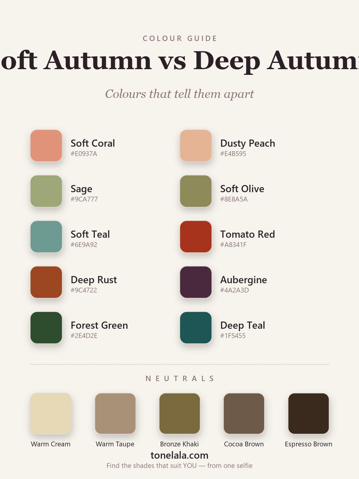
| Color | Hex | Flatters |
|---|---|---|
| Soft Coral | #E0937A |
Soft Autumn, light, grayed warmth |
| Dusty Peach | #E4B595 |
Soft Autumn, gentle and pale |
| Sage | #9CA777 |
Soft Autumn, muted, low-saturation green |
| Soft Olive | #8E8A5A |
Soft Autumn, softened earth tone |
| Soft Teal | #6E9A92 |
Soft Autumn, hazy, medium-value blue-green |
| Tomato Red | #A8341F |
Deep Autumn, saturated, full-bodied warm red |
| Deep Rust | #9C4722 |
Deep Autumn, dense, dark warmth |
| Aubergine | #4A2A3D |
Deep Autumn, dark, rich, near-Winter depth |
| Forest Green | #2E4D2E |
Deep Autumn, deep, saturated green |
| Deep Teal | #1F5455 |
Deep Autumn, dark, intense blue-green |
The pattern is the trick. Look at Soft Teal beside Deep Teal, or Soft Olive beside Forest Green: same warm family, wildly different depth. The shade that makes your skin look clear and even is pointing you to your season.
Shared neutrals: Warm Cream #E7D7B6, Warm Taupe #A89177, Bronze Khaki #7A6A3C, Cocoa Brown #6F5A48 and Espresso Brown #3A2A1E. These run from light to deep, so a Soft Autumn lives in the top of that range and a Deep Autumn in the bottom.
Still not sure, Soft Autumn or Deep Autumn?
Find your color season →How to tell which you are
Four checks I'd run, in good daylight, hair off your face and no makeup:
Drape light against dark. Hold a soft, pale shade (dusty peach, sage) under your chin, then a deep one (forest green, aubergine). A Soft Autumn looks fresh in the pale shade and a little shadowed under the eyes in the deep one. A Deep Autumn looks flat in the pale shade and lifted by the deep one. Whichever leaves your skin looking clear rather than tired is your side.
Measure your own contrast. Take a clear, well-lit photo of your bare face and look at the gap between your hair and your skin. Small gap, everything blending softly, that's Soft Autumn. Obvious gap, dark hair standing away from the skin, that's Deep Autumn.
Try jewelry, but as a depth test, not a metal test. Both seasons wear gold beautifully, so don't expect gold-vs-silver to decide it. Instead notice whether fine, antique gold suits you better (Soft Autumn) or bold, deep gold and bronze hold their own next to your face without looking lost (Deep Autumn).
Watch what washes you out. Soft Autumns get overwhelmed by anything strong and saturated, a true rich rust can swallow the face. Deep Autumns get drained by anything pale and dusty, a soft sage can make the skin look gray. The color that overpowers you is the one from the other season.
If you're Soft Autumn / If you're Deep Autumn
If you're Soft Autumn, your colors are the gentle, grayed-down earth tones, camel, soft coral, sage, soft olive, warm taupe. Keep saturation low and value light-to-medium, and let outfits stay tonal rather than high-contrast. Pairing a deep neutral with a soft pastel often does more for you than two strong colors fighting it out. The full breakdown, with hex codes and what to avoid, is in the Soft Autumn guide.
If you're Deep Autumn, you get the richest end of warm, deep rust, tomato red, forest green, aubergine, espresso. You can carry depth and contrast that would flatten a Soft Autumn, so lean into dark, saturated shades and let espresso or deep warm navy do the work black does for other people. Your complete palette lives in the Deep Autumn guide.
The reliable way to settle it
Draping at the mirror gets you close, but value and contrast are genuinely hard to judge on your own face, lighting lies, and we all see ourselves through habit. A photo-based analysis takes that guesswork out: it reads your undertone, measures how light or dark you actually are, and checks the contrast between your features, then places you in the season whose depth matches yours. That's the difference between thinking you're Soft Autumn and knowing it.
If you want it done properly, find your color season from two photos. And if you're weighing up other look-alikes, Soft Autumn against the cooler Soft Summer, or Deep Autumn against Deep Winter, the rest of the color analysis guides walk through every neighbouring pair the same way.
Frequently asked questions
What's the difference between Soft Autumn and Deep Autumn?
Both are warm seasons, so the split isn't really about undertone, it's about value and chroma. Soft Autumn is light-to-medium and muted, built from grayed-down earth tones like camel, sage and soft coral. Deep Autumn is dark and richer, built from saturated earth tones like deep rust, forest green and aubergine. Light and soft means Soft Autumn; dark and rich means Deep Autumn.
Am I Soft Autumn or Deep Autumn?
Look at your overall depth and contrast first. If your hair, eyes and skin sit close together in value with a gentle, hazy quality, you're likely Soft Autumn. If your hair reads genuinely dark against your skin and rich colors look right on you, you're likely Deep Autumn. The fastest reliable answer comes from a photo-based analysis that measures your value and contrast properly.
Which is deeper, Soft Autumn or Deep Autumn?
Deep Autumn, clearly, depth is the whole point of it. Deep Autumn coloring is darker and higher in contrast, and it can carry the strongest, darkest colors of the Autumn family. Soft Autumn is the lightest and gentlest, which is exactly why deep, saturated shades tend to overwhelm it.
Can you be both Soft Autumn and Deep Autumn?
No, you land in one. You can sit near the border, though, because both share True Autumn as a neighbour, so a few warm earth tones flatter either one. When you're on the line, your best colors come from the season whose value matches yours: lighter and softer for Soft Autumn, darker and richer for Deep Autumn.
How do I tell Soft Autumn from Deep Autumn with draping?
Hold a light, muted shade like sage or dusty peach near your face, then a deep, rich shade like forest green or aubergine. On a Soft Autumn the deep color adds weight and shadow under the eyes; on a Deep Autumn the muted color looks flat and washed-out while the rich one makes the face come forward. Watch which one makes your skin look clear rather than tired.
Related guides
Deep Winter vs True Autumn: How to Tell the Difference
A color analyst on Deep Winter vs True Autumn, how they differ on undertone, value and chroma, the colors that separate them, and how to tell which you are.
Soft Autumn vs True Summer: How to Tell the Difference
A color analyst on Soft Autumn vs True Summer, the two dials that separate them, the colors that tell them apart, and how to decide which you are.

True Autumn vs Deep Autumn: How to Tell the Difference
True Autumn vs Deep Autumn explained: undertone, value and chroma, the colors that separate them, and how to tell which season you really are.

Soft Summer vs Soft Autumn: How to Tell the Difference
A color analyst on Soft Summer vs Soft Autumn, the one difference that separates them, the colors that tell them apart, and how to decide which you are.
Deep Autumn vs Deep Winter: How to Tell the Difference
Deep Autumn vs Deep Winter, settled by a color analyst: how they split on undertone, value and chroma, the colors that separate them
Soft Autumn vs True Autumn: How to Tell the Difference
Soft Autumn vs True Autumn, explained by a color analyst, how they differ on undertone, value and chroma, the colors that separate them
Prefer in person? Find color analysis near you
Browse local color analysts by city, or get the same season, palette and best-colors breakdown online from one selfie.
See your colors on a photo of you
Upload one selfie and ToneLala reveals your season, your full palette, and your best hair, makeup, jewelry and outfits, styled on you.