In a sentence: True Winter is the cool, deep, bright, high-contrast season, the most purely cool of all twelve. Your palette is built from icy, blue-based colors, true red, royal blue, emerald, fuchsia, plus the crisp neutrals most seasons can't pull off: black and true white. Skip to the full palette with hex codes or find your own season.
True Winter Color Palette: The Complete Guide (with Hex Codes)
By ToneLalaUpdated July 2, 2026

Contents
The thing I notice first with a True Winter is the coolness, not just cool skin, but a clean, blue-based clarity across the whole face, usually paired with dark hair and bright, well-defined eyes. There's no warmth to soften the edges. And when I drape a warm color against that face, the reaction is immediate: the skin goes gray, the eyes dull, the person looks faintly unwell. Then I swap in a true blue-red or an icy pink and everything sharpens, the contrast that was always there suddenly has something to push against. True Winter isn't cold. It's crisp, and it wants color that's crisp right back.
This guide is the version I wish more sites wrote: actual hex codes, the colors that genuinely drain you, and an honest section on how to tell whether you're really a True Winter or one of the cool seasons it gets confused with.
What "True Winter" actually means
True Winter (sometimes just called Cool Winter) is one of the twelve seasons in personal color analysis. Every season sits on three dials, and a True Winter color analysis lands the same way each time:
- Undertone: cool or warm. True Winter is cool, and not cool-leaning-anything: it's the most purely cool season on the wheel, sitting at the icy, blue-based end of the dial. This is the trait that separates it from its Winter neighbours.
- Value: light or dark. True Winter is deep.
- Chroma: bright or muted. True Winter is bright and clear: saturated jewel tones, never grayed-down.
Add those up and you get very high contrast: deep, cool, vivid coloring that's flattered by deep, cool, vivid color. Where Deep Winter is a jewel box turned dark and faintly neutral, True Winter is an icy spotlight, the coolest version of all of it, blue-based and crystal-clear. That pure-cool clarity is the heart of the true winter color palette, and it's the single trait that should steer every choice you make.
The palette
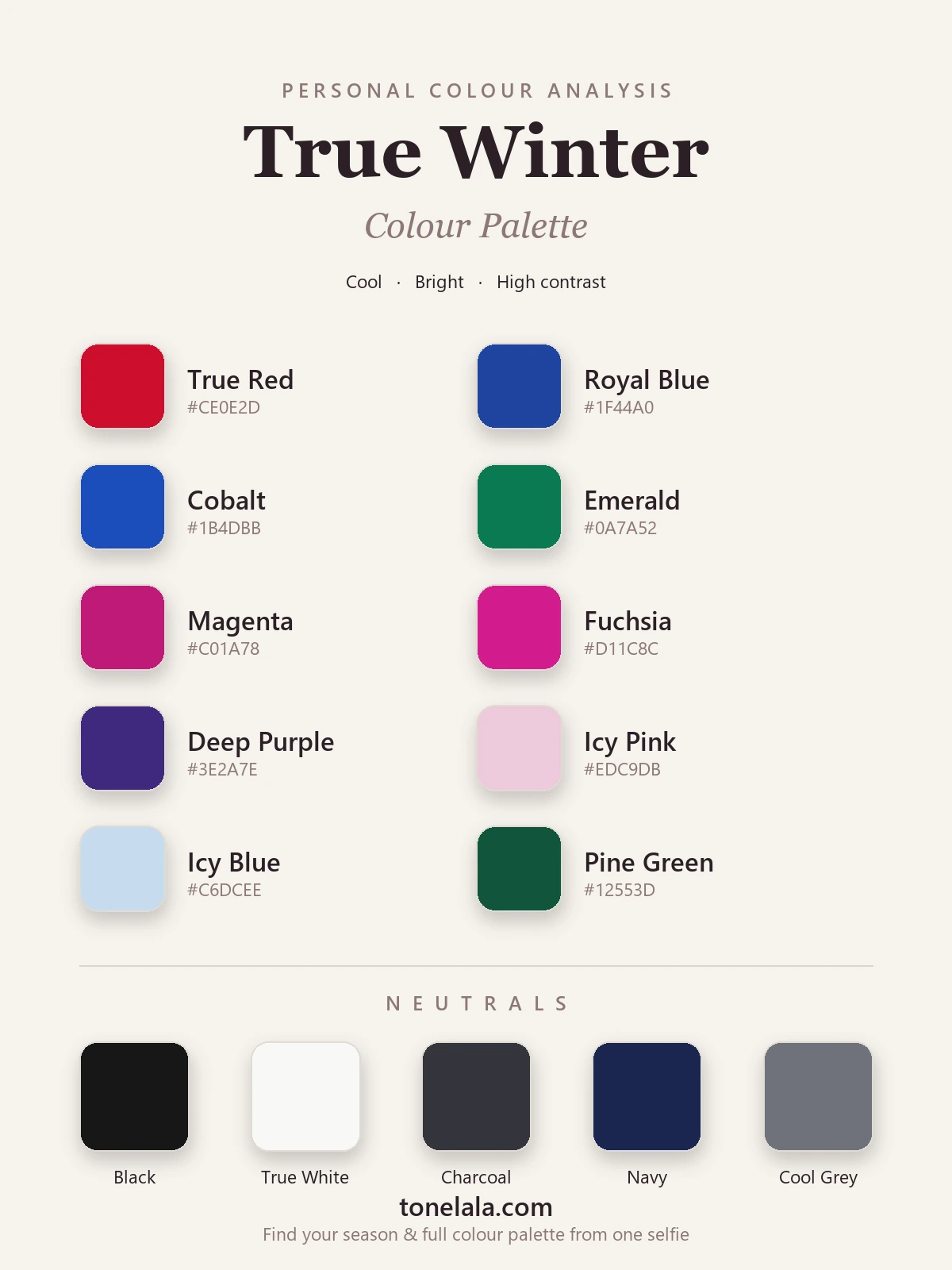
Clear, icy, cool. Every color has a blue-based, jewel-like intensity, nothing warm or muddied anywhere.
Your best colors
| Color | Hex |
|---|---|
| True Red | #CE0E2D |
| Royal Blue | #1F44A0 |
| Cobalt | #1B4DBB |
| Emerald | #0A7A52 |
| Magenta | #C01A78 |
| Fuchsia | #D11C8C |
| Deep Purple | #3E2A7E |
| Icy Pink | #EDC9DB |
| Icy Blue | #C6DCEE |
| Pine Green | #12553D |
Your neutrals: and here's the True Winter superpower: black #171717 and true white #F8F8F5 genuinely flatter you, and the two together make a high-contrast pairing that looks effortless on you and overwhelming on softer seasons. Round it out with Charcoal #34353B, Navy #1B2750 and Cool Gray #6F727A.
Your metals: silver, white gold and platinum, cool and bright, to match your icy clarity. Yellow gold pulls warm and slightly sallow against you.
Not sure True Winter is actually your season?
Find your color season →Colors to avoid (and why)
These don't just underwhelm, they actively fight your coloring:
- Warm earthy tones: camel, mustard, olive, terracotta, rust and warm gold belong to Autumn; against your icy coolness they turn muddy and pull the skin sallow.
- Muted & dusty tones: sage, dusty rose, mushroom, anything grayed-down reads as "tired" on bright, high-contrast coloring.
- Warm, weak pastels: butter yellow, peach, hazy apricot. Your icy pastels work because they're cool and crisp; warm soft ones collapse next to your contrast.
The mirror test: if a color turns your skin sallow or your features softer than the garment, it's too warm or too muted for you.
How to know you're actually a True Winter
True Winter borders three seasons that fool people constantly:
- True Winter vs Deep Winter: both cool and high-contrast. True Winter is the purer, icier cool, living on crisp blue-based brights and icy pastels; Deep Winter leans darker and slightly more neutral, owning the deepest jewel tones. If your best colors are icy and clear rather than deep and rich, lean True.
- True Winter vs Bright Winter: both cool and very clear. True Winter is a touch deeper and cooler; Bright Winter is a shade brighter with a faint cool-neutral edge that lets it go fully electric. If pure icy coolness suits you better than charged-up vividness, you're True.
- True Winter vs Cool (True) Summer: both genuinely cool, so undertone won't separate them. Chroma and contrast do: Winter is far brighter and higher-contrast, flattered by clear jewel tones and black-and-white; Cool Summer is soft and gentle, flattered by muted, dusty cools. Bright and dramatic → True Winter.
One more: if you love the coolness here but the brightest jewel tones feel a touch much, and an even more electric, slightly-warmer-cool suits you better, you may belong to the brighter, lighter Bright Winter instead. The reliable way to settle any of these is a draping session or a photo-based analysis that reads your undertone, value and contrast for you.
True Winter makeup
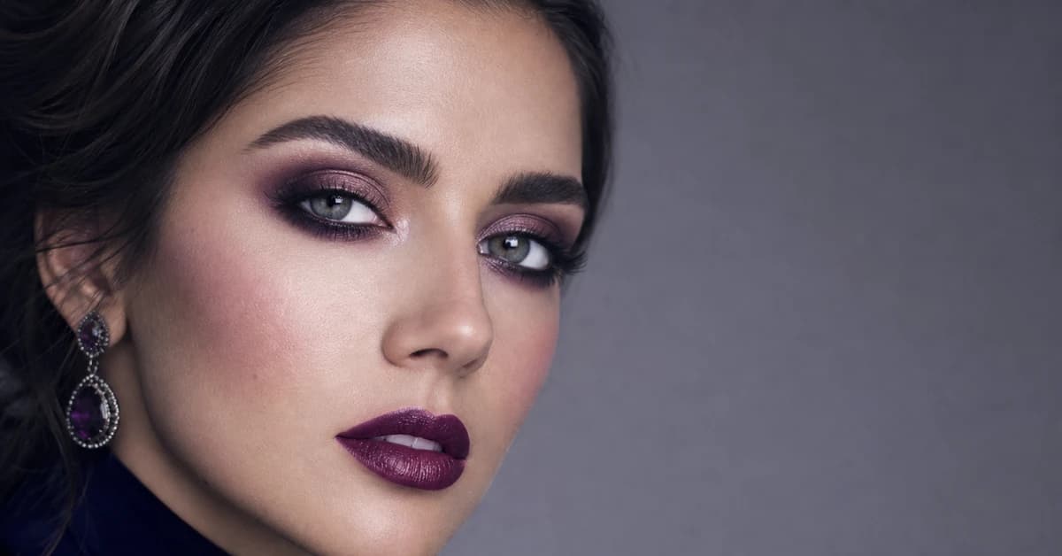
True Winter makeup can go crisp and bold where warmer seasons can't. For lips, reach for true red, blue-red, fuchsia and cool berry: clear and saturated, never muddied. Blush wants a cool rose or berry that mirrors the lip rather than a warm peach. On the eyes, charcoal, cool plum, navy and emerald are stunning, and True Winter is one of the few seasons that can wear a true black liner and a sharp winged line without it overpowering the face. What to avoid: warm corals, peachy nudes, bronzes and anything golden, they pull warm against your icy undertone and smudge out the clarity that's your whole signature.
True Winter hair colors
True Winter hair is cool and deep, with built-in contrast: blue-black, true cool dark brown, or a deep cool espresso all let your features lead. A clean, ashy near-black reads beautifully crisp on you. What fights this season is warmth, golden, caramel, honey and copper highlights pull your coloring off-balance and turn the skin sallow, and warm "lived-in" balayage dulls the clean contrast you're built around. The most common mistake I see is a True Winter who's added warm dimension to "soften" things, and it does the opposite of soften, it just muddies the face. If you want movement in your color, ask your colorist for cool, clear tone rather than warm balayage.
True Winter celebrities, and why the lists never agree
Search "True Winter celebrities" and you'll find the same famous faces sorted three different ways across different sites. That's not because anyone's wrong, it's because celebrity typing is done from photos under wildly varying light, makeup and dyed hair, all of which change how someone reads on camera. A naturally True Winter person shot in warm studio light with caramel highlights can easily read Deep Autumn or Deep Winter in a single frame.
So celebrity examples are fun for inspiration, but a shaky way to type yourself. True Winter is defined by your own cool undertone, deep value and bright, high chroma, not by whether you resemble a particular star. The only reliable read is a proper color analysis on a clear photo of your own face.
Putting it to work
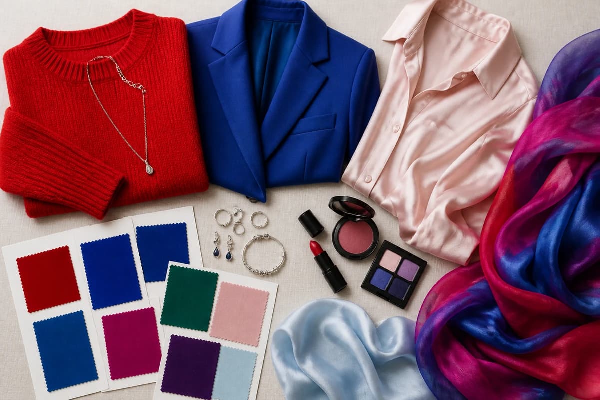
Build a small capsule from two neutrals + three colors you actually love, say black and true white, with true red, royal blue and emerald. Everything mixes, because everything shares the same cool, icy DNA. Let one clear color carry the outfit against a crisp neutral and you're done: black with true red, true white with cobalt, navy with icy pink. Lean into the contrast instead of fighting it, on you, that crisp coolness reads as effortless, not severe.
Frequently asked questions
What is the True Winter color palette?
True Winter is the purest, coolest of the twelve seasons, cool, deep and bright, with very high contrast. The palette is built from clear, icy-cool colors: true red, royal blue, emerald, magenta and fuchsia, plus icy pastels and the crisp neutrals black and true white. Nothing warm, muted or earthy.
Is True Winter warm or cool?
Cool, more purely cool than any other season. Where Deep Winter carries a hint of neutral depth and Bright Winter leans cool-neutral, True Winter sits at the icy, blue-based extreme of the undertone dial. If true-blue reds and icy pastels flatter you and every warm tone turns sallow, you're reading cool.
What's the difference between True Winter and Deep Winter?
Both are cool and high-contrast. True Winter is the purer, icier cool, it owns the crisp, blue-based brights and icy pastels. Deep Winter leans darker and slightly more neutral, so it carries the deepest jewel tones (pine, deep emerald, sapphire) as comfortably as the brights. Iciest cool → True Winter; deepest and a touch neutral → Deep Winter.
How do I know if I'm a True Winter and not a Cool Summer?
Both are cool, so undertone alone won't separate them, chroma and contrast do. True Winter is bright and high-contrast: clear jewel tones and black-and-white look striking on you. Cool (True) Summer is softer and lower-contrast, flattered by muted, dusty cools. Bright and dramatic → True Winter; soft and gentle → Cool Summer.
What makeup is best for a True Winter?
Clear, cool and crisp: true-red, blue-red, fuchsia or cool-berry lips; a cool rose or berry blush; and sharp eye shades like charcoal, cool plum, navy and emerald. A true black liner works beautifully. Skip warm corals, peachy nudes, bronzes and golden tones, they pull warm and mute your icy clarity.
Related guides
True Winter Makeup: Best Shades for Lips, Eyes & Cheeks
A color analyst's True Winter makeup guide, best lip, blush and eye shades with hex codes, foundation undertone tips, and the warm shades to avoid.

Deep Winter vs True Autumn: How to Tell the Difference
A color analyst on Deep Winter vs True Autumn, how they differ on undertone, value and chroma, the colors that separate them, and how to tell which you are.

Deep Winter vs True Winter: How to Tell the Difference
Deep Winter vs True Winter, explained by a color analyst: how they differ on undertone, value and chroma, the colors that separate them

Deep Winter Color Palette: The Complete Guide (with Hex Codes)
A color analyst's complete Deep Winter (Dark Winter) guide, your exact palette with hex codes, best neutrals and metals, colors to avoid

True Winter Celebrities
A color analyst on True Winter celebrities, the cool, deep, high-contrast look, why the lists disagree, the palette they share, and how to type yourself.

Cool Winter Color Palette (a.k.a. True Winter)
A color analyst on the Cool Winter palette, why it's the same season as True Winter, your exact colors with hex codes, best neutrals and metals
Prefer in person? Find color analysis near you
Browse local color analysts by city, or get the same season, palette and best-colors breakdown online from one selfie.
See your colors on a photo of you
Upload one selfie and ToneLala reveals your season, your full palette, and your best hair, makeup, jewelry and outfits, styled on you.