In a sentence: Deep Winter and True Winter are both cool, deep and high-contrast, the difference is that True Winter is the purest, iciest cool (crisp blue-based brights, clear pastels), while Deep Winter runs darker and slightly more neutral, owning the deepest jewel tones. Skip to the distinguishing palette or find out which you are.
Deep Winter vs True Winter: How to Tell the Difference
By ToneLalaUpdated July 13, 2026

Contents
I drape these two seasons back to back more than almost any other pair. The client sits down, clearly cool, clearly high-contrast, clearly a Winter, and the only question left is which kind. That last step trips people up because Deep Winter and True Winter share so much: the same dark hair, the same cool skin, the same way black and true white look striking instead of harsh. On paper they read almost identical.
The split is real, though, and it lives in two of the three dials color analysts work with: chroma and depth. Get those right and the rest of your wardrobe falls into place. Get them wrong and you spend years in colors that are almost right, close enough to look fine, never close enough to look like the room leans in. Here's exactly how the two differ, the colors that pull them apart, and how to tell which one is yours.
Deep Winter vs True Winter: the core difference
Every season sits on three dials, undertone (cool/warm), value (light/dark) and chroma (bright/muted). Deep Winter and True Winter agree on the first and disagree, gently, on the rest.
- Undertone. Both are cool. True Winter is the most purely cool season on the wheel, blue-based, icy, with nothing to soften the edges. Deep Winter is cool with a faint whisper of neutral depth, and that whisper is what makes it "deep" rather than icy-bright. Neither is warm. If warm colors turn your skin sallow, you're somewhere in this pair.
- Value. Both are deep/dark: but value is Deep Winter's headline trait. Its whole palette sits darker, leaning on the richest, most saturated versions of every cool color. True Winter is also dark, yet it balances those depths against clear, light icy pastels.
- Chroma. This is the cleanest tell. True Winter is bright and crystal-clear: crisp, blue-based, jewel-like, never grayed. Deep Winter is clear too, but a shade quieter and darker, which lets it carry the deepest jewel tones without them turning flat.
The shorthand I use with clients: True Winter is an icy spotlight: the coolest, brightest version of Winter, blue-based and sharp. Deep Winter is a jewel box: the same coolness turned a touch darker and richer, so the deepest emeralds, sapphires and wines come alive. Same family, two different intensities of the same cool DNA.
The colors that tell them apart
These ten are the swatches I actually reach for when I'm deciding between the two. Each leans toward one season, wear them side by side and the lean becomes obvious on your face.
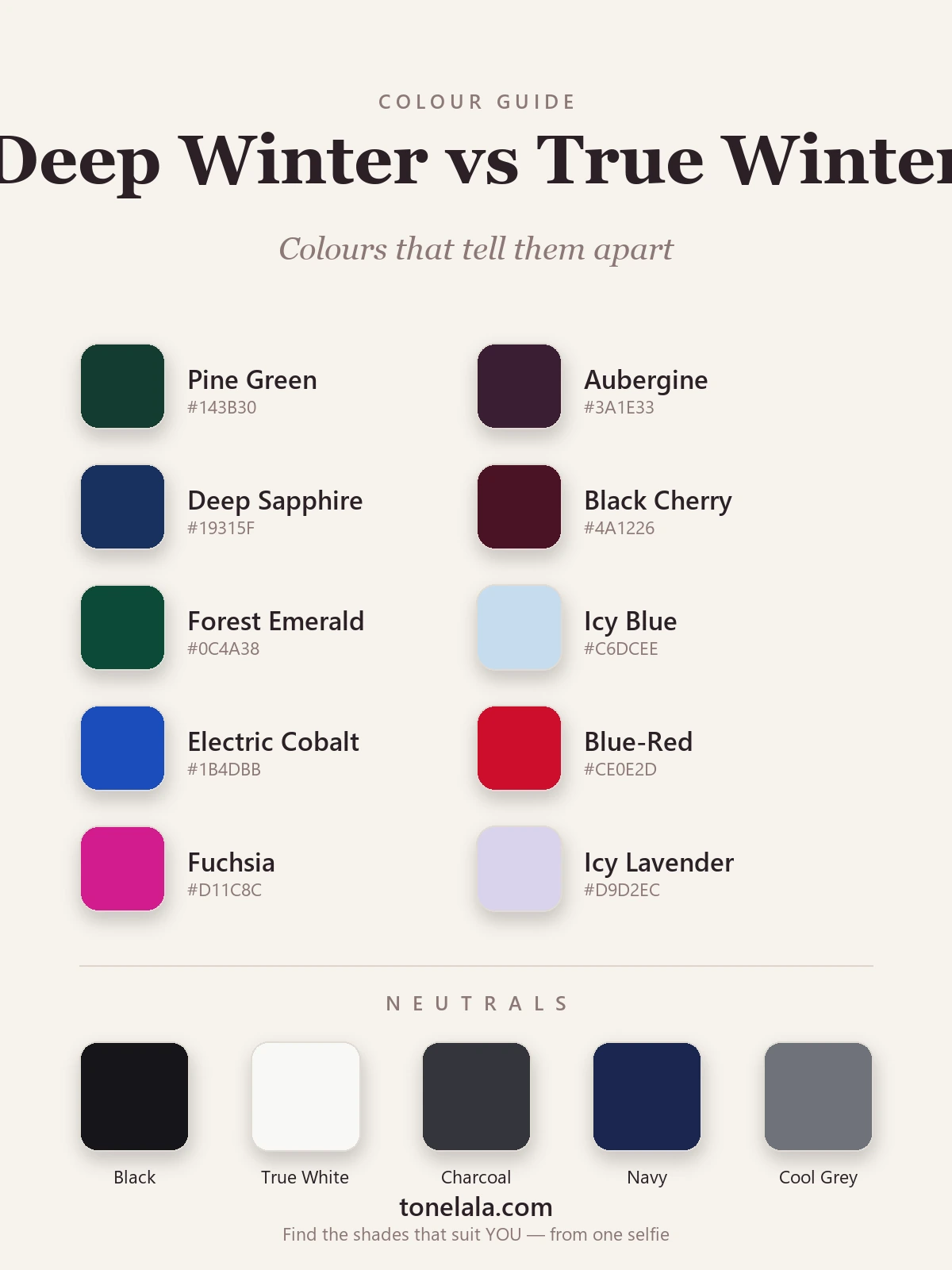
| Color | Hex | Flatters |
|---|---|---|
| Pine Green | #143B30 |
Deep Winter, the deepest cool green, where True Winter prefers brighter emerald |
| Aubergine | #3A1E33 |
Deep Winter, dark, cool and faintly neutral; classic Deep depth |
| Deep Sapphire | #19315F |
Deep Winter, richest cool blue; True Winter's blue runs brighter |
| Black Cherry | #4A1226 |
Deep Winter, the darkest cool wine, effortless on Deep coloring |
| Forest Emerald | #0C4A38 |
Deep Winter, emerald taken to its deepest, most saturated point |
| Icy Blue | #C6DCEE |
True Winter, clear, light, blue-based pastel; the signature icy clarity |
| Electric Cobalt | #1B4DBB |
True Winter, bright, charged blue that Deep can find a touch much |
| Blue-Red | #CE0E2D |
True Winter, crisp, true blue-red; sharper and lighter than a Deep wine |
| Fuchsia | #D11C8C |
True Winter, clear, cool-bright pink; pure-cool brilliance |
| Icy Lavender | #D9D2EC |
True Winter, pale, cool and luminous; reads weak on Deep coloring |
Shared neutrals: Black #16161A, True White #F8F8F5, Charcoal #34353B, Navy #1B2750 and Cool Gray #6F727A, both seasons wear all five, and black-with-true-white is a power pairing for either.
Still not sure, Deep Winter or True Winter?
Find your color season →How to tell which you are
You don't need a studio to get a strong read. You need daylight, a mirror and a few honest minutes.
- Drape deep against icy. Hold a pine green or black cherry near your face, then swap to a clear icy blue or icy lavender. One family will look natural and one will feel slightly off. If the deep jewel tones settle in and the icy pastels look thin or chilly on you, lean Deep Winter. If the icy pastels make your eyes pop and the deepest shades feel heavy or aging, lean True Winter.
- Test brightness, not just coolness. Both seasons are cool, so coolness alone won't separate them, push on chroma instead. Put on the electric cobalt and the blue-red. If bright, charged color energizes your face, you're reading True. If even bright color starts to overwhelm and you want it darker and quieter, you're reading Deep.
- Watch what washes you out. True Winter is undone by anything muted or anything too dark-and-dull. Deep Winter is undone by anything too pale and weak. The color that makes your features look softer or grayer than the garment is telling you which direction you don't go.
- Check the silver/black combo. Both love silver and both can wear solid black near the face. But Deep Winter can pile on the very deepest tones, black, pine, aubergine together, without disappearing, where True Winter usually wants a clear bright or an icy pastel in the mix to keep that crisp contrast alive.
If you're Deep Winter
Build around depth and contrast. Pair a dark neutral with one rich jewel tone and let it carry the look, charcoal with pine, navy with black cherry, black with deep sapphire. Your icy pastels still work, but you'll reach for them as accents against darkness rather than as the main event. If this is you, the full breakdown, every shade with hex codes, neutrals, metals and what to avoid, is in the Deep Winter guide.
If you're True Winter
Build around clarity and icy coolness. Your magic is the crisp pairing: black with blue-red, true white with cobalt, navy with icy pink. Clear, blue-based brights and clean icy pastels are where you come alive, and you can wear them lighter and brighter than a Deep Winter comfortably can. For your complete palette, makeup and styling, see the True Winter guide.
The reliable way to settle it
The reason these two get muddled is that the deciding traits, a slight shift in chroma, a slight shift in depth, are genuinely hard to judge on your own face, under your own bathroom light, with hair you may have dyed warmer or cooler over the years. Draping helps, but it asks you to be the analyst and the subject at once, which is exactly when the eye plays tricks.
A photo-based analysis sidesteps all of that: it reads your undertone, value and contrast from a clear image of your own face, so the answer doesn't hinge on a guess about whether a pastel looked "weak" in the moment. If you're hovering between Deep and True Winter, or you're not even certain you're a Winter at all, that's the cleanest way to know. You can browse the rest of the color analysis guides to see where every season sits, then find out which one is yours.
Frequently asked questions
What's the difference between Deep Winter and True Winter?
Both are cool, deep and high-contrast. The split is on chroma and depth. True Winter is the purest, iciest cool, it owns crisp blue-based brights and clear icy pastels. Deep Winter runs a shade darker and slightly more neutral, so it carries the deepest jewel tones (pine, aubergine, black cherry, deep sapphire) as comfortably as the brights. Iciest and clearest → True Winter; darkest and a touch neutral → Deep Winter.
Am I a Deep Winter or a True Winter?
Drape your deepest jewel tones (pine green, aubergine, black cherry) against a clean icy pastel and a blue-based bright. If the dark, rich colors look effortless and pure icy pastels feel a little weak, you're likely Deep Winter. If the icy pastels and crisp blue-reds light you up while the darkest tones feel slightly heavy, you're likely True Winter. The deciding trait is whether your coloring wants depth or pure icy clarity.
Which is warmer, Deep Winter or True Winter?
Neither is warm, both are cool seasons. True Winter is the more purely cool of the two, sitting at the blue-based, icy extreme of the undertone dial. Deep Winter is cool with a faint whisper of neutral depth, which is what lets it carry the darkest jewel tones. So if anything, Deep Winter reads very slightly less icy, but it is never warm.
Which season is deeper, Deep Winter or True Winter?
Deep Winter is the deeper of the two, depth is its defining trait, so its palette sits darker overall and leans on the richest, most saturated versions of cool colors. True Winter is also a deep, dark season, but its signature is brightness and pure icy coolness rather than maximum depth, so it balances deep shades with clear, light icy pastels.
Can you be both Deep Winter and True Winter?
No, you have one season, but you can sit on the border between them, and many people do. Both belong to the Winter family and share the same cool, high-contrast core, so the overlap is large. When you're borderline, the safe move is to wear the colors both seasons share (true red, emerald, cobalt, icy blue, black, true white) and let a proper analysis settle which way you lean.
How can I tell if I'm Deep Winter or True Winter without a professional analysis?
Do three checks in daylight. First, hold your darkest jewel tones beside your clearest icy pastels and see which family looks more natural on you. Second, test silver against the face, both seasons love it, but Deep Winter can also handle the deepest shades without being overwhelmed. Third, notice what washes you out: if even bright color starts to feel heavy, lean True; if pastels feel weak and you want more depth, lean Deep. A photo-based analysis reads all three for you at once.
Related guides

Deep Winter vs True Autumn: How to Tell the Difference
A color analyst on Deep Winter vs True Autumn, how they differ on undertone, value and chroma, the colors that separate them, and how to tell which you are.

Deep Winter vs Bright Winter: How to Tell the Difference
A color analyst on Deep Winter vs Bright Winter, how they differ on undertone, value and chroma, the colors that separate them

True Autumn vs Deep Autumn: How to Tell the Difference
True Autumn vs Deep Autumn explained: undertone, value and chroma, the colors that separate them, and how to tell which season you really are.

Deep Autumn vs Deep Winter: How to Tell the Difference
Deep Autumn vs Deep Winter, settled by a color analyst: how they split on undertone, value and chroma, the colors that separate them

True Winter vs Bright Winter: How to Tell the Difference
A color analyst on True Winter vs Bright Winter, how undertone, value and chroma differ, the colors that tell them apart, and how to decide which you are.

True Summer vs True Winter: How to Tell the Difference
True Summer vs True Winter, explained by a color analyst: how they differ on value and chroma, the colors that separate them, and how to tell which you are.
Prefer in person? Find color analysis near you
Browse local color analysts by city, or get the same season, palette and best-colors breakdown online from one selfie.
See your colors on a photo of you
Upload one selfie and ToneLala reveals your season, your full palette, and your best hair, makeup, jewelry and outfits, styled on you.