In a sentence: The best colors for blue eyes are blues and blue-greens that echo the iris, sapphire, cobalt, teal, denim, periwinkle, plus warm contrasts like rust, copper and coral that make them pop, with the exact versions set by your undertone. Skip to the full palette or find your exact shades.
Best Colors for Blue Eyes: Your Best Shades (with Hex Codes)
By ToneLalaUpdated October 8, 2026
Contents
- 01 Blue Eyes and color, what actually flatters
- 02 The best colors for blue eyes
- 03 The color families, one by one
- 04 White, gray, black and navy
- 05 Which blue are your eyes?
- 06 Colors for blue eyes by hair color
- 07 Colors to avoid with blue eyes
- 08 Blue Eyes across the color seasons
- 09 Makeup and styling tips for blue eyes
- 10 Where to start
About 27 percent of Americans have blue eyes, according to a 2014 poll for the American Academy of Ophthalmology, and estimates for the world population run around 8 to 10 percent. Blue eyes have no blue pigment. The front layer of the iris holds very little melanin, and light scattered in it looks blue, the same kind of effect that makes the sky blue. In 2008, researchers at the University of Copenhagen traced most blue eyes to a single genetic change near the OCA2 gene that turns down melanin production in the iris.
Because the color comes from scattered light rather than pigment, blue eyes shift visibly with what is around them. A denim shirt can make them look brighter; a dull beige sweater can make them look gray. This guide covers the ten colors that work best, with hex codes, how to adjust them for your shade of blue and your hair color, the neutrals, and the colors where advice disagrees.
Blue Eyes and color, what actually flatters
Wear a color that matches your eyes and the eye reads deeper and more saturated, because the two reinforce each other. Wear the opposite color (blue's complement is orange) and the contrast makes the blue stand out. Both groups are easy to wear: the matching family (blues, teals, periwinkles) and the contrast family (rust, copper, coral, warm gold) are everyday colors, so a palette for blue eyes is wide rather than fussy.
Eyes are only half of it, though. The color right next to your face is read against your skin, so your undertone decides whether a shade flatters you as a whole. Blue eyes turn up on cool, rosy complexions and on warm, golden ones, which is why two blue-eyed people can look best in two different blues.
So treat your eye color as the direction and your undertone as the dial. Blue eyes point you toward blues and warm contrasts; your undertone decides whether those should be cool and clear (sapphire, cobalt, icy blue) or warm and earthy (teal, rust, copper).
The best colors for blue eyes
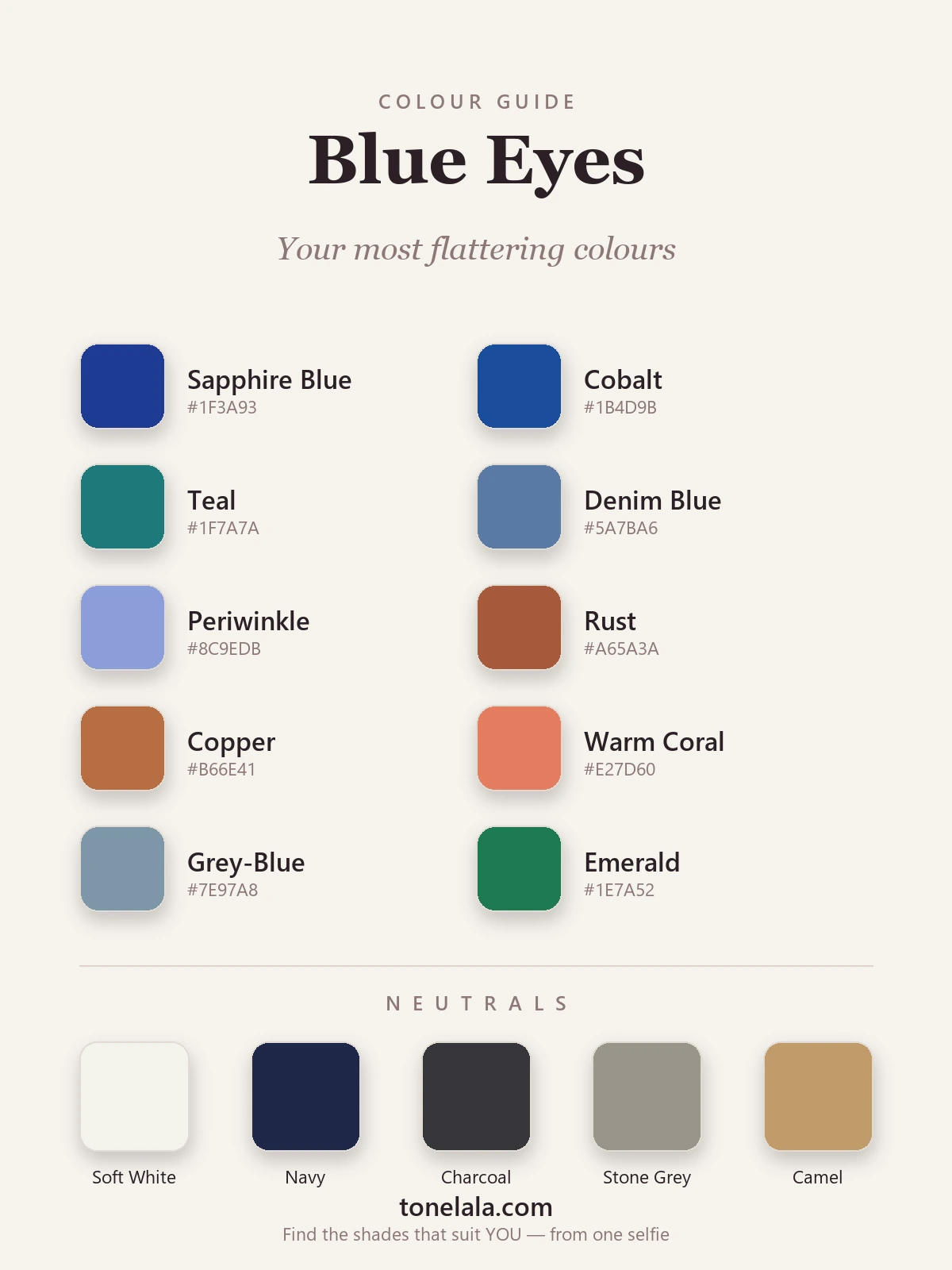
Ten shades: some echo the iris, the rest are warm contrasts that make it stand out.
| Color | Hex |
|---|---|
Sapphire Blue #1F3A93 |
A deep, true blue that deepens blue eyes by echo and suits most people. |
Cobalt #1B4D9B |
A brighter blue for more impact; it makes blue eyes look vivid. |
Teal #1F7A7A |
A blue-green between the eye and the warm side of the wheel, best on warmer blue-eyed coloring. |
Denim Blue #5A7BA6 |
The everyday mid-blue; relaxed and easy to wear with blue eyes. |
Periwinkle #8C9EDB |
A blue with a lilac tint, soft near the face, good on cool, fair skin. |
Rust #A65A3A |
A warm orange-red opposite blue on the wheel; the contrast brings blue eyes forward. |
Copper #B66E41 |
Blue's complement with a metallic warmth; good against warm, golden skin. |
Warm Coral #E27D60 |
A lighter, pinker warm tone that contrasts with blue eyes and suits spring and summer clothes. |
Gray-Blue #7E97A8 |
A muted, dusty blue for soft, low-contrast coloring and gray-blue eyes. |
Emerald #1E7A52 |
A jewel green that frames blue eyes and works on cool and warmer coloring. |
Best neutrals: Soft White #F4F2EC for clean contrast, Navy #1E2749 as a near-blue dark, Charcoal #36363B for depth where black feels too hard, Stone Gray #9A958C as an everyday mid-neutral, and Camel #C19A6B for a warm base that also contrasts gently with blue eyes.
Want YOUR exact most-flattering shades?
Find your color season →The color families, one by one
Deep blues: sapphire, cobalt and navy
The echo route. A blue a step deeper or brighter than your eyes makes the iris look more saturated. Navy is the version for work clothes and coats; sapphire and cobalt are for tops, dresses and knits.
Pale blue: the one guides disagree on
Some guides, Best Life among them, recommend light and powder blues for blue eyes. Others, including PaletteHunt and Polished and Primed, say a pale blue that matches the iris washes the eyes out. Both happen: on fair, cool skin with light blue eyes, pale blue often looks fresh; on deeper or warmer coloring it tends to look flat. If it does nothing for you, wear it below the waist and keep a deeper color at the neckline.
Teal and blue-green
Teal sits between the blue of the eye and the green side of the wheel, so it echoes and contrasts at once. It suits blue eyes with a green or gold ring around the pupil especially well, and warm skin more than very cool skin.
Rust, copper and terracotta
The contrast route, and the one every guide agrees on. Orange-based colors sit opposite blue on the color wheel, so they make blue eyes look bluer. Rust and terracotta are the easiest to wear; a terracotta sweater or a copper scarf is enough. Bright neon orange is where advice splits again: most guides call it too strong, Best Life suggests tangerine and marigold.
Warm coral and peach
The lighter end of the contrast family, and the easiest summer option. Coral suits warm and neutral skin; on cool skin, a pinker coral or watermelon looks better than an orange one.
Jewel tones: emerald, plum and burgundy
Emerald frames blue eyes without competing with them, and plum and burgundy add depth on cool and neutral skin. These are the colors most guides suggest for evening.
Warm neutrals: camel, cognac and cream
Camel and cognac carry a little orange, so they act as a quiet version of the contrast route. Cream is the gentler alternative to white on warm skin.
White, gray, black and navy
Neutrals are where the guides disagree most.
- White: some guides say crisp white sharpens blue eyes; others say stark white near the face drains them. It depends on the skin: crisp white suits cool, high-contrast coloring; soft white or cream suits warm or softer coloring.
- Gray: charcoal and a blue-leaning gray usually work; a flat mid-gray can make blue eyes look gray too. Some guides recommend gray and silver for blue eyes, others say cool gray flattens them, so try yours near a window before buying.
- Black: few guides mention it. Head-to-toe black is stark next to very light blue eyes and fair skin; navy or charcoal gives the same depth with less contrast. Dark hair and bright blue eyes carry black easily.
- Navy: the safest dark for blue eyes. It echoes the iris and works where you would otherwise wear black.
Which blue are your eyes?
Blue eyes vary more than the label suggests, and the shade changes which colors work best. This grouping is general color logic, not a fixed rule.
Gray-blue eyes
Soft, smoky blue with gray in it. Dusty, muted colors keep the eyes looking blue: gray-blue, slate, soft teal, dusty rose, mauve. Very bright colors can make gray-blue eyes look grayer by comparison.
Light, icy or sky blue eyes
Pale and clear. Periwinkle, soft navy, cool pinks and lavender suit them; strong black or very dark colors can overpower them. Light blue eyes on fair skin are where pale blue clothes most often work.
Bright, clear blue eyes
Saturated blue with clear whites. These can take the strongest colors: cobalt, sapphire, emerald, true red, and crisp white.
Dark or deep blue eyes
Navy-toned eyes. Deep jewel tones (sapphire, emerald, plum) and rich warm contrasts (rust, copper) both suit them; pastels can look weak beside them.
Blue eyes with a gold or green ring
Often called central heterochromia. Teal, copper and warm greens pick up the ring; warmer neutrals such as camel and olive look better than cool gray.
Colors for blue eyes by hair color
| Hair | Lead with | Go easy on |
|---|---|---|
| Ash or platinum blonde | Periwinkle, navy, cool pink, gray-blue | Mustard, orange-brown |
| Golden or honey blonde | Teal, coral, warm aqua, camel | Icy pastels, stark black |
| Red or strawberry blonde | Teal, emerald, navy, cream, rust | Bright orange next to the hair, cool pink |
| Light to mid brown | Denim, teal, rust, cognac | Flat mid-gray |
| Dark brown or black | Sapphire, cobalt, emerald, crisp white | Dusty pastels |
| Gray or silver | Navy, periwinkle, plum, soft white | Beige close to the hair color |
Blonde hair with blue eyes has its own guide: best colors for blonde hair and blue eyes.
Colors to avoid with blue eyes
- Muddy, washed-out blues: a dull, grayed denim or a murky slate that sits too close to your iris can make blue eyes look flat. A cleaner sapphire or a clearer gray-blue sharpens them again.
- Dingy mid-gray and heavy taupe-brown: flat grays and dull browns can gray out the whole face and give blue eyes nothing to contrast with. Charcoal, navy or a warmer brown keeps the neutral without the drain.
- The wrong-temperature whites and brights: stark optic white can drain warm, golden coloring (try a soft white), and very cool neon can overpower softer blue-eyed coloring. Temperature and clarity matter more than the color name.
Blue Eyes across the color seasons
Blue eyes do not belong to one season; they appear across the system, which is why undertone has to decide your shades. Seasonal analysis sorts coloring by undertone (warm or cool), depth (light or deep) and chroma (soft or clear). Your eye color nudges you toward blues and warm contrasts; those three settings place you.
Cool, fair, high-contrast blue-eyed coloring often lands in Winter, with clear sapphire, cobalt and icy blue (see the Winter palette). Cool but softer, lower-contrast coloring leans Summer, with periwinkle, gray-blue and dusty versions of the same family (Summer palette). Warm, golden blue-eyed coloring tends toward Spring or Autumn, where teal, rust, copper and warm coral suit best (Spring, Autumn). The color analysis guides explain each season.
Makeup and styling tips for blue eyes
On the lids, warm browns, bronze, copper, peach and a soft terracotta act as blue's complement and make your eyes look bluer, usually more than a matching blue shadow, which can flatten them. Plum and a warm taupe work for definition, and a chocolate or navy liner sharpens the eye with less harshness than black. For lips and cheeks, follow your undertone: warm coral and peachy rose for golden skin, cool berry and rose for cool skin. Makeup for blue eyes goes shade by shade.
Jewelry and metals
Gold and copper warm the picture and, like other orange tones, make blue eyes look bluer; silver and white gold keep things crisp and cool. Let your undertone choose: gold for warm skin, silver for cool, either for neutral. The jewelry metal guide has the tests.
What to put closest to the face
The colors that matter most are the ones within a hand's width of your eyes: tops, collars, scarves, earrings and glasses frames. A navy, teal or rust scarf over a neutral coat does more for blue eyes than a colored skirt. Tortoiseshell or warm brown frames suit warm coloring; navy, gray or clear frames suit cool.
Where to start
Find the blue you already own that gets the most compliments, and hold a rust or terracotta piece next to it near a window. If the rust makes your eyes look bluer and your skin warmer, you lean warm: build around teal, denim, copper and camel. If the rust makes your skin look sallow but the blue looks clean, you lean cool: build around sapphire, cobalt, navy and soft white, and use plum or emerald when you want contrast. If both look good, you are probably neutral and can use both lists. When you are still unsure after that, a personal analysis reads the undertone for you.
Frequently asked questions
What colors look good with blue eyes?
Two groups. Blues and blue-greens a step deeper than the iris (sapphire, cobalt, teal, denim, periwinkle) echo the eye and make it look clearer. Warm colors from the orange side of the wheel (rust, copper, terracotta, warm coral) contrast with blue and make it stand out. Emerald, plum, navy and camel round out the list. Which version of each suits you best depends on your skin's undertone.
What color makes blue eyes stand out the most?
Orange-based colors, by contrast: rust, copper, terracotta and coral sit opposite blue on the color wheel, and every guide we checked agrees on them. A deep blue such as sapphire or navy is the other route; it deepens the eye by repetition. Try both near a window and see which you prefer.
What colors should you avoid with blue eyes?
It depends more on your skin than on the eye, but a few traps recur: a pale blue that matches the iris too closely, which can make the eyes look washed out; dull mid-gray; muddy, dingy browns; and, on warm coloring, stark optic white. Bright neon orange is too strong for most people even though rust and copper suit blue eyes. A cleaner, deeper or warmer version of the same color usually fixes it.
Do all blue eyes suit the same colors?
No. Blue eyes appear with cool and warm coloring alike. Cool, rosy skin usually looks best in clear sapphire, cobalt and icy blues; warm, golden skin in teal, rust, copper and warm coral. Gray-blue eyes also suit softer, dustier colors than bright, clear blue eyes. The eye color points you toward blues and warm contrasts; your undertone decides whether they should be cool and clear or warm and earthy.
How do I find my exact best colors for blue eyes?
Start with the palette below, then narrow it by undertone, depth and contrast: compare gold and silver jewelry, cream and white, and a deep and a pale blue near your face in daylight. A personal color analysis reads your skin's undertone alongside your eye color and gives you your season and shades; you can start one at tonelala.com/onboarding.
Does wearing blue make blue eyes pop?
A blue a step deeper or brighter than your eyes usually does, because it repeats the color and makes the iris look more saturated. A pale blue that matches the eye closely is where guides disagree: some recommend it, others say it washes blue eyes out. If you like light blue, wear it away from the face or with a deeper color at the neckline.
What color shirt makes blue eyes pop?
For a shirt worn right under the face: navy, sapphire or cobalt to echo the eye, or rust, terracotta or a warm coral to contrast with it. A denim shirt is the everyday version. Emerald and plum also frame blue eyes well. Check the shirt in daylight; shop lighting makes most blues look brighter than they are.
Should blue eyes wear gold or silver jewelry?
The eyes do not decide it; your skin's undertone does. Gold and copper add warmth near the face and, like other orange tones, make blue eyes look bluer, so they suit warm and neutral skin. Silver and white gold look crisper and suit cool, rosy skin. If both look fine on you, you are probably neutral and can choose by outfit.
Related guides
Best Colors for Blonde Hair And Blue Eyes: Your Best Shades (with Hex Codes)
A color analyst's guide to the best colors for blonde hair and blue eyes, 10 flattering shades and 5 neutrals with hex codes, what to avoid, and your season.
Best Colors for Red Hair And Green Eyes: Your Best Shades (with Hex Codes)
A color analyst's edit of the best colors for red hair and green eyes, 10 flattering shades and 5 neutrals with hex codes, what to avoid
Best Colors for Brown Hair And Brown Eyes: Your Best Shades (with Hex Codes)
The best colors for brown hair and brown eyes: teal, rust, emerald, plum and more with hex codes, colors that make brown eyes stand out, best neutrals and shades to avoid.
Best Colors for Dark Skin And Brown Eyes: Your Most Flattering Shades (with Hex Codes)
A color analyst's guide to the best colors for dark skin and brown eyes, jewel tones, bright clears and the neutrals that glow, with hex codes.
Best Colors for Tan Skin And Green Eyes: Your Most Flattering Shades (with Hex Codes)
A stylist's edit of the best colors for tan skin and green eyes, olive, teal, rust, gold and more, with hex codes, neutrals and shades to avoid.
Best Colors for Olive Skin And Brown Eyes: Your Most Flattering Shades (with Hex Codes)
A color analyst's guide to the best colors for olive skin and brown eyes, teal, terracotta, olive, gold and more, with hex codes and shades to avoid.
Prefer in person? Find color analysis near you
Browse local color analysts by city, or get the same season, palette and best-colors breakdown online from one selfie.
See your colors on a photo of you
Upload one selfie and ToneLala reveals your season, your full palette, and your best hair, makeup, jewelry and outfits, styled on you.