
In a sentence: The colours that go with terracotta are cool, deep partners — teal, sage, navy, olive and forest green — plus warm, dusty companions like blush, mustard and burnt orange, all softened with cream and taupe neutrals. Skip to the full pairing palette or find your most flattering colours.
Terracotta is the colour my clients fall for on holiday and then can't work out how to wear at home. They buy the clay-coloured dress in a sun-baked little shop, it looks glorious against whitewashed walls and a tan, and then it hangs in the wardrobe in grey February because nothing they own seems to go with it. The colour isn't the problem. It's that terracotta sits in an awkward middle ground — too warm to treat like a neutral, too earthy to treat like a bright — and most of us reach for the wrong partners out of habit.
Here's what I've learned styling it: terracotta has two completely different jobs, and the trick is deciding which one you want. Pair it with cool blues and greens and it becomes a statement, a proper jewel-toned pop. Pair it with creams, mustards and other warm earth tones and it settles back into a soft, almost-neutral that quietly warms everything around it. The mistake is doing neither — washing it out with stark white, or fighting it with a cold, bright colour that sends it muddy. Pick a lane, keep the company warm or deliberately cool, and terracotta does the rest.
What kind of colour terracotta is
Terracotta is a warm, earthy orange-brown — clay literally fired in a kiln, named for it — sitting somewhere around #C67B5C to #B5562A. The thing to understand is that it's a muted, low-chroma orange: there's brown and grey mixed into it, which is exactly why it reads as grounded and expensive rather than loud like a pure pumpkin orange. That softened warmth is the whole story for pairing it.
Two principles follow from that. First, because terracotta lives on the warm orange side of the colour wheel, its natural complement sits opposite, in the cool blue-to-teal range — which is why teal, navy and a denim-y blue make it genuinely sing. Second, because it's muted, it loves partners that share its softness: dusty pinks, sage greens, creamy off-whites. Anything too clean or too saturated next to it creates a mismatch in texture, not just hue, and terracotta ends up looking dull while the bright thing looks plasticky.
It also helps to know terracotta isn't a single shade. There's a pinker, coral-leaning clay on one end and a deeper, rusty brick on the other, and where your particular terracotta sits nudges its best partners one way or another. The principle holds either way: treat it as a warm, sophisticated near-neutral, keep undertone in mind, and the right colours fall into place almost on their own.
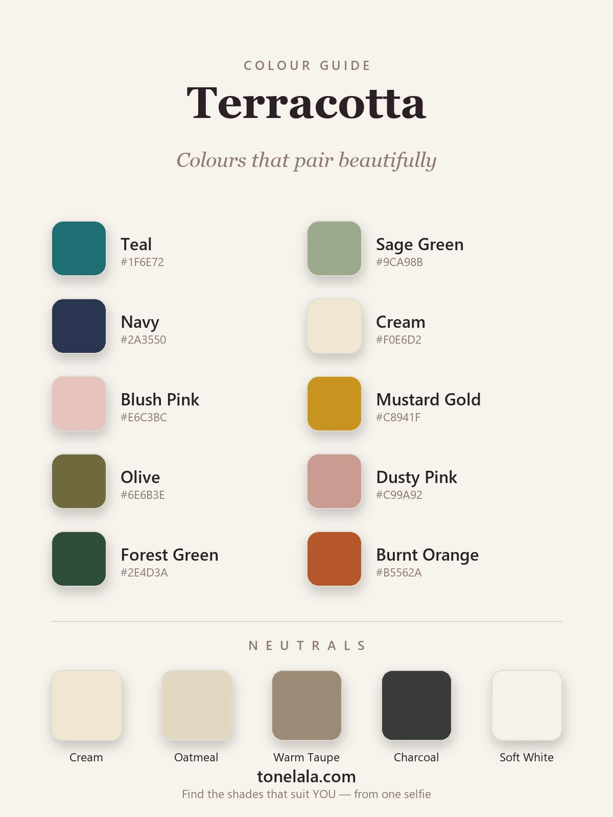
The best colours to go with terracotta
These ten are the ones I keep coming back to — half of them cool partners that make terracotta pop, half warm ones that let it relax into the background. Each earns its place for a specific reason.
| Colour | Hex |
|---|---|
Teal #1F6E72 |
The classic complement — cool blue-green opposite terracotta on the wheel; instantly makes it richer. |
Sage Green #9CA98B |
A softer, dustier cool partner; the grown-up contrast when teal feels too bold. |
Navy #2A3550 |
The reliable anchor — adds depth and polish without the coldness of black. |
Cream #F0E6D2 |
The effortless one; warm cream lets terracotta breathe and keeps the look soft. |
Blush Pink #E6C3BC |
Dusty, gentle pink in the same warm family — romantic and easy, never twee. |
Mustard Gold #C8941F |
Earthy golden warmth; the autumn pairing that always looks considered and expensive. |
Olive #6E6B3E |
A warm, muddy green that sits in terracotta's world — quietly rich, very wearable. |
Dusty Pink #C99A92 |
A deeper, mauve-tinged rose that tones beautifully with the clay for a soft, modern look. |
Forest Green #2E4D3A |
Deep cool green for proper jewel-on-jewel contrast — terracotta's most elegant evening match. |
Burnt Orange #B5562A |
Terracotta's bolder cousin; analogous warmth that reads intentional and seasonal worn together. |
Neutrals that go with terracotta: Cream #F0E6D2, Oatmeal #E3D8C2, Warm Taupe #9C8A74, Soft White #F6F2E9, and Charcoal #383B3A (your best "dark" — warmer and far more flattering than black).
Which shade of terracotta actually suits YOU?
Find your colour season →Colours to avoid with terracotta
- Cool, icy brights — fuchsia, electric blue, cold cool-pink. They're too high-contrast and too cool for terracotta's warm, earthy mood, so they jar rather than complement, and the clay tone goes muddy beside them.
- Pure jet black, head to toe — it works in a pinch, but it deadens terracotta's glow and reads heavy. Charcoal or navy gives you the same anchoring effect while letting the warmth breathe.
- A clashing bright warm red — sitting a true scarlet right next to terracotta tends to muddle the two into one confused orange. If you want red in the mix, keep it deep and separated, or reach for burnt orange instead.
The quick test: if a colour makes the terracotta look browner or muddier, it's wrong. If the terracotta looks more like warm, glowing clay, you've found a friend.
Terracotta outfit combinations
A pairing on paper is one thing; a whole outfit is another. Here are four I come back to again and again, built so you can copy them straight off the page.
- Terracotta jumper + teal trousers + cream trainers — the pairing I recommend most. The cool teal makes the clay pop, cream keeps it soft, and gold studs finish it. Balanced and quietly striking for everyday.
- Terracotta midi dress + caramel boots + gold jewellery — lean all the way into the warmth. Tan leather and gold make terracotta look genuinely luxe; a tan belt at the waist pulls the whole thing together.
- Terracotta blazer + cream silk top + navy tailored trousers — a warm pop up top, a grown-up anchor below. Brilliant for work, and proof you never needed black to look sharp.
- Terracotta skirt + forest green knit + charcoal accessories — deep-on-deep for cooler months. Forest green gives the rich contrast and charcoal grounds it, for an outfit that feels considered rather than loud.
How to wear terracotta for your colour season
Here's the bit most pairing guides skip: there isn't one terracotta. The colour spans everything from a pinkish, coral-leaning clay to a deep, rusty brick — and the right version for you depends entirely on your own colouring. Warm, deep types come alive in a rich, earthy terracotta; lighter, brighter types suit a clearer, more coral-tinged version. Wear the wrong temperature of terracotta near your face and even this generous colour can leave you looking a little sallow.
Warm, deep seasons — think True Autumn or Deep Autumn — own terracotta outright; it echoes the warm depth in their colouring, and they can lean their pairings warmer still, with mustard, olive and burnt orange. Softer, lighter colouring is happiest in a gentler, more muted clay kept low-contrast, leaning on blush, dusty pink and sage. Cooler seasons can usually borrow a single coral-leaning terracotta as an accent, but tend to look better with it away from the face. None of these are rules so much as starting points — but they're the difference between terracotta looking like your colour and terracotta just looking like a nice dress.
If you've ever held up a terracotta top and felt it either glowed or quietly drained your face, that's undertone talking — and it's almost impossible to judge reliably in your own mirror. My colour analysis guides walk through how warmth, depth and contrast work season by season, and our guide to colours that go with sage green is a useful companion if sage is becoming your favourite partner for it. A personal analysis tells you the exact version of terracotta — and which of these colours — will flatter you most, rather than leaving you to guess.
Putting it together
Terracotta rewards a decision. Choose to make it pop and build around one cool partner you love — teal, navy or forest green — with cream to soften and gold to finish. Or choose to let it relax, and surround it with warm earth tones like mustard, olive and caramel so it reads as a rich, glowing neutral. Either way, keep its company either deliberately cool or warmly muted, skip the icy brights and the stark black-and-white your instincts reach for, and this becomes one of the most flattering colours you can own. The trick was never finding what goes with terracotta — it was deciding what you wanted it to do.