In a sentence: the best colors for fair skin are clear, medium-depth shades, soft teal, periwinkle, raspberry, dusty rose, emerald and plum, that add contrast to a pale complexion without flattening it. Skip to the full palette or find your exact shades.
Best Colors for Fair Skin: Your Most Flattering Shades (with Hex Codes)
By ToneLalaUpdated July 11, 2026
Contents
Hold a piece of pale beige knitwear up to a fair face and watch what happens, the fabric and the skin sort of dissolve into each other, and the person behind it suddenly looks a little washed out, a little flat. Now swap it for a clear soft teal. The face lifts. The eyes look brighter, the skin looks more even, and nothing about the person has changed except the color sitting under their chin.
That's the whole game with fair skin. Pale complexions don't carry much of their own contrast, so they borrow it from clothing, which means the right color does a lot of visible work, and the wrong one quietly drains you. I've draped fabric against fair skin in hundreds of sessions, and the lesson is always the same: fair skin doesn't need quiet colors to look delicate. It needs clear ones to look alive.
Understanding fair skin and color
"Fair skin" describes how light your complexion is, low melanin, pale surface, and that's a separate question from undertone. You can be fair with a cool, pink-leaning undertone, fair with a warm, golden one, or fair and neutral. So the first thing to know is that fairness sets the level a color should sit at, and undertone decides the actual hue.
Because fair skin reflects so much light, two things tend to flatter it. The first is a bit of saturation, a color with some pigment in it gives the face a contrast point, so the complexion reads bright rather than blank. The second is the right temperature: a cool, rosy fair skin glows beside cool berries and true blues, while a warm, peachy fair skin comes alive next to coral and warm green. Get the temperature wrong and even a beautiful color can make pale skin look grayish or flushed.
The trap to avoid is the obvious one, assuming pale skin wants pale colors. Wash-out, not over-saturation, is the usual problem. A very light, ashy shade held against an already-light face has nowhere to push the contrast, so it blurs. Far better to reach for a clear medium tone that frames the face and lets it stand forward.
The best colors for fair skin
These ten flatter the broadest range of fair complexions, clear, medium-depth shades with enough pigment to bring the face forward.
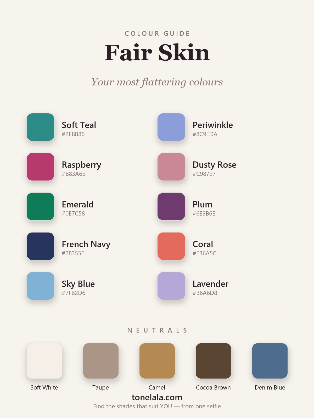
| Color | Hex | Why it works |
|---|---|---|
| Soft Teal | #2E8B86 |
Sits perfectly between warm and cool, so almost any fair skin can wear it; brings out the eyes and keeps the complexion fresh. |
| Periwinkle | #8C9EDA |
A blue with a touch of violet, flattering on cool and neutral fair skin, and far kinder than a hard primary blue. |
| Raspberry | #B83A6E |
A clear berry that adds gorgeous contrast to pale skin; reads vivid without the harshness of true red. |
| Dusty Rose | #C98797 |
The soft option that still works, muted pink with enough depth to lift the face rather than match it. |
| Emerald | #0E7C58 |
A jewel green makes fair skin look luminous; the depth gives the contrast that pale complexions crave. |
| Plum | #6E3B6E |
Rich, slightly cool purple that flatters fair skin without overpowering it, elegant near the face. |
| French Navy | #28355E |
The grown-up alternative to black for fair skin, deep and structured, but softer against pale features. |
| Coral | #E36A5C |
The standout for warm fair skin; its peachy heat echoes the skin's own warmth and gives an instant glow. |
| Sky Blue | #7FB2D6 |
A clear mid-blue that brightens the eyes and keeps a cool fair complexion looking rested. |
| Lavender | #B6A6D8 |
Cool, modern and soft, a pastel with enough pigment to read deliberate rather than washed out. |
Best neutrals: Soft White #F4EFE6 instead of stark white, Taupe #A99685 for a quiet base, Camel #B68A52 to add warmth, Cocoa Brown #5A4332 as a gentler stand-in for black, and Denim Blue #4E6E8E for everyday.
Want YOUR exact most-flattering shades?
Find your color season →Colors to avoid with fair skin
A few shades consistently work against fair skin near the face:
- Skin-adjacent neutrals. Pale beige, buttery yellow, weak peach and ashy oatmeal sit so close to a fair complexion that they blur the edge between fabric and face, the effect is tired and washed out. If you love these, wear them low on the body, not at the collar.
- Heavy, muddy darks. Flat black and murky brown can swamp delicate fair coloring, throwing shadows under the eyes and chin rather than lifting you. A French navy or cocoa brown gives the same depth without the drain.
- The wrong temperature. A warm mustard on cool, rosy fair skin (or an icy fuchsia on warm, golden fair skin) can make the complexion look sallow or flushed. The hue matters less than whether it matches your undertone.
The quick test: hold the color right under your jaw in daylight. If your skin looks brighter and more even, keep it. If your face suddenly looks more tired than the color, move it away from your face.
Fair Skin and the color seasons
Here's the part most "colors for fair skin" lists skip, fair skin doesn't belong to one season. It runs across all of them, and your undertone plus contrast level decides which.
If your fair skin is cool and rosy, you're likely a Summer or, with more contrast, a Winter, think periwinkle, raspberry, emerald and true navy. If it's warm and peachy, you lean Spring (clear coral, warm teal, sky blue) or, when muted, Autumn. Fair-and-delicate with low contrast often points to Light Summer or Light Spring, where soft, luminous versions of these colors shine. Fairness sets the brightness; undertone and contrast set the exact palette, and that's exactly what the color analysis guides walk through season by season.
Makeup & styling for fair skin
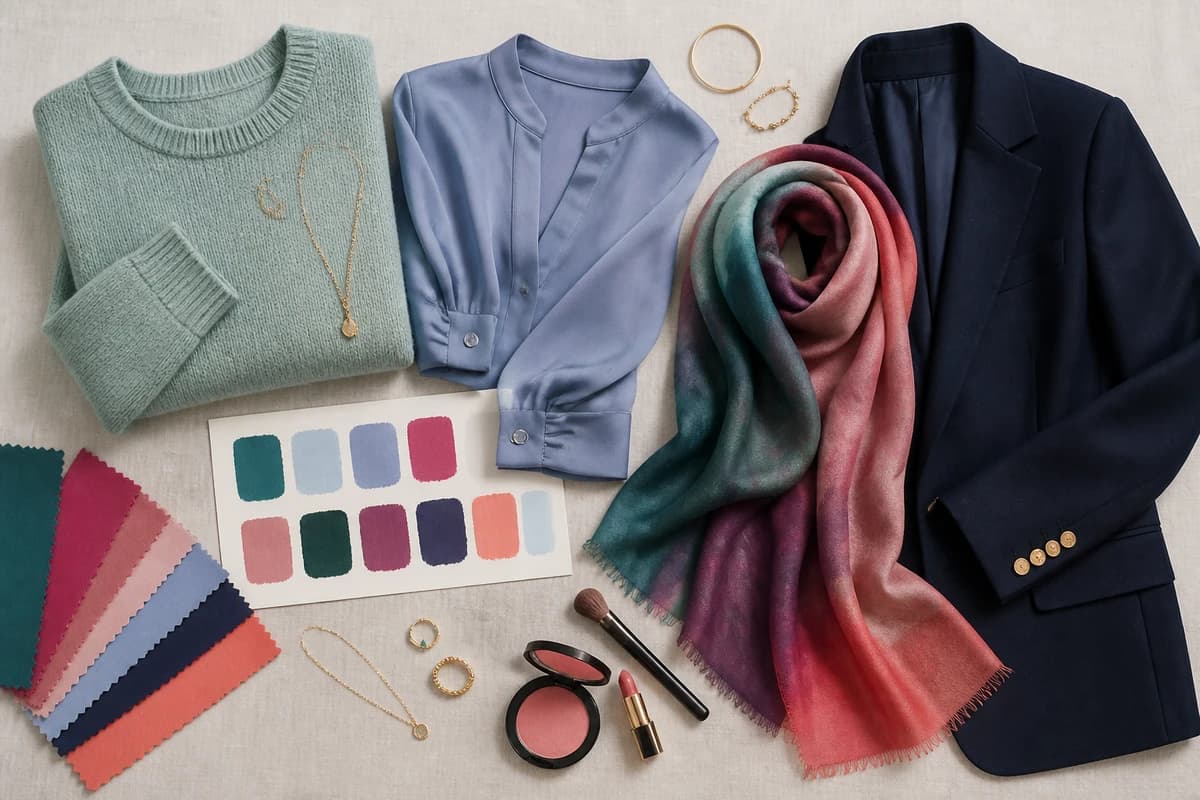
The same logic carries to makeup. Cool fair skin tends to look freshest in rose, berry and soft plum lips with a cool-pink or apricot blush, while warm fair skin glows in coral, peach and warm rose with a peachy flush, and a too-dark, too-warm bronzer is the fastest way to muddy a pale complexion, so go light. For clothing, build outfits around one of your clear colors near the face and let your softer neutrals do the supporting work below; pair gold with warm fair skin and silver with cool, and keep contrast in mind, a delicate, low-contrast face is happier in a tonal outfit than in head-to-toe stark black-and-white.
Putting it together
Fair skin is one of the easiest complexions to flatter once you stop treating it as fragile. It doesn't want to be matched or muted, it wants a clear color to push against, in the right temperature for your undertone. Start with a soft teal, a raspberry or an emerald near your face and you'll see the lift immediately. From there, the real precision comes from knowing your undertone, contrast and season, so the colors you reach for aren't just generally flattering on fair skin, they're flattering on you.
Frequently asked questions
What colors suit fair skin best?
Fair skin is flattered most by clear, medium-depth colors that bring contrast to the face without overwhelming it, soft teal, periwinkle, raspberry, dusty rose, emerald and plum are reliable wins. Pale skin can look washed out beside very light, low-contrast shades, so a color with a little saturation and depth tends to make the complexion look brighter and more even. The single most flattering version of each, though, depends on whether your undertone is cool, warm or neutral.
What colors should fair skin avoid?
Watch out for shades that sit too close to your own skin tone, pale beige, buttery yellow, weak peach and ashy oatmeal can blur the line between fabric and face and leave you looking tired. Very heavy, muddy darks like flat black or murky brown can also overpower delicate fair coloring, casting shadows rather than lifting you. None of these are banned; they just usually need to be worn away from the face or swapped for a clearer version. Your exact 'avoid' list comes down to undertone.
What are the best neutrals for fair skin?
Soft white (#F4EFE6) instead of stark optic white, taupe (#A99685), camel (#B68A52), a cocoa brown (#5A4332) rather than flat black, and a mid denim blue (#4E6E8E). These give fair skin grounding without the harshness that pure black or bright white can bring to a pale complexion. Cool-toned fair skin can also wear a soft charcoal or slate gray beautifully in place of camel.
Does undertone change which colors suit fair skin?
Yes, more than the fairness itself. Two people can both be very pale, but cool (pink, red or blue) undertones glow in berry, emerald, periwinkle and true navy, while warm (golden, peachy) undertones come alive in coral, warm teal, soft gold and warm greens. Neutral undertones sit comfortably in between. Fairness sets the brightness and contrast level; undertone decides the exact palette. That's why a personal color analysis is the quickest route to your real shortlist.
How do I find my exact shades for fair skin?
Look at the veins on your inner wrist and how your skin reacts to gold versus silver: cool undertones (blue or purple veins, silver flatters) lean to a cool palette; warm undertones (greenish veins, gold flatters) lean warm; if it's a toss-up you're likely neutral. From there your contrast level points you to a seasonal palette, light, true, bright or deep. A proper color analysis at tonelala.com/onboarding pins down your undertone, contrast and season so you get an exact set of shades rather than a general guess.
Related guides

Best Colors for Fair Skin And Dark Hair: Your Most Flattering Shades (with Hex Codes)
A color analyst's guide to the best colors for fair skin and dark hair, 10 flattering shades and 5 neutrals with hex codes, what to avoid
Best Colors for Dark Skin And Brown Eyes: Your Most Flattering Shades (with Hex Codes)
A color analyst's guide to the best colors for dark skin and brown eyes, jewel tones, bright clears and the neutrals that glow, with hex codes.
Best Colors for Tan Skin And Green Eyes: Your Most Flattering Shades (with Hex Codes)
A stylist's edit of the best colors for tan skin and green eyes, olive, teal, rust, gold and more, with hex codes, neutrals and shades to avoid.
Best Colors for Olive Skin And Brown Eyes: Your Most Flattering Shades (with Hex Codes)
A color analyst's guide to the best colors for olive skin and brown eyes, teal, terracotta, olive, gold and more, with hex codes and shades to avoid.
Best Colors for Medium Skin: Your Most Flattering Shades (with Hex Codes)
A color analyst's guide to the best colors for medium skin, teal, coral, marigold, emerald and more, with hex codes, the right neutrals and what to avoid.

Best Colors for Pale Skin: Your Most Flattering Shades (with Hex Codes)
A color analyst's guide to the best colors for pale skin, 10 flattering shades with hex codes, the best neutrals, what to avoid
Prefer in person? Find color analysis near you
Browse local color analysts by city, or get the same season, palette and best-colors breakdown online from one selfie.
See your colors on a photo of you
Upload one selfie and ToneLala reveals your season, your full palette, and your best hair, makeup, jewelry and outfits, styled on you.