In a sentence: Soft, cool, muted colours — gentle blues, sage greens, lavender — tend to calm, while bright, warm, saturated ones energise, and once you know which is which you can dress for the mood you want. Skip to the calming palette or find your season.
Watch what people reach for on a frantic morning versus a slow Sunday. The frantic morning tends to end in something safe and quiet — a soft grey-blue jumper, a sage cardigan — while the unhurried day is when the brighter, bolder pieces come out. Most of us are doing colour psychology without naming it, dressing towards the mood we already have or the one we're hoping to find. I notice it constantly with clients: the colours they describe as "comforting" are almost always the soft, cool, slightly greyed ones, and the colours they call "a lot" are the bright, warm, saturated ones.
That split — soothing versus stimulating — is the genuinely useful part of colour psychology, and it's more reliable than the horoscope-ish claims you'll see online. Cool colours generally feel calmer than warm ones. Soft, low-saturation versions of any hue feel quieter than clear, vivid ones. Those two patterns hold up well, and together they explain most of what people mean when they call a colour "calming". Below I'll walk through which colours soothe, which energise, and how to use both on purpose instead of by accident.
What actually makes a colour feel calming
A colour's effect comes from three things, not just its name. The first is temperature: cool colours (blues, blue-greens, cool purples) tend to feel restful, while warm colours (reds, oranges, warm yellows) tend to feel active. Part of this is physical — cool colours appear to recede, to sit back from you, while warm colours seem to advance, almost stepping forward off the rail. A colour that sits back feels less demanding to look at, and "less demanding" is a big part of "calm".
The second is saturation — how pure or intense the colour is. A vivid, clear turquoise and a soft, dusty version of the same blue-green are technically the same hue, but they feel completely different to wear. The muted one whispers; the vivid one announces. As a rule, the more you grey a colour down, the calmer it reads. The third is lightness: pale, airy tints generally feel softer and more open than deep, heavy shades, though a deep colour can feel grounding and settled rather than loud (navy is the classic example — calm in a steady, dependable way rather than an airy one).
Put those together and the recipe for a calming colour is consistent: cool or soft-warm, low in saturation, and not jarringly bright. That's why a greyed eucalyptus soothes and an electric lime does not, even though both are green.
Which colours calm, and why
A few families do the heavy lifting when it comes to calm.
Blue is the one people name first, and for good reason. We tie it to open sky and still water — wide, settled things — so it carries a sense of space and steadiness. Soft sky blue and powder blue feel airy and restful; deeper blues feel dependable and grounded. Blue rarely feels demanding, which is exactly why it turns up in bedrooms, spas and bank logos alike.
Green sits right in the middle of the visible spectrum, which is part of why it feels so easy on the eye — it asks very little of you. We read it as natural, alive and balanced, and the soft, greyed versions (sage, eucalyptus, soft moss) are some of the most universally soothing colours there are. Green is restful without being sleepy; it feels fresh and calm at the same time.
Soft purples — lavender and dusty mauve — blend blue's calm with a touch of warmth, so they feel gentle and a little comforting rather than cool and distant. They're soothing with a hint of softness to them, which is why they read as quietly nurturing.
The calming colour palette
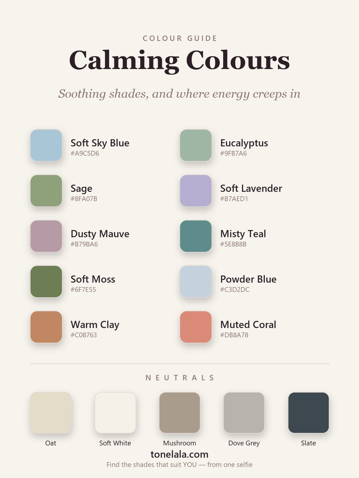
Ten shades I lean on when a client wants their wardrobe to feel calmer — mostly soft, cool tones, with two warm-but-gentle colours at the end to show where energy starts to creep back in.
| Colour | Hex |
|---|---|
Soft Sky Blue #A9C5D6 |
The most restful of all — open-sky blue that feels airy and quietly spacious. |
Eucalyptus #9FB7A6 |
A soft, greyed blue-green; fresh and soothing, like a slow morning. |
Sage #8FA07B |
Earthy and grounded; green's calmest, most wearable face. |
Soft Lavender #B7AED1 |
Blue's calm with a gentle warmth — soothing and a touch nurturing. |
Dusty Mauve #B79BA6 |
A muted, comforting pink-purple that settles a look without going sweet. |
Misty Teal #5E8B8B |
A deeper cool tone for grounding; calm with a little quiet depth. |
Soft Moss #6F7E55 |
A warmer, mossier green that feels rooted and restful. |
Powder Blue #C3D2DC |
Pale and serene; reads almost like a soft neutral. |
Warm Clay #C08763 |
Where energy begins — a soft, earthy warm tone that lifts without shouting. |
Muted Coral #DB8A78 |
The most active here; a gentle warm pop that adds life to a calm base. |
Calming neutrals: Oat #E5DCC8, Soft White #F4F1E9, Mushroom #A99C8D, Dove Grey #B6B3AD and Slate #3E4750. These quiet, low-contrast neutrals are what make a calming palette actually feel calm — pair a soft colour with oat or dove grey and the whole outfit settles. Slate gives you a restful alternative to hard black when you want a little depth.
Which calming colours are actually right for YOUR colouring?
Find your colour season →Which colours energise
The other end of the spectrum is just as useful to understand. Red is the most activating colour there is — it advances towards you, catches the eye and is genuinely hard to ignore, which is why it's the colour of stop signs, alarms and sale tags. Bright orange is sociable and warm, full of get-up-and-go. Clear yellow reads as the brightest, most stimulating colour of all; a little goes a long way. None of these are colours to avoid — they're brilliant when you want energy, confidence or a lift — they simply raise the volume of a look rather than lowering it.
The interesting part is the middle ground. Soften and grey those warm colours down and they keep their warmth while losing the jolt. Warm clay and muted coral are exactly that: they bring life and a flush of warmth to a calm palette without tipping it into "loud". That's why I included them above. A wardrobe of nothing but soft blues can start to feel a little flat and cool, and one warm, gentle accent stops it from going lifeless. Calm doesn't have to mean cold.
Dressing with colour intent
Here's the practical bit: once you can sort colours into calming and energising, you can dress for the day you want rather than the one you've got. Big presentation and you're nervous? Lean into a calm, cool base — soft blue or sage — with one grounding neutral, and let the colour quietly steady you. Flat, sluggish, need a lift? Reach for a warm accent — muted coral, warm clay — against your neutrals to nudge the energy up. Going somewhere you want to feel settled and approachable? Soft greens and blues read as calm and trustworthy, which is no accident given where we see them used.
You don't need a head-to-toe theme for this to work. A single calming colour near your face — a scarf, a knit, a shirt — does most of the job, because that's what people read first. Build the rest from quiet neutrals and you've got a look that feels the way you want with very little effort.
One honest caveat: colour psychology gives you the general pattern, but the colour that truly soothes you can be personal. A shade tied to a happy memory or a place you love can calm you more than any rule predicts. Use the soft-and-cool guideline as your starting point, then trust what actually makes you feel settled when you put it on.
Calm colours and your own colouring
There's a layer most colour-psychology articles skip, and it's the one I care about most: a calming colour only calms if it also suits you. Soft sky blue is restful in the abstract, but on the wrong undertone it can drain your face and leave you looking tired — which is the opposite of calm. The calming family is wide. There's a cool, icy soft blue and a warmer, dustier one; a fresh sage and a deeper, mossier green. They don't all flatter the same person.
Cool, soft colouring tends to glow in airy blues, eucalyptus and soft lavender. Warmer colouring is usually happier in soft moss, warm clay and a mauve with a little warmth in it. Deeper colouring can take misty teal and slate as its calm-but-grounded anchors, while lighter, softer colouring suits the palest, gentlest versions kept low-contrast. If you've ever bought a "calming" soft blue and felt washed out in it, the shade was almost certainly fighting your undertone — not the idea. My colour analysis guides walk through each season, and the pieces on how to wear lavender and how to wear sage green go deeper on two of the most soothing colours here. A personal analysis pins down the exact soft blues and greens that calm and flatter you, so you're not guessing.
Putting it together
Calm comes from soft, cool, muted colour; energy comes from bright, warm, saturated colour — and the most useful thing you can do is treat that as a dial you control. Build a quiet base from soft blues, sage and gentle neutrals when you want to feel settled, add a warm clay or coral accent when you want a lift, and keep your most flattering shades near your face. Get the version of each calming colour right for your own colouring, and a soothing wardrobe stops being a vague idea and becomes something you can reach for on purpose, on exactly the days you need it.