
In a sentence: The colours that go with sage green are warm, earthy tones — terracotta, blush, mustard, rust, caramel and coral — anchored by navy or charcoal and softened with cream and greige neutrals. Skip to the full pairing palette or find your most flattering colours.
Sage green is the colour people reach for when they want to look calm and a little expensive without trying too hard — and then they freeze at the second step, because they have no idea what to put with it. I get the question constantly: a client buys the sage jumper or paints the bedroom that gorgeous muted green, and then everything they add looks either dull or weirdly mismatched. The colour itself is rarely the problem. The pairing is.
Here's my honest take after years of styling it: sage green is a warm-neutral's best friend and a bright colour's worst nightmare. It wants earth tones and soft, dusty companions — not the crisp, high-contrast partners we're all trained to default to. The instinct is to "brighten it up" with white and a pop of bold colour, and that's almost always where it goes sideways. Get the one idea right — keep its company soft and warm — and sage suddenly does the heavy lifting for you.
What kind of colour sage green is
Sage green is a muted, greyed-down green with a soft, slightly herbal quality — named after the leaf, and it behaves like one. The key thing to understand is that it's low in chroma: there's grey mixed into it, which is exactly why it reads as restful rather than loud. Most sages also lean gently warm, sitting somewhere between a true cool green and an olive, though you'll find cooler, greyer versions too.
That muted, earthy character is what drives everything about pairing it. Because sage is soft and slightly dusty, it loves partners that share that softness — warm clays, dusty pinks, creamy off-whites. Anything too clean or too saturated next to it creates a mismatch in texture, not just hue: the bright colour looks plasticky and sage looks tired. And because it sits on the green side of the wheel, its natural complement lives in the warm orange-to-terracotta range, which is why those tones make it sing rather than clash. Treat sage as a sophisticated neutral with a warm heart — somewhere between olive, grey and eucalyptus — and the right partners fall into place almost on their own.
The best colours to go with sage green
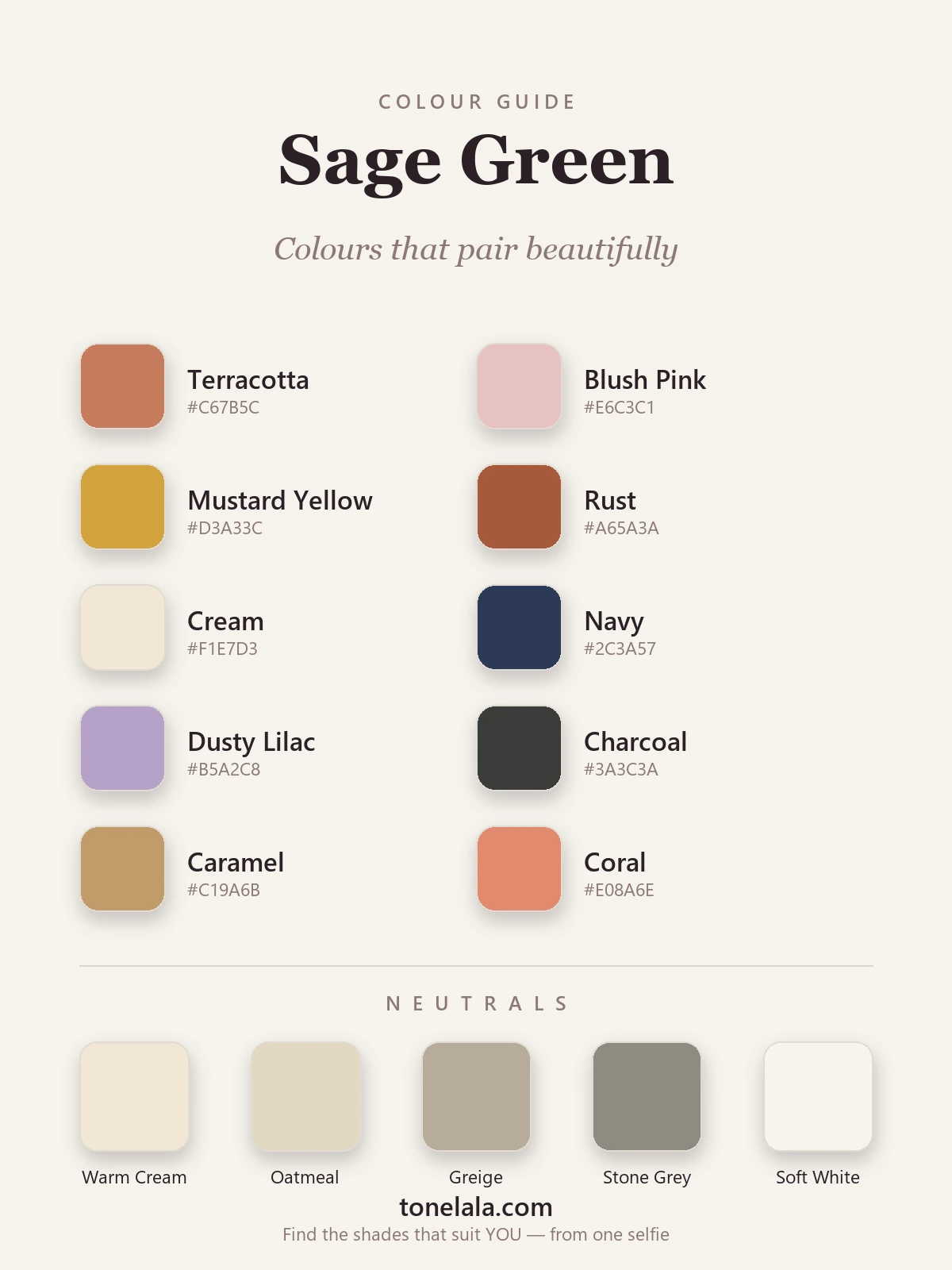
These ten are the ones I keep coming back to — each earns its place for a specific reason.
| Colour | Hex |
|---|---|
Terracotta #C67B5C |
The classic complement — warm clay opposite sage on the wheel; instantly makes it richer. |
Blush Pink #E6C3C1 |
Dusty, soft pink that flatters sage's gentleness for a romantic, easy contrast. |
Mustard Yellow #D3A33C |
Earthy golden warmth that picks up any olive lurking in the sage. |
Rust #A65A3A |
A deeper, autumnal cousin of terracotta — grounding and rich for cooler months. |
Cream #F1E7D3 |
The effortless one; warm cream lets sage breathe and keeps the look soft. |
Navy #2C3A57 |
The grown-up anchor — adds depth and polish without the harshness of black. |
Dusty Lilac #B5A2C8 |
A muted, near-analogous purple that feels unexpected and gently modern. |
Charcoal #3A3C3A |
Your best "dark" — grounds sage like black would, but reads warmer and softer. |
Caramel #C19A6B |
Warm tan that bridges sage and brown leather beautifully; pure quiet luxury. |
Coral #E08A6E |
A softer, sunnier pop of warmth when terracotta feels too earthy. |
Neutrals that go with sage green: Warm Cream #F1E7D3, Oatmeal #E2D8C3, Greige #B7AC9B, Stone Grey #8E8B82, and Soft White #F7F4EC — warm, dusty neutrals that echo sage's softness instead of fighting it.
Which shade of sage green actually suits YOU?
Find your colour season →Colours to avoid with sage green
- Bright, acidic greens (lime, neon, kelly green) — they make muted sage look flat and slightly dirty by comparison. Greens together need to share the same softness, or one always loses.
- Pure black — it can work, but it's the lazy choice; against sage's warm softness it often reads cold and heavy. Charcoal or navy gives you the same anchor with far more harmony.
- Cool, icy brights — electric blue, fuchsia, stark white. They're too high-contrast and too cool for sage's gentle, earthy mood, so they jar rather than complement.
Sage Green outfit combinations
- Sage knit + terracotta trousers + cream trainers — the pairing I recommend most. Warm, balanced, and quietly stylish for everyday; add gold studs and you're done.
- Sage midi dress + caramel leather boots + gold jewellery — lean into the earthy warmth. The tan and gold make sage look genuinely luxe, and a tan belt to break it at the waist pulls the whole thing together.
- Sage blazer + blush silk top + navy tailored trousers — soft contrast up top, a grown-up anchor below. Brilliant for work or dinner, and proof that you don't need black to look sharp.
- Sage jumper + charcoal denim + rust scarf — a cosy autumn combination where charcoal grounds it and the rust scarf at the neck gives the whole look its spark.
How to wear sage green for your colour season
Here's the bit most pairing guides skip: there isn't one sage green. The colour spans everything from a warm, golden, almost-olive sage to a cool, pale, greyed one — and the right version for you depends entirely on your own colouring. A warm, deep sage (think olive's gentler sibling) flatters warm and rich seasons; a cooler, dustier sage suits soft and cool colouring far better. Wear the wrong temperature of sage near your face and even this forgiving colour can leave you looking a little washed out.
The same logic applies to the pairings. A warm person looks incredible in sage with rust and mustard; a cooler person is better in sage with blush, dusty lilac and navy. A deep, high-contrast colouring can take sage with charcoal and the strongest terracotta, while a soft, gentle colouring is happiest keeping the whole combination low-contrast and dusty. None of these are rules so much as starting points — but they're the difference between sage looking like your colour and sage just looking like a nice jumper. If you're not sure which camp you fall into, my colour analysis guides walk through how warmth, depth and contrast work season by season — and a personal analysis tells you the exact shade of sage (and which of these partners) will flatter you most, rather than leaving you to guess in front of a mirror.
Putting it together
Sage green rewards restraint and warmth. Build around it the way you would a neutral — pick one warm earth tone you love (terracotta, rust or caramel), one soft neutral (cream or greige), and let sage be the calm centre that ties them together. Skip the bright, cold colours your wardrobe instincts reach for, lean into the dusty and the golden, and this is one of the easiest, most flattering colours you can own. The trick was never finding what goes with sage — it was trusting it to stay soft.