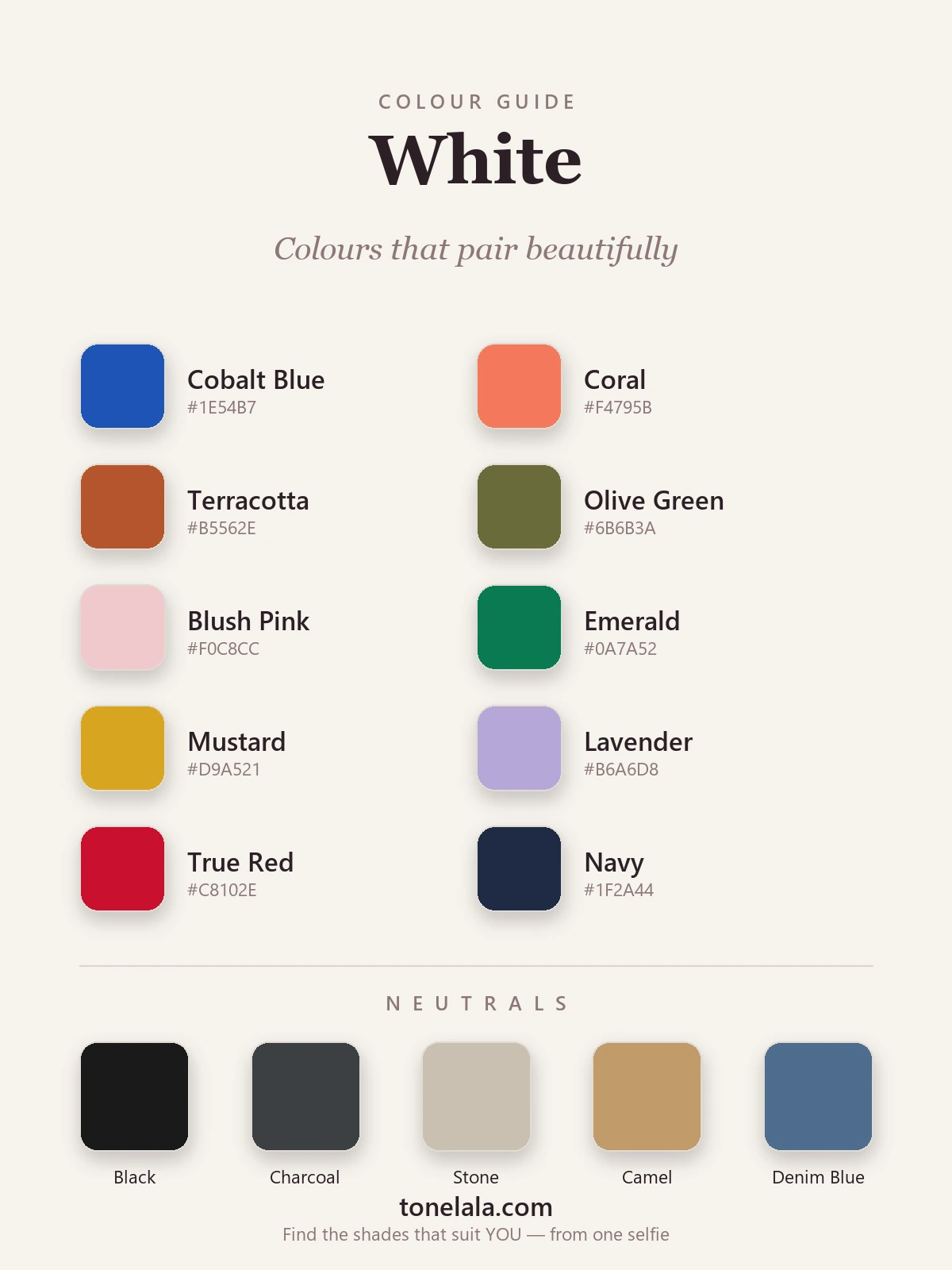
In a sentence: the best colours that go with white are clear, confident shades — cobalt blue, coral, true red, emerald and mustard — with softer partners like blush, lavender and olive, plus black, charcoal, stone, camel and denim blue as neutrals. Skip to the full pairing palette or find your most flattering colours.
A white shirt is the most photographed item in fashion and the most underused at home. We hang it next to a hundred things, decide it "goes with everything", and wear it with the same jeans on repeat. White does go with everything — that's its function — but going with and looking deliberate are two different outcomes, and the gap between them is almost always one decision: which colour you put beside it, and whether your white is warm or cool.
Here's the thing I tell every client. White isn't one colour. There's a crisp, blue-based optic white and there's a soft, yellow-based ivory, and they behave completely differently. Optic white snaps against a jewel tone and reads sharp and modern; ivory melts into earthy shades like terracotta and olive and reads soft and expensive. Get the temperature of your white right and almost any colour will work. Get it wrong and even a beautiful pairing looks faintly off. So before you pick a partner colour, decide what kind of white you're actually wearing.
What kind of colour white is
White is the presence of all reflected light, which is why it works as the brightest neutral you own. It has no single hue to clash with, so technically it pairs with the entire wheel. That's the line every other site stops at — true, but not useful, because it skips the part that decides whether the outfit lands.
What white actually does is two things. First, it maximises freshness: against a clean white, a saturated colour looks cleaner and a pale colour looks crisper, because white pushes the eye toward brightness rather than depth. That's the opposite of black, which deepens and enriches. Second — and this is the part that catches people out — white has a temperature. A cool optic white (somewhere around #F8F8FF) leans blue and loves cool, clear colours. A warm ivory or cream (around #F4EFE0) leans yellow and loves warm, earthy ones. So the colours that sing next to white aren't random — they're the ones whose temperature agrees with your particular white. Match the two and white frames a colour effortlessly; mismatch them and the whole thing feels slightly muddy even when the individual pieces are lovely.
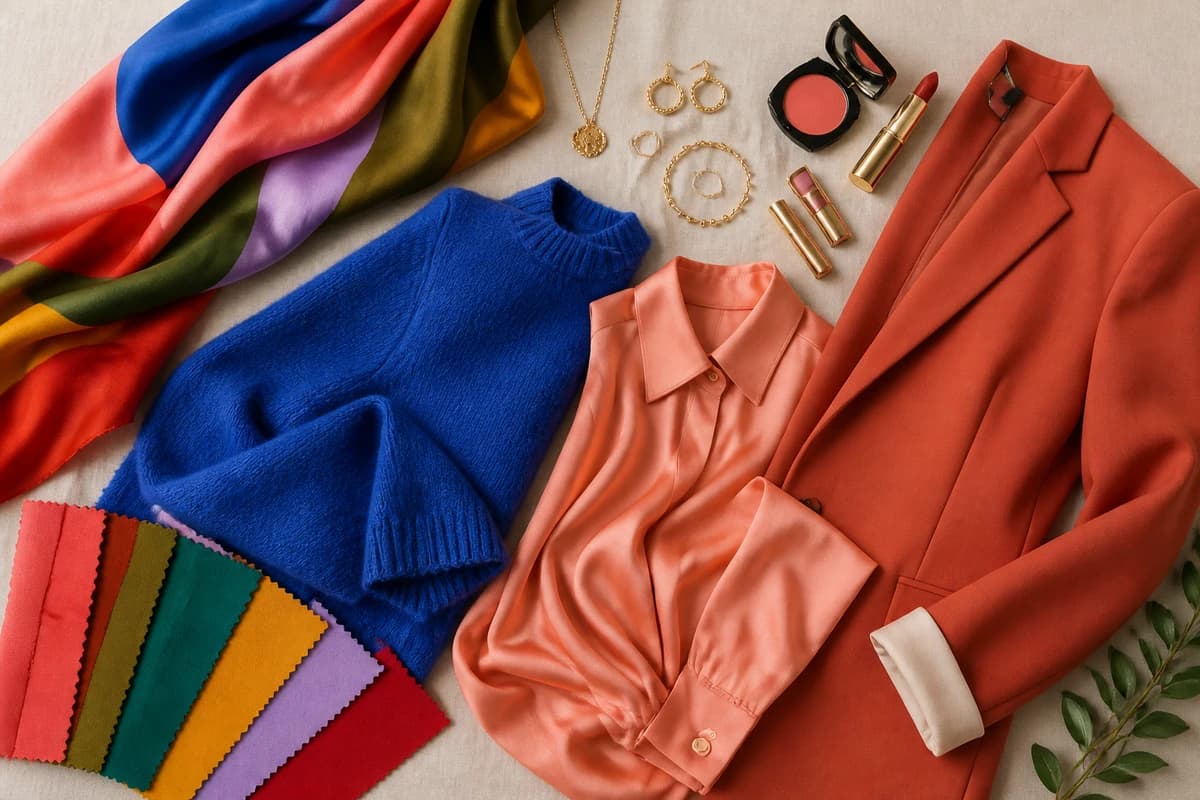
The best colours to go with white
These ten earn their place — a spread of cool, warm and soft shades so there's a white pairing for every wardrobe and every mood.
| Colour | Hex | Why it works |
|---|---|---|
| Cobalt Blue | #1E54B7 |
The most striking partner of all. A clear, bright blue against crisp white is fresh, confident and unmistakably modern. |
| Coral | #F4795B |
Warm, sunny and alive — white keeps coral looking clean rather than sweet. The easiest summer pairing there is. |
| Terracotta | #B5562E |
Earthy warmth that a soft ivory-white grounds beautifully; reads relaxed and quietly stylish, never loud. |
| Olive Green | #6B6B3A |
Muted, grown-up green that warm white makes look intentional instead of military. A favourite for everyday. |
| Blush Pink | #F0C8CC |
Soft pink with white is gentle and pretty; the white stops blush tipping into babyish and keeps it clean. |
| Emerald | #0A7A52 |
Jewel-on-bright. Optic white and emerald is crisp, rich and a little dressy — far fresher than emerald with black. |
| Mustard | #D9A521 |
A golden yellow that feels warm and characterful against white; the brightness keeps it from going dull. |
| Lavender | #B6A6D8 |
A cool, modern pastel that white sharpens; reads soft but considered, especially against a cool white. |
| True Red | #C8102E |
The high-contrast classic. White and red is bold, clean and graphic — nautical in summer, sharp year-round. |
| Navy | #1F2A44 |
The most reliable pairing you own. Navy and white is endlessly wearable, crisp and impossible to get wrong. |
Neutrals that go with white: Black #1A1A1A for the highest contrast there is, Charcoal #3C3F44 for a softer dark, Stone #C9C0B1 for a quiet tonal look, Camel #C19A6B to add warmth (white and camel looks instantly expensive), and Denim Blue #4E6E8E as the easy everyday partner.
Which shade of white actually suits YOU?
Find your colour season →Colours to avoid with white
White is forgiving, but a couple of combinations genuinely fall flat:
- Mismatched whites. A cool optic-white top with a warm cream skirt is the most common white mistake there is — side by side they read like a laundry accident rather than a tonal choice. Keep your whites in the same temperature family, or break them up with a clear colour so the eye stops comparing them.
- Washed-out pastels. The palest lemon, barely-there mint, the faintest baby blue — anything that sits almost as light as white has nothing to contrast against, so it simply disappears. If you want soft, choose a pastel with a touch more depth (blush, lavender, a proper sky blue) so white still has something to frame.
- Murky, low-saturation mids. Sludgy taupe-greens and greyed-out browns can look dingy beside a bright white, because white exposes how muddy they are. White rewards clarity — give it a colour with some life in it.
The quick test: hold the colour against your white and ask whether it looks cleaner for being there. If white makes it look dull or makes the two whites argue, swap it out.
White outfit combinations
A few pairings I come back to again and again:
- White + navy + camel. A white shirt, navy trousers, a camel coat or bag. Crisp, expensive-looking and seasonless — the most reliable white outfit there is.
- White + cobalt (or true red). A white dress or tee with one clear, bright colour — cobalt shoes and earrings, or a red lip and bag. The contrast does all the work; instantly looks decided.
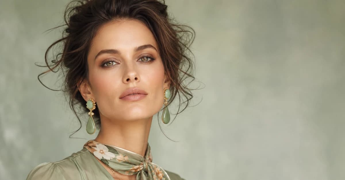
- White + terracotta + olive. A warm ivory-white with earthy shades and gold jewellery. Soft, modern and grounded — brilliant for warm colouring and a perfect transitional-season look.
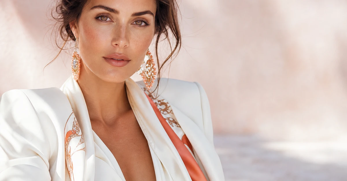
- White + black. A white shirt and black trousers, or the reverse. The highest-contrast, most graphic look you can build, and it always reads polished. Add gold or silver to taste.
How to wear white for your colour season
Here's the part the colour-theory sites skip: the best white for you, and which of these pairings will flatter you, depends on your own colouring — because white near the face is doing a lot of work.
Bright, cool optic white suits deep, cool, high-contrast colouring most easily. If you're a True Winter or Bright Winter, you can wear crisp white right up to your jaw and it looks like it was made for you — especially with cobalt, emerald or true red. If you're warmer or softer — many Autumns and Summers — a stark, blue-white close to your face can look harsh and slightly draining, exaggerating shadows and any redness. That doesn't mean no white. It means reaching for a warm ivory or soft cream instead, and pairing it with earthy or muted colours — terracotta, olive, blush — rather than electric brights. A Soft Summer glows in a soft white with lavender and dusty blue; a warm Autumn looks best in cream with terracotta and mustard.
The shortcut to all of this is knowing your season. The colour analysis guides walk through each one, and a proper personal analysis reads your undertone, depth and contrast to tell you the exact white — cool optic or warm ivory — and the precise partner colours that light you up.
Putting it together
White is the most generous neutral you own, but it does its best work as a clean frame, not the whole picture. Decide first whether your white is cool or warm, then give it one clear colour you love — cobalt, coral, navy, camel — and let white keep it fresh. Lean into contrast rather than pairing white with another almost-white, and the basics you've worn a hundred times start looking deliberate, crisp and unmistakably you. The real upgrade isn't a whiter white; it's knowing which white is yours, and exactly which colour to put beside it.