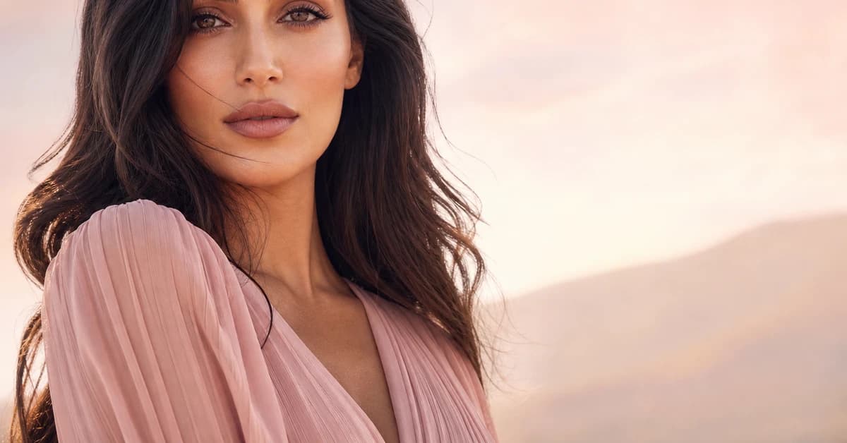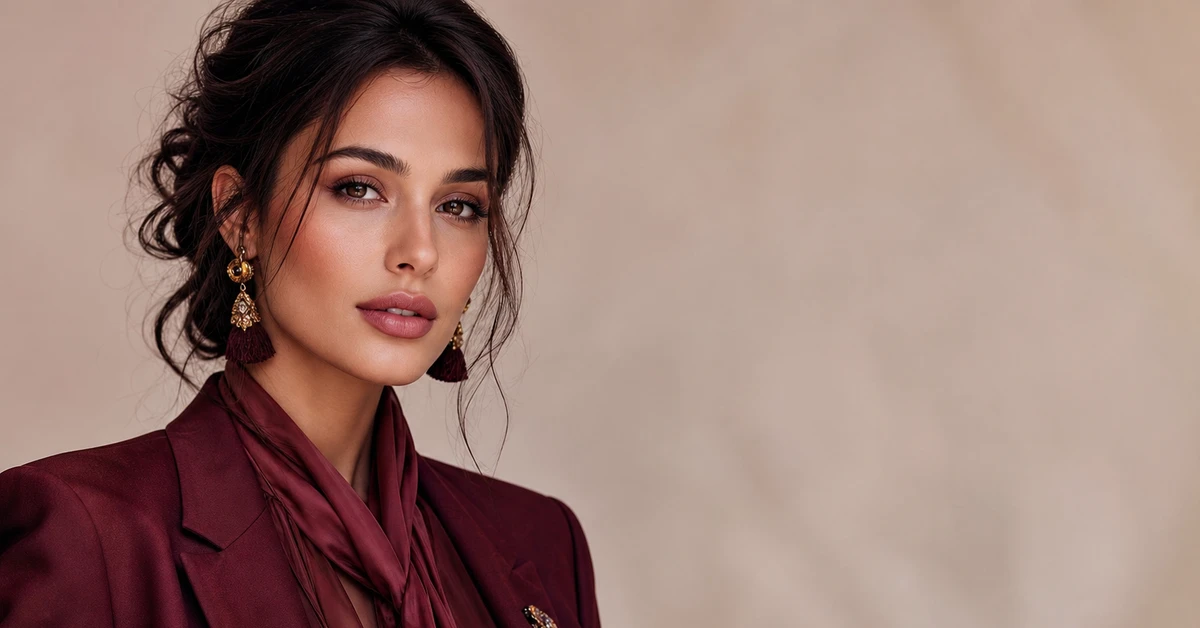
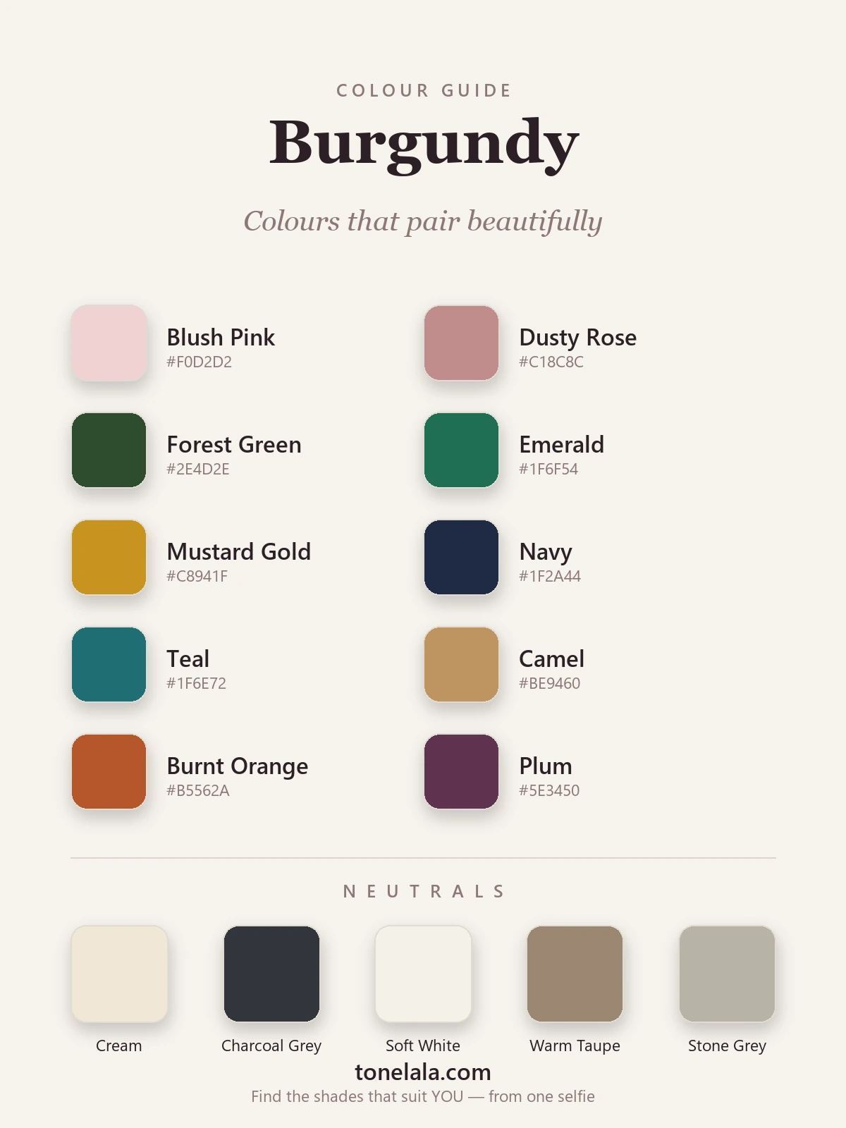
In a sentence: The colours that go with burgundy are blush pink, dusty rose, forest green, emerald, mustard gold, navy, teal, camel, burnt orange and plum — with cream, charcoal and taupe doing the neutral work. Skip to the full pairing palette or find your most flattering colours.
Burgundy is the colour I reach for the second the light starts to drop in autumn — and it's the one clients most often own, yet most often get stuck styling. They've got the burgundy jumper, the burgundy boots, the burgundy bag. And then they wear all three with black, every single time, because black feels safe. It works, but it's the least interesting thing burgundy can do.
The reason burgundy is such a generous colour is that it's already doing two jobs at once: it has the depth of a dark neutral and the richness of a jewel tone. That means it can sit quietly behind camel and cream, or it can throw a proper spark next to emerald. Most people only ever use the quiet half. This guide is about the other half — the actual shades, with hex codes, that make burgundy look considered rather than convenient.
What kind of colour burgundy is
Burgundy is a deep, dark red with a distinctly cool, blue-based undertone — it's red mixed with purple and a good deal of brown, named after the wine, sitting somewhere around #6E1423 to #800020. That blue-purple lean is the whole story. It's what separates burgundy from a warm brick or a true scarlet, and it's what decides who plays well alongside it.
Because it's a dark, muted, cool-leaning colour, burgundy behaves a bit like a neutral with the volume turned up. Two things follow from that. First, its complement on the colour wheel is green — so forest green and emerald give you the most satisfying, classic contrast. Second, anything that shares its softened, slightly dusty quality (blush, dusty rose, plum, teal) blends in seamlessly, while clean, bright, warm colours tend to fight it.
It also helps to know burgundy isn't a single shade. There's a cool, almost purple wine on one end and a warmer, brick-tinged oxblood on the other, and where your particular burgundy sits nudges its best partners one way or the other. The principle holds either way: keep undertone in mind and the pairings almost choose themselves.
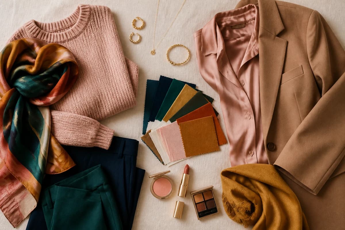
The best colours to go with burgundy
Here's the palette I actually use — five "easy wins" you can wear tomorrow, and a few braver options for when you want burgundy to do more than just behave.
| Colour | Hex |
|---|---|
Blush Pink #F0D2D2 |
A soft, tonal partner — same red family, far lighter. Reads romantic and modern, never twee. |
Dusty Rose #C18C8C |
The grown-up version of blush; muted enough to sit in burgundy's world without competing. |
Forest Green #2E4D2E |
Burgundy's near-complement. Deep green against deep wine is the most elegant contrast there is. |
Emerald #1F6F54 |
The same green idea with more life in it — jewel-on-jewel, rich and a little festive. |
Mustard Gold #C8941F |
Warm ochre lifts burgundy out of seriousness; the autumn pairing that always looks expensive. |
Navy #1F2A44 |
A softer, smarter "dark" than black. Two deep tones that hold hands instead of clashing. |
Teal #1F6E72 |
Shares burgundy's blue base, so it harmonises rather than shouts — cool, slightly unexpected. |
Camel #BE9460 |
The single most flattering neutral-ish partner. Warm tan makes burgundy glow. |
Burnt Orange #B5562A |
A muted, earthy orange (not bright) — analogous warmth that feels intentional and seasonal. |
Plum #5E3450 |
Burgundy's purple cousin. Tonal, moody and quietly luxurious worn together. |
Neutrals that go with burgundy: Cream #EFE7D4, Soft White #F4F1EA, Warm Taupe #9A8772, Stone Grey #B9B3A7 and Charcoal Grey #33363B (your best "dark" — kinder and more flattering than black).
Which shade of burgundy actually suits YOU?
Find your colour season →Colours to avoid with burgundy
- Bright, warm orange-reds and tomato shades. They sit on the opposite side of the undertone line from burgundy's blue-red base, so the two reds bicker rather than blend. If you want warmth, keep it muted — burnt orange, not pillar-box.
- Muddy mid-browns. A flat chocolate brown can dissolve into burgundy until the outfit reads as one murky block. Lift it with camel or a warmer tan instead.
- Pure jet black, used head to toe. It's not wrong, but it deadens burgundy's richness and can age the pairing. Charcoal or navy gives you the same anchoring effect while letting the wine tone breathe.
The quick test: if a colour makes the burgundy look browner or muddier, it's wrong. If the burgundy looks more like jewel-toned wine, you've found a friend.
Burgundy outfit combinations
A pairing on paper is one thing; a whole outfit is another. Here are four I come back to again and again, built so you can copy them straight off the page.
- Burgundy + camel + cream. A burgundy knit, a camel coat, cream trousers. This is the failsafe — warm, polished, the kind of outfit that looks like you tried without trying. Gold jewellery finishes it.
- Burgundy + forest green. A burgundy skirt with a forest-green jumper, or the reverse. Deep-on-deep contrast that feels rich rather than loud — my favourite cool-weather pairing for evenings.
- Burgundy + blush + soft white. Burgundy trousers, a blush blouse, white trainers or a soft-white coat. Tonal and unexpectedly soft, it takes burgundy somewhere lighter and more spring-like.
- Burgundy + navy + gold. Burgundy and navy together with a gold buckle, watch or chain. Quietly sharp, brilliant for work, and proof you never needed black.
How to wear burgundy for your colour season
Here's the part most pairing guides skip: there isn't one burgundy. The shade that lights you up depends on your own colouring, and getting it right matters more than any pairing.
Deep, cool-toned people — think True Winter or Deep Winter — wear a true, blue-based wine burgundy beautifully; it echoes the cool depth in their colouring. Warm, deep types like Deep Autumn or True Autumn come alive in a brick-leaning, slightly earthier burgundy instead, and may want to lean their pairings warmer — more camel, mustard and burnt orange than blush and teal. Softer, lighter seasons usually do best in a muted, lighter "burgundy" closer to a deep dusty rose, kept away from the face if it's very dark.
If you've ever held up a burgundy top and felt it either glowed or quietly drained your face, that's undertone talking — and it's almost impossible to judge reliably in your own bathroom mirror. Our colour analysis guides walk through how each season reads, and a personal analysis tells you the exact version of burgundy (and the pairings) built for your skin, hair and eyes.
Putting it together
Treat burgundy as a rich neutral and you've already won half the battle: pair it with camel and cream for ease, navy and charcoal for sharpness, then bring in forest green, emerald or mustard when you want it to genuinely sing. The one rule worth keeping is undertone — match burgundy to softened, slightly cool or earthy partners rather than clean, bright ones, and the whole outfit clicks into place. Get your shade right, lean on these ten colours, and you'll never default to burgundy-and-black again.