In a sentence: The colours that go with gold are navy, royal blue, emerald, forest green, burgundy, plum and teal for rich contrast; blush, ivory and chocolate brown for a softer, tonal look — all anchored by ivory, charcoal, soft black, taupe and stone grey. Skip to the full pairing palette or find your most flattering colours.
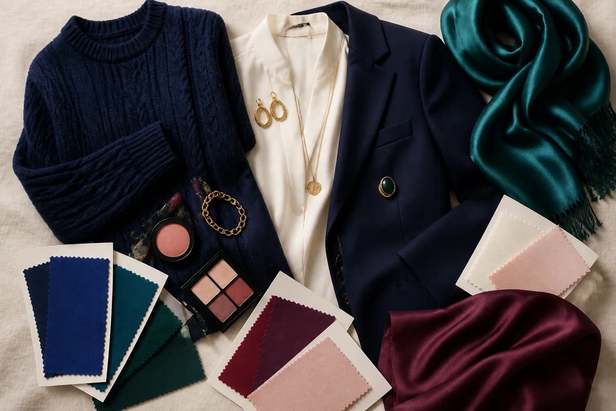
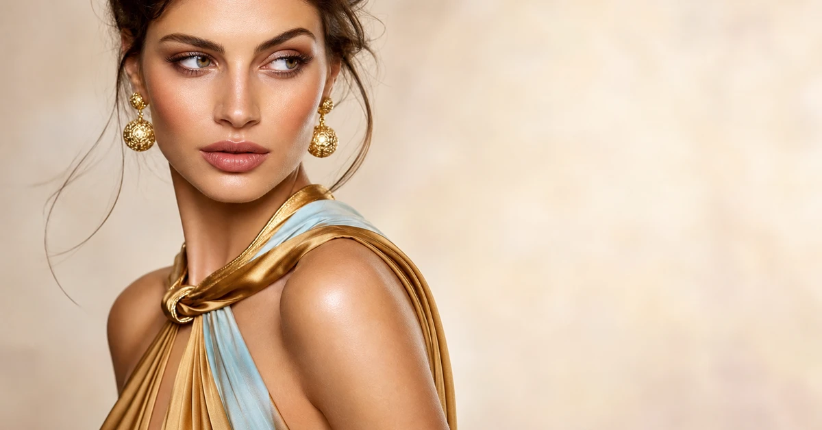
A stylist's tray of gold accessories at the end of a shoot tells you everything about how the colour behaves. Lay a gold cuff on a pale grey jumper and it looks like a forgotten bit of costume jewellery; lay the same cuff on a deep emerald or a navy and it suddenly reads like the most expensive thing on the rail. Nothing about the gold changed — only what sat behind it. I've watched clients write off "gold isn't really me" when the real problem was the backdrop, every time.
Here's the thing about gold: it's not really a colour you build an outfit around, it's a finishing note — a warm, reflective metallic that needs depth around it to come alive. Whether you're styling a gold blouse, a heap of gold jewellery, or a gold-and-white living room, the rule is the same. Give gold something rich and saturated to glow against and it looks luxurious. Surround it with pale, washed-out shades and it tips into brassy. Below are the ten colours I reach for to make gold look intentional, with real hex codes, plus the neutrals that hold the whole thing together.
What kind of colour gold is
Gold sits in an unusual spot because it's two things at once: a warm yellow-orange hue and a reflective metallic finish. Strip the shine away and you're left with something close to a deep ochre or honey — a saturated, warm, fairly dark yellow. That warmth is the headline. It's why gold belongs to the warm half of the colour wheel and why it behaves so differently from a cool, icy silver.
The colour-wheel logic follows on cleanly. Because gold is a warm yellow, its complement lives in the blue-to-purple range — which is exactly why navy, royal blue and plum feel so satisfying beside it. Deep blues and purples are gold's opposite in both temperature and hue, so they give it maximum contrast and let the metal flash against them. Analogous warm neighbours — browns, rusts, olive — harmonise instead, for a softer, tonal effect. And because gold reads as a deep, rich colour, it wants partners with similar depth: jewel tones, not pastels.
Two practical points worth knowing. First, gold's metallic shimmer means it functions almost like a neutral accent — a little goes a long way, and it lifts a colour scheme the way a good piece of jewellery lifts an outfit. Second, not all gold is the same: a cool, white-gold or pale champagne behaves quite differently from a deep, warm, antique gold, and the warmer your gold, the more it craves deep, rich company rather than anything chalky.
The best colours to go with gold
Here are the ten I keep coming back to — a run of deep jewel tones for contrast, plus a few softer and warmer options when you want gold to feel gentle rather than glamorous.
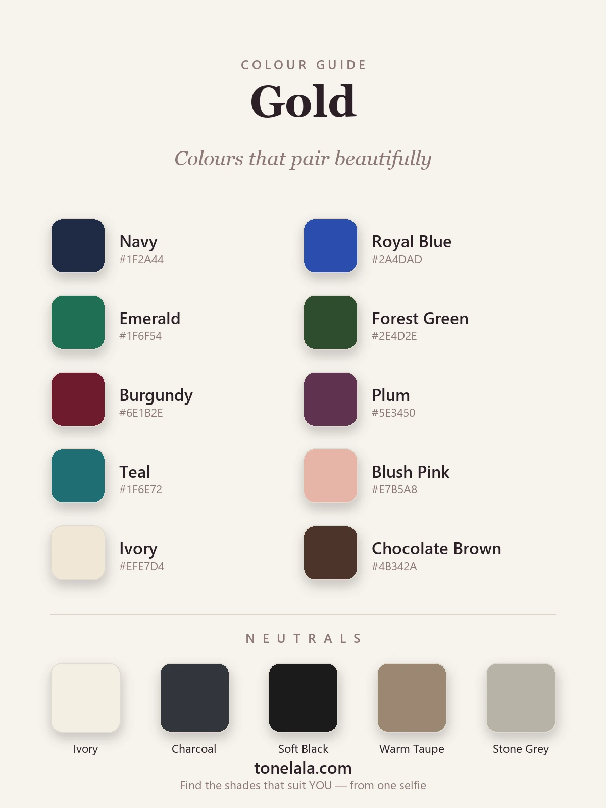
| Colour | Hex |
|---|---|
Navy #1F2A44 |
The failsafe. Deep, cool blue gives gold maximum contrast and instant polish — the reason navy-and-gold looks expensive everywhere. |
Royal Blue #2A4DAD |
A brighter, bolder take on the blue complement. Vivid blue against warm gold is rich, regal and full of life. |
Emerald #1F6F54 |
Jewel-on-jewel at its best. Deep green throws gold forward so it gleams — endlessly flattering and a little festive. |
Forest Green #2E4D2E |
The quieter, mossier cousin of emerald. Reads almost like a neutral and makes warm gold look grown-up and earthy. |
Burgundy #6E1B2E |
Deep wine red and warm gold are the classic autumn-into-evening pairing — luxurious, warm and very hard to get wrong. |
Plum #5E3450 |
A softer slice of gold's purple complement. Moody and romantic, gorgeous with an antique or rose gold. |
Teal #1F6E72 |
Sits across the wheel from gold's warmth, so the contrast is rich and a touch unexpected — brilliant in interiors. |
Blush Pink #E7B5A8 |
The gentle one. A muted, peachy pink keeps gold soft and pretty rather than bold — lovely for warmer skin. |
Ivory #EFE7D4 |
Warm cream lets gold breathe without dulling it — far kinder than stark white, which can make gold look hard. |
Chocolate Brown #4B342A |
The tonal choice. Brown shares gold's warmth, so the pairing feels seamless, rich and quietly luxe. |
Neutrals that go with gold: Ivory #F4EFE2 to keep it warm and fresh, Charcoal #33363B and Soft Black #1C1B1A for a dark anchor with a touch of drama, Warm Taupe #9A8772 for an easy tonal backdrop, and Stone Grey #B9B3A7 for a soft, modern neutral.
Does gold or silver actually suit YOU?
Find your colour season →Colours to avoid with gold
- Pale, chalky pastels. Baby pink, mint, pale lemon and powder blue have no depth, so gold has nothing to push against and tips into looking brassy or cheap. If you love pastels, go a few shades deeper — blush over baby pink, teal over mint.
- Icy, cool-toned silvers and greys. A very cool, blue-grey can fight gold's warmth and make it look slightly off and yellowed. A warmer stone grey or taupe sits beside gold far more happily.
- Neon brights, head to head. A hot fuchsia or electric lime competing with gold's shine reads loud and a little cheap. Let gold be the only metallic, glowing thing in the look; keep everything else rich but matte.
The quick test: if a colour makes gold look brassy or yellowy, it's wrong. If the gold suddenly looks like proper, gleaming treasure, you've found a friend.
Gold outfit and decor combinations
- The classic: a navy dress with gold jewellery and a gold clutch — sharp, timeless and impossible to get wrong. Works for the office party and the wedding alike.
- Quiet luxury: a chocolate-brown knit with gold hoops and a warm ivory coat. Tonal, warm and expensive-looking for almost no effort.
- A bit of drama: an emerald or burgundy gown with gold heels and a gold cuff. The jewel tone does the heavy lifting; the gold just catches the light.
- Everyday: ivory or stone-grey separates with a gold necklace and watch. Soft, neutral and let the metal be the whole point.
- Interiors: for a gold-accented room, paint the walls deep navy, forest green or a warm ivory, then bring gold in through lamps, frames and hardware. Against ivory it feels light and Parisian; against navy or green it feels rich and considered.
If you take one rule from this section, make it this: gold is the jewel, not the setting. Keep the colours around it deep and rich, let the gold be the one thing that catches the light, and the whole look reads expensive.
How to wear gold for your colour season
The biggest question with gold isn't what to pair it with — it's whether gold itself flatters you, and that comes down to undertone. Gold is a warm metal, so it tends to light up warm and golden colouring most. Deep, warm types such as True Autumn and Deep Autumn practically glow in gold, and look wonderful pairing it with their burgundy, olive, teal and chocolate. Warm, bright Springs carry a lighter, brighter gold beautifully against ivory and coral. Cooler, blue-toned colouring — many Summers and some Winters — can find a soft yellow gold a touch harsh and may prefer rose or white gold, or silver, near the face.
Your best pairings shift with your colouring too. A warm, deep person can wear gold with the richest jewel tones and earthy browns; a cooler person tends to look better keeping gold a little further from the face and leaning on plum, teal and ivory. If you've ever held a gold chain to your throat and felt it either warmed your skin or made it look sallow, that's undertone talking — and it's genuinely hard to judge in your own mirror. Our colour analysis guides walk through how each season reads, and if you specifically want to settle the metal question, gold vs silver: which suits you and the best jewellery metal for your skin tone go deeper still. A personal analysis tells you your exact best gold — and the colours that make your face come alive rather than wash it out.
Putting it together
Treat gold as a finishing jewel and give it deep, rich company: navy or royal blue when you want classic polish, emerald or burgundy when you want glamour, chocolate or olive when you want warm and tonal. Keep one warm neutral close — ivory, taupe or a soft charcoal — and let the gold be the only thing that gleams. Steer clear of chalky pastels and icy silvers that flatten it, get your shade of gold right for your colouring, and it stops being the accent you're unsure about and becomes the one that makes everything else look more expensive.