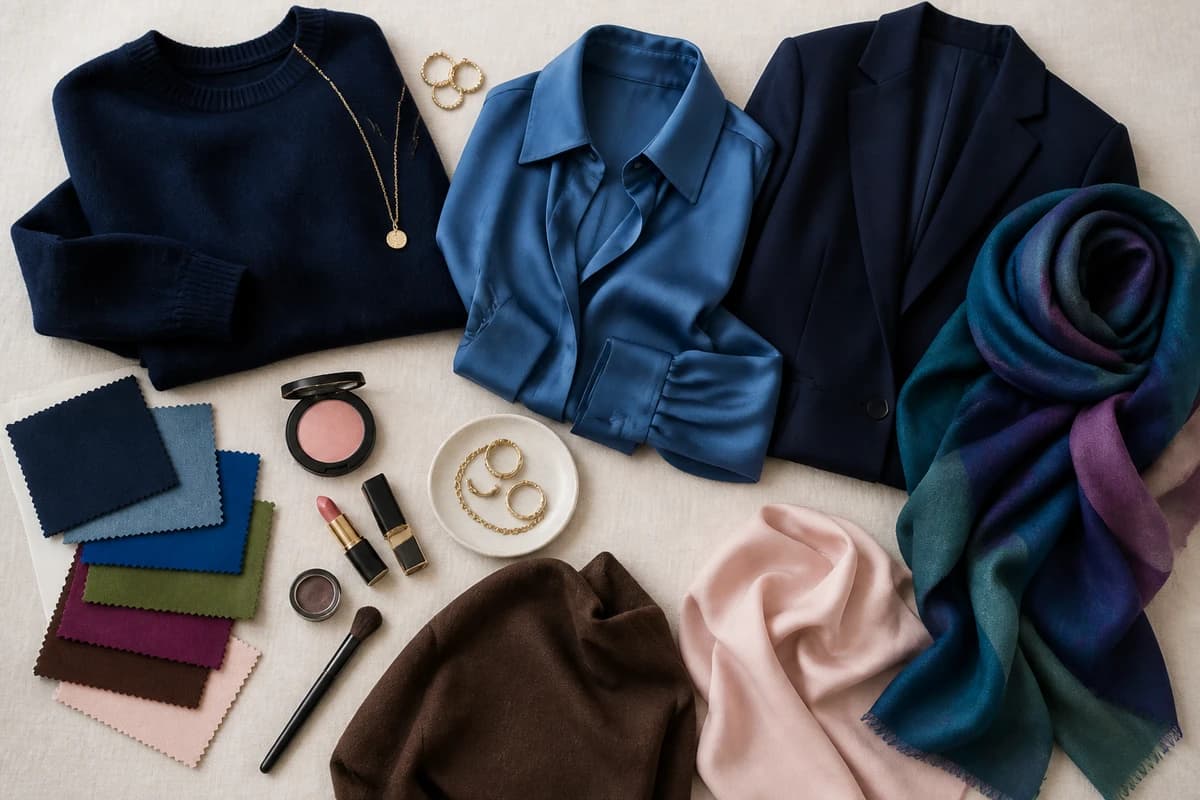
In a sentence: The colours that go with orange are navy, denim blue, teal and cobalt for cool contrast; olive, forest green, chocolate and mustard for a warm tonal look; and plum and blush to soften it — all anchored by cream, stone, grey, charcoal and camel. Skip to the full pairing palette or find your most flattering colours.
A client once told me she'd "given up on orange" after a rust-coloured jumper sat in her wardrobe untouched for two winters. When she finally pulled it out for me, the problem was obvious in three seconds: she kept reaching for it with black jeans, and the pairing was so heavy it made the orange look like a traffic cone. We put the same jumper with deep navy trousers and a cream scarf, and it went from costumey to quietly expensive. She wears it weekly now.
That's the thing about orange — it has a reputation for being difficult, but it's really just a colour that needs the right partner. Get the partner right and orange reads warm, confident and a little bit chic. Get it wrong and it shouts. Below are the ten colours I reach for again and again to pair with orange, with real hex codes, plus the neutrals that hold the whole thing together.
What kind of colour orange is
Orange is a secondary colour — red plus yellow — which means it's warm right through to its core. It's also one of the loudest colours on the wheel, second only to yellow for grabbing the eye, so almost everything about styling it comes down to balance. A clear, bright tangerine behaves very differently from a dusty terracotta or a deep rust, but they all share that underlying heat, and that heat decides what flatters them.
The colour-wheel logic is genuinely useful here. Orange's direct complement is blue, sitting straight across the wheel, which is exactly why navy, denim and cobalt pair with it so naturally — opposites create contrast and contrast creates interest. Its analogous neighbours are red and yellow, which sit either side of it; they can harmonise into a warm, sunset palette, but they can also clash if you let two bright warm colours fight at the same volume. And because orange is so warm and so vivid, it's flattered most by colours that are cooler and deeper than it is.
One more thing worth knowing: the more muted or earthy your orange, the easier it is to wear. A soft terracotta or burnt rust behaves almost like a neutral and slots into a wardrobe with very little effort, while a pure, saturated orange demands more deliberate pairing. The brighter the orange, the more it needs a calm, cool companion to push against — which is why the combinations below matter most when your orange is at full volume.
The best colours to go with orange
Here are the ten I keep coming back to — a mix of cool blue-family anchors, the warm earth tones that go tonal with orange, and a couple of softer options.
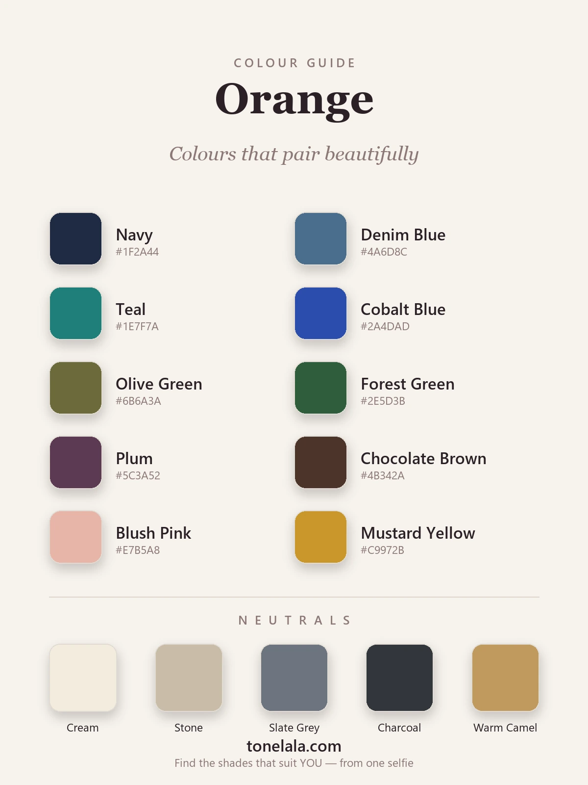
| Colour | Hex |
|---|---|
Navy #1F2A44 |
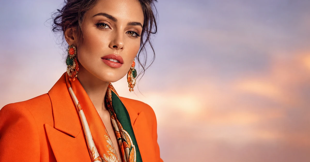
The failsafe. Deep, cool blue is orange's complement dialled down to wearable — sharp without the harshness of black. |
Denim Blue #4A6D8C |
Orange's everyday best friend. A medium blue cools the warmth and keeps the whole look relaxed and modern. |
Teal #1E7F7A |
A blue-green that sits near orange's complement, so the contrast is rich and a little unexpected — brilliant with rust. |
Cobalt Blue #2A4DAD |
The high-impact pairing. Bright cool blue against bright warm orange is punchy, confident and full of life. |
Olive Green #6B6A3A |
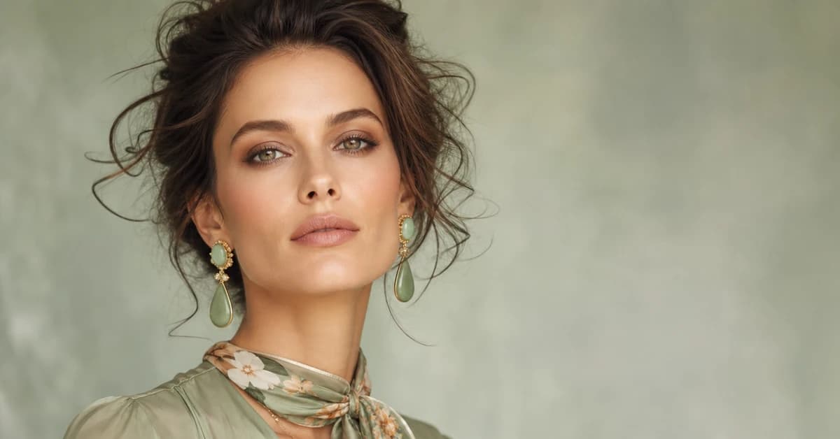
A muted, earthy green that shares orange's warmth — together they read outdoorsy, grounded and very autumnal. |
Forest Green #2E5D3B |
Deep green reads almost like a neutral and makes a warm orange look fresh and rich rather than loud. |
Plum #5C3A52 |
A deep, cool purple-brown that adds drama without clashing — gorgeous with a burnt or terracotta orange. |
Chocolate Brown #4B342A |
The chic alternative to black. Brown shares orange's warmth, so the pairing feels intentional and luxe. |
Blush Pink #E7B5A8 |
The gentle one. A muted, peachy pink keeps orange soft and pretty rather than bold — lovely for warmer skin. |
Mustard Yellow #C9972B |
A tonal, sunset pairing. Yellow is orange's neighbour, and a deep mustard harmonises instead of fighting it. |
Neutrals that go with orange: Cream #F3ECDD to keep it soft and warm, Stone #C9BCA6 for a quiet modern backdrop, Slate Grey #6E7480 and Charcoal #33363B to cool it down for everyday wear, and Warm Camel #C09A5E to lean into its golden side.
Which shade of orange actually suits YOU?
Find your colour season →Colours to avoid with orange
- Bright red right beside it. Red and orange are neighbours on the wheel, so worn together at full strength they compete and the eye doesn't know where to land. A deep brick or burgundy is the smarter way to bring red into the picture.
- Hot pink and fuchsia. Two loud warm-leaning colours fighting for attention rarely flatter — it tips into clashing fast. If you want pink, a soft, muted blush sits far more happily next to orange.
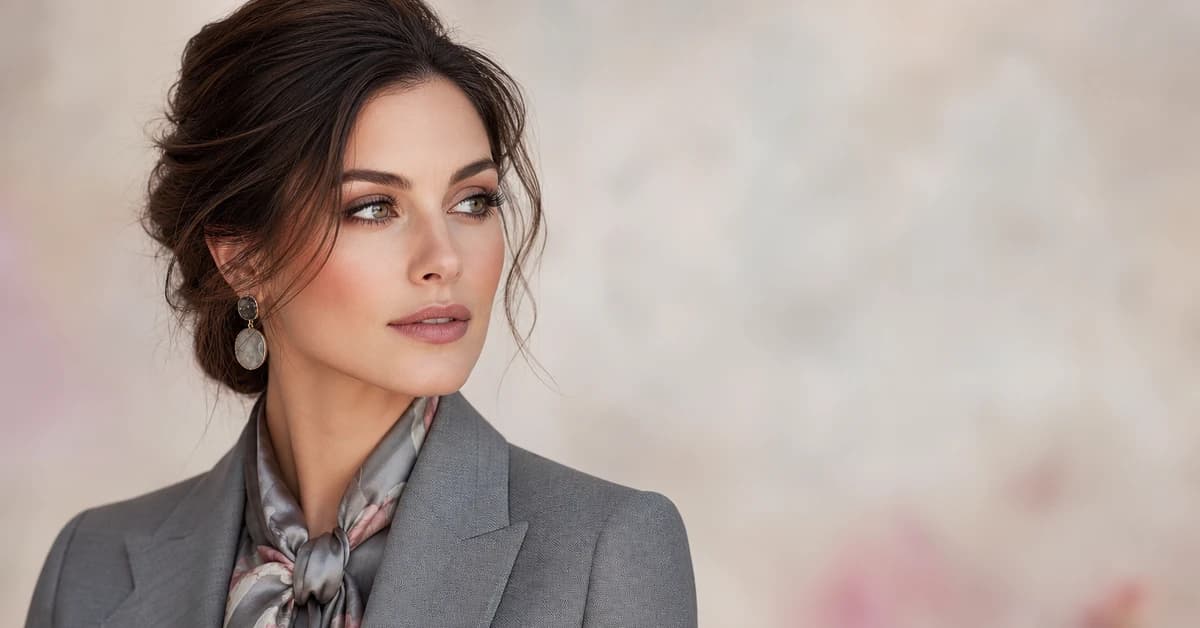
- Black, used carelessly. It works graphically, but a hard black-and-orange pairing can read like Halloween and tends to drain skin near the face. Swap in charcoal, navy or chocolate and you keep the depth without the costume.
Orange colour combinations to try
- The classic: an orange knit with navy trousers and cream trainers — warm, easy and impossible to get wrong. Add gold hoops to pull it together.
- Quiet luxury: a terracotta jumper with chocolate-brown wide-leg trousers and camel loafers. Tonal, warm and very expensive-looking for almost no effort.
- A bit of contrast: a bright orange dress with a denim jacket and white sneakers. The cool blue is orange's complement, so it balances the heat without trying too hard.
- Earthy and grounded: a rust blouse with olive trousers and tan accessories — a sunset palette that feels rich rather than loud, perfect for autumn.
- Smart event: a slate-grey suit with an orange silk blouse or pocket square. Grey mutes the orange just enough to read polished rather than playful, so it works for the office and a celebration alike.
If you only take one rule from this section, make it this: let orange be the loudest thing you're wearing, and keep everything else a notch cooler and deeper. The moment two warm colours compete at the same volume, the outfit loses its anchor.
How to wear orange for your colour season
The single biggest reason orange "doesn't suit" someone is almost always the wrong orange, not orange itself. A warm, earthy terracotta or rust glows on deep, warm colouring — think True Autumn and warm Spring types — but the same shade can look muddy on someone cool and bright. Flip it round: a clear, juicy tangerine or coral lifts brighter, warmer colouring, yet reads harsh on a soft, muted complexion. Same colour family, opposite results.
Your best pairings shift with your colouring too. A deep, warm person can carry orange with chocolate, olive and forest green; a brighter person tends to look better in coral with navy, teal and cream. If you want to know exactly where you sit, the colour analysis guides walk through each season, my guide to how to wear orange covers outfit formulas in more depth, and a personal analysis pins down your precise shade of orange — and the colours that make your face come alive rather than wash it out.
Putting it together
Treat orange as the star and give it a cooler, deeper co-star: navy or denim when you want easy, teal or cobalt when you want contrast, chocolate or olive when you want warm and grown-up. Keep one neutral close to your face — cream, grey or camel — and let the orange do the talking from there. Worn like that, it stops being the colour you've been avoiding and becomes the one people remember you in.