In a sentence: True Summer and Light Summer are both cool and soft, so they barely differ on undertone, what separates them is depth and clarity, with True Summer sitting medium, cooler and a touch clearer, and Light Summer staying lighter, paler and more neutral-cool. Skip to the distinguishing palette or find out which you are.
True Summer vs Light Summer: How to Tell the Difference
By ToneLalaUpdated July 13, 2026

Contents
Two women came to me in the same week, both certain they were "a Summer," both reaching for the same dusty blues, and they were not the same season at all. One could put on a cool raspberry and look polished; on the other, that exact raspberry sat like a bruise and dragged her face down. Swap them onto powder blue and the second one lit up while the first faded a little, like a photo losing a stop of contrast. Same cool family, two different homes inside it.
That is the whole problem with True Summer vs Light Summer. They share an undertone, they share a softness, and most online palettes show them in overlapping pastels, so people pick the prettier picture rather than the one that fits their face. The useful question is never "warm or cool" here, because both are cool. It's "how much depth can your face actually carry."
True Summer vs Light Summer: the core difference
Every season sits on three dials, undertone, value and chroma, and these two only meaningfully part on two of them.
- Undertone, nearly the same. Both are cool. True Summer is the most purely cool of the three Summers, with no warm hedge at all. Light Summer is cool too, but cool-leaning-neutral, so its coolness is gentler and airier. This is the dial people expect to separate them, and it barely does.
- Value, the big one. True Summer is medium: neither pale nor deep. Light Summer is light, and value is the loudest dial in its whole make-up; everything in the palette sits pale and luminous. This single difference is what you're really seeing when one of them suits a richer color and the other doesn't.
- Chroma, a smaller, real gap. True Summer is medium-muted: softened, but still clear enough to read as proper color. Light Summer is soft-to-medium and a notch more neutral. So True Summer is fractionally clearer and cooler, Light Summer fractionally softer and more neutral.
Put plainly: True Summer is the deeper, cooler, slightly clearer cousin; Light Summer is the paler, airier, slightly softer one. Their contrast levels follow from that, Light Summer reads low-contrast and gentle, while True Summer reads low-to-medium and a touch more defined. If you imagine a cool, soft blue, True Summer is that blue at medium strength and Light Summer is the same blue with two parts white stirred in.
The colors that tell them apart
The pastels both seasons share won't decide anything, the giveaways are the deeper, clearer shades only True Summer can carry, set against the pale, airy ones that belong to Light Summer.
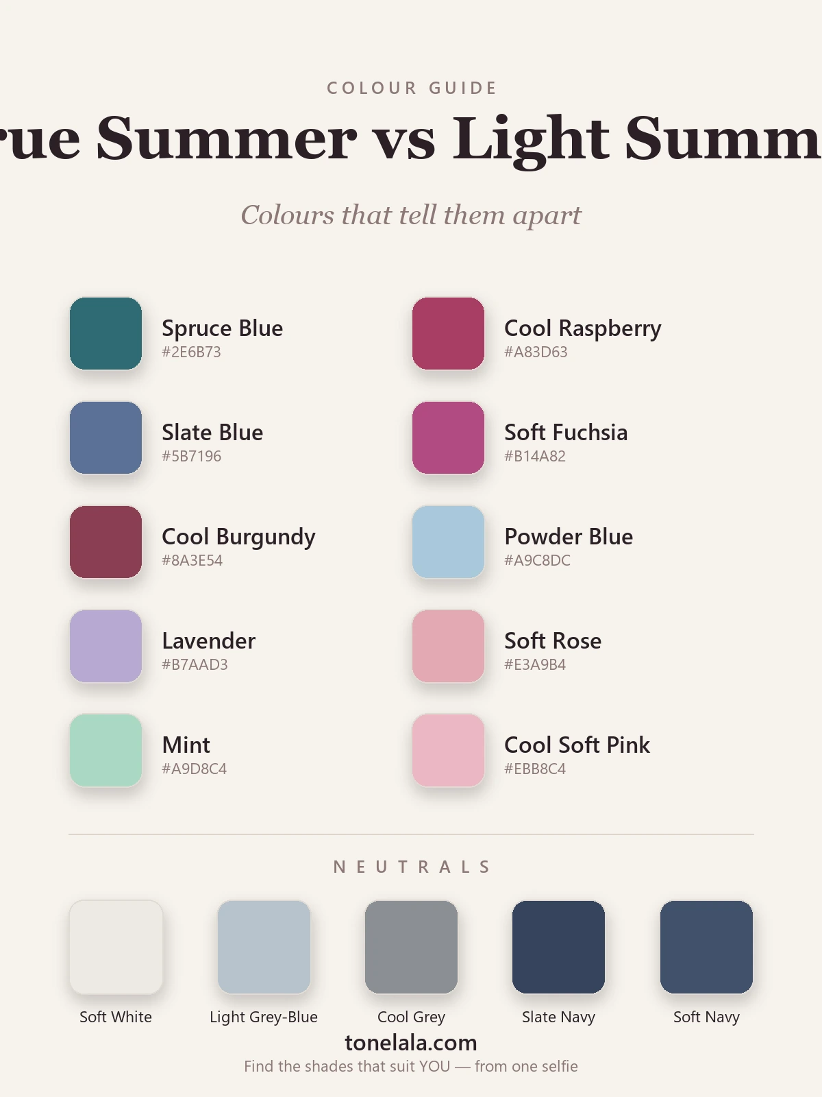
| Color | Hex | Flatters |
|---|---|---|
| Spruce Blue | #2E6B73 |
True Summer, medium depth a Light Summer can't hold |
| Cool Raspberry | #A83D63 |
True Summer, clear, cool and saturated enough to define the face |
| Slate Blue | #5B7196 |
True Summer, a fuller, cooler blue at medium value |
| Soft Fuchsia | #B14A82 |
True Summer, the clarity reads elegant, not loud |
| Cool Burgundy | #8A3E54 |
True Summer, its most useful deeper accent |
| Powder Blue | #A9C8DC |
Light Summer, pale and luminous, the season's signature |
| Lavender | #B7AAD3 |
Light Summer, soft, cool and airy |
| Soft Rose | #E3A9B4 |
Light Summer, light and gentle near the face |
| Mint | #A9D8C4 |
Light Summer, a delicate cool green True Summer would deepen |
| Cool Soft Pink | #EBB8C4 |
Light Summer, barely-there cool pink that brightens light coloring |
Shared neutrals: Soft White #EDEAE3, Light Gray-Blue #B6C2CB, Cool Gray #8A8E94, Slate Navy #36435C (True Summer leans on this darker one) and Soft Navy #41506B (Light Summer's lighter, softer dark). Neither season wears black.
Still not sure, True Summer or Light Summer?
Find your color season →How to tell which you are
The frontmatter and the swatches set the theory; these are the checks I actually run at the mirror.
- The depth drape. Hold a deeper cool color, a cool raspberry or slate blue, under your chin in daylight, then swap it for a powder blue or soft rose. Watch the face, not the fabric. If the deeper shade leaves your skin even and your eyes lifted, you're True Summer. If it casts a shadow and the pastel is the one that freshens you, you're Light Summer.
- The wash-out test. Pastels are pretty on everyone in the shop, so ask a sharper question: do they make your face look rested, or do they make it disappear? On a true Light Summer, soft pastels light the face up. On a True Summer, the palest ones can leave you looking a little washed out, as though you've skipped the deeper note your coloring wants.
- The jewelry read, careful with this one. Both seasons sit happily in silver and white metals, so silver-versus-gold won't separate them the way it separates a Summer from an Autumn. What you can notice is weight: a heavier, brighter polished metal tends to suit True Summer's slightly greater depth, while a finer, softer finish flatters Light Summer's lightness. Treat it as a tie-breaker, not a verdict.
- The contrast glance. Look at your bare face in a clear mirror and judge the distance between your skin, hair and eyes. Light Summer is genuinely low-contrast, everything melts together. True Summer is low-to-medium, a step more defined. The more your features quietly stand apart, the more likely you're True.
If you're True Summer / If you're Light Summer
If you're True Summer, you've got a bit more room than you think. Your coloring carries medium depth, so the cool raspberries, spruce blues and slate navies that overwhelm a Light Summer are exactly what make your face look its clearest. Keep your pastels for soft moments rather than your main event, and let a deeper cool shade sit near your face when you want to look put-together. The full breakdown, with every hex code and your best neutrals, lives in the True Summer guide.
If you're Light Summer, the instinct to soften everything is the right one. Your face wants light, cool, gently-muted color, and the moment something gets too deep or too saturated it starts wearing you. Lean into powder blue, lavender and soft rose, and reach for a soft navy rather than a hard dark when you need an anchor. The complete palette, neutrals and metals are in the Light Summer guide.
The reliable way to settle it
Here's the honest part: value and chroma are the two hardest dials to judge in your own bathroom, because the lighting flatters or flattens without warning and we're all a little biased about our own faces. The depth drape works beautifully when you can see it clearly, and not at all under a warm bulb at night. That's why two people who are genuinely different seasons can both stare into the same mirror and reach the same wrong answer.
A photo-based analysis sidesteps all of that. It reads your undertone, value and contrast off a clear, true-light image of your actual face, which is exactly the information the drape is trying to give you and exactly what the mirror keeps fudging. If you'd rather not gamble between two seasons that look so alike on a screen, that's the dependable route, and you can compare it against the rest of the color analysis guides once you know where you land. Find out which you are.
Frequently asked questions
What is the difference between True Summer and Light Summer?
Both are cool, soft seasons, so the difference is value and chroma rather than undertone. True Summer is medium in depth and a touch clearer and cooler, it can carry a cool raspberry or a slate blue. Light Summer is lighter across the board and a little more neutral-cool, so it lives in powder blue, lavender and soft rose. Same cool family; True Summer is the deeper, fuller one, Light Summer the paler, airier one.
Am I a True Summer or a Light Summer?
Hold a deeper cool color like a cool raspberry or slate blue against your face, then a powder blue or soft rose. If the deeper shade looks balanced and the pastel washes you out, you're True Summer. If the deeper shade feels heavy and pulls focus while the pastel lights you up, you're Light Summer. It comes down to how much depth your face can carry.
Which is warmer, True Summer or Light Summer?
Neither is warm, both are cool seasons. If anything, True Summer is the more decisively cool of the two, while Light Summer leans cool-neutral, so its coolness is gentler and airier. The real split between them is depth and clarity, not warmth: True Summer is cooler and clearer, Light Summer is lighter and softer.
Which is deeper, True Summer or Light Summer?
True Summer is deeper. It sits at a medium value with a little more saturation, so colors like cool burgundy, spruce and slate navy belong to it. Light Summer is the lightest of the cool Summers, its colors stay pale and luminous, and a deep shade quickly overpowers the face.
Can you be both True Summer and Light Summer?
You land in one season, but you can sit right on the border between them and borrow from the neighbour. Many people are a clear Light Summer who can stretch into the softer end of True Summer, or a True Summer light enough to wear a few Light Summer pastels near the face. A proper analysis places your dominant season and shows which way you flex.
How do I tell True Summer from Light Summer at home?
Use three checks. Drape a deeper cool color against a pale one and see which keeps your face fresh. Notice whether pastels look pretty or washed out on you. And look at your natural contrast, Light Summer is low-contrast and gentle, True Summer is low-to-medium and a touch more defined. The deeper, clearer read is True Summer; the paler, softer read is Light Summer.
Related guides

Soft Autumn vs True Summer: How to Tell the Difference
A color analyst on Soft Autumn vs True Summer, the two dials that separate them, the colors that tell them apart, and how to decide which you are.

Soft Summer vs True Summer: How to Tell the Difference
Soft Summer vs True Summer, explained by a color analyst: how they differ on undertone, value and chroma, the colors that separate them

Soft Summer vs Light Summer: How to Tell the Difference
Soft Summer vs Light Summer, explained by a color analyst, how they differ on value and chroma, the colors that separate them

Light Summer vs Light Spring: How to Tell the Difference
A color analyst on Light Summer vs Light Spring, how they differ on undertone, value and chroma, the colors that separate them

True Summer vs True Winter: How to Tell the Difference
True Summer vs True Winter, explained by a color analyst: how they differ on value and chroma, the colors that separate them, and how to tell which you are.

True Spring vs Light Spring: How to Tell the Difference
True Spring vs Light Spring, explained by a color analyst: how undertone, value and chroma differ, the colors that separate them
Prefer in person? Find color analysis near you
Browse local color analysts by city, or get the same season, palette and best-colors breakdown online from one selfie.
See your colors on a photo of you
Upload one selfie and ToneLala reveals your season, your full palette, and your best hair, makeup, jewelry and outfits, styled on you.