In a sentence: 12-season color analysis takes the classic four seasons and splits each into three, sorting your coloring by undertone, value and chroma so the match is precise rather than rough. Skip to the twelve seasons mapped out or find your own season.
12-Season Color Analysis Explained
By ToneLalaUpdated July 12, 2026

Contents
The first time the four-season system let me down, I was draping a client who was plainly warm, golden skin, warm-brown eyes, the lot, yet every rich Autumn color I held up made her look slightly heavy. Push to a clear, fresh Spring and she lit up. Same warmth, completely different palette. The old four-box model had nowhere to put her. The twelve-season system does, and that gap is exactly why it exists.
If you've read a few color articles you've met "Soft Summer" or "Bright Winter" without anyone explaining where those names come from. They're the twelve seasons, and once you see how they're built, the whole thing stops feeling like jargon and starts feeling like a map. Here's that map, in plain language.
Where the four seasons came from
The original system, popularised in the 1980s, sorted everyone into Spring, Summer, Autumn or Winter. It rested on one idea: warm coloring (Spring, Autumn) suits warm colors, and cool coloring (Summer, Winter) suits cool ones. Spring and Autumn share warmth; Summer and Winter share coolness. Light versus dark roughly separated the pairs.
It was a brilliant shortcut, and for a lot of people it worked. The trouble is it leaned on a single dial, warm or cool, and pretended everyone landed cleanly on one side. Plenty of us don't. You can be warm but bright, or cool but muted, and the four-box model simply had no slot for that. So color analysts added two more dials.
The three dials behind all 12 seasons
Every one of the twelve seasons is described by three traits. Learn these and the names decode themselves.
- Undertone: warm (golden, peachy) or cool (blue, pink). This is the original dial.
- Value: how light or dark your overall coloring is, from pale features to deep, high-contrast ones.
- Chroma: how bright or muted you are. Bright coloring carries clear, saturated color; muted coloring is softened, as if a drop of gray were stirred in.
No season is defined by all three at once. Instead, each is governed by the two that dominate. Soft Summer is cool and muted. Bright Winter is cool and bright. True Autumn is warm above all else. That's the engine of the whole system, three dials, two of them leading in any given season.
How the 4 seasons split into 12
Here's the part that ties it together: each classic season divides into three sub-seasons. One is the true version, the purest form of that season, and the other two borrow a quality from a neighbour, so they sit on the boundary between two of the original four.
- Spring → Light Spring, True Spring, Bright Spring. Warm and fresh. Light Spring borrows Summer's lightness; Bright Spring borrows Winter's clarity; True Spring is the warmest, most golden of the three.
- Summer → Light Summer, True Summer, Soft Summer. Cool and soft. Light Summer borrows Spring's lightness; Soft Summer borrows Autumn's muteness; True Summer is the coolest and clearest of the three.
- Autumn → Soft Autumn, True Autumn, Deep Autumn. Warm and rich. Soft Autumn borrows Summer's softness; Deep Autumn borrows Winter's depth; True Autumn is the most purely warm.
- Winter → Deep Winter, True Winter, Bright Winter. Cool and dramatic. Deep Winter borrows Autumn's depth; Bright Winter borrows Spring's brightness; True Winter is the iciest and most saturated.
Notice the pattern: the "borrowing" seasons always reach toward an adjacent family on the color wheel, never the opposite one. A Soft Summer drifts toward Autumn (its warm, muted neighbour), not toward Winter. That overlap is why two seasons from different families, Soft Summer and Soft Autumn, say, can look so alike. They meet at the muted, neutral middle.
The 12 seasons at a glance
Below is one representative color from each season, so you can see how the families relate across the temperature and value range.
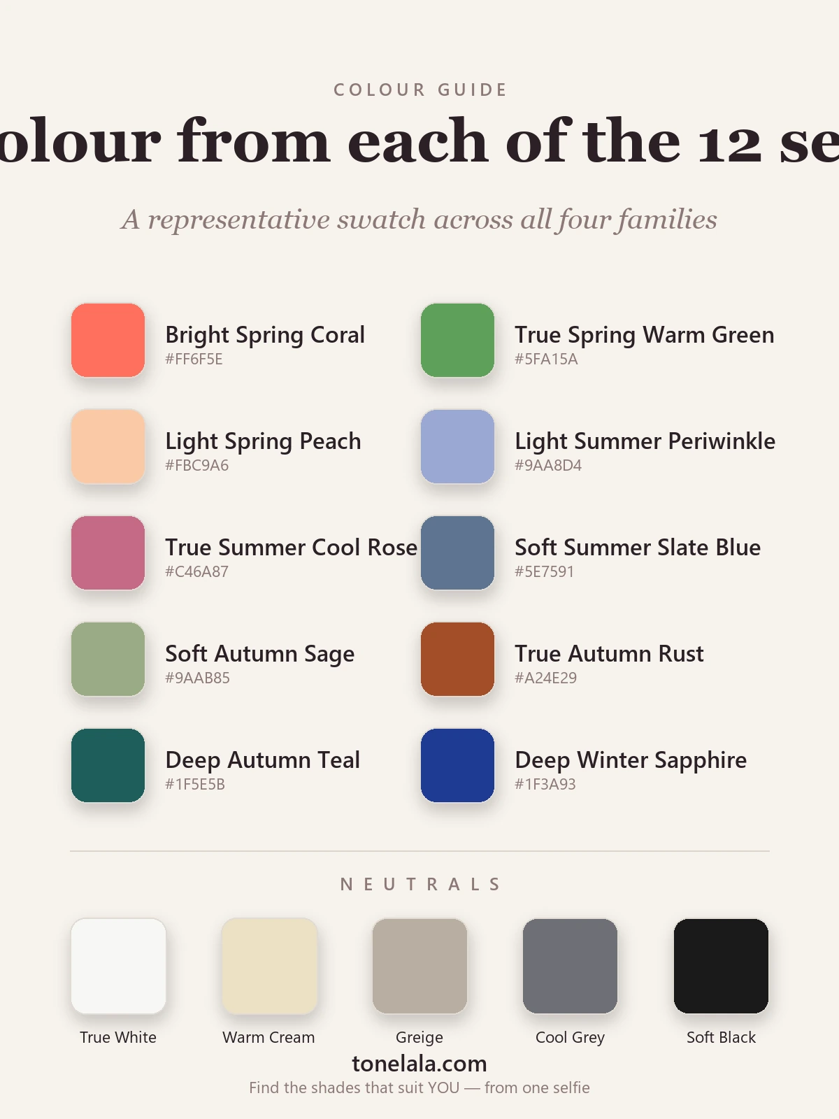
| Season | Defined by | A signature color |
|---|---|---|
| Light Spring | Warm · light | Peach #FBC9A6 |
| True Spring | Warm · clear | Warm green #5FA15A |
| Bright Spring | Warm · bright | Coral #FF6F5E |
| Light Summer | Cool · light | Periwinkle #9AA8D4 |
| True Summer | Cool · clear | Cool rose #C46A87 |
| Soft Summer | Cool · muted | Slate blue #5E7591 |
| Soft Autumn | Warm · muted | Sage #9AAB85 |
| True Autumn | Warm · rich | Rust #A24E29 |
| Deep Autumn | Warm · deep | Deep teal #1F5E5B |
| Deep Winter | Cool · deep | Sapphire #1F3A93 |
| True Winter | Cool · clear | True red #C8102E |
| Bright Winter | Cool · bright | Fuchsia #E0218A |
The shared neutrals: no single neutral suits all twelve, which is rather the point. Warm seasons lean on warm cream #EDE0C4 and golden browns; cool seasons reach for true white #F7F7F4, cool gray #6E7076 and, for Winters, soft black #1A1A1A. The muted seasons share greige #B8AEA1 as their easy go-to. Metals follow undertone, gold for the warm seasons, silver for the cool ones.
Curious which of the twelve is actually yours?
Find your color season →Why the extra precision matters
Picture two warm women. One is fair, fine-featured and looks washed out in anything heavy, she's a Light or True Spring. The other is deep, rich and glows in rust and chocolate, she's a True or Deep Autumn. The four-season model would have called both of them "warm" and handed them the same earthy palette, draining the first and underselling the second.
The twelve-season system fixes that by adding value and chroma. It also rescues the in-betweeners, the neutral-warm and neutral-cool among us who never fit the original Warm-or-Cool question. A Soft Summer finally has somewhere to live: cool, but only just, and decidedly muted. That nuance is the difference between a palette that's almost right and one that genuinely makes your face look rested.
How to find your own season
You can make a fair start at home. Judge each dial in daylight, never under warm bulbs: hold a clearly warm color and a clearly cool one to your face and see which settles your skin (undertone); notice whether you're naturally high-contrast or gentle (value); and test whether a vivid color flatters you or wears you (chroma). Two of those three will usually shout louder than the rest, and that points you at a family.
Honestly, though, undertone is the hardest thing to read in your own mirror. Lighting lies, dyed hair throws you off, and we're all biased about our own faces. That's where a proper draping session or a photo-based analysis earns its keep, it reads undertone, value and chroma together and lands you on the right one of the twelve. (That's exactly what ToneLala does: you upload a photo, and the analysis works out all three dials, then builds your palette on a picture of you rather than a generic swatch card.)
If you'd like to go deeper on any single season, browse the full color analysis guides, or read up on two of the most-confused neighbours, Soft Summer and True Autumn.
The short version
Twelve seasons, four families, three dials. Each classic season splits into a true form and two that lean toward a neighbour, and every palette is described by the two dimensions, out of undertone, value and chroma, that dominate your coloring. Once you know your two leading dials, the right season is rarely far behind. Then dressing gets quieter and easier, because everything in your palette already agrees with everything else.
Frequently asked questions
What is 12-season color analysis?
12-season color analysis sorts natural coloring into twelve palettes built from three traits: undertone (warm or cool), value (light or dark) and chroma (bright or muted). Each of the four classic seasons, Spring, Summer, Autumn, Winter, splits into three sub-seasons, giving a far more precise match than the original four.
How do the 12 seasons map onto the 4 seasons?
Each classic season splits into three. Spring becomes Light, True and Bright Spring; Summer becomes Light, True and Soft Summer; Autumn becomes Soft, True and Deep Autumn; Winter becomes Deep, True and Bright Winter. The 'True' season is the purest version, and the other two lean toward a neighbouring season.
What are the three dimensions used in 12-season analysis?
Undertone (warm versus cool), value (how light or dark the coloring is) and chroma (how bright or muted it is). Every season is defined by which two of these dimensions dominate, for example Soft Summer is cool and muted, while Bright Winter is cool and bright.
Is the 12-season system better than the 4-season system?
It's more precise. The original four seasons assumed everyone was clearly warm or cool, but many people sit in between. The twelve seasons add value and chroma, so neutral-leaning and muted coloring finally has an accurate home rather than being forced into Warm or Cool.
How do I find out which of the 12 seasons I am?
Look at your undertone, value and chroma together, then test colors against your face in daylight. Because lighting and your own bias make undertone hard to judge in a mirror, the reliable route is a draping session or a photo-based analysis that reads all three dimensions for you.
Related guides

Seasonal Color Analysis: The Complete Guide
A color analyst's complete guide to seasonal color analysis, how the 12 seasons work, the three dials that decide yours, and how to find your own.

What Color Season Am I
What color season am I? A color analyst walks you through undertone, value and contrast with simple self-tests to narrow down your seasonal palette.

What Is My Color Palette?
What is my color palette? A color analyst shows how undertone, value and chroma decide your season and the exact colors that flatter you.

Personal Color Analysis: The Complete Guide
A color analyst's complete guide to personal color analysis, the 4, 12 and 16 season systems, undertone, value and chroma, and how to find yours.

What Is Color Analysis
A color analyst explains what color analysis is, the 4 and 12 season systems, undertone, value and chroma, and what your result actually gives you.

16-Season Color Analysis Explained
A color analyst explains the 16-season (Sci-ART-style) system, how it splits each season into four, where it extends the 12 seasons
Prefer in person? Find color analysis near you
Browse local color analysts by city, or get the same season, palette and best-colors breakdown online from one selfie.
See your colors on a photo of you
Upload one selfie and ToneLala reveals your season, your full palette, and your best hair, makeup, jewelry and outfits, styled on you.