In a sentence: Your color season comes down to three dials, undertone (warm or cool), value (light or deep), and contrast (bright or muted), and once you read all three honestly, you land in one of the twelve seasons. Skip to the four directions palette or find your season.
What Color Season Am I
By ToneLalaUpdated July 10, 2026

Contents
A client sent me a photo last week with the message "I've taken four quizzes and got four different answers." I get that a lot. The reason the quizzes disagree isn't that color analysis is made up, it's that most of them ask you to pick a single word for your skin, when your season is actually decided by three separate qualities pulling in their own directions. Read them one at a time, in the right order, and the fog clears fast.
So this is the walkthrough I give in person, written down. We'll settle your undertone first, then your value, then your contrast, three small tests you can do today, and by the end you'll know which corner of the color wheel you live in, even if you can't yet name the exact season. That last bit of precision is genuinely hard to do on your own face, and I'll be honest about why.
Start with the three dials
Every one of the twelve seasons is just a combination of three measurements. Forget the seasonal names for a moment and think in terms of these:
- Undertone: the color running underneath your skin. Warm leans golden, peachy or yellow; cool leans blue, pink or rosy; neutral sits in between.
- Value: how light or deep your overall coloring is. Picture your hair, eyes and skin together on a scale from very fair to very deep.
- Contrast: how far your features sit apart from one another. Pale skin with near-black hair is high contrast; soft mid-blonde on light skin is low contrast.
The trick is that one dial usually shouts louder than the other two. That dominant trait decides your family; the other two decide which version of it you are. A deeply pigmented brunette is led by value. Someone whose coloring looks obviously hushed is led by contrast. Find your loudest dial and you're already halfway home.
Test one: your undertone
This is the dial people get wrong most, so do more than one check and look for agreement.
- Silver vs gold. Hold a piece of silver jewelry under your chin in natural daylight, then a piece of gold. If silver makes your skin look clean and even, you're cool. If gold warms and lifts you while silver looks a little gray, you're warm. If both look fine, you're probably neutral.
- The wrist test. Look at the veins on the inside of your wrist. Blue or purple reads cool; green reads warm; a mix reads neutral.
- White vs cream. Hold optic white against your face, then soft cream. Cool skin looks crisp in pure white; warm skin looks healthier in cream.
If two of three point the same way, trust that direction. Undertone splits the whole system in half: warm pulls you toward Spring and Autumn, cool pulls you toward Summer and Winter.
Test two: your value
Value asks one question, overall, are you a light person or a deep person? Don't overthink individual features; squint at yourself in a mirror until detail blurs and you're left with a general lightness or darkness.
Light coloring (fair skin, light-to-mid hair, light eyes) leans toward the Light seasons, Light Spring and Light Summer. Deep coloring (deep hair and eyes, skin of any depth that carries strong pigment) leans toward the Deep seasons, Deep Autumn and Deep Winter. If you sit comfortably in the middle, value isn't your dominant dial, and one of the other two will be doing the deciding.
The palette
Here's a quick way to see the four directions your coloring can lean. Each pair below belongs to a different corner, warm, cool, deep-bright and soft-muted, and the neutrals underneath show how your "basics" shift with you.
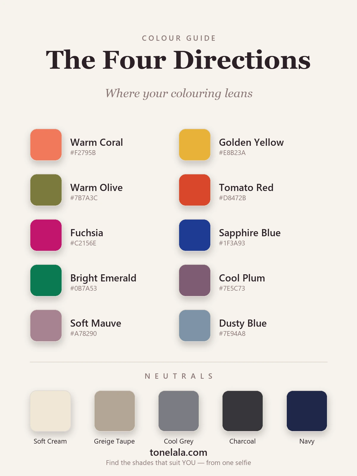
The four directions
| Color | Hex | Leans |
|---|---|---|
| Warm Coral | #F2795B |
Warm (Spring) |
| Golden Yellow | #E8B23A |
Warm (Spring) |
| Warm Olive | #7B7A3C |
Warm (Autumn) |
| Tomato Red | #D8472B |
Warm (Autumn) |
| Fuchsia | #C2156E |
Cool (Winter) |
| Sapphire Blue | #1F3A93 |
Cool (Winter) |
| Bright Emerald | #0B7A53 |
Deep / bright |
| Cool Plum | #7E5C73 |
Cool / muted |
| Soft Mauve | #A78290 |
Soft (Summer) |
| Dusty Blue | #7E94A8 |
Soft (Summer) |
The neutrals shift too: warm coloring wants Soft Cream #EFE7D6 and Greige Taupe #B3A695; cool coloring wants Cool Gray #7A7C82, Charcoal #36363B and Navy #1E2749. Whichever side of the swatch makes your face look rested is the side your season lives on.
Stuck between two directions and want a second pair of eyes?
Find your color season →Test three: your contrast
Contrast is the dial that separates seasons people constantly confuse, and it's the easiest to misjudge by eye, so use your camera. Take a clear photo of yourself in even light, then convert it to greyscale.
In black and white, do your hair, skin and eyes sit far apart in tone, or do they blur into a similar gray? High contrast (a sharp jump between, say, dark hair and light skin) points to the Bright and Deep seasons, Bright Spring, Bright Winter, Deep Winter. Low contrast (everything reading a gentle, similar gray) points to the Soft seasons, Soft Summer and Soft Autumn. This single test is what tells a Deep Winter apart from a Soft Summer, even when both look "cool and dark" in color.
Putting the three dials together
Now stack your three answers and read where they meet:
- Warm + light + medium contrast → Light or True Spring.
- Warm + deep + warm-rich → True or Deep Autumn.
- Warm + muted → Soft Autumn.
- Cool + light + soft → Light or True Summer.
- Cool + muted → Soft Summer.
- Cool + deep + high contrast → True or Deep Winter.
- Very high contrast + clear, bright color → Bright Spring or Bright Winter, depending on undertone.
If two seasons feel equally possible, return to your dominant dial, the one that was loudest in testing, and let it cast the deciding vote. For the bigger picture of how the four families relate, the color analysis guides lay out all twelve, and you can go deeper on the family you're leaning toward, the Summer palette if you've landed cool and soft, or the Winter palette if you're cool and high-contrast.
Why the last 10% is hard to do alone
You can get impressively close with these three tests. What's genuinely difficult is the final call, and it's not because you're not paying attention. Bathroom lighting throws a color cast over everything. Hair dye and a tan hide your true value. And we are all quietly biased about our own faces, which makes undertone the hardest thing to read in your own mirror. Two of my dials might be obvious to you while the third stays stubbornly ambiguous, and that third dial is usually the one that decides between two neighbouring seasons.
That's the gap a proper analysis closes. With ToneLala you upload a clear photo, and the analysis reads your undertone, value and contrast together, then builds your palette on a picture of your own face instead of a generic swatch card, so you can actually see why a color works. It turns "I think I'm probably a Summer" into knowing exactly which Summer, and which reds, blues and neutrals are yours.
Where to go from here
Run the three tests today, silver versus gold, a squint for value, a greyscale photo for contrast, and write down a single word for each. That short list is the backbone of your season, and it'll make every quiz and palette you read from now on actually make sense. When you want the precise answer rather than the neighbourhood, find your season and let a clear photo settle the dial you couldn't.
Frequently asked questions
What color season am I?
Your color season is decided by three things working together: your undertone (warm, cool or neutral), your value (how light or deep your natural coloring is), and your contrast (how bright or muted it reads). Read those three dials and you land in one of the twelve seasons, for example warm plus deep plus muted points to True or Deep Autumn, while cool plus light plus soft points to Light or True Summer. The most reliable way to pin yours down is a draping test or a photo-based analysis, which you can start at tonelala.com/onboarding.
How do I find my color season at home?
Start with undertone using the silver-versus-gold and vein tests, then judge value by how light or deep your hair, eyes and skin are together, then judge contrast by photographing yourself in greyscale to see how far your features sit apart. Those three answers narrow you to one of the four families and then to a specific season. Home tests get you close, but mixed dye, makeup and lighting can mislead, so confirm with a proper analysis.
How do I know my undertone?
Hold silver jewelry to your face, then gold. If silver looks clean and gold looks muddy you are cool; if gold lifts you and silver looks flat you are warm; if both look fine you are likely neutral. Back it up with the wrist test, blue or purple veins lean cool, green veins lean warm, and check whether pure white or soft cream looks better against your skin.
What is the difference between value and contrast in color analysis?
Value is how light or deep your overall coloring is on a scale from very fair to very deep. Contrast is how far apart your features sit from each other, pale skin with near-black hair is high contrast, while soft mid-blonde hair on light skin is low contrast. Value and contrast are separate dials, and reading them apart is what separates, say, a Deep Winter from a Soft Summer.
Can I have features from more than one season?
Yes, and most people do, that is exactly why typing yourself by eye is hard. One dial often dominates: a deeply pigmented brunette is usually led by value, while someone whose coloring reads obviously soft is led by chroma. The dominant trait places your season; the secondary trait fine-tunes which version of it you are.
Is an online color season quiz accurate?
A quiz can point you toward a family, but accuracy depends entirely on judging undertone, value and contrast correctly, and those are the things people misread about their own face under bathroom lighting. A photo-based analysis reads all three from a clear image of you and builds your palette on a picture of your face rather than a generic swatch card, which is far more reliable than self-scoring a quiz.
Related guides

What Is My Skin Undertone
A color analyst explains what your skin undertone is, how to find it with simple at-home tests, and the colors that flatter cool, warm and neutral undertones.

Seasonal Color Analysis: The Complete Guide
A color analyst's complete guide to seasonal color analysis, how the 12 seasons work, the three dials that decide yours, and how to find your own.

What Is My Color Palette?
What is my color palette? A color analyst shows how undertone, value and chroma decide your season and the exact colors that flatter you.

How to Find Your Undertone
A color analyst's guide to finding your undertone with the vein, jewelry, white-paper and sun tests, read warm, cool and neutral the way the pros do.

12-Season Color Analysis Explained
A color analyst explains all 12 seasons, how they split from the classic 4, the three dials behind them, and how to find which season is yours.

Color Analysis Quiz: Find Your Season
How a color analysis quiz works, what it can and can't tell you about your season, and how to take ours, written by a certified personal color analyst.
Prefer in person? Find color analysis near you
Browse local color analysts by city, or get the same season, palette and best-colors breakdown online from one selfie.
See your colors on a photo of you
Upload one selfie and ToneLala reveals your season, your full palette, and your best hair, makeup, jewelry and outfits, styled on you.