In a sentence: Seasonal color analysis reads three things about your coloring, undertone, depth and chroma, to place you in one of four color families (and 12 sub-types), each with a palette built to flatter you. Skip to the spectrum or find your own season.
Seasonal Color Analysis: The Complete Guide
By ToneLalaUpdated July 5, 2026

Contents
The first time I draped a client and watched her face change, I understood why people get obsessive about this. She'd come in wearing a stone-gray jumper she liked, looking faintly tired. I swapped it for a clear coral, and the tiredness lifted, her skin evened out, the shadows under her eyes softened, and she actually leaned toward the mirror. Same woman, same light, same five seconds apart. The only variable was the color against her skin. That flick between flat and lit is the whole of seasonal color analysis, and once you've seen it a few times you can't unsee it.
This is the overview for the entire system, what seasonal color analysis actually is, the three properties it reads, how the four families split into twelve, and how to work out which one is yours. Think of it as the map. Each family and sub-type has its own full guide, and I'll point you to those as we go; if you'd rather skip the self-diagnosis, the find-your-season route reads all of this from a couple of photos.
What seasonal color analysis actually is
Strip away the seasonal names and the idea is simple: some colors make your skin look clearer, more even and more rested, and some make it look sallow, gray or blotchy. That isn't taste or mood, it's a measurable interaction between the color of a garment and the pigments in your skin, hair and eyes. Seasonal color analysis is just an organized way of finding the colors that fall on the flattering side of that line, then grouping them into a palette you can actually shop from.
The "seasons" are a naming convention, borrowed from nature, for four broad types of coloring. Spring coloring is warm and clear, like new leaves in morning sun. Autumn is warm and earthy, like the same garden in late October. Summer is cool and soft, like haze over water. Winter is cool and clear, all ice and contrast. The names are evocative, but don't take them literally, they have nothing to do with the season you were born in or the colors you happen to like. They're shorthand for a particular mix of undertone, depth and clarity.
The three dials every season is read on
Every season, all twelve of them, is just a position on three sliders. Get these three right and the family falls out almost automatically.
- Undertone, warm or cool. This is the master dial. Warm skin has a golden, yellow or peach cast and is flattered by gold; cool skin has a blue, pink or rosy cast and is flattered by silver. Spring and Autumn are the warm families; Summer and Winter are the cool ones. If you get nothing else right, get this.
- Value (depth), light to deep. How dark your overall coloring is, taking hair, skin and eyes together. A pale blonde with light eyes sits at the light end; deep hair with deep eyes sits at the deep end. This separates a Light Spring from a Deep Winter even when both might wear a clear color.
- Chroma (clarity), soft or clear. Whether your coloring wants muted, dusty color or bright, saturated color. Clear coloring is energized by intensity; soft coloring is flattered by grayed-down, gentle tones and overwhelmed by neon. This is the dial people skip most, and it's the one that separates a Summer from a Winter, or a Soft Autumn from a True Autumn.
A fourth quality, your natural contrast: sits on top of these. It's the gap between your lightest and darkest features. Pale-skin-against-dark-hair is high contrast; hair, skin and eyes that sit close in value is low contrast. Contrast rarely changes the family, but it's the deciding factor between sub-types, and it's why two people with the same undertone can still suit very different palettes.
How the four families split into twelve
Each family splits into three sub-types, and the logic is the same every time: one sub-type leans toward its neighbouring family, one is the purest version of itself, and one leans the other way. Knowing the family gets you most of the way; the sub-type is the fine-tuning.
- Spring: warm and clear. Light Spring (the palest), True Spring (the most purely warm), Bright Spring (the most vivid, bordering Winter).
- Summer: cool and soft. Light Summer (the airiest), True Summer (the most purely cool), Soft Summer (the most muted, bordering Autumn).
- Autumn: warm and earthy. Soft Autumn (the gentlest, bordering Summer), True Autumn (the richest and most golden), Deep Autumn (the darkest, bordering Winter).
- Winter: cool and clear. Deep Winter (the richest), True Winter (the iciest), Bright Winter (the most electric of all twelve).
Notice how the families hand off to each other around the wheel: Bright Spring and Bright Winter are neighbours through their shared brightness; Soft Summer and Soft Autumn meet in the muted middle. That's why people so often feel "between two seasons", they usually are, sitting on a border. The sub-types exist precisely to name those in-between places.
The seasonal spectrum
To show how wide the system reaches, here's one signature color pulled from each corner of the wheel, warm and cool, clear and soft, light and deep, finished with neutrals that lean both ways.
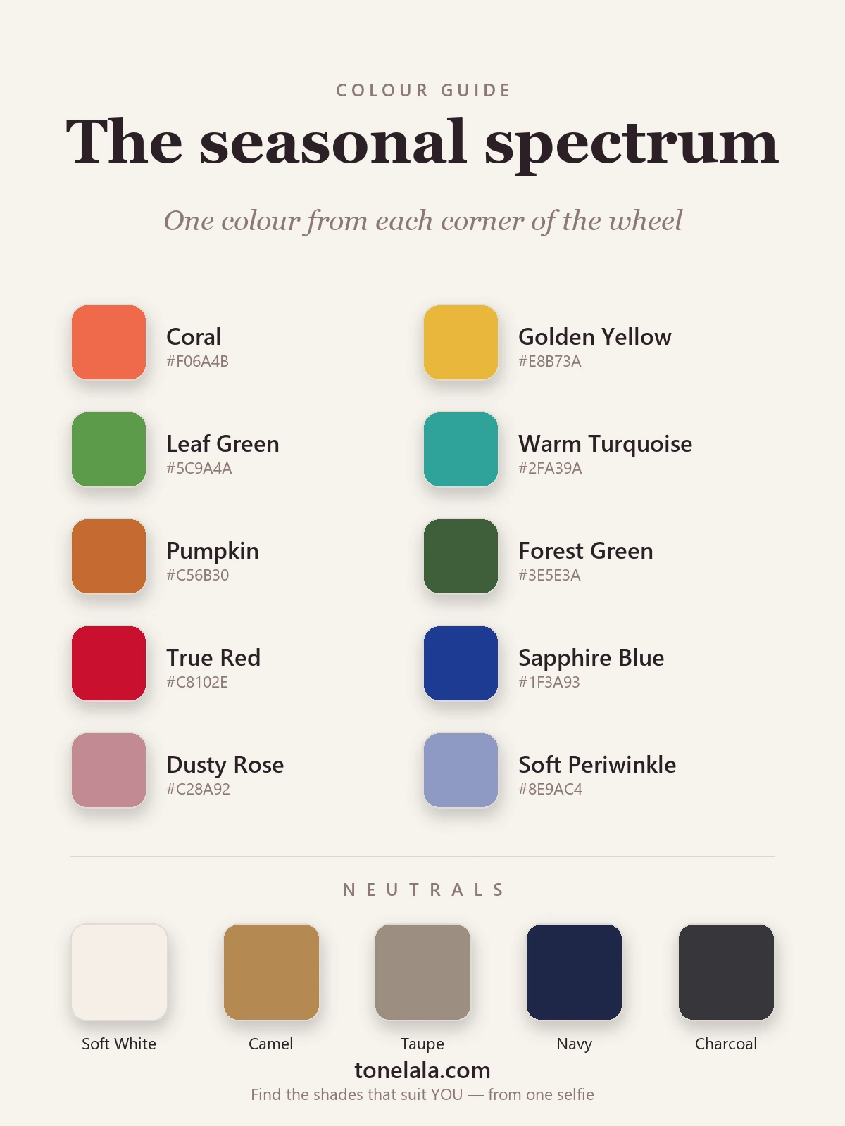
One color from each region
| Color | Hex |
|---|---|
| Coral | #F06A4B |
| Golden Yellow | #E8B73A |
| Leaf Green | #5C9A4A |
| Warm Turquoise | #2FA39A |
| Pumpkin | #C56B30 |
| Forest Green | #3E5E3A |
| True Red | #C8102E |
| Sapphire Blue | #1F3A93 |
| Dusty Rose | #C28A92 |
| Soft Periwinkle | #8E9AC4 |
Neutrals: chosen to span the warm-to-cool range, because your family decides which end is yours: Soft White #F4EFE6 and Camel #B68A52 read warm, Navy #1E2749 and Charcoal #36363B read cool, and Taupe #9B8E80 sits in the middle. No single person wears all of these well, that's the point. Your season tells you which half of this chart is for you.
Metals: the simplest tell of all. Gold flatters warm seasons (Spring and Autumn); silver flatters cool ones (Summer and Winter). Hold both to your face in daylight, whichever makes your skin look cleaner is pointing at your undertone.
Want to know which of the twelve is yours?
Find your color season →How to find your color season
Work the dials in order, because each one narrows the field.
- Settle undertone first. Gold versus silver, cream versus stark white, warm coral versus cool fuchsia. Whichever side consistently makes your skin look even and rested is your undertone, and that alone halves the twelve seasons.
- Then read depth. Are you naturally light, medium or deep overall? Light coloring is overwhelmed by very dark shades near the face; deep coloring can carry them with ease.
- Then read chroma. Hold a muted, dusty version of a color beside a clear, saturated one. If the clear version switches your face on, you're clear; if the dusty one feels more like you and the bright one wears you, you're soft.
- Finally, check contrast to land the sub-type, high contrast pushes you toward the brighter, deeper end of your family; low contrast toward the lighter, softer end.
Here's the honest caveat: these three dials are genuinely hard to judge on yourself. Bathroom lighting is rarely neutral, phone cameras lie about undertone, and a lifetime of wearing colors that "feel like you" quietly biases the test. Even experienced analysts drape in controlled light for a reason. If you want certainty rather than a best guess, the reliable route is a proper draping session or a photo-based analysis that reads undertone, depth and contrast for you, and tells you not just the family but the exact sub-type.
If you'd like to go deeper before deciding, the color analysis guides walk through every family and sub-type in detail. A good place to start is the family you already suspect, many people who run warm find themselves between Spring and Autumn, so reading both side by side often makes the difference obvious.
Why it's worth getting right
The payoff isn't a rule about what you're "allowed" to wear, it's the end of guessing. When you know your season, the shop floor gets quieter: you walk past three-quarters of the rail without a second look, and the quarter that's left mostly works. Your wardrobe starts agreeing with itself, because everything you own shares the same underlying warmth, depth and clarity, so things mix without effort. Makeup gets simpler for the same reason. And the small daily friction of why does this look slightly off fades, because you stopped buying the colors that caused it.
Seasonal color analysis isn't about chasing trends or shrinking your options. It's about spending your attention on the colors that already make you look like a better-rested version of yourself, and letting the rest go.
Frequently asked questions
What is seasonal color analysis?
Seasonal color analysis is a method for finding the range of colors that flatter you most, based on your natural undertone, depth and contrast. It sorts coloring into families named after the seasons, Spring, Summer, Autumn and Winter, most often split further into 12 sub-types. The aim is a personal palette where every color makes your skin look clearer and more even.
What are the 12 color seasons?
The 12 seasons are sub-types of the four families. Spring splits into Light, True and Bright Spring; Summer into Light, True and Soft Summer; Autumn into Soft, True and Deep Autumn; Winter into Deep, True and Bright Winter. Each shares its family's core trait but leans lighter, deeper, softer or brighter than its siblings.
How do I find my color season?
Read three things about your coloring in turn: undertone (warm or cool), depth (light to deep) and chroma (soft or clear). Those three dials point to a family, and a fourth quality, your natural contrast, narrows it to a sub-type. The reliable way to settle it is draping or a photo-based analysis, because lighting and habit make these hard to judge in a mirror.
Is seasonal color analysis accurate?
It's accurate when the reading is done well, in neutral light, with your face bare, comparing real drapes rather than guessing from memory. The color families are based on consistent properties of skin, hair and eyes, so a careful analysis is repeatable. Most disagreements come from poor lighting or from skipping straight to a sub-type before confirming the family.
Can your color season change over time?
Your underlying undertone stays the same for life, so your family rarely changes. What shifts is depth and contrast, hair graying or being colored changes how light or high-contrast you read, which can move you to a softer or lighter sub-type within the same family. A re-analysis after a big hair change is worth it.
Related guides

What Color Season Am I
What color season am I? A color analyst walks you through undertone, value and contrast with simple self-tests to narrow down your seasonal palette.

What Is My Color Palette?
What is my color palette? A color analyst shows how undertone, value and chroma decide your season and the exact colors that flatter you.

How to Find Your Color Season
A color analyst's step-by-step guide to finding your color season at home, drape, vein, jewelry and white tests

12-Season Color Analysis Explained
A color analyst explains all 12 seasons, how they split from the classic 4, the three dials behind them, and how to find which season is yours.

Color Analysis Quiz: Find Your Season
How a color analysis quiz works, what it can and can't tell you about your season, and how to take ours, written by a certified personal color analyst.

What Is My Skin Undertone
A color analyst explains what your skin undertone is, how to find it with simple at-home tests, and the colors that flatter cool, warm and neutral undertones.
Prefer in person? Find color analysis near you
Browse local color analysts by city, or get the same season, palette and best-colors breakdown online from one selfie.
See your colors on a photo of you
Upload one selfie and ToneLala reveals your season, your full palette, and your best hair, makeup, jewelry and outfits, styled on you.