In a sentence: personal color analysis reads three things about your natural coloring, undertone, value and chroma, and matches them to a season whose palette flatters you. See the palette or find your own season.
Personal Color Analysis: The Complete Guide
By ToneLalaUpdated July 6, 2026
Contents
A woman sat down in my chair last winter holding two scarves she couldn't choose between, both a soft pink, both bought on the same trip. Under one her skin went faintly gray and the shadows under her eyes deepened; under the other her face evened out and lifted, and she looked like she'd slept well. Same woman, same light, two minutes apart. The only thing that changed was that one pink was cool and blue-based and the other had a warm, peachy lean, and her skin had a clear opinion about which belonged near it. That little before-and-after is the whole of personal color analysis in miniature: a color next to your face either echoes your natural coloring or argues with it, and the difference is plain to anyone looking.
So when people ask what personal color analysis actually is, I tell them it isn't magic and it isn't taste. It's a method, a repeatable way of reading three measurable qualities of your coloring and using them to predict, reliably, which colors flatter you and which quietly drain you. This guide is the full map: what those three qualities are, how the four-, twelve- and sixteen-season systems organize them, what the process looks like in practice, and what you actually walk away with. By the time you reach the palette below, you'll understand not just that certain colors suit you, but why.
What personal color analysis actually is
Personal color analysis is the practice of identifying your most flattering colors from the colors you were born with, your skin, hair and eyes. The principle underneath it is straightforward. Every color has a temperature, a lightness and an intensity, and so does your face. When a garment's qualities match your own, your eye reads the whole thing as harmonious: skin looks even, shadows soften, your features come forward. When they clash, the color borrows the life out of your face, that washed-out, "are you feeling all right?" effect we've all caught in a changing-room mirror.
It helps to be clear about what it is not. It isn't about your favorite colors, and it bans nothing, wear whatever you love. It isn't the same as chasing "your colors" by trend or by what's in the shops this season. And it isn't fortune-telling dressed up as science; it's closer to optometry. An analyst reads your coloring the way an optician reads your eyes, measuring something real about you and matching a solution to it. If you want the short, standalone version of this idea, I've written it up separately in what is color analysis. The output is a palette, but the genuine value is the logic, because logic travels: once you understand why a warm coral flatters you and an icy fuchsia doesn't, you can stand in any shop, in any year, and know.
The three dials it measures
Every system, simple or complex, comes down to three dials. Get these and you understand the entire field.
- Undertone, warm, cool or neutral. The temperature underneath your skin, separate from how tanned or fair you are. Warm undertones lean golden, peachy or yellow; cool undertones lean pink, red or blue; neutral sits between the two. This is the dial your face reacts to first. The quick home check: hold gold jewelry to one side of your jaw and silver to the other, and notice which makes your skin look lit rather than gray.
- Value, light to deep. How light or deep your overall coloring is, taking skin, hair and eyes together. A pale blonde with light eyes sits at the light end; deep hair with deep eyes sits at the deep end. Value decides whether soft, light colors suit you or whether you can carry real depth near the face without being swamped.
- Chroma, clear to muted. How clear or soft your coloring is. Some people light up next to bright, saturated color; others are flattered by grayed-down, dusty shades and look slightly overpowered by anything too vivid. Chroma is the dial most people have never heard of, and it's the one that explains why two equally warm, equally light people can still need different palettes.
A fourth quality, your natural contrast, the gap between your lightest and darkest features, sits on top of these three. It rarely changes which family you're in, but it's often the deciding factor between neighbouring sub-types. Read undertone, value and chroma together and you've described someone's coloring precisely, and that combined reading is what a season actually is. It's also why a single blunt rule like "you're a winter, wear black" can't be trusted: it captures undertone and maybe value but ignores chroma entirely.
The four-season system
The original framework sorts coloring into four families, built mainly on temperature and depth:
- Spring: warm and light, with clear, fresh color. Sunny corals, golden yellows, bright greens.
- Summer: cool and soft. Dusty, blue-based shades: soft rose, slate blue, gentle lavender.
- Autumn: warm and deep, leaning muted and earthy. Rust, olive, golden brown, forest green.
- Winter: cool and deep, with high contrast and clarity. True red, sapphire, emerald, crisp black-and-white.
The four-season model is a brilliant place to start because it teaches the two biggest dials fast: are you warm or cool, light or deep? For many people that alone is a revelation, discovering you've spent a decade in cool colors when your skin was quietly begging for warmth. But four buckets is a coarse net. It mostly leaves chroma out, which is exactly why so many people feel "between seasons," genuinely flattered by colors from two different families. That in-between feeling isn't you failing the test. It's the test only having four answers.
The twelve- and sixteen-season systems
To fix that, analysts split each of the four seasons into three, giving twelve. Each season gains a third dimension, so chroma finally gets a vote alongside undertone and value. Spring becomes Light Spring (the softest, lightest warm), True Spring (the warmest and clearest) and Bright Spring (the most vivid, bordering Winter). Winter splits into Deep, True and Bright. Every family does the same, and the palette tunes much more tightly to your actual coloring. The logic is the same each time: one sub-type leans toward the neighbouring family, one is the purest version of itself, and one leans the other way. I walk through all of them in 12-season color analysis explained.
The sixteen-season system, drawn from the Sci-ART tradition, goes one step further and splits each season into four rather than three, adding finer gradations for the in-between coloring that twelve seasons still rounds off. It's the most precise of the three and the hardest to self-diagnose, since it asks you to place yourself within fractions of a dial. If you want the detail on how those extra divisions work, see 16-season color analysis explained. For most people, twelve seasons is the sweet spot: precise enough to shop confidently from, simple enough to actually understand.
A palette across the seasons
To show how wide the system reaches, here's a spread sampled across the four families, warm and cool, clear and soft, light and deep, finished with neutrals that lean both ways. No single person wears all of these well; your own season would draw a much smaller, more consistent set from this spectrum.
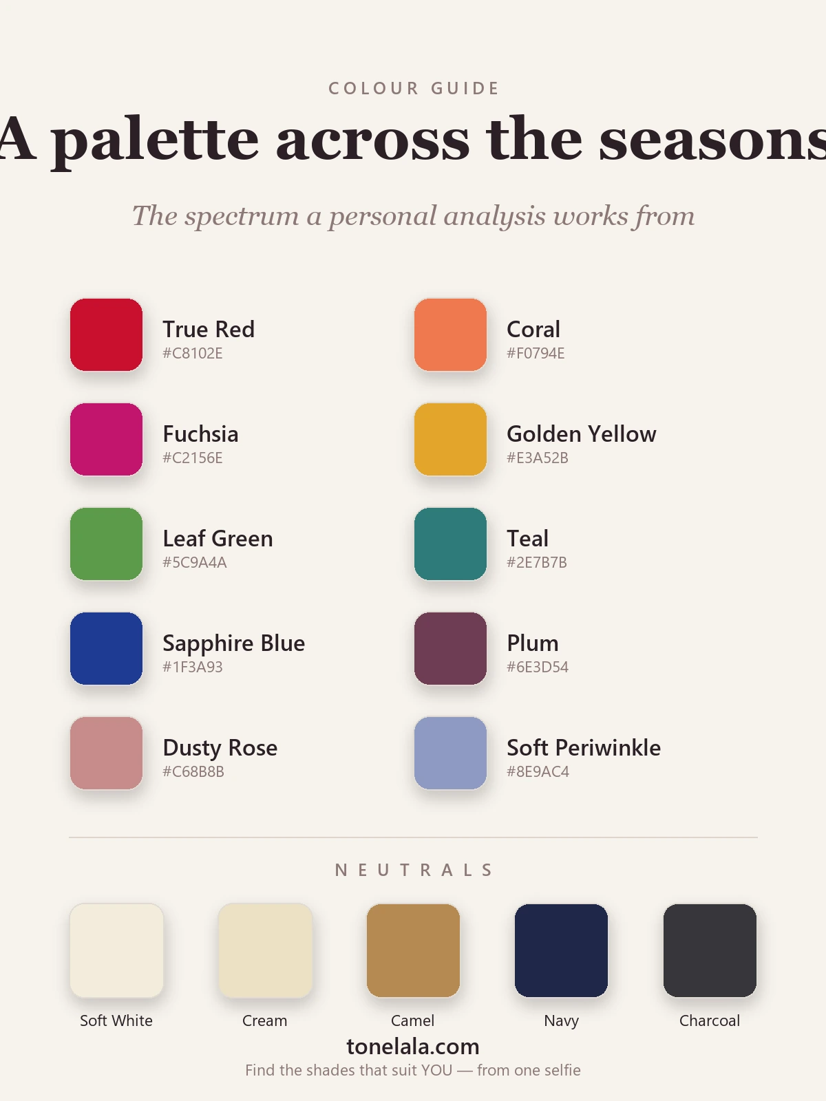
The colors above run from warm corals and golden yellows on the Spring–Autumn side to cool fuchsia and sapphire on the Summer–Winter side, with balanced shades like teal, plum and soft periwinkle sitting between.
| Color | Hex |
|---|---|
| True Red | #C8102E |
| Coral | #F0794E |
| Fuchsia | #C2156E |
| Golden Yellow | #E3A52B |
| Leaf Green | #5C9A4A |
| Teal | #2E7B7B |
| Sapphire Blue | #1F3A93 |
| Plum | #6E3D54 |
| Dusty Rose | #C68B8B |
| Soft Periwinkle | #8E9AC4 |
Neutrals span the same range: Soft White #F3ECDC and Cream #EDE0C4 for the warmer, softer seasons; Camel #B68A52 as a warm tonal base; and Navy #1E2749 with Charcoal #36363B for the cooler, deeper end. Your season narrows these to the handful that genuinely flatter you, which is what finally makes a wardrobe hang together.
Metals are the simplest tell of all: gold flatters the warm seasons (Spring and Autumn), silver the cool ones (Summer and Winter). Hold both to your face in daylight, whichever makes your skin look cleaner is pointing at your undertone.
Curious which season is yours?
Find your color season →How a personal color analysis is done
In a traditional session, the analyst sits you in neutral daylight, bare-faced, hair pulled back, and drapes fabric in turn under your chin. The trick is comparison rather than guessing: warm gold against cool silver, stark white against soft cream, a clear coral against a muted rose. Your face does the talking, under the right drape the skin evens out and the eyes brighten; under the wrong one shadows and redness jump forward. The analyst works the three dials in sequence, confirming undertone, then value, then chroma, and only then narrowing to a sub-type. This is the method behind color draping, and it's why a good session never starts from your favorite shade.
The modern route reads the same three qualities from clear, unedited photographs instead of in-person drapes, which removes the studio appointment without removing the rigour, as long as the lighting is honest and the images aren't filtered. Either way, the deliverable is the same: your season, your palette, and the reasoning that lets you apply it yourself.
What a personal color analysis gives you
At the end you get a season and, with it, a palette: the colors that flatter you, the best neutrals to build a wardrobe around, and which metals, gold, silver, or both, sit well against your skin. A thorough analysis goes further and hands you the reasoning, plus the practical extensions: the makeup tones that suit you, the hair colors that complement rather than fight your undertone, and the shades to treat with care.
The part that actually changes things is portable. Once you know you're a True Spring or a Soft Summer, you stop shopping by hope. You can hold a garment up and judge it against one clear standard, which means fewer impulse buys, far less of that "right shape, wrong color, never worn" waste at the back of the wardrobe, and looking quietly well in every photo without thinking about it. The shop floor gets quieter, you walk past three-quarters of the rail without a second look, and the quarter that's left mostly works. It's less a set of rules than a shortcut you carry everywhere.
How to find your season
You can absolutely begin at home. Sort out undertone first with the gold-versus-silver test and a look at your veins, then ask whether light or deep colors suit you better, and finally, the hard one, whether clear, bright shades flatter you or softer, dustier ones do. That'll usually point you to a family, and our color analysis guides break down every season and sub-type so you can read your palette in detail. Many people who run warm find themselves caught between Spring and Autumn, so reading both side by side often makes the difference obvious.
Where self-diagnosis tends to stall is chroma and the fine line between neighbouring seasons, the difference between a Soft Summer and a True Summer, say, which even good eyes struggle to call in a mirror. Bathroom lighting is rarely neutral, phone cameras lie about undertone, and a lifetime of wearing colors that "feel like you" quietly biases the test. That's what a proper analysis settles: reading undertone, value and chroma together, under controlled conditions, so you get your actual season rather than your best guess. If you'd like that done for you, from clear photos, no studio appointment needed, you can start one here and get your palette and the reasoning behind it.
The short version
Personal color analysis reads three real qualities of your coloring, undertone, value and chroma, and matches them to a season whose palette flatters you. The four-season system teaches the basics; twelve seasons gets you to the precise shades; sixteen fine-tunes the borderlines. What you walk away with isn't just a list of pretty colors but a standard you can apply to everything you wear, for good. Most people don't need more colors in their wardrobe. They need the right ones, and that's the whole point of finding your season.
Frequently asked questions
What is personal color analysis?
Personal color analysis is the process of identifying the colors that flatter you most, based on three measurable qualities of your natural coloring, undertone (warm, cool or neutral), value (how light or deep you are) and chroma (how clear or muted you are). Read those three together and you land in a color season with a palette tuned to your skin, hair and eyes. The point isn't to ban any color; it's to know which ones make your face look even and rested rather than tired.
How does personal color analysis work?
An analyst reads your undertone, your overall depth and your contrast level, traditionally by draping fabric swatches under your chin in neutral daylight, and increasingly by reading clear, unfiltered photos. Warm versus cool, light versus deep, clear versus muted: those readings place you in a season, and the season comes with a palette. A thorough analysis also explains the reasoning, so you can judge any garment, lipstick or hair color against one standard instead of guessing.
What is the difference between the 4, 12 and 16 season systems?
The 4 season system sorts coloring into Spring, Summer, Autumn and Winter, the quickest way to learn whether you run warm or cool, light or deep. The 12 season system splits each of those into three (for example Light, True and Bright Spring) so chroma gets a vote, giving a far more precise palette. The 16 season system splits each season into four, adding finer in-between sub-types. More divisions means more accuracy but harder self-diagnosis.
How do I find my personal color season?
Work the three dials in order. Settle undertone first with the gold-versus-silver test, that alone halves the seasons. Then read depth: are you naturally light, medium or deep? Then read chroma: do clear, saturated colors switch your face on, or do softer, dustier ones suit you better? Those point to a family; your natural contrast narrows it to a sub-type. The reliable way to settle the borderline calls is draping or a photo-based analysis at tonelala.com/onboarding.
Is personal color analysis worth it?
If you've ever bought the right shape in the wrong color and never worn it, yes. Knowing your season turns a wardrobe of near-misses into a small set of colors that all work together and all flatter you, which means fewer impulse buys, less waste, and looking well in photos without trying. The real value is portable: once you know your season, you carry the standard into every shop, for good.
Related guides

What Color Season Am I
What color season am I? A color analyst walks you through undertone, value and contrast with simple self-tests to narrow down your seasonal palette.
Korean Personal Color Analysis Explained
A color analyst explains Korean personal color analysis (퍼스널컬러), how the warm/cool tone system works, why it went viral, and how it maps to the seasons.

What Is My Color Palette?
What is my color palette? A color analyst shows how undertone, value and chroma decide your season and the exact colors that flatter you.

Value and Contrast in Color Analysis
A color analyst explains value and contrast in color analysis, what they mean, how to assess your own, and why they decide which colors flatter you.
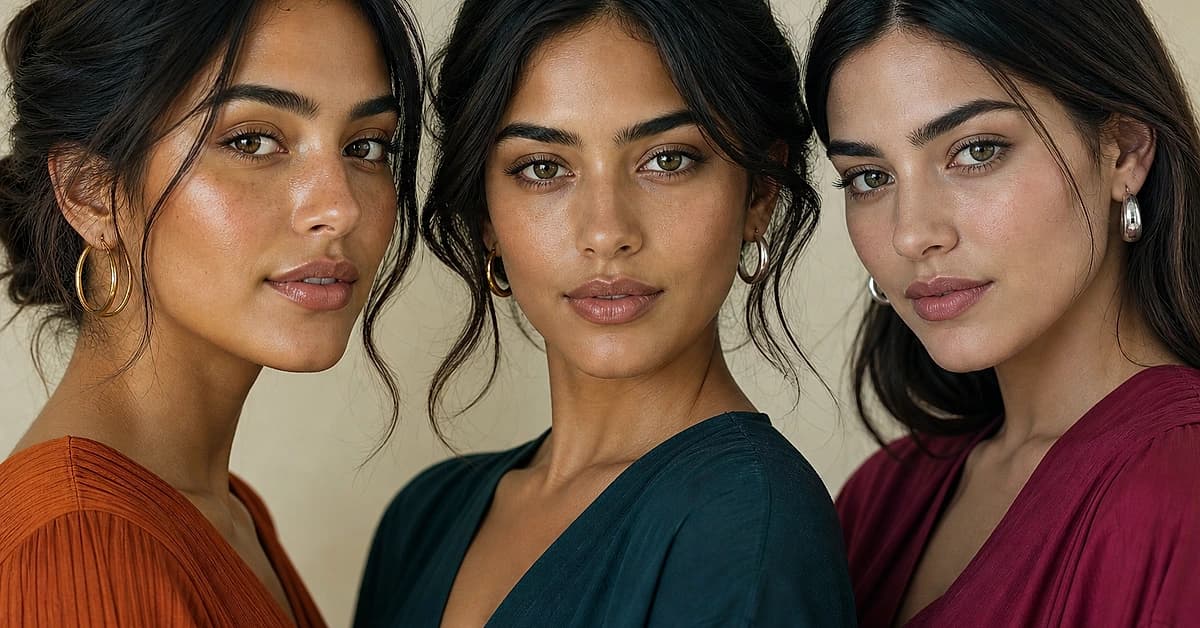
Olive Skin Undertones: Warm, Cool and Neutral Olive Explained
Olive skin is a green-gray cast that can sit over a warm, neutral or cool undertone. Five daylight tests to tell which olive you are, with the colors, makeup, hair and seasons for each.
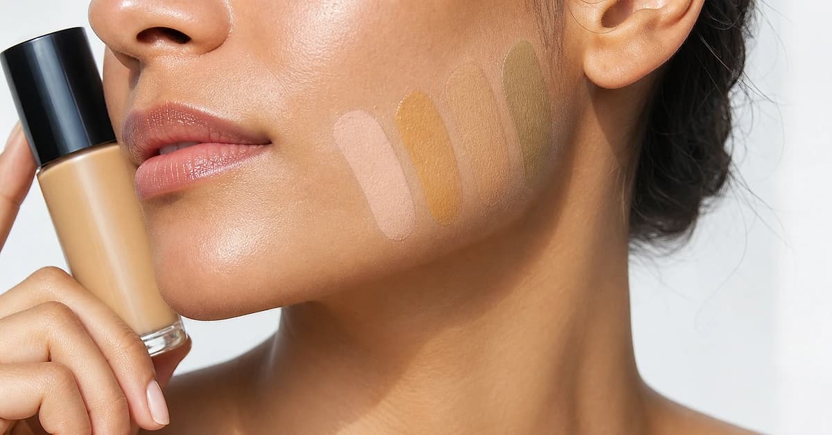
Foundation Undertone Chart: Warm, Cool, Neutral and Olive Shades Explained
A color analyst's foundation undertone chart, what warm, cool, neutral and olive shades look like, how brands label them (W, C, N, G, P), how to test yours and which to buy.
Prefer in person? Find color analysis near you
Browse local color analysts by city, or get the same season, palette and best-colors breakdown online from one selfie.
See your colors on a photo of you
Upload one selfie and ToneLala reveals your season, your full palette, and your best hair, makeup, jewelry and outfits, styled on you.