In a sentence: The best colors for neutral undertones are balanced, slightly muted shades, teal, jade green, soft coral, dusty rose, amethyst, true red, denim blue, soft plum, warm olive and aqua, with cream, taupe, soft white, soft navy and stone as neutrals. Skip to the full palette or find your exact shades.
Best Colors for Neutral Undertones: Your Most Flattering Shades (with Hex Codes)
By ToneLalaUpdated October 7, 2026
Contents
- 01 Check that you're neutral first
- 02 Understanding neutral undertones and color
- 03 The best colors for neutral undertones
- 04 Warm-neutral or cool-neutral: which side to lead with
- 05 Black, white and gray on neutral undertones
- 06 Colors to avoid with neutral undertones
- 07 Neutral Undertones and the color seasons
- 08 Makeup & styling for neutral undertones
- 09 Outfit ideas for neutral undertones
- 10 Celebrities often described as neutral
- 11 Where to start
If both gold and silver jewelry look fine on you, and warm and cool tops seem equally wearable, you probably have neutral undertones. That flexibility is real. The catch is that "fine" is a low bar: when most colors work a little, it is easy to end up with a closet of acceptable colors and no clear idea which ones actually make you look well.
Neutral skin sits between warm and cool, so the colors that suit it best usually sit there too. They are medium in strength and a little softened, neither strongly golden nor strongly blue. This guide lists those colors with hex codes, shows which half of the list to lead with if you lean slightly warm or slightly cool, and covers black and white, the colors to go easy on, makeup, hair and outfits.
Check that you're neutral first
Neutral undertones are easy to over-diagnose, because a warm or cool person who tests in bad light can look neutral too. Try these in daylight near a window, with a clean face, and look for a pattern rather than one decisive answer:
- Metals. Hold gold and then silver against your face. Neutral skin tends to look about the same in both. If one clearly makes you look brighter, you probably lean that way.
- White and cream. Hold pure white fabric and then cream under your chin. Cool skin usually looks cleaner in white, warm skin in cream. Neutral skin looks fine in both.
- Sun. Skin that both burns and tans, or tans gradually, points toward neutral. Guides disagree on the details here, so treat it as weak evidence.
- Veins. Wrist veins that look blue-green, or that you can't decide on, fit neutral. This is the least reliable test, since skin thickness and lighting change how veins look.
If the results split two to two, you are likely neutral. Our neutral skin tone guide goes through the signs in more detail, and how to find your undertone covers the full set of tests.
Understanding neutral undertones and color
Undertone is the color underneath your skin, separate from how fair or dark you are. Warm undertones lean golden, peach or yellow. Cool undertones lean pink, red or blue. Neutral undertones balance the two, so neither clearly wins. Many people with neutral undertones also have a slight olive cast, a green-gray tint that makes the warm or cool lean even harder to read (our olive skin undertones guide covers that case).
Because neutral skin isn't pulled strongly either way, it doesn't clash with warm or cool colors the way a clearly warm or clearly cool face can. The rules that trouble other people, such as "no silver on warm skin", mostly don't apply. Two extremes still tend to lose: the purest, most saturated colors can overpower a balanced face, and very grayed, dull colors can make it look flat. The middle ground is where neutral skin looks best: a teal that is neither baby blue nor forest green, a coral that is warm without turning orange, a rose that is pink without looking icy.
The best colors for neutral undertones
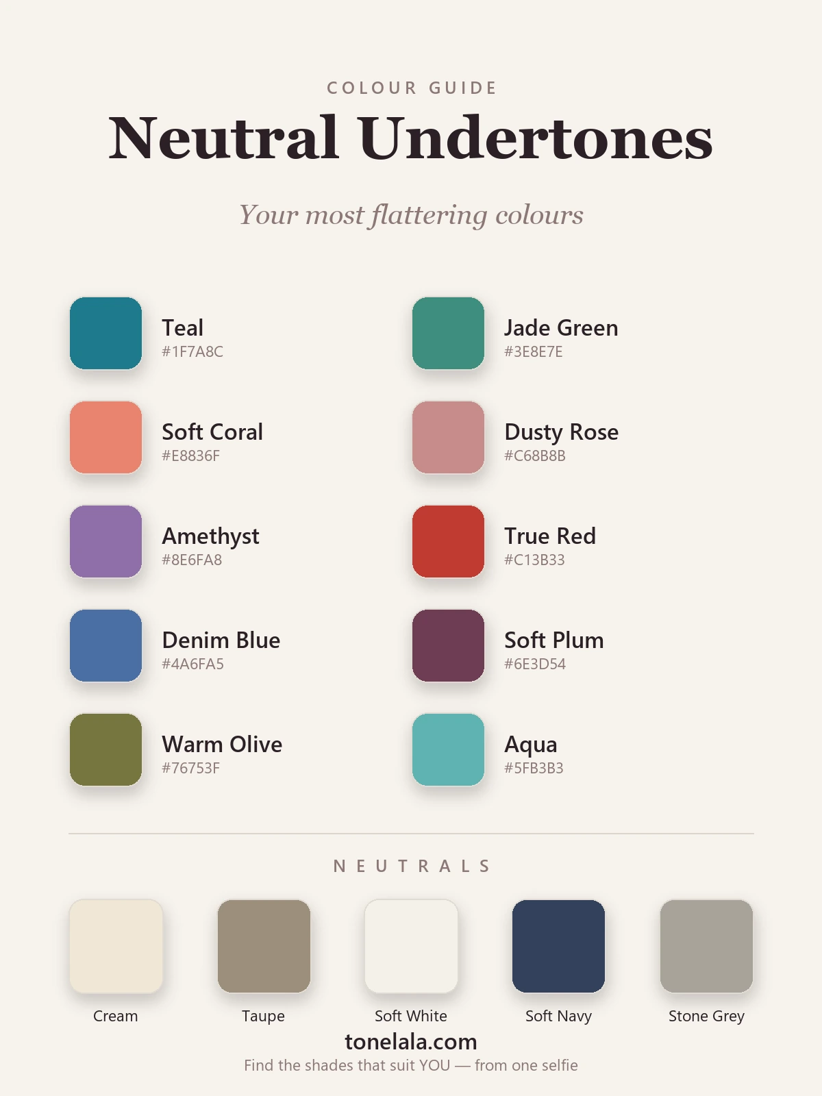
Ten balanced shades that suit most neutral undertones and mix easily with each other.
| Color | Hex |
|---|---|
Teal #1F7A8C |
Sits between blue and green, so its temperature is balanced. It is the safest bright color for most neutral skin. |
Jade Green #3E8E7E |
A soft, blue-leaning green with depth but no glare. It evens out the skin and pairs with every neutral below. |
Soft Coral #E8836F |
Warm, with enough pink in it to stay balanced. It adds color to the face without tipping into orange. |
Dusty Rose #C68B8B |
The cool counterpart to coral: a muted, slightly mauve pink that works well worn near the face. |
Amethyst #8E6FA8 |
A medium, slightly grayed purple that sits between warm and cool. |
True Red #C13B33 |
A red that is neither orange nor blue. It is one of the few strong colors that suits most neutral skin. |
Denim Blue #4A6FA5 |
A medium, softly muted blue. It looks clean without the chill of icy blue. |
Soft Plum #6E3D54 |
A deep berry for fall and winter, gentler on neutral skin than a harsh burgundy or aubergine. |
Warm Olive #76753F |
A green with gray and gold in it. It flatters neutrals who lean olive in particular. |
Aqua #5FB3B3 |
A lighter cousin of teal for warm months, bright enough to look fresh without overpowering. |
Best neutrals: Cream #EFE7D5 and Soft White #F4F1E9 (softer than stark optic white); Taupe #9C8E7C (a mid-brown with no strong lean); Stone Gray #A7A299 (a gray with a little warmth, so it doesn't look cold); and Soft Navy #33415C as a dark neutral near the face.
The color families behind the list
The ten shades come from four families that ranking guides return to again and again. Dusty, complex colors (dusty rose, mauve, dusty teal) have a little gray mixed in, which matches the blend in neutral skin. Blue-greens (teal, jade, aqua) sit between warm and cool on the color wheel. Medium-depth jewel tones (amethyst, emerald, sapphire) work when they aren't at full voltage. Softened earth colors (olive, taupe, stone) suit neutrals who lean slightly warm. If a color you like belongs to one of these families, it is a good bet even if it isn't on the list.
Want YOUR exact most-flattering shades?
Find your color season →Warm-neutral or cool-neutral: which side to lead with
Most neutral people lean a little one way. That lean doesn't rule colors out, but it tells you which half of the palette to wear near your face most often.
| If you lean | Lead with | Neutrals | Metal |
|---|---|---|---|
| Slightly warm (cream looks a touch better than white, gold a touch better than silver) | Soft coral, warm olive, true red, teal, aqua | Cream, taupe | Gold or rose gold |
| Slightly cool (white looks a touch better than cream, silver a touch better than gold) | Dusty rose, amethyst, denim blue, soft plum, jade | Soft white, stone gray, soft navy | Silver or white gold |
| Neither, even after testing | Teal, jade, true red, dusty rose | Any of the five | Either, or mixed |
If you can't tell which way you lean, start with teal, jade and true red. They sit closest to the middle and are the least likely to go wrong.
Black, white and gray on neutral undertones
Guides disagree on these, so here is where they differ.
Black. Several fashion guides call black safe or flattering on neutral skin. Color-analysis guides more often steer neutral people, especially lighter or softer ones, toward soft navy or charcoal near the face. In practice, deeper neutrals with dark hair usually wear black well. If black makes your skin look gray, wear it as trousers or a skirt and put a softer dark on top.
White. Some guides list crisp white for neutrals; others say stark white looks too harsh and recommend soft white or ivory. Cream and soft white are the safer default. Pure white works best when you have some contrast in your own coloring, such as dark hair or dark eyes.
Gray. Mid grays with a little warmth (stone, greige) suit most neutrals. Very cold blue-grays can drain color from the face, especially in winter light.
Colors to avoid with neutral undertones
Very little is off-limits on neutral skin. A few things tend to underwhelm:
- Stark optic white and icy pastels. Icy blue, icy pink and blue-white can look cold against balanced skin. Cream, soft white or a dusty version of the same pastel usually works better. Guides disagree on mint: some recommend it for neutrals and others list it as a color to avoid, so check it in daylight.
- The most golden, saturated warm shades. Pure marigold, true orange and very yellow gold can sit heavy on neutral skin. Mustard instead of marigold, or coral instead of orange, usually solves it.
- Neon and the dullest colors. Electric cobalt, vivid orange and neon pink sit at one extreme, muddy grayed colors at the other. Some guides do recommend cobalt and burnt orange for neutrals, so if you love one of these, try it in daylight before ruling it out.
The quick check: if a color makes you look tired, sallow or slightly gray, it is too far toward one extreme. If your skin looks even and your eyes look clear, keep it.
Neutral Undertones and the color seasons
"Neutral undertone" tells you the colors above will suit you. It can't tell you the single most flattering version of each, because neutral people still differ in depth, brightness and which way they lean. That is what the color seasons sort out.
A neutral undertone that is light and soft often lands in Light Summer, where the palette gets paler and a touch cooler. Soft, muted neutrals are the classic Soft Summer (leaning cool) and Soft Autumn (leaning warm); these two seasons are built around the blended colors neutral skin wears best. A light, slightly warm neutral can sit in Light Spring, where teal turns into a brighter aqua and coral warms up. A deep neutral can fall into Deep Autumn or Deep Winter, where soft plum and olive get richer and true red deepens. Same starting palette, several exact versions. The color analysis guides walk through each season.
Makeup & styling for neutral undertones
Neutral skin can wear both warm and cool makeup convincingly. The goal is to keep the overall look balanced rather than strongly golden or strongly pink.
Foundation
Many makeup brands label neutral shades with an N, or sometimes as "beige" or "natural". Swatch two or three shades along the jaw and check them in daylight; the right one disappears. A foundation that turns orange after an hour is too warm, and one that looks pink or ashy is too cool.
Lips and cheeks
The rose, soft coral and berry families from the palette carry straight over: a dusty rose or soft peach blush, a true red or soft coral lip for day, a plum or berry for evening. Nude lipsticks that are rosy-beige usually work better than very brown or very pink nudes.
Eyes
Taupe, soft brown and warm gray shadows suit almost every neutral. From there you can push warm (bronze, copper) or cool (soft mauve, slate) to match what you're wearing. Brown or soft black liner reads softer than jet black on lighter neutrals.
Jewelry and metals
Gold and silver both work, and several guides add rose gold as a good middle option. Rather than choosing one metal for life, let it follow the outfit: gold with coral, olive and cream; silver with teal, dusty rose and gray. Mixed-metal pieces suit neutral skin better than they suit most people.
Hair color
If you color your hair, shades that are neither very ashy nor very brassy tend to work: soft golden brown, chestnut, caramel highlights, or a beige or soft ash blonde for lighter hair. Fashion guides that cover hair suggest the same middle ground. Very platinum or very copper shades push your look toward one temperature, which can work, but test them with a temporary color or a wig first.
Outfit ideas for neutral undertones
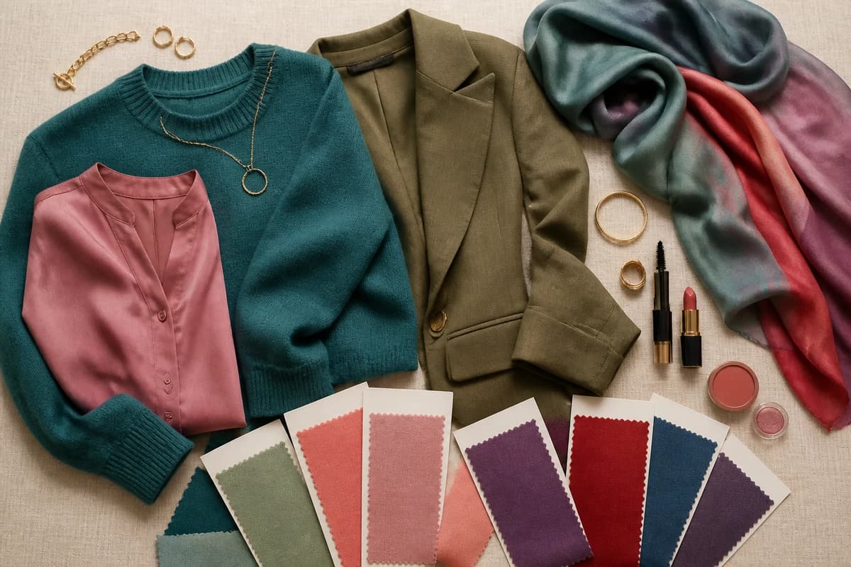
- Teal knit, cream trousers, tan loafers, gold hoops. The easiest starting outfit: one balanced color with a soft neutral.
- Dusty rose blouse, soft navy trousers, silver jewelry. A cool-leaning version for work.
- True red dress, taupe heels, small gold earrings. For evenings, red does the work, so keep everything else quiet.
- Denim blue shirt, warm olive chinos, white sneakers. Casual and balanced, and the same formula works for men.
- Soft plum sweater, stone gray coat, black jeans. A winter outfit that keeps black away from the face.
Celebrities often described as neutral
Lists of "neutral undertone celebrities" don't agree with each other and are based on photos, which are edited and lit, so treat any name as an example rather than a fact. Kerry Washington is the name that comes up in more than one style guide. Jennifer Aniston and Angelina Jolie appear in other lists, though different sources place them as warm or cool. Looking at what these women wear on red carpets can still help: soft jewel tones, blended neutrals and true reds appear often.
Where to start
If you want to change one thing this week, buy or pull out one teal or jade top and wear it with cream or soft white near your face. If it makes your skin look even, you have confirmed the middle of the palette works on you. Next, work out your lean with the white-versus-cream test and add two colors from that side of the table: coral and olive if you lean warm, dusty rose and amethyst if you lean cool. Keep soft navy or taupe as the dark neutral until you know whether black flatters you.
The colors above will suit most neutral undertones as they are. To know whether your neutral is light, soft or deep, and which exact version of each color fits you best, find your season.
Frequently asked questions
What colors suit neutral undertones best?
Medium-strength colors that sit between warm and cool: teal, jade green, soft coral, dusty rose, amethyst, true red, denim blue, soft plum, warm olive and aqua. Most colors are wearable on neutral skin, so the useful question is which version of a color to buy. The blended, slightly softened version usually looks better than the most orange or the most icy one.
What colors should neutral undertones avoid?
Very little is off-limits. The usual trouble spots are the extremes: icy pastels and stark optic white can look cold, and pure marigold or bright orange can look heavy. Sources disagree on mint and on bright colors such as cobalt, so test them in daylight. If you lean slightly warm or slightly cool, your list of colors to go easy on shifts with that lean.
What are the best neutrals for neutral undertones?
Cream and soft white instead of stark white, taupe and stone gray instead of a strongly yellow camel or a cold charcoal, and soft navy as the dark neutral. These sit in the middle temperature-wise, so they don't pull neutral skin toward yellow or toward pink.
Does my undertone change which colors look best?
Yes. Undertone decides whether the warm or the cool version of a color sits better on you. Being neutral means both versions are usually wearable, which is why your wardrobe can be wider than a strongly warm or strongly cool person's. Within that, depth (how light or dark you are) and contrast decide whether the light or deep version of each color suits you best.
How do I find my exact most-flattering shades?
Test colors against your bare face in daylight, without makeup, and look at your skin rather than the fabric. A good color makes skin look even and rested; a poor one adds shadows under the eyes or a yellow or gray cast. A personal color analysis reads undertone, depth and contrast together and places you in a season, which narrows the list to your exact shades.
How do I know if I have neutral undertones?
Look for a pattern across several tests rather than one result. Neutral skin tends to look fine in both gold and silver jewelry, looks about the same against pure white and cream fabric, and shows wrist veins that look blue-green or hard to call. No single test settles it, and lighting changes every one of them, so do them in daylight by a window.
Does black suit neutral undertones?
Usually, yes, though guides differ on how well. Several fashion guides call black safe or flattering on neutral skin, while color-analysis guides more often suggest soft navy or charcoal near the face, especially for lighter or softer coloring. If black makes your skin look gray or your eyes look shadowed, wear it on the lower half and keep a softer dark near your face.
What season am I if I have neutral undertones?
Neutral undertones are common in the Soft seasons (Soft Summer and Soft Autumn), which sit between warm and cool, and in Light Summer and some Light Springs. A deeper neutral can fall into Deep Autumn or Deep Winter. Undertone alone can't place you; depth and contrast decide which neighboring season fits.
Is a neutral undertone the same as olive skin?
Not exactly. Olive describes a green or gray cast that sits on the surface, while neutral describes a balance between warm and cool. They overlap a lot: many olive-skinned people test as neutral because the green cast hides whether they lean warm or cool. Warm olive is one of the colors in the palette above that flatters olive-leaning neutrals in particular.
Related guides
Best Colors for Warm Undertones: Your Most Flattering Shades (with Hex Codes)
A color analyst's guide to the best colors for warm undertones, coral, rust, golden yellow, olive and teal with hex codes, plus neutrals and what to avoid.

Best Colors for Cool Undertones: Your Most Flattering Shades (with Hex Codes)
A color analyst's guide to the best colors for cool undertones, 10 flattering shades and 5 neutrals with hex codes, what to avoid
Most Flattering Colors for Brunettes: Your Best Shades (with Hex Codes)
A color analyst's guide to the most flattering colors for brunettes, 10 best shades and 5 neutrals with hex codes, what to avoid
Best Colors for Dark Skin And Brown Eyes: Your Most Flattering Shades (with Hex Codes)
A color analyst's guide to the best colors for dark skin and brown eyes, jewel tones, bright clears and the neutrals that glow, with hex codes.
Best Colors for Tan Skin And Green Eyes: Your Most Flattering Shades (with Hex Codes)
A stylist's edit of the best colors for tan skin and green eyes, olive, teal, rust, gold and more, with hex codes, neutrals and shades to avoid.
Best Colors for Olive Skin And Brown Eyes: Your Most Flattering Shades (with Hex Codes)
A color analyst's guide to the best colors for olive skin and brown eyes, teal, terracotta, olive, gold and more, with hex codes and shades to avoid.
Prefer in person? Find color analysis near you
Browse local color analysts by city, or get the same season, palette and best-colors breakdown online from one selfie.
See your colors on a photo of you
Upload one selfie and ToneLala reveals your season, your full palette, and your best hair, makeup, jewelry and outfits, styled on you.