In a sentence: The best colors for cool undertones are blue-based, true blue-red, fuchsia, cool berry, emerald, sapphire, cobalt, royal purple, cool teal and icy pastels, worn with cool neutrals like pure white, gray, charcoal and navy. Skip to the full palette or find your exact shades.
Best Colors for Cool Undertones: Your Most Flattering Shades (with Hex Codes)
By ToneLalaUpdated July 13, 2026

Contents
Hold a piece of silver jewelry up to your face and then a piece of gold. If the silver makes your skin look clean and even and the gold makes it look slightly yellow or muddy, you almost certainly have a cool undertone, and you've just learned the single most useful thing about getting dressed. Cool undertones mean your skin has a blue, pink or rosy base running underneath it, rather than a golden or peachy one. The colors that flatter you share that same coolness.
Most of my cool-toned clients arrive having been sold the wrong reds and browns for years. They own a wardrobe of "safe" camel, rust and warm beige, and they can't work out why they always look a little washed out in photos. The fix is rarely about wearing brighter or darker colors, it's about wearing cooler ones. Get the temperature right and your skin looks clear, your eyes sharpen, and you stop reaching for blusher to fix a tiredness that was never really there.
Understanding cool undertones and color
Undertone is the quiet color underneath your skin, and it doesn't change with a tan. Cool undertones read blue, pink or rosy; warm undertones read golden, peachy or yellow. The classic checks: your veins look blue or purple at the wrist rather than green, silver suits you more than gold, and pure white looks crisp on you while cream looks a bit dull. Plenty of people are neutral or cool-neutral too, but if those signs point cool, this palette is yours.
Here's why undertone matters more than almost anything else when you pick colors. A garment sits right next to your face, and your skin and the fabric are constantly being compared by anyone looking at you. When a color shares your undertone, the two harmonize and your skin looks like the freshest thing in the frame. When it clashes, a warm, golden color against cool skin, the fabric "borrows" the yellow and pushes it onto your face, so you look sallow or gray. That's the whole mechanism. It's not that warm colors are bad; it's that they're not yours. Cool skin wants cool color, full stop.
The best colors for cool undertones
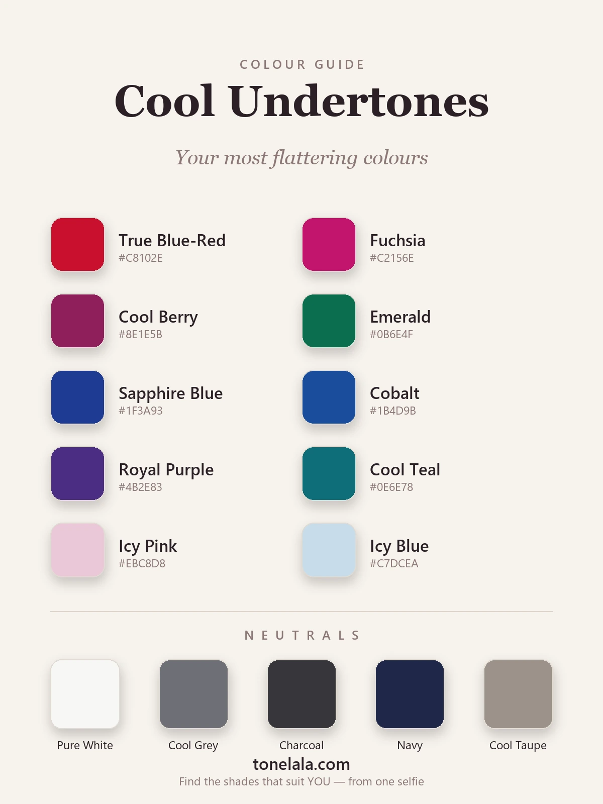
These ten are my reliable workhorses for cool coloring, a spread of clear blue-reds, jewel tones and soft icy pastels so there's something here for every mood and occasion.
| Color | Hex |
|---|---|
True Blue-Red #C8102E |
A red with blue in its base rather than orange, the cool person's perfect red. Crisp, confident, lights the whole face up. |
Fuchsia #C2156E |
A clear blue-pink that's electric against cool skin. The most fun, most flattering bright you own. |
Cool Berry #8E1E5B |
Deep raspberry-wine, a richer, dressier fuchsia for evenings. Reads expensive and never muddy on cool tones. |
Emerald #0B6E4F |
A blue-leaning green that makes cool skin look luminous. Jewel-rich and far kinder than any olive. |
Sapphire Blue #1F3A93 |
Deep, true blue with no warmth in it, endlessly wearable and quietly striking on cool coloring. |
Cobalt #1B4D9B |
A brighter, punchier blue when you want a color that does the talking. Sharp and modern against cool skin. |
Royal Purple #4B2E83 |
Blue-based purple is practically made for cool undertones, regal, flattering, a little unexpected. |
Cool Teal #0E6E78 |
Blue-green that sits beautifully between your blues and greens; rich without ever turning warm. |
Icy Pink #EBC8D8 |
A pale, cool pink for soft days, gentle near the face and far more flattering than any peach. |
Icy Blue #C7DCEA |
A whisper-cool pastel that reads clean and fresh; the easiest soft color for cool skin to wear. |
Best neutrals: Pure White #F7F7F4 for crisp contrast (skip cream); Cool Gray #6E7076, the most useful cool neutral you own; Charcoal #36363B for depth where black might feel too hard; Navy #1E2749 as a softer dark base; and Cool Taupe #9C9189, a grayed neutral that gives you warmth-adjacent comfort without the yellow of camel.
Want YOUR exact most-flattering shades?
Find your color season →Colors to avoid with cool undertones
A few color families consistently fight cool skin, and it's almost always a temperature problem, not the color itself:
- Orange and tomato red. Anything with an orange base, coral, tomato, terracotta, bright orange, throws yellow onto cool skin and makes it look ruddy or tired. Reach for a blue-red or fuchsia instead and the same level of impact suddenly flatters you.
- Golden, earthy warms. Mustard, marigold, olive, rust and warm gold are gorgeous on warm seasons and quietly draining on cool ones. If you love yellow, a clear lemon is far kinder than mustard.
- Warm neutrals. Camel, tan, beige and warm chocolate brown lean golden and tend to dull cool skin. Swap them for cool gray, charcoal, navy or a grayed taupe and your everyday basics start working with you instead of against you.
Cool Undertones and the color seasons
This is the honest part: "cool" tells you the temperature of your coloring, but not its full story, so it can't tell you the single most flattering version of each color on its own. In seasonal color analysis, every palette is built from three dimensions: undertone (warm or cool), depth (light or deep) and chroma (soft/muted or bright/clear). Being cool sorts you firmly into the cool half of the system, the Winter and Summer families, but which one decides your exact shades.
If you're cool and deep with high contrast between your hair, skin and eyes, you're likely a Winter, and you want the clear, saturated versions of everything above, true red, sharp fuchsia, vivid sapphire, crisp black and white. If you're cool and soft, with a gentler, lower-contrast look, you're likely a Summer, and you want the muted, dusty versions of those same hues, soft berry instead of fuchsia, slate blue instead of cobalt, rose-brown instead of charcoal. Same cool temperature, genuinely different palettes. That's why two cool people can look brilliant in very different colors, and why I never stop at "you're cool." The color analysis guides walk through each season in detail if you want to place yourself.
Makeup & styling for cool undertones
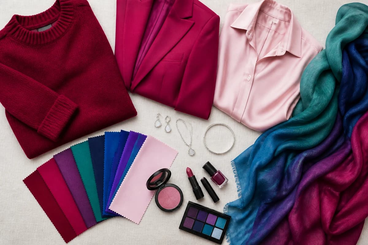
The same temperature rule runs straight through your makeup bag. Cool undertones are flattered by blue-based pinks, berry and rosy mauve on the lips and cheeks, a true red rather than a brick or coral, and cool-toned foundations with pink or neutral (not golden or olive) bases, a foundation that's too warm is the fastest way to look slightly orange. For eyes, taupe, soft gray, plum and cool navy beat bronze and warm copper. Silver, white gold and platinum jewelry sit more naturally against cool skin than yellow gold, and a crisp white shirt near your face does more flattering work than a cream one ever will. None of it is fussy, once you know you're cool, you're really just nudging every choice a few degrees away from gold.
Putting it together
Knowing you're cool is the unlock: it turns getting dressed from guesswork into a simple temperature check. Build a small wardrobe around two cool neutrals, gray and navy are the most useful, and two or three of the colors above, lean on blue-reds and jewel tones when you want impact, and reach for the icy pastels on softer days. Keep gold and earthy warm tones for accessories you wear away from your face, if at all. From there, the only thing left is precision: confirming whether you're a clear, deep Winter or a soft, muted Summer, and pulling out the exact reds, pinks and blues that flatter you. That's what a personal analysis is for, it reads your undertone, depth and contrast together and hands you the palette, so you never have to guess at a color again.
Frequently asked questions
What colors suit cool undertones?
Blue-based colors are the ones that flatter cool undertones most, true blue-red, fuchsia, cool berry, emerald, sapphire, cobalt, royal purple and cool teal, plus soft icy pink and icy blue. The test is the base of the color: a red with blue in it (a cherry or raspberry) lifts cool skin, while an orange-red drags it down. Cool pinks, blues, purples and blue-greens are your easiest wins.
What colors should cool undertones avoid?
Warm, golden, earthy tones are the trap, orange, tomato red, mustard, terracotta, olive, camel and warm browns all pull yellow against cool skin and make it look tired or sallow. It's rarely the color itself, it's the temperature: swap orange-red for a blue-red, mustard for lemon, and camel for cool gray or taupe and the same outfit suddenly works.
What are the best neutrals for cool undertones?
Cool neutrals, pure or optic white instead of cream, cool gray, charcoal, navy and a grayed cool taupe rather than golden beige. These give you a wardrobe base that never fights your skin. If you love a soft neutral, reach for gray or cool taupe over camel and tan, which lean warm.
Does my exact undertone change which colors suit me?
Yes, 'cool' is the starting point, not the finish line. Whether you're a Winter (cool plus deep, high-contrast coloring) or a Summer (cool plus soft, muted coloring) decides whether you want clear, vivid jewel tones or gentle, dusty versions of the same hues. Two cool people can suit very different palettes, which is why a full season reading matters.
How do I find my exact most-flattering shades?
Confirming you're cool is step one; pinpointing your season, and therefore your exact reds, blues and pinks, is step two. A personal color analysis reads your undertone, depth and contrast together and gives you a tailored palette of the precise shades that flatter you. You can start one at tonelala.com/onboarding.
Related guides
Best Colors for Warm Undertones: Your Most Flattering Shades (with Hex Codes)
A color analyst's guide to the best colors for warm undertones, coral, rust, golden yellow, olive and teal with hex codes, plus neutrals and what to avoid.
Best Colors for Neutral Undertones: Your Most Flattering Shades (with Hex Codes)
The best colors for neutral undertones: 10 flattering shades and 5 neutrals with hex codes, which side to lead with if you lean warm or cool, and what to avoid.
Most Flattering Colors for Brunettes: Your Best Shades (with Hex Codes)
A color analyst's guide to the most flattering colors for brunettes, 10 best shades and 5 neutrals with hex codes, what to avoid
Best Colors for Dark Skin And Brown Eyes: Your Most Flattering Shades (with Hex Codes)
A color analyst's guide to the best colors for dark skin and brown eyes, jewel tones, bright clears and the neutrals that glow, with hex codes.
Best Colors for Tan Skin And Green Eyes: Your Most Flattering Shades (with Hex Codes)
A stylist's edit of the best colors for tan skin and green eyes, olive, teal, rust, gold and more, with hex codes, neutrals and shades to avoid.
Best Colors for Olive Skin And Brown Eyes: Your Most Flattering Shades (with Hex Codes)
A color analyst's guide to the best colors for olive skin and brown eyes, teal, terracotta, olive, gold and more, with hex codes and shades to avoid.
Prefer in person? Find color analysis near you
Browse local color analysts by city, or get the same season, palette and best-colors breakdown online from one selfie.
See your colors on a photo of you
Upload one selfie and ToneLala reveals your season, your full palette, and your best hair, makeup, jewelry and outfits, styled on you.