In a sentence: the best colors for warm undertones are golden, earthy, sun-warmed shades, coral, tomato red, golden yellow, mustard, peach, terracotta, olive, forest green and the warm end of teal and turquoise, anchored by cream, camel and chocolate-brown neutrals. Skip to the full palette or find your exact shades.
Best Colors for Warm Undertones: Your Most Flattering Shades (with Hex Codes)
By ToneLalaUpdated July 8, 2026
Contents
I can usually spot a warm undertone before a client has finished sitting down. Hold a gold scarf to one jaw and a silver one to the other, and on a warm person the gold side just settles, skin looks lit and even, the silver side faintly gray. That's the whole game with warm undertones: your skin has gold, peach or yellow running underneath it, and colors that carry the same warmth make you glow, while cool, blue-based colors quietly drain you.
Here's the bit most people get wrong, though. "Warm" tells you the direction of your palette, not the exact shades. I've draped two women who were both unmistakably warm and ended up handing them surprisingly different colors, one lived in soft peach and golden honey, the other in deep rust and forest green. Same undertone, different depth. So treat this guide as the honest, useful starting point: the colors that flatter warm undertones as a family, with real hex codes, and then I'll be straight with you about where you need to go to nail your single most flattering version.
Understanding warm undertones and color
Undertone is the color underneath your skin's surface, and it doesn't change with a tan or a bad night's sleep. A warm undertone has gold, peach or yellow in it. (Cool undertones lean pink, red or blue; neutral sits in between.) The quick home tests: your veins tend to look more green than blue, gold jewelry flatters you more than silver, and you probably tan rather than burn-and-stay-pink. None of these is foolproof on its own, but together they point the same way.
Why does undertone matter more than anything else? Because color sitting next to your face either echoes your warmth or argues with it. A golden-yellow knit beside warm skin reads as one harmonious thing, your eye sees a lit, even complexion. A cool, blue-based fuchsia does the opposite: it throws the gold in your skin into relief, and suddenly you look sallow or tired, like the color is borrowing the life out of your face. That's not the color being "bad", it's just the wrong temperature for you.
So the rule for warm undertones is simple to say and genuinely transformative in practice: take any color you love and reach for its warm version. Not cool blue-red but tomato. Not icy lemon but golden honey. Not bluebell but teal. Same colors, dialled toward gold, that single shift is what makes a wardrobe finally feel like it fits.
The best colors for warm undertones
These are the ten I come back to for warm clients again and again, a spread of warm reds and oranges, golden yellows, earthy greens and the warm cousins of blue.
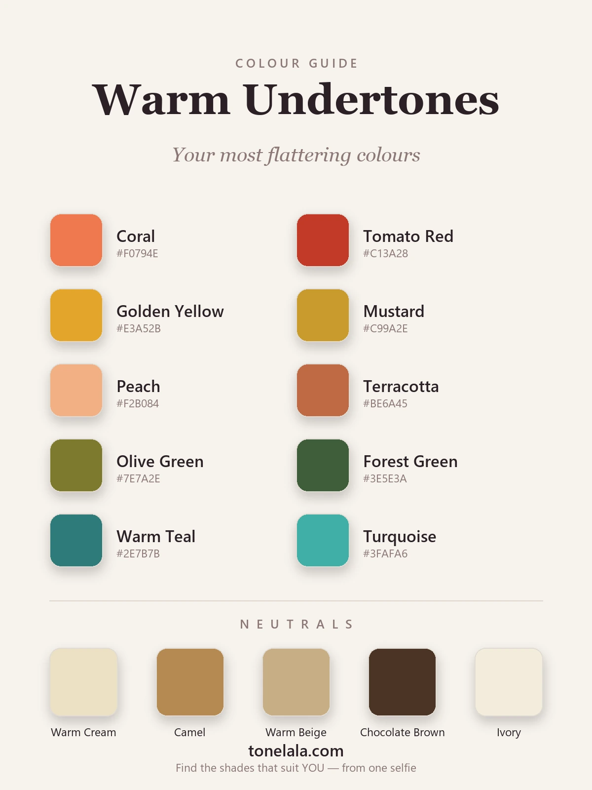
| Color | Hex |
|---|---|
| Coral | #F0794E |
| Tomato Red | #C13A28 |
| Golden Yellow | #E3A52B |
| Mustard | #C99A2E |
| Peach | #F2B084 |
| Terracotta | #BE6A45 |
| Olive Green | #7E7A2E |
| Forest Green | #3E5E3A |
| Warm Teal | #2E7B7B |
| Turquoise | #3FAFA6 |
A quick word on why each earns its place. Coral #F0794E is the warm undertone's best friend, peachy-orange, it mirrors the warmth in your skin almost exactly. Tomato red #C13A28 is your red: orange-leaning, never blue, so it reads rich rather than harsh. Golden yellow #E3A52B and mustard #C99A2E are pure sunlight, colors most people fear, but warm skin carries them like nobody else. Peach #F2B084 is the soft option, flattering the way good light is. Terracotta #BE6A45 is that roasted, earthy warmth that looks expensive on you. Olive #7E7A2E and forest green #3E5E3A prove green isn't cool by default, golden, earthy greens are made for warmth. And warm teal #2E7B7B with turquoise #3FAFA6 are how a warm person wears blue: pick the versions with green and gold in them and they sing instead of sulk.
Best neutrals: Warm Cream #EDE0C4 (your soft off-white), Ivory #F3ECDC (a touch cleaner, still never stark), Camel #B68A52 (keeps a look tonal and expensive), Warm Beige #C7AE85 (the easiest everyday base), and Chocolate Brown #4A3526 (your "dark", far kinder than black).
Want YOUR exact most-flattering shades?
Find your color season →Colors to avoid with warm undertones
- Icy, blue-based brights: fuchsia, icy pink, cool ruby red, electric cobalt. They're the opposite temperature to your skin, so they pull the gold out of your face and leave it looking gray. If you love pink, go coral or warm peach-pink; if you love red, go tomato.
- Pure black and stark white: both are cool and high-contrast, and they tend to overpower a warm complexion rather than flatter it. Black drops a hard shadow under the chin; bright white can make warm skin look slightly yellow. Reach for chocolate brown and warm cream instead, same idea, your temperature.
- Cool dusty grays: blue-gray and slate sit flat and joyless against warmth and gray you out. If you want a soft neutral, a warm greige or camel does the same job without draining you.
None of these are forbidden, they're just the ones that most often disappoint. Treat them as "handle with care," and when in doubt, warm the color up.
Warm undertones and the color seasons
This is where "best colors for warm undertones" stops being one list and becomes yours. In seasonal color analysis, warm undertone is the through-line of two whole families, the Springs and the Autumns: but undertone is only one of three dials. Depth (how light or deep you are) and chroma (how clear or muted) decide your exact palette.
Roughly: if you're warm and light and clear, you're Spring territory, your coral is bright, your yellow is sunny, your greens are fresh (Light Spring, True Spring). If you're warm and deep or muted, you're Autumn, your colors roast down into rust, golden olive and forest green (True Autumn, Soft Autumn, Deep Autumn). Same warm undertone, but a Light Spring in deep terracotta can look weighed down, and a Deep Autumn in pale peach can look washed out. That's not a contradiction, it's why a generic "warm" chart only gets you most of the way.
Our color analysis guides walk through each season in detail, so once you know roughly where you sit, you can read your exact palette. And if you're not sure whether you're a light, deep, soft or bright kind of warm, which is genuinely hard to judge in your own mirror, that's exactly what a personal analysis settles.
Makeup & styling for warm undertones
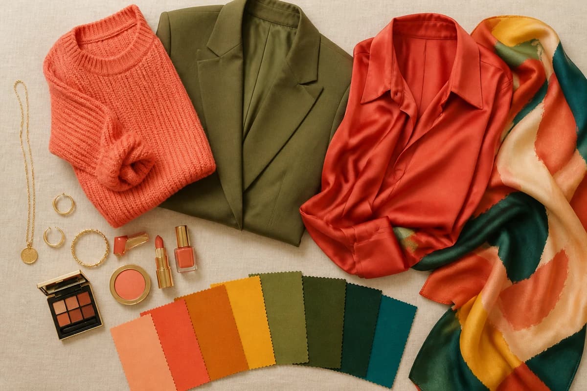
Makeup is the fastest place to feel the difference. Warm undertones come alive in peachy-bronze and warm apricot blush rather than cool pink, in terracotta, brick, warm coral and brown-red lips rather than blue-reds, and in copper, bronze, warm gold and olive eyeshadow rather than cool taupe and gray. A warm brown or bronze liner beats black, and a warm-toned foundation is non-negotiable, a cool one is the quickest way to make warm skin look gray. For metals, gold is your hero; if you love silver, choose a warm-toned or champagne-tinted version and keep it away from your face. The same logic runs through styling: warm-washed, slightly faded denim sits with your palette far better than a crisp blue-black wash.
Putting it together
Build a small warm capsule and getting dressed stops being a guessing game: pick two warm neutrals you love, say camel and chocolate brown, then add two or three of the colors above, like coral, golden yellow and forest green. Everything mixes, because it all shares the same gold-based DNA, and your face stays lit in all of it. That's the real payoff of dressing for a warm undertone, not following rules, but finally putting on a color and watching your skin look like it did something right. Get the family right from this guide, then let a proper analysis hand you your exact coral and your exact olive, the two shades that turn "this suits me" into "what is that, you look incredible."
Frequently asked questions
What colors suit warm undertones?
Warm undertones are flattered by colors with gold, yellow or red folded into them, coral, tomato red, golden yellow, mustard, peach, terracotta, olive, forest green, and the warmer end of teal and turquoise. The thread running through all of them is warmth: skip a color's icy, blue-based version and reach for its golden one. The single most flattering shade depends on whether you're light, deep, soft or bright warm, your season decides the exact version.
What colors should warm undertones avoid?
The hardest colors for warm undertones are icy, blue-based brights, fuchsia, icy pink, cool ruby, electric blue, plus pure black and stark white, and cool dusty grays. They fight the gold in your skin and tend to make it look gray or sallow. None are truly banned, but swap them for warmer cousins: tomato instead of cool red, cream instead of stark white, chocolate or navy instead of black.
What are the best neutrals for warm undertones?
Warm neutrals beat cool ones every time: warm cream (#EDE0C4) and ivory (#F3ECDC) instead of bright white, camel (#B68A52) and warm beige (#C7AE85) for that tonal, expensive look, and chocolate brown (#4A3526) as your 'dark' in place of black. These five do the quiet background work and let your warmer colors sing.
Does my undertone change which exact colors flatter me?
Yes, undertone sets the direction (warm means golden, earthy colors), but your depth, chroma and contrast decide the exact shade. A light warm person glows in peach and soft gold; a deep warm person carries rust and forest green; a bright warm person suits clear, sunny versions. That's why two people with warm undertones can need quite different palettes, and why a personal analysis is worth doing.
How do I find my exact most-flattering shades?
Confirming warm undertone is step one; pinning down your exact shades means placing you within the warm seasons, Warm/True Spring, Warm/True Autumn and their lighter, deeper, softer and brighter neighbours. The reliable way is a photo-based color analysis that reads your undertone, depth and contrast together, so you get your specific coral, your specific olive, not a generic chart. You can start one at tonelala.com/onboarding.
Related guides

Best Colors for Cool Undertones: Your Most Flattering Shades (with Hex Codes)
A color analyst's guide to the best colors for cool undertones, 10 flattering shades and 5 neutrals with hex codes, what to avoid
Best Colors for Neutral Undertones: Your Most Flattering Shades (with Hex Codes)
The best colors for neutral undertones: 10 flattering shades and 5 neutrals with hex codes, which side to lead with if you lean warm or cool, and what to avoid.
Most Flattering Colors for Brunettes: Your Best Shades (with Hex Codes)
A color analyst's guide to the most flattering colors for brunettes, 10 best shades and 5 neutrals with hex codes, what to avoid
Best Colors for Dark Skin And Brown Eyes: Your Most Flattering Shades (with Hex Codes)
A color analyst's guide to the best colors for dark skin and brown eyes, jewel tones, bright clears and the neutrals that glow, with hex codes.
Best Colors for Tan Skin And Green Eyes: Your Most Flattering Shades (with Hex Codes)
A stylist's edit of the best colors for tan skin and green eyes, olive, teal, rust, gold and more, with hex codes, neutrals and shades to avoid.
Best Colors for Olive Skin And Brown Eyes: Your Most Flattering Shades (with Hex Codes)
A color analyst's guide to the best colors for olive skin and brown eyes, teal, terracotta, olive, gold and more, with hex codes and shades to avoid.
Prefer in person? Find color analysis near you
Browse local color analysts by city, or get the same season, palette and best-colors breakdown online from one selfie.
See your colors on a photo of you
Upload one selfie and ToneLala reveals your season, your full palette, and your best hair, makeup, jewelry and outfits, styled on you.