In a sentence: a neutral skin tone has a balanced warm-cool undertone, so the most flattering colors are blended, medium-saturation shades, teal, jade green, soft coral, dusty rose, periwinkle, true red, denim blue, soft plum, sage green and aqua, anchored by cream, taupe, soft white, soft navy and stone. Skip to the full palette or find your season.
Neutral Skin Tone: Undertones & Best Colors
By ToneLalaUpdated July 8, 2026

Contents
Most of the clients who turn up genuinely unsure of their undertone end up being neutral. They've done the wrist-vein test twice and got a different answer each time, tried on a gold necklace and a silver one and concluded "they both look okay?", and they leave the shop with a vague sense that the rules everyone else seems to follow just don't quite land on them. If that's you, take it as good news rather than a verdict on your eyesight. You're probably not failing the tests, you're sitting in the middle of them.
A neutral skin tone isn't a lack of an undertone, the way it sometimes gets described. It's a balance of warm and cool, with neither one winning by much. That balance is exactly why both camps look "fine" on you, and it's also why "fine" can feel like a trap: when nearly everything works a little, it's hard to tell what works brilliantly. So this guide does two things, it shows you how to confirm you really do have a neutral skin tone, and then it gives you the versatile palette that turns "fine" into a color you actually reach for.
What a neutral skin tone actually means
Two things get muddled here, so let's separate them. Skin tone in everyday speech often means depth, how fair or deep your complexion is. Undertone is the quiet color underneath that depth: warm leans golden, peachy or yellow; cool leans pink, red or blue. When people say "neutral skin tone" they almost always mean a neutral undertone, a complexion where warm and cool are roughly balanced, and that can happen at any depth, from very fair to very deep.
So a neutral skin tone is defined by what it doesn't do: it doesn't pull strongly golden, and it doesn't pull strongly pink. Both are present in small, roughly equal measure. There's a close cousin worth naming too, an olive cast, a green or green-gray overlay that many neutral complexions carry. Olive isn't a separate undertone so much as a layer sitting on top of your warm-cool balance, which is why olive skin so often reads as neutral underneath. If you've always felt that "warm" and "cool" both half-describe you, a neutral undertone with a touch of olive is the most common explanation I see.
How to tell if you have a neutral skin tone
No single test is gospel, neutrals trip them up precisely because the answers come out ambiguous, so I run a few together and look for a pattern of in-between results.
- The jewelry test. Hold a gold piece to your bare face in daylight, then a silver one. Warm skin glows beside gold and dulls beside silver; cool skin does the reverse. If both look good and you genuinely can't pick a clear winner, that ambiguity is itself the signal, neutral.
- The wrist-vein check. Look at the veins on your inner wrist in natural light. Clearly blue or purple suggests cool; clearly green suggests warm. A muddled mix you can't quite call? Neutral. (Treat this one as a tiebreaker, not proof, lighting and skin thickness throw it off easily.)
- White versus cream. Drape a stark optic-white top under your chin, then a soft cream one. Cool skin usually prefers the crisp white; warm skin prefers the cream. If neither obviously wins, you're balanced.
- How you tan and react to color. Neutral skin often tans fairly evenly rather than going distinctly golden or staying pink, and it tends not to clash dramatically with either warm or cool clothing.
The honest caveat: these tests confirm a direction, and neutral's direction is "no strong direction". If you keep landing in the middle, that's your answer. If you want certainty rather than a best guess, and to know whether your neutral leans the tiniest bit warm or cool, which changes your palette, that's exactly what a proper color analysis is for. There's more on the testing itself in my guide to how to find your undertone.
The best colors for a neutral skin tone
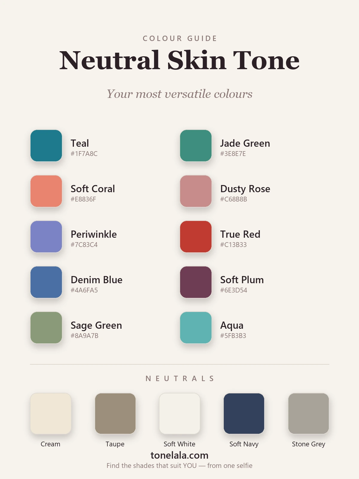
Ten balanced shades I keep reaching for on neutral skin, versatile, flattering, and easy to build a wardrobe around without overthinking it.
| Color | Hex | Why it works |
|---|---|---|
| Teal | #1F7A8C |
The single most reliable color for a neutral skin tone, sitting exactly between blue and green, it's temperature-balanced, so it flatters almost every neutral complexion without effort. |
| Jade Green | #3E8E7E |
A soft, blue-leaning green that's rich without shouting; it brings out a healthy evenness in the skin and pairs with nearly everything else here. |
| Soft Coral | #E8836F |
Warm, but tempered with enough pink to stay balanced, gives neutral skin a lit, rested glow without tipping into orange. |
| Dusty Rose | #C68B8B |
The cool counterpart to coral: a muted, slightly mauved pink that's gentle and especially flattering worn close to the face. |
| Periwinkle | #7C83C4 |
A blue-violet that splits warm and cool straight down the middle, a quiet hero for neutral skin and far easier to wear than a pure bright purple. |
| True Red | #C13B33 |
A balanced red that's neither orange-warm nor blue-cool. Neutral skin can wear a true red beautifully, one of the few loud colors that consistently lands. |
| Denim Blue | #4A6FA5 |
A medium, softly muted blue with the easy wearability of your favorite jeans; clean and flattering without the chill of an icy blue. |
| Soft Plum | #6E3D54 |
A deep, balanced berry for autumn and winter dressing, rich and grown-up, and kind to neutral skin where a harsher aubergine might not be. |
| Sage Green | #8A9A7B |
A muted green-gray that looks effortless and expensive, and especially flatters anyone whose neutral leans a touch olive. |
| Aqua | #5FB3B3 |
The lighter, fresher cousin of teal for warmer months, bright enough to feel alive, balanced enough never to overwhelm. |
Best neutrals: Cream #EFE7D5 and Soft White #F4F1E9 (warmer and kinder than stark optic white); Taupe #9C8E7C (a perfectly balanced mid-brown, the neutral's neutral); Stone Gray #A7A299 (a soft gray with a hint of warmth, so it never reads cold); and Soft Navy #33415C as your flattering dark anchor in place of black.
Want YOUR exact most-flattering shades?
Find your color season →Colors a neutral skin tone can be careful with
Very little is genuinely off-limits, that's the gift of being balanced, but a few things consistently underwhelm on a neutral skin tone:
- Stark optic white and pure icy pastels. Icy blue, icy pink and a brilliant blue-white can read a touch cold against balanced skin. Swap to cream, soft white or a dustier version of the same pastel and it warms right up.
- The most saturated golden-warm shades. Pure marigold, true orange and a very yellow gold can sit a little heavy and pull a warmth that isn't quite yours. Soften them, mustard over marigold, coral over orange, and they come back into play.
- Anything at full, candy-bright saturation. Electric brights and the muddiest grayed-out tones are the two extremes where a balanced face tends to lose. You'll almost always look better in the medium-saturation version of a color than its loudest or its dullest one.
None of these are banned. They're simply the shades that disappoint most often on neutral skin, so treat them as handle-with-care rather than forbidden.
Which color seasons suit a neutral skin tone
This is the part most undertone guides skip. Knowing you have a neutral skin tone tells you the palette above will suit you, but it can't tell you the single most flattering version of each color, because a neutral undertone still splits four ways by depth and brightness. That's what the color seasons add.
A neutral skin tone that's light and soft usually lands in the Summer family (think Light Summer), where every color in your palette gets a touch softer and cooler. A neutral that's light and a shade warmer leans towards Spring, your teal brightens into aqua, your coral warms slightly. A deeper neutral edges into Autumn or Winter, where your soft plum and sage turn richer and your true red deepens. And a neutral that reads clearly balanced but bright can sit in the True seasons, wearing those colors at full clarity. Same starting palette, four different "exact" versions, and your season decides which is yours.
If you're new to all this, my color analysis guides walk through each season in detail, and the seasonal color analysis guide is the best place to see how undertone, depth and contrast fit together. If you specifically want to dig into the undertone side, how to find your undertone goes deeper on the testing.
Makeup & styling for a neutral skin tone
Makeup is where a neutral skin tone gets to show off, because you can wear warm and cool products convincingly, the only rule is to keep things balanced rather than veering hard either way. For lips and cheeks, the rose, soft-coral and berry families from your palette translate straight across: a dusty-rose blush, a true-red or soft-coral lip, a plum for evening. On the eyes, taupe and warm-gray shadows are practically made for you, and you can edge warm (bronze) or cool (soft mauve) to suit the outfit. Both gold and silver jewelry genuinely flatter you, so let the metal follow the color you're wearing: gold with the corals and sages, silver with the teals and roses, rather than defaulting to one forever.
Putting it together
A neutral skin tone isn't a missing answer, it's a license to wear the balanced, lived-in middle of almost every color family, and to look effortless doing it. Build a small wardrobe around two or three of the shades above (teal and dusty rose are a brilliant starting pair) anchored by cream, taupe and soft navy, and you'll have pieces that mix without a second thought. The colors here will flatter you as they are. To know the exact light, deep, warm or cool version that makes you look most rested and alive, and to settle the undertone question for good, find your season. Find your color season.
Frequently asked questions
What is a neutral skin tone?
A neutral skin tone is one where the undertone, the quiet color beneath the surface of your skin, is balanced between warm and cool, with neither clearly dominating. It's separate from how fair or deep your skin is: you can have light, medium or deep skin and still be neutral. In practice it means warm golden colors and cool blue-based colors both look broadly fine on you, rather than one camp obviously flattering and the other obviously clashing.
How do I tell if I have a neutral skin tone?
Three quick checks: hold gold jewelry to your face, then silver, if both look good and neither is clearly better, that points to neutral. Look at the veins on your inner wrist in daylight; a mix of blue and green (not clearly one) suggests neutral. And notice how you react to stark white versus cream, if neither jumps out as obviously more flattering, you're likely balanced. A neutral skin tone is defined by the absence of a strong warm or cool pull, so the tell is usually that nothing is an obvious 'no'.
What colors suit a neutral skin tone?
Balanced, medium-saturation colors that aren't aggressively warm or cool, teal, jade green, soft coral, dusty rose, periwinkle, true red, denim blue, soft plum, sage green and aqua, with cream, taupe, soft white, soft navy and stone as neutrals. A neutral skin tone is the most flexible of all, so the goal isn't finding colors that 'work' (most do), it's choosing blended, lived-in versions that mirror your own balance instead of the most extreme warm or cool shades.
Is a neutral skin tone the same as an olive skin tone?
Not quite, though they overlap. 'Neutral' describes a balanced warm-cool undertone; 'olive' describes a green or green-gray cast that often sits over the top. Many people are both, neutral with an olive overlay, but you can be neutral without looking olive, and a deep olive complexion can lean warm or cool underneath. If you're unsure, treat olive as a layer on top of your underlying warm/cool/neutral balance rather than a fourth undertone.
Which color seasons suit a neutral skin tone?
A neutral skin tone can land in almost any season, because being balanced doesn't fix your depth or brightness. A light, soft neutral often sits in Summer (such as Light Summer); a light, slightly warm neutral leans Spring; a deeper neutral edges into Autumn or Winter; and a bright, balanced neutral can suit the True seasons. Your undertone narrows the field, but depth and contrast decide your exact season, which is what a personal color analysis pinpoints.
Related guides

Warm vs Cool Undertones
A color analyst's guide to warm vs cool undertones: simple at-home tests, the neutral middle ground, and example colors with hex codes for each.

Warm-Toned Skin: How to Tell & Best Colors
How to tell if you have warm-toned skin, the vein, jewelry and white-paper tests, plus the colors, metals and neutrals that flatter warm skin

Warm vs Cool Skin Tone: How to Tell
Learn how to tell if you have a warm, cool or neutral skin tone with simple at-home tests, plus the colors that flatter each undertone.

Olive Skin Tone: The Complete Guide
What olive skin tone actually is, how to tell if you have the green-gray cast, your likely undertone, the seasons it maps to and the colors that flatter it.
Olive Skin Undertones: Warm, Cool and Neutral Olive Explained
Olive skin is a green-gray cast that can sit over a warm, neutral or cool undertone. Five daylight tests to tell which olive you are, with the colors, makeup, hair and seasons for each.

Light Brown Skin Tone: Best Colors
A color analyst's guide to light brown skin tone, how to spot it, read your warm, cool or neutral undertone
Prefer in person? Find color analysis near you
Browse local color analysts by city, or get the same season, palette and best-colors breakdown online from one selfie.
See your colors on a photo of you
Upload one selfie and ToneLala reveals your season, your full palette, and your best hair, makeup, jewelry and outfits, styled on you.