In a sentence: Most color analysis mistakes come down to bad conditions, wrong light, makeup still on, a tan, judging colors one at a time, so fix the setup, compare shades in pairs, and treat any home result as a hypothesis. See the test shades or find your season.
Color Analysis Mistakes to Avoid
By ToneLalaUpdated July 7, 2026
Contents
- 01 Mistake 1: Testing in the wrong light
- 02 Mistake 2: Trusting the vein test (and other shortcuts)
- 03 Mistake 3: Leaving your makeup, or a tan, on
- 04 Mistake 4: Judging colors one at a time
- 05 Mistake 5: Letting your favorites bias the result
- 06 Mistake 6: Stopping at warm or cool
- 07 Mistake 7: Trusting your screen
- 08 Getting an honest answer
A woman once arrived at my studio certain she was a Spring. She'd done the vein test, watched a dozen videos, and built a whole wardrobe of warm coral and gold around it. The moment I draped her in proper daylight, against true comparison colors and with her makeup off, her face told a completely different story, she was a cool, soft Summer, and the warm shades she'd been buying were the exact ones washing her out in every photo. Nothing about her coloring had changed. The way she'd tested it had simply led her astray.
That happens more than you'd think. Color analysis isn't difficult because the theory is complicated, it's difficult because the conditions you judge in quietly lie to you. Get the light, the makeup, the tan and the method right and the answer is often surprisingly obvious. Get them wrong and you can convince yourself of almost anything. So before you decide on a season, it's worth knowing exactly where the traps are.
Mistake 1: Testing in the wrong light
This is the big one, and it undoes everything else. Most people judge colors under warm household bulbs, in a dim bathroom, or in direct sunshine, and every one of those adds a color cast. Warm bulbs throw yellow onto your skin and make warm shades look better than they are. Direct sun blows out the subtle differences you're trying to read. Mixed light, half daylight and half lamp, is worst of all because your eye can't settle.
The fix is simple and free: test in bright, indirect natural daylight, ideally facing a north-facing window or standing just inside an open door on an overcast day. No lamps on, no overhead bulbs, no direct sun on your face. Daylight is the only light neutral enough to show you the truth, and switching to it is the single biggest accuracy upgrade most people can make.
Mistake 2: Trusting the vein test (and other shortcuts)
The wrist-vein test, blue veins mean cool, green veins mean warm, is everywhere online, and it's the shortcut I most often have to gently unpick. Vein color is affected by how thick your skin is, how deep your coloring is, and the light you're standing in. Lots of people see teal, or honestly can't tell, and read far too much into a 50/50 call.
Here's the deeper problem: even a perfect undertone reading only tells you one of the three things that decide your season. The jewelry test (does gold or silver flatter you?) is a better clue, and watching how your skin reacts to a warm versus a cool drape is better still. But no single quick test gives you a season. Treat the vein test as one faint signal among many, not a diagnosis.
Mistake 3: Leaving your makeup, or a tan, on
Foundation, bronzer, blusher and lipstick all sit between the fabric and your skin, masking the very undertone shifts you're trying to see. A warm bronzer can make a cool person test warm; a pink blusher can do the reverse. You have to read the bare canvas.
Fake tan is the same problem at full volume. A self-tan lays a warm, orange-leaning layer over your natural coloring and makes nearly everyone look like an Autumn or Spring for a week or two. I've seen people analyze themselves mid-tan, buy a warm wardrobe, then wonder why it stops working once it fades. Analyze on clean, bare skin in its natural state, no makeup, and no recent tan, real or bottled.
Mistake 4: Judging colors one at a time
Your eye is brilliant at comparison and poor at absolutes. Hold up a single red and you'll struggle to say whether it flatters you. Hold a true blue-red next to a warm tomato-red and the difference jumps out, one clears your skin, the other tints it. Color analysis works in pairs and contrasts, never one swatch in isolation.
These are the comparison pairs I actually drape with. Each pair pits warm against cool, or bright against muted, because that contrast is what reveals which direction your skin leans.
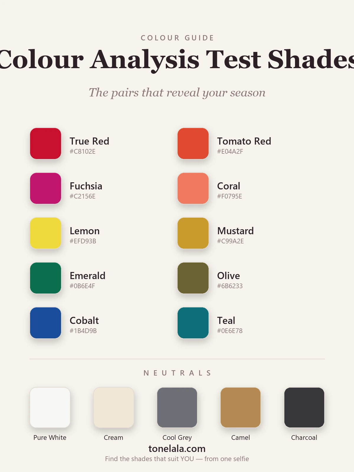
| Test pair | Hex | What it reveals |
|---|---|---|
True Red #C8102E |
A blue-based red, if this clears and brightens your skin, you lean cool. | |
Tomato Red #E04A2F |
A warm orange-red, if this one lights you up instead, you lean warm. | |
Fuchsia #C2156E |
Cool blue-pink; flatters cool skin and tends to overwhelm warm. | |
Coral #F0795E |
Warm peach-pink; the fuchsia/coral pair is one of the clearest warm-cool tells. | |
Lemon #EFD93B |
A cool, sharp yellow, kinder to cool and bright coloring. | |
Mustard #C99A2E |
A warm, golden yellow, the lemon/mustard pair separates warm from cool fast. | |
Emerald #0B6E4F |
Blue-green that suits cool seasons; a quick check against olive. | |
Olive #6B6233 |
Warm, muted green that glows on warm, earthy coloring. | |
Cobalt #1B4D9B |
A bright, clear blue, tells you whether you can take high chroma. | |
Teal #0E6E78 |
A softer blue-green, if teal flatters more than cobalt, you may be muted. |
Neutral drapes: Pure White #F7F7F4 versus Cream #EFE7D6 is the fastest warm-cool check of all, one will look crisp on you and the other a touch off. Cool Gray #6E7076, Camel #B68A52 and Charcoal #36363B round out the set, letting you see whether your best base is cool and clean or warm and golden.
Not sure which drapes flatter YOU?
Find your color season →Mistake 5: Letting your favorites bias the result
This one is human, and it catches everyone, including analysts who don't have a second pair of eyes. You love a color, so you want to be the season that wears it, and your brain helpfully decides the drape looks great. Self-analysis is hard for exactly this reason: you can't see your own face neutrally, and you're emotionally invested in the answer.
A few guards help. Look at how your skin changes, not whether you like the color, does it look clearer and more even, or does shadow, redness or sallowness creep in under the jaw and around the mouth? Photograph each drape in the same daylight and compare the shots later, when the color itself has stopped dazzling you. And stay honest about the difference between "I love this color" and "this color loves me." They're often not the same thing.
Mistake 6: Stopping at warm or cool
Plenty of people get as far as "I'm warm" or "I'm cool" and assume they're done. But undertone is only the first of three dimensions. A full season is built from undertone (warm or cool), depth (light or deep) and chroma (soft/muted or bright/clear). Two warm people can be wildly different, a Bright Spring wants clear, vivid color, while a Soft Autumn wants muted, earthy versions of the same hues, and dressing one in the other's palette goes quietly wrong.
This is why the popular four-season model so often misfires, and why the twelve-season system exists. If you've landed on a broad temperature but can't work out why some "right" colors still feel off, depth and chroma are usually the missing pieces. My color analysis guides walk through all twelve seasons, and the Soft Autumn and Soft Summer guides are a good place to start if your coloring feels muted and hard to pin down.
Mistake 7: Trusting your screen
The last trap is the most modern one. Phone and laptop screens auto-adjust white balance, boost saturation and shift warmth depending on ambient light and battery settings. A drape that looks perfect on your phone may be nothing like the real fabric, and "virtual" filters that recolor your face are guessing, not measuring. Screens are wonderful for inspiration and useless for a verdict. Judge real color against real skin in real daylight, every time.
Getting an honest answer
If there's a thread running through all of this, it's that color analysis is only as good as the conditions you do it in. Fix the obvious things first, bright indirect daylight, makeup off, no tan, real fabric not a screen, then compare colors in pairs rather than alone, watch your skin instead of your preferences, and carry it all the way through undertone, depth and chroma rather than stopping at warm or cool. Do that and a careful home test will get you genuinely close.
The honest limit, though, is that you can't fully see your own face, and a trained eye comparing dozens of drapes in controlled conditions will catch the subtleties you can't. That's the whole point of a personal analysis, it reads your undertone, depth and contrast together, sidesteps every mistake above, and hands you the exact season and palette, so you never have to second-guess a color again.
Frequently asked questions
What is the most common color analysis mistake?
Bad lighting, without question. Most people judge colors under warm yellow bulbs or mixed artificial light, both of which add a color cast that quietly skews every result toward warm. You can do everything else perfectly and still land on the wrong season if the light is wrong. Test in bright, indirect natural daylight near a window, never under household bulbs, and never in direct sun.
Is the vein test accurate for finding your color season?
Not on its own. The wrist-vein test (blue-purple veins read cool, green veins read warm) is a rough hint at undertone at best, vein color is affected by skin thickness, depth and the light you're standing in, and plenty of people genuinely can't tell. Worse, undertone is only one of three things that decide your season. Use the vein test as a loose clue, never as a verdict.
Can I do color analysis on myself accurately?
You can get a useful steer at home, but self-analysis is genuinely hard. You can't see your own face neutrally, you're biased toward the colors you already like, and a phone screen or mirror adds its own color cast. The most common outcome is talking yourself into your favorite season rather than your real one. Test in daylight, with no makeup, against true comparison pairs, and treat the result as a strong hypothesis rather than a final answer.
Does makeup affect a color analysis?
Yes, a lot. Foundation, bronzer, blusher and a bold lip all sit between the fabric and your skin and hide the exact undertone shifts you're trying to read. Fake tan does the same thing on a bigger scale by adding a warm orange layer that makes almost everyone look warmer than they are. Always analyze on a clean, bare, natural-toned face, including no recent self-tan.
Why do I keep getting a different color season every time?
Almost always because the conditions keep changing, different light, different makeup, a new tan, a different screen, so you're not comparing like with like. The other big reason is testing colors one at a time instead of in pairs; your eye needs to see warm against cool, or bright against muted, to judge which one your skin actually prefers. Control the conditions and compare in pairs and the answer steadies. A professional analysis removes the guesswork entirely, you can start one at tonelala.com/onboarding.
Related guides
How to Do Color Analysis at Home
A color analyst's step-by-step guide to draping yourself at home with household items, the kit, the method, the tests and the pitfalls that throw people off.

Color Analysis Test: How to Find Your Colors
A color analyst's guide to the color analysis test, the vein, jewelry and draping checks you can do at home, plus how an accurate photo analysis works.

How to Find Your Undertone
A color analyst's guide to finding your undertone with the vein, jewelry, white-paper and sun tests, read warm, cool and neutral the way the pros do.
How to Find Your Color Season
A color analyst's step-by-step guide to finding your color season at home, drape, vein, jewelry and white tests

Colors That Clash With Burgundy (and What to Wear Instead)
A stylist's guide to the colors that clash with burgundy, bright red, orange, hot pink, mismatched maroons, tan, why they fight, and the swaps that make burgundy look expensive instead.
Color Analysis Quiz: Find Your Season
How a color analysis quiz works, what it can and can't tell you about your season, and how to take ours, written by a certified personal color analyst.
Prefer in person? Find color analysis near you
Browse local color analysts by city, or get the same season, palette and best-colors breakdown online from one selfie.
See your colors on a photo of you
Upload one selfie and ToneLala reveals your season, your full palette, and your best hair, makeup, jewelry and outfits, styled on you.