In a sentence: Color analysis at home means draping paired fabrics under your chin in neutral daylight and watching whether each one clears your skin or muddies it, start with the draping test colors below, or find your season.
How to Do Color Analysis at Home
By ToneLalaUpdated July 6, 2026
Contents
The first time I draped a client I watched her face do something she couldn't see herself. One green made her skin look poured-on and even; the next, a half-step warmer, dropped a gray shadow under her eyes and pulled out a redness around her nose that hadn't been there a moment before. Same woman, same light, ten seconds apart. That swing is the whole of color analysis, and you don't need a studio to see it, you need a window, a white sheet, and a bit of patience.
Most people who try this at home get a flicker of the right answer and then talk themselves out of it. They test under a warm kitchen bulb, keep their makeup on, hold one color up with nothing to compare it against, and end up convinced they "suit everything", which nobody does. Get the conditions right and the differences stop being subtle. Below is the exact method I'd hand a friend who wanted to do this properly with what's already in the house.
What you'll need (it's mostly in the house)
You don't need a kit. You need neutral light and a few honest comparisons.
- Daylight. A north-facing window, or any window on a bright but overcast day, gives the even, color-neutral light you're after. Avoid direct sun and avoid bulbs, even "daylight" LEDs usually carry a cast.
- A large mirror, positioned so the light falls on your face, not behind you.
- A white sheet or bath towel to drape over your shoulders and hide your clothing completely. The color you're wearing will skew everything, so it has to disappear.
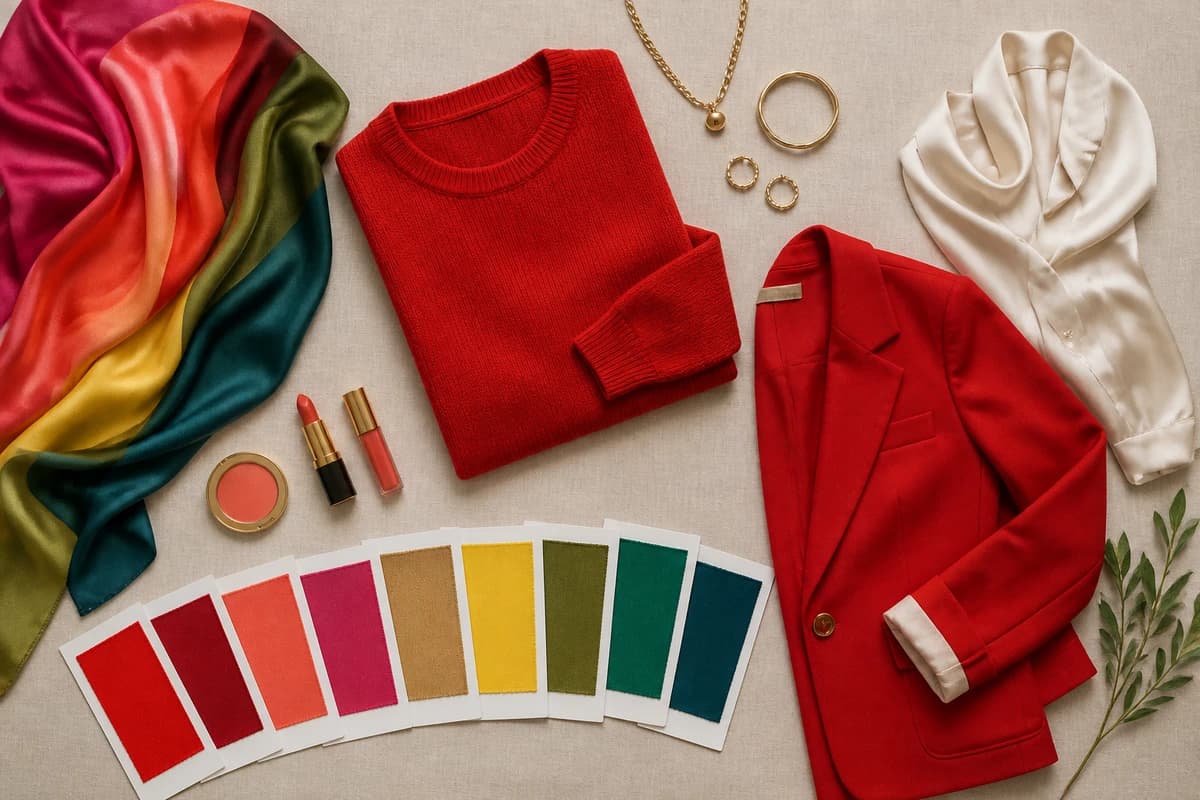
- Colored fabrics in pairs. Scarves, tea towels, jumpers, pillowcases, fabric offcuts, anything large enough to sit under your chin and fill your lower vision. You want a warm and a cool version of several colors (a tomato red and a blue red, a coral and a fuchsia), plus light versus deep and bright versus muted.
- Gold and silver jewelry, one piece of each, for the metals test.
- A clean, bare face and your hair pulled fully back off your forehead and cheeks.
- A friend, ideally, to hold fabrics up while you keep still and just watch. Doing both jobs at once is the most common reason home results wobble.
The four things you're actually testing
Seasonal color analysis sorts everyone along three sliders, temperature, value and chroma, and a home drape is simply you reading those sliders off your own face. Hold this in your head before you start, because it stops you chasing "nice colors" and keeps you watching for the right shift.
- Temperature, warm or cool. Does golden, peachy, orange-based color flatter you, or blue-based, rosy color? This is the big one, and the metals test is its shortcut.
- Value, light or deep. Do you bloom in soft, pale colors, or do you come alive in rich, dark ones that would swamp someone lighter?
- Chroma, bright or muted. Do clear, saturated colors sharpen your face, or do they overpower it while soft, grayed-down shades let your skin breathe?
- Contrast, between your own features. High contrast (dark hair, light skin, bright eyes) reads differently from a blended, low-contrast coloring where hair, skin and eyes sit close in depth.
You're not trying to name all four perfectly. You're watching which end of each slider makes your skin look like the freshest thing in the mirror.
The draping test colors
These are the ten I'd test first, deliberately paired so each one has a warm-or-cool, light-or-deep partner to play against. Hold a color up, then its opposite, and your face will tell you which it prefers.
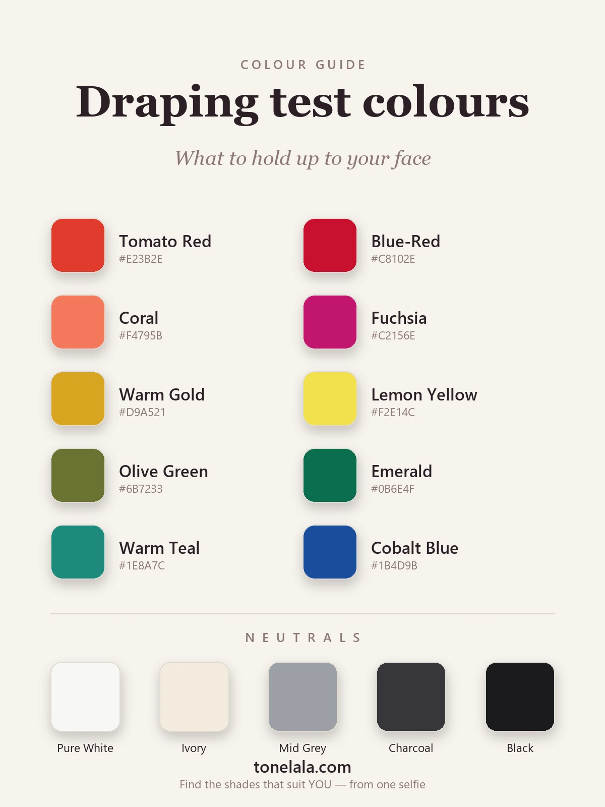
| Color | Hex |
|---|---|
Tomato Red #E23B2E |
A warm, orange-based red. If this one lifts you and the blue-red looks harsh, you're leaning warm. |
Blue-Red #C8102E |
A cool, blue-based red. Crisp and clean on cool skin; can look severe on warm. The classic temperature test. |
Coral #F4795B |
Warm, peachy pink. Flatters golden undertones; tends to turn cool skin sallow. |
Fuchsia #C2156E |
A clear blue-pink. Electric on cool coloring; often too cold against warm skin. Coral's exact opposite. |
Warm Gold #D9A521 |
A golden yellow that glows on warm seasons and can pull yellow shadows onto cool ones. |
Lemon Yellow #F2E14C |
A cooler, sharper yellow, a good check for clear, bright coloring versus soft. |
Olive Green #6B7233 |
A muted, warm green. Soft, earthy coloring loves it; bright or cool skin can look drained beside it. |
Emerald #0B6E4F |
A clear, blue-leaning green. Jewel-bright on cool and bright seasons; reads cleaner than olive. |
Warm Teal #1E8A7C |
Blue-green with warmth in it, a useful in-between that flatters several seasons and exposes a few. |
Cobalt Blue #1B4D9B |
A bright, true blue. Sharpens high-contrast, bright coloring; can overwhelm a soft, muted face. |
Neutrals to test too: Pure White #F7F7F4 against Ivory #F3ECDD is a quick warm-cool read, one will look clean on you and the other a touch dingy. Mid Gray #9CA0A6 checks how you handle muted tones, Charcoal #36363B how you handle depth, and Black #1A1A1C is the honest one: it flatters deep, cool coloring and ages everyone else, so watch what it does under your chin.
Torn between two seasons after draping yourself?
Find your color season →The method, step by step
Settle in front of the window, sheet over your shoulders, hair back, face clean. Then work through it slowly, rushing is what produces the "I suit everything" mirage.
- Start with the metals. Hold gold under your chin, then silver. One usually makes your skin look even and lit; the other adds a faint gray or yellow. Gold-flatters points warm, silver points cool. If it's genuinely a tie, you may be neutral, note it and move on.
- Test temperature in pairs. Tomato red versus blue-red, coral versus fuchsia, warm gold versus lemon. Each time, hold one up for a few seconds, watch your face, swap to its partner, and watch again. You're looking for which one clears your skin and which adds shadow, redness or a tired cast.
- Test value. Hold a pale version of a color, then a deep one. Do soft pastels make you glow or vanish? Does a rich, dark shade frame your face or sit on it like a weight? This sorts light seasons from deep ones.
- Test chroma. Bright emerald or cobalt against muted olive or gray. Bright coloring sharpens beside saturation; muted coloring looks calmer and clearer beside the softer, grayed-down version.
- Look for the pattern, not the perfect color. After a dozen pairs you'll see a direction, warm and soft, say, or cool and bright. That direction is your season's neighbourhood. Within it, the individual best shades fall into place.
Photograph each drape if you can, in the same light, with your phone's filters off. A still image is far easier to judge calmly than a live reflection you're squinting at.
What "good" and "bad" actually look like
People expect a dramatic verdict and miss the real signals, which are quieter. When a color is right, your skin looks even and rested, any under-eye shadow softens, blemishes and redness fade back, your eyes look brighter, and the color seems to sit behind your face rather than in front of it. When a color is wrong, your skin picks up the very thing you don't want, yellow, gray, ashy or ruddy, lines and shadows deepen, and your eyes go flat. Sometimes the fabric looks gorgeous on its own and still does this to you; that's exactly the trap. You're grading your face, never the swatch.
The pitfalls that throw most people off
Almost every wrong home result traces back to one of these.
- Bad light. Warm bulbs, low-CRI LEDs, direct sun and a colored wall all cast onto your skin. Neutral daylight or nothing.
- Wearing color or makeup. A bright top reflects upward and base makeup evens your skin artificially, hiding the very reactions you're testing. Cover up in white, take the makeup off.
- Testing colors alone. A single color with nothing to compare it to nearly always "looks fine." The information lives in the contrast between a pair, always drape opposites back to back.
- Hair in the way. Loose hair, especially if it's colored, frames your face with its own tone and skews the read. Pull it fully back, or wrap it in the same white.
- Judging the fabric, not yourself. It's instinct to look at the pretty color. Train your eyes up to your jaw, cheeks and under-eyes instead.
- Wanting a particular answer. If you're hoping to be a Bright Winter, you'll see it where it isn't. This is the single hardest bias to beat on yourself, and the main reason a second pair of objective eyes is worth it.
Turning a home drape into a real answer
A careful session at the window will reliably tell you your direction, warm or cool, light or deep, bright or muted, and that alone will sharpen every shopping trip from now on. Where home testing runs out of road is the last step: choosing between two neighbouring seasons that share most of the same drapes. If you've narrowed it to "definitely cool, but Summer or Winter?", you've done the hard part, and the difference now comes down to depth and chroma in a way that's genuinely tricky to call in your own mirror.
That's the point of reading more widely. The color analysis guides walk through how each season reads on real faces, and if your drape pointed cool and soft, start with the Soft Summer palette; if it pointed cool and deep, compare it against the Deep Winter palette. Reading the two you're torn between, side by side, often settles it.
Putting it together
Color analysis at home comes down to one disciplined habit: neutral light, a white sheet, a bare face, and colors tested in opposing pairs while you watch your skin rather than the fabric. Do that across temperature, value and chroma and a clear direction will surface, usually faster than you'd expect. Treat the result as a confident starting point, not a sealed verdict, especially if two seasons are still pulling at you. When you want the exact season and the precise shades that go with it, that's what a proper analysis is for.
Frequently asked questions
How do you do color analysis at home?
Sit in front of a window in daylight with clean, bare skin and hair pulled back, drape a large white sheet over your shoulders, then hold paired fabrics up under your chin one at a time, warm against cool, light against deep, bright against muted. Watch your face, not the fabric. The color that makes your skin look clear and even and your eyes brighter is on your side; the one that adds shadows, redness or a gray cast is fighting you. Do it across several color families and a direction starts to emerge, that's your season.
What do I need to do color analysis at home?
Very little. A north-facing window or an overcast day for neutral light, a large mirror, a white sheet or towel to cover your clothing, your hair pulled off your face, and a spread of colored fabrics, scarves, tea towels, jumpers, fabric offcuts, anything large enough to sit under your chin. A piece of gold and a piece of silver jewelry for the metals test, and ideally a friend to hold things up so you can keep still and just observe.
Can I do color analysis on myself accurately?
You can get a good sense of your warm-or-cool direction and whether you suit light, deep, bright or muted colors, that alone is enough to shop better. Pinning down the exact season among the twelve is harder on yourself, because lighting, makeup and your own bias all nudge the result, and you're judging tiny shifts in your skin while also operating the swatches. Treat a home drape as a strong starting point, then confirm it if you want certainty.
Why do my color analysis results keep changing at home?
Almost always the light. Warm bulbs, low-CRI LEDs, a brightly painted wall, direct sun or a colorful top all throw a cast onto your skin and shift what looks good. Test by the same neutral daylight every time, cover your clothing with white, take off makeup, and compare colors in pairs rather than one at a time. Consistency comes from controlling the conditions, not from testing more colors.
Is doing color analysis at home as good as a professional analysis?
It's a great free first pass and it'll improve how you shop straight away. What a trained analyst adds is controlled lighting, a full set of calibrated drapes and an objective eye that isn't attached to the answer, which is exactly where home tests tend to go wrong. If you've draped yourself and still feel torn between two seasons, that's the moment a proper analysis earns its keep.
Related guides

Color Analysis Mistakes to Avoid
A color analyst's guide to the most common color analysis mistakes, bad lighting, the vein test, fake tan, makeup and more, and how to get an honest result.

Color Analysis Test: How to Find Your Colors
A color analyst's guide to the color analysis test, the vein, jewelry and draping checks you can do at home, plus how an accurate photo analysis works.

How to Find Your Color Season
A color analyst's step-by-step guide to finding your color season at home, drape, vein, jewelry and white tests

Color Analysis Quiz: Find Your Season
How a color analysis quiz works, what it can and can't tell you about your season, and how to take ours, written by a certified personal color analyst.

Korean Personal Color Analysis Explained
A color analyst explains Korean personal color analysis (퍼스널컬러), how the warm/cool tone system works, why it went viral, and how it maps to the seasons.
What Color Season Am I
What color season am I? A color analyst walks you through undertone, value and contrast with simple self-tests to narrow down your seasonal palette.
Prefer in person? Find color analysis near you
Browse local color analysts by city, or get the same season, palette and best-colors breakdown online from one selfie.
See your colors on a photo of you
Upload one selfie and ToneLala reveals your season, your full palette, and your best hair, makeup, jewelry and outfits, styled on you.