In a sentence: a color analysis test means holding colors, metals and fabrics next to your face in neutral daylight and reading whether each one clears your skin or muddies it, start with the test colors below, or find your season.
Color Analysis Test: How to Find Your Colors
By ToneLalaUpdated July 10, 2026
Contents
- 01 What a color analysis test is actually measuring
- 02 Set the conditions first
- 03 The vein test
- 04 The jewelry test
- 05 The draping test
- 06 The color analysis test palette
- 07 Reading the results, what "good" and "bad" look like
- 08 How an accurate photo analysis works
- 09 Where to go from here
- 10 Putting it together
A friend asked me to settle a long-running argument with her sister: was she warm or cool? We stood her at the kitchen window, pulled her hair back, and held a strip of golden mustard under her chin. Her skin went the color of weak tea. Swapped it for a cool raspberry and her face lifted, the shadows under her eyes softened, her freckles seemed to settle down. Ten seconds, no equipment, argument over. That swing, the way one color rests your face and the next one drains it, is the entire point of a color analysis test, and you can see it on yourself this afternoon.
The catch is that most people run the test badly and then don't trust the result. They check their veins under a warm bulb, keep their foundation on, hold a single scarf up with nothing to compare it against, and decide they "suit everything", which nobody does. The tests themselves are sound. What lets people down is the conditions. Get those right and the differences stop being subtle guesses and start being obvious, the kind of thing you wonder how you ever missed.
What a color analysis test is actually measuring
Before you hold anything up, it helps to know what you're looking for, because it stops you chasing "pretty colors" and keeps your eye on the right shift. Seasonal color analysis sorts everyone along three sliders, and every test below is just a way of reading those sliders off your own face.
- Temperature, warm or cool. Does golden, peachy, orange-based color flatter you, or blue-based, rosy color? This is the big one, and the vein and jewelry tests are its shortcuts.
- Value, light or deep. Do you bloom in soft, pale colors, or come alive in rich, dark ones that would swamp someone lighter?
- Chroma, bright or muted. Do clear, saturated colors sharpen your face, or do soft, grayed-down shades let your skin breathe while bright ones overpower it?
You're not trying to name all three perfectly on the first go. You're watching which end of each slider makes your skin look like the freshest thing in the mirror. Hold that in mind and the rest is just looking.
Set the conditions first
This is the part everyone skips, and it's the part that decides whether your result means anything. Color is only ever what the light lets you see, so a bad set-up will quietly hand you the wrong answer.
- Neutral daylight. A north-facing window, or any window on a bright but overcast day, gives the even light you need. Avoid direct sun and avoid bulbs, even "daylight" LEDs usually carry a cast.
- A bare, clean face. Foundation has its own undertone and base makeup evens your skin artificially, hiding the very reactions you're testing.
- Hair pulled fully back. Loose hair, especially if it's colored, frames your face with its own tone. Pull it off your forehead and cheeks, or wrap it in white.
- White over your clothing. A colored top reflects upward onto your skin. Drape a white sheet or towel over your shoulders so the color you're wearing disappears.
The vein test
Turn your inner wrist to the daylight and look at the veins through your skin. If they read green or olive, the warm yellow in your skin is tinting the blue of the veins underneath, that points warm. If they read blue or purple, your skin is cooler and isn't adding that yellow filter, that points cool. If you honestly see both, or can't decide, that's information too: it usually means neutral.
Here's the honest bit, though. Wrist skin is thin, the light shifts the reading easily, and the vein test is wrong often enough that I'd never call a season on it alone. Use it as the first vote, not the verdict. It's quick, it needs no equipment at all, and it sets up an expectation you can then confirm, or overturn, with the tests that follow.
The jewelry test
This one is more reliable, and it's my favorite quick check. Hold a piece of gold jewelry up near your face in the daylight, look for a few seconds, then swap it for silver. You're not judging which metal you like, you're watching your skin. One metal usually makes your face look even, lit and rested; the other drops a faint gray or yellow over it, or makes your skin look slightly grubby.
Gold that flatters points warm. Silver that flatters points cool. If it's genuinely a tie, both look fine, neither does any harm, you're likely neutral, and that's common. Do it with clean metal against bare skin, and ideally hold both up at once, one either side, so the comparison is side by side rather than from memory.
The draping test
The draping test is the heart of the whole thing, and it's exactly what a professional analyst does, just with calibrated fabric instead of whatever's in your wardrobe. You hold colored fabric up under your chin and watch what it does to your skin. The trick that makes it work is pairs: never test a color on its own, because a single color with nothing to compare it to nearly always "looks fine." The information lives in the contrast between two opposites held up back to back.
Gather scarves, tea towels, jumpers, pillowcases, fabric offcuts, anything large enough to sit under your chin and fill your lower vision. You want warm-versus-cool versions of several colors, plus a light-versus-deep pair and a bright-versus-muted pair. Then work through them slowly, holding one up, watching your face, swapping to its opposite, and watching again.
The color analysis test palette
These are the ten shades I'd test first, deliberately paired so each one has a warm-or-cool partner to play against. Hold a color up, then its opposite, and your face will tell you which it prefers, which clears your skin and which adds shadow, redness or a tired cast.
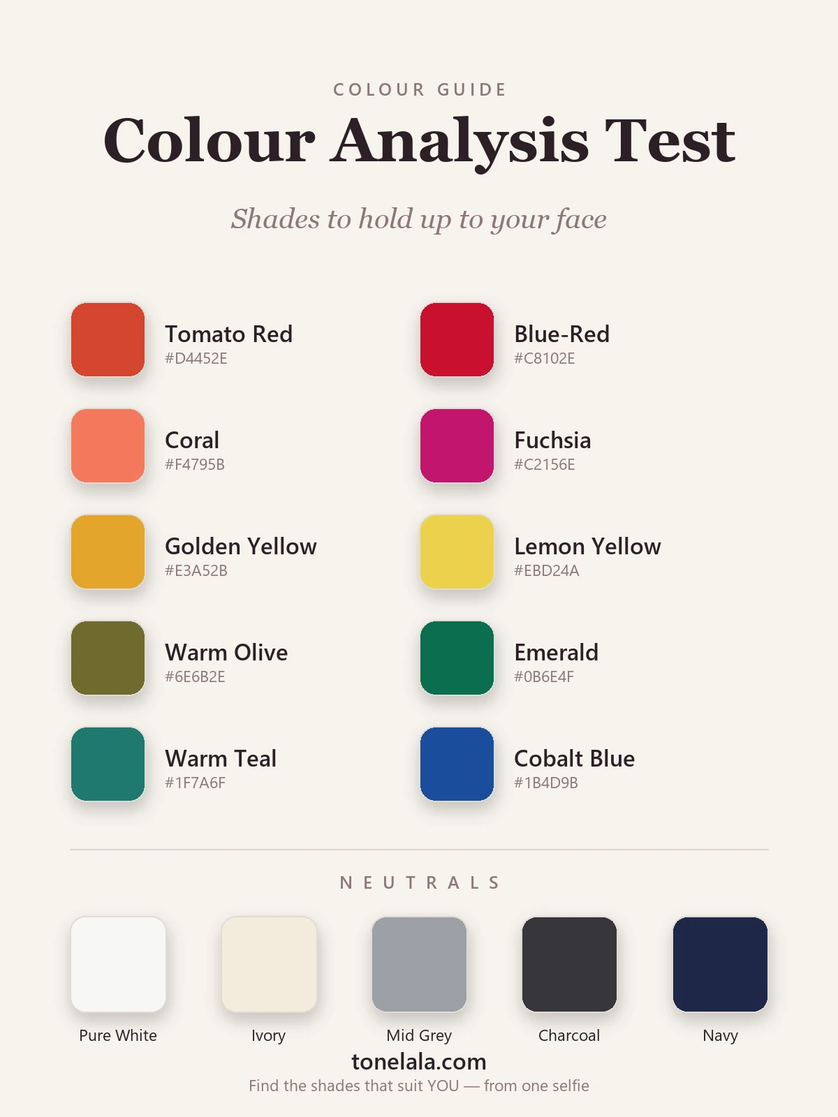
| Color | Hex |
|---|---|
Tomato Red #D4452E |
A warm, orange-based red. If this lifts you and the blue-red looks harsh, you're leaning warm. |
Blue-Red #C8102E |
A cool, blue-based red. Crisp on cool skin, severe on warm, the classic temperature test. |
Coral #F4795B |
Warm, peachy pink. Flatters golden undertones; tends to turn cool skin sallow. |
Fuchsia #C2156E |
A clear blue-pink. Electric on cool coloring, too cold on warm. Coral's exact opposite. |
Golden Yellow #E3A52B |
The most revealing drape there is, it glows on warm skin and exposes coolness fast. |
Lemon Yellow #EBD24A |
A cooler, sharper yellow. Set beside golden yellow, the pair settles undertone almost on its own. |
Warm Olive #6E6B2E |
A muted, warm green. Soft, earthy coloring loves it; bright or cool skin looks drained beside it. |
Emerald #0B6E4F |
A clear, blue-leaning green. Jewel-bright on cool and bright seasons; reads cleaner than olive. |
Warm Teal #1F7A6F |
Blue-green with warmth in it, a useful in-between for telling warm-neutral from cool-neutral. |
Cobalt Blue #1B4D9B |
A bright, true blue. Sharpens high-contrast, bright coloring; can overwhelm a soft, muted face. |
Neutrals to test too: Pure White #F7F7F4 against Ivory #F3ECDC is a quick warm-cool read in itself, one will look clean on you and the other a touch dingy. Mid Gray #9CA0A6 checks how you handle muted tones, Charcoal #36363B how much depth your face can carry, and Navy #1E2749 is a softer test of darkness than black before you commit to the harshest neutral of all.
Torn between two seasons after testing yourself?
Find your color season →Reading the results, what "good" and "bad" look like
People expect a dramatic verdict and miss the real signals, which are quieter. When a color is right, your skin looks even and rested, any under-eye shadow softens, blemishes and redness fade back, your eyes seem to brighten, and the color appears to sit behind your face rather than in front of it. When a color is wrong, your skin picks up the very thing you don't want, yellow, gray, ashy or ruddy, lines and shadows deepen, and your eyes go flat.
Don't grade color by color, either. Run a dozen pairs and look for the pattern. Maybe warm reds, golden yellow and olive all flattered you while their cool partners pulled you down, that's a warm direction. Maybe the soft, muted shades calmed your face while the bright ones shouted over it, that's low chroma. The individual best shades fall into place once you know the neighbourhood. Photograph each drape in the same light with your phone's filters off, too; a still image is far easier to judge calmly than a live reflection you're squinting at.
How an accurate photo analysis works
Here's the question I get most: if the home tests are this good, why does anyone need more? The answer is the last mile. A careful home test reliably gives you your direction, warm or cool, light or deep, bright or muted, and that alone sharpens every shopping trip. Where it runs out of road is choosing between two neighbouring seasons that share most of the same colors. Lighting wobbles, makeup creeps back on, and your own hopes nudge the read; if you're quietly wishing to be a Bright Winter, you'll see it where it isn't. That bias is the single hardest thing to beat on yourself.
A photo-based analysis closes that gap by applying the exact same draping logic under controlled conditions. Instead of fabric, calibrated digital colors are tested against well-lit photos of your face, and the shifts in your skin are read carefully, by a trained eye or an analysis system, to land on a single season rather than a rough direction. The principle is unchanged: compare colors against your face, watch what each does, rule out everything that doesn't flatter. What it adds is consistency and an objective read that isn't attached to the answer. Good source photos matter as much here as good lighting matters in person, which is why the upload step asks for even, natural light and a clear view of your face.
Where to go from here
If your tests pointed clearly one way, the color analysis guides show how each season reads on real faces. If you want to go deeper on the at-home method, the color analysis at home guide walks through a full draping session step by step, and what color draping is explains the technique the professionals use. If your result hinged on undertone, how to find your undertone breaks the vein, jewelry and paper tests down in more detail.
Putting it together
A color analysis test comes down to one disciplined habit: neutral light, a bare face, hair back, and colors tested against your skin in opposing pairs while you watch your face rather than the fabric. Run the vein, jewelry and draping tests together, look for the direction they agree on across temperature, value and chroma, and a clear answer will surface, usually faster than you'd expect. Treat it as a confident starting point, not a sealed verdict, especially if two seasons are still pulling at you. When you want the exact season and the precise shades that go with it, a photo-based personal color analysis applies the same logic under steadier conditions and hands you the finished palette, so you can stop guessing at color for good.
Frequently asked questions
What is a color analysis test?
A color analysis test is any check that tells you which colors flatter your natural coloring and, ideally, which seasonal palette you belong to. At home it's usually a cluster of quick tests, the vein test, the gold-versus-silver jewelry test and a draping test with colored fabric, read together in daylight. A professional version replaces guesswork with calibrated drapes or well-lit photos and a trained eye. They all answer the same question: held next to your face, does this color clear your skin or muddy it?
How do I test my colors at home?
Stand at a window in neutral daylight with a bare, clean face and your hair pulled back. Run three tests in order. First the vein test, green veins lean warm, blue or purple lean cool. Then the jewelry test, hold gold then silver under your chin and see which makes your skin look rested rather than tired. Then the draping test, hold colored fabrics up in warm-versus-cool pairs and watch which one smooths your skin. When most of the tests point the same way, you've found your direction.
Is the vein test for color analysis accurate?
It's a useful clue, not a verdict. Green veins suggest the warm yellow in your skin is tinting them, which points warm; blue or purple veins point cool. But wrist skin is thin and lighting throws the result easily, and plenty of people genuinely see both, which usually means neutral. Treat the vein test as one vote among several. Run it alongside the jewelry and draping tests and trust the direction they agree on, not any single check.
Can a color analysis test be done with photos?
Yes, and it's how a lot of people get analyzed now. A photo-based test applies the same comparison logic as in-person draping, calibrated digital colors are tested against well-lit photos of your face, and the differences in your skin are read carefully to land on a season. The principle is identical: compare colors against your face and watch what each one does. Good source photos in even, neutral light matter just as much here as good lighting matters to draping in person.
How accurate is an at-home color analysis test?
Accurate enough to point you in the right direction, warm or cool, light or deep, bright or muted, which alone will sharpen every shopping trip. Where home tests struggle is the last step: separating two neighbouring seasons that share most of the same colors. Lighting, makeup and your own hopes all nudge the result, and judging tiny shifts in your own face while operating the swatches is genuinely hard. Treat a home test as a strong start, then confirm it when you want the exact season.
Related guides
Color Analysis Mistakes to Avoid
A color analyst's guide to the most common color analysis mistakes, bad lighting, the vein test, fake tan, makeup and more, and how to get an honest result.
How to Do Color Analysis at Home
A color analyst's step-by-step guide to draping yourself at home with household items, the kit, the method, the tests and the pitfalls that throw people off.
How to Find Your Undertone
A color analyst's guide to finding your undertone with the vein, jewelry, white-paper and sun tests, read warm, cool and neutral the way the pros do.
How to Find Your Color Season
A color analyst's step-by-step guide to finding your color season at home, drape, vein, jewelry and white tests
Color Analysis Quiz: Find Your Season
How a color analysis quiz works, what it can and can't tell you about your season, and how to take ours, written by a certified personal color analyst.
Korean Personal Color Analysis Explained
A color analyst explains Korean personal color analysis (퍼스널컬러), how the warm/cool tone system works, why it went viral, and how it maps to the seasons.
Prefer in person? Find color analysis near you
Browse local color analysts by city, or get the same season, palette and best-colors breakdown online from one selfie.
See your colors on a photo of you
Upload one selfie and ToneLala reveals your season, your full palette, and your best hair, makeup, jewelry and outfits, styled on you.