In a sentence: the best colors to go with cream are caramel, terracotta, sage green, dusty blush, olive, rust, navy, forest green, burgundy and chocolate brown, with ivory, oatmeal, warm gray, camel and soft white as its neutrals. Skip to the full pairing palette or find your most flattering colors.
Colors That Go With Cream
By ToneLalaUpdated July 4, 2026

Contents
Cream is the color people reach for when they want to look expensive without trying, and it usually works, right up until they pair it with a stark, bluish white and the whole outfit goes faintly gray. That's the thing about cream: it's warm, and it only looks rich next to other warm things. Put a cream knit beside an optic-white shirt and the cream suddenly reads as dirty. Put the same knit over caramel trousers with a chocolate bag and a little gold, and it reads as money.
After years of styling clients in it, my rule is simple: treat cream as a warm canvas, not a white one. It behaves like a soft, low-key neutral, it can carry a dusty blush as happily as it carries a deep forest green, but it always wants partners that share its warmth or give it real depth. Get that right and cream becomes one of the most flattering, hardest-working colors you own.
What kind of color cream is
Cream is a very pale, low-chroma, warm off-white, somewhere around #F5EFDC. Two things about it drive everything that pairs well with it. First, it's a near-neutral: it's so light and so muted that, like ivory or oatmeal, it sits quietly under almost any accent color without competing. That's why cream works as a soft base the way a clean white does, but gentler.
Second, and this is the part people miss, it's warm and yellow-based. Because cream leans warm, other warm colors glow beside it: caramel, terracotta, rust and olive all feel sunlit and considered next to it. Cool colors can work too, but they have to be deep to hold up, navy and forest green give cream the contrast a pale pastel never could. The colors that genuinely fight cream are the cold ones: blue-whites, dove grays and icy pastels all make its warmth look slightly off. Knowing cream is a warm, pale near-neutral is all you need to predict what will sing against it.
The best colors to go with cream
Here are the ten I keep coming back to, warm earth tones to keep it tonal, soft warm shades for romance, and a few deep anchors so cream can be dressed up when it needs to be.
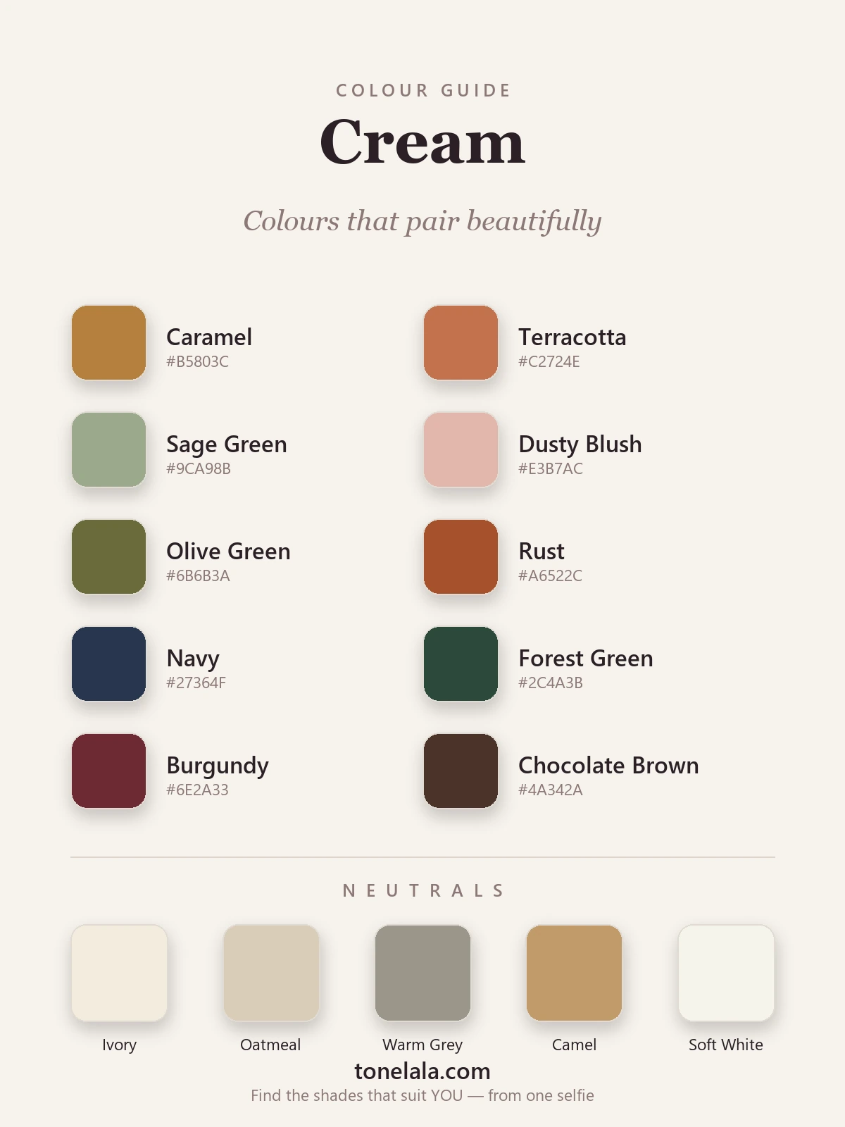
| Color | Hex | Why it works |
|---|---|---|
| Caramel | #B5803C |
Cream's easiest partner, a golden mid-brown in its own warm family, so the pairing reads instantly polished and expensive. |
| Terracotta | #C2724E |
A warm, clay orange that makes cream look sunlit and grounded. Tonal enough to feel deliberate, never loud. |
| Sage Green | #9CA98B |
A soft, grayed green that's gentle and modern beside cream, the easy way to add color without contrast. |
| Dusty Blush | #E3B7AC |
A warm, muted pink that flatters cream the way it flatters skin: soft, romantic and quietly pretty. |
| Olive Green | #6B6B3A |
Cream and olive is a muted, grown-up classic, both warm, both low-chroma, instantly considered. |
| Rust | #A6522C |
A deeper, burnt earth tone for richer warmth; against pale cream it reads autumnal and a little luxe. |
| Navy | #27364F |
The cool counterpoint. Deep and blue-based, it gives a soft cream a backbone and makes its warmth glow. |
| Forest Green | #2C4A3B |
A deep, slightly cool green that anchors cream beautifully, peak quiet-luxury for autumn and winter. |
| Burgundy | #6E2A33 |
A deep wine red that shares cream's warmth but adds the depth it lacks, instant evening richness. |
| Chocolate Brown | #4A342A |
Cream's own deeper relative. Tonal brown-on-cream is the safest, most expensive-looking pairing there is. |
Neutrals that go with cream: Ivory #F3ECDD for a soft tonal layer; Oatmeal #D8CDB8 for gentle, textural warmth; Warm Gray #9B958A for a quiet, grounded contrast that isn't cold; Camel #C19A6B, my favorite, instantly expensive; and Soft White #F6F4EC for a clean off-white that won't fight cream the way optic white does.
Is YOUR best shade of cream warm or cool?
Find your color season →Colors to avoid with cream
Cream is forgiving, but a few partners genuinely work against it:
- Stark blue-white. A cold, optic white beside warm cream makes the cream look dingy and yellowed by comparison, the contrast reads as a stain, not a choice. Reach for soft white or ivory so your off-whites sit in the same warm family.
- Cool dove gray. A blue-toned gray drains the warmth from both colors and the outfit goes flat and slightly joyless. Swap in warm gray or camel, which have enough warmth or depth to hold their own.
- Icy, blue-based pastels. Baby blue, cool lilac and mint sit at the opposite temperature to cream, so the two never quite settle together. If you love a pastel, choose its warmer, dustier cousin, dusty blush over cool pink, sage over mint.
The fix for all three is the same: keep cream's partners warm, or make any cool partner properly deep (navy, forest) so it earns its place.
Cream outfit combinations
A few pairings I put together on repeat:
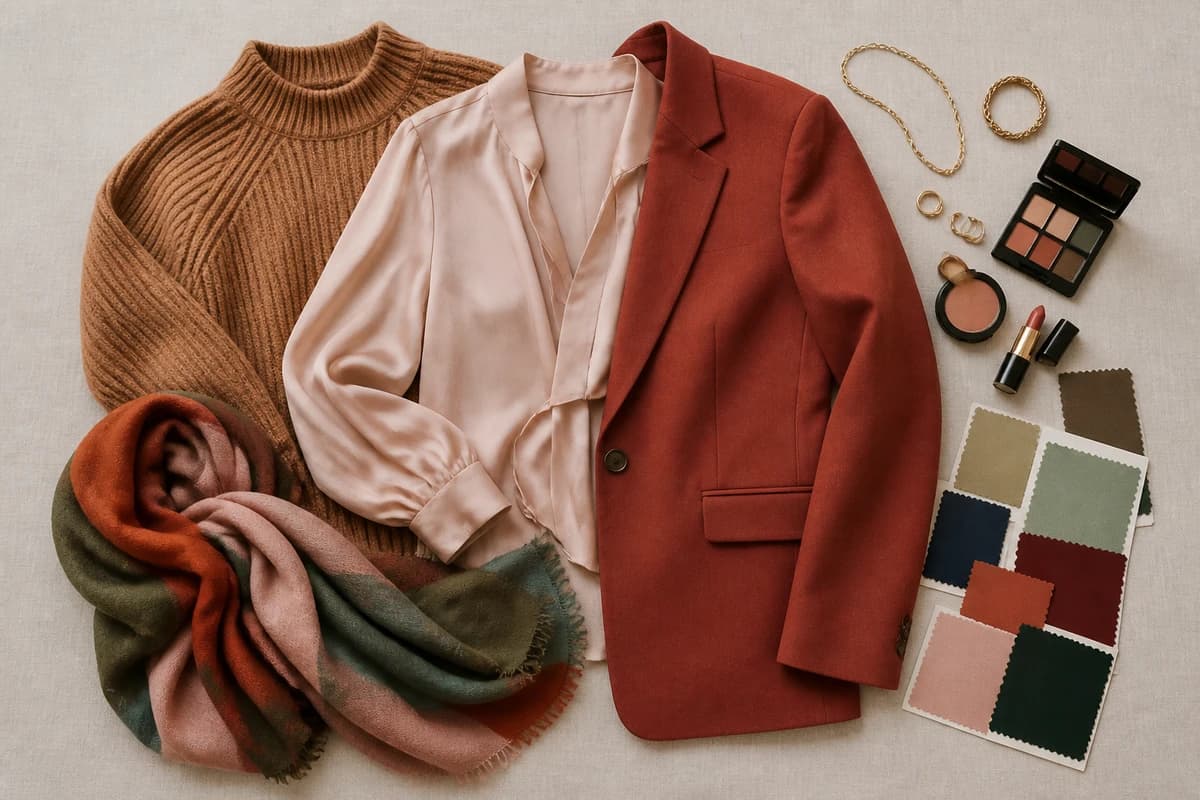
- Cream + caramel + chocolate (everyday). A cream knit, caramel trousers and a chocolate bag and boots, with gold jewelry. Tonal, warm and quietly expensive, the look that reads polished with no effort at all.
- Cream + navy (smart). A cream blazer or trousers with a navy top and accessories. The cool navy gives pale cream a backbone, and the warm-cool contrast does all the heavy lifting.
- Cream + dusty blush + gold (soft). A cream dress or skirt with a blush silk top and gold earrings. Romantic and flattering without being sugary, ideal when you want elegant rather than bold.
- Cream + forest green (or burgundy) for evening. Swap the accent for a deep jewel tone and cream dresses right up: a cream slip with a forest velvet jacket, or a burgundy heel against a cream suit. Rich, grown-up, never garish.
How to wear cream for your color season
Cream genuinely suits a lot of people, but which cream, and which partner colors, is where your personal coloring comes in. There isn't one cream; there's a whole range from buttery, golden ivory through to a soft, barely-warm off-white, and the best one for you depends on your undertone, depth and contrast.
If you're warm and deep (a True or Deep Autumn), rich, golden, buttery creams are made for you, and they'll happily carry deeper partners like rust, burgundy and chocolate. If you're warm and light (a Spring), softer, fresher creams with caramel, blush and sage will feel more like you. If you're cool, you're better in the palest, least-yellow creams, almost a soft white, paired with cooler partners like navy and forest, and you'll want to keep golden, buttery creams to a minimum near your face. And soft, muted coloring (a Summer or Soft Autumn) tends to look best in cream worn with equally soft partners, sage, dusty blush, warm gray, rather than anything stark.
That's the bit a generic chart can't do for you. Our color analysis guides walk through each season, and if you want to go deeper on cream's close neighbours, the guides on how to wear beige and how to wear brown cover its warmer relatives. A proper personal analysis reads your undertone, depth and contrast to tell you the exact cream, and the exact partner colors, that flatter you most.
Putting it together
Cream is at its best when you stop treating it as a stand-in for white and start treating it as the warm, pale canvas it really is. Give it warmth or one deep anchor, caramel and chocolate for everyday, navy for something smart, forest or burgundy for evening, and it goes from "almost white" to genuinely expensive-looking. Build a small cream capsule around two neutrals and two or three of the colors above, and everything will mix, because each partner here was chosen to flatter cream's warmth. The only cream mistake worth worrying about is pairing it with something cold and stark. Everything warm, cream can carry.
Frequently asked questions
What colors go with cream?
Cream pairs beautifully with warm earth tones like caramel, terracotta, rust and olive; soft warm shades like dusty blush and sage green; cool navy for contrast; and rich depths like forest green, burgundy and chocolate brown. For neutrals it loves ivory, oatmeal, warm gray, camel and soft white. The most foolproof combination is cream with caramel and a flash of chocolate brown, tonal, warm and quietly expensive.
What color best complements cream?
Cream is a pale, warm, yellow-based off-white, so its truest foil is a deep cool blue, navy gives a soft cream a backbone and makes its warmth glow. If you want something tonal and easier, caramel is the partner I reach for most: it sits in cream's own warm family and reads instantly polished. For real richness, chocolate brown is the safest deep anchor of all.
What colors should you not wear with cream?
Be careful with stark, blue-white, which can make a warm cream look slightly dingy and yellowed beside it; with cool dove grays that drain the warmth from both; and with icy, blue-based pastels such as baby blue or cool lilac, whose coolness fights cream's warmth. None are banned, but they're the pairings that most often fall flat. Swap blue-white for ivory, cool gray for warm gray, and icy pastels for their warmer, dustier versions.
What neutrals go with cream?
Cream is itself a neutral, so it pairs across the whole warm-neutral family: ivory and soft white for a layered tonal look, oatmeal for gentle texture, camel for richer warmth, and warm gray for a quiet, grounded contrast. Camel is the one I lean on most, cream and camel together look far more expensive than they have any right to.
How do I wear cream for my skin tone?
Match the cream to your undertone. Warm and deep coloring suits rich, golden and buttery creams; cool or very light coloring is kinder to soft, barely-there creams with less yellow in them. Cream sits close to your skin tone, so the wrong one can wash you out, hold two shades near your face in daylight and keep the one that warms your skin rather than graying it. A personal color analysis pins down your exact shade and partners.
Related guides

Colors That Go With Charcoal
A stylist's guide to the colors that go with charcoal gray, 10 pairings plus 5 neutrals with hex codes, outfit combinations and what to avoid.

Colors That Go With Khaki
A stylist's guide to the best colors that go with khaki, navy, rust, burgundy, white and more, with hex codes, outfit combinations and what to avoid.

Colors That Go With Peach
The best colors to pair with peach, neutrals, complementary shades and combinations that flatter, with a ready-to-use palette and stylist tips.

Colors That Go With Mint Green
A stylist's guide to the colors that go with mint green, coral, navy, blush, gold and more, with hex codes, outfit combinations and shades to avoid.

Colors That Go With Maroon
A stylist's guide to the colors that go with maroon, 10 pairings and 5 neutrals with hex codes, outfit combinations, what to avoid, and how to wear it.

Colors That Go With Turquoise
A stylist's guide to the colors that go with turquoise, 10 pairings and 5 neutrals with hex codes, outfit ideas, what to avoid
Prefer in person? Find color analysis near you
Browse local color analysts by city, or get the same season, palette and best-colors breakdown online from one selfie.
See your colors on a photo of you
Upload one selfie and ToneLala reveals your season, your full palette, and your best hair, makeup, jewelry and outfits, styled on you.