In a sentence: Wear orange as the star of the outfit and give it a cool, deep co-star, navy, denim or teal for crisp contrast, or olive, chocolate and cream when you want it warm and tonal. Skip to the pairing palette or find your most flattering colors.
How to Wear Orange: Outfit Ideas & Color Pairings
By ToneLalaUpdated July 9, 2026
Contents
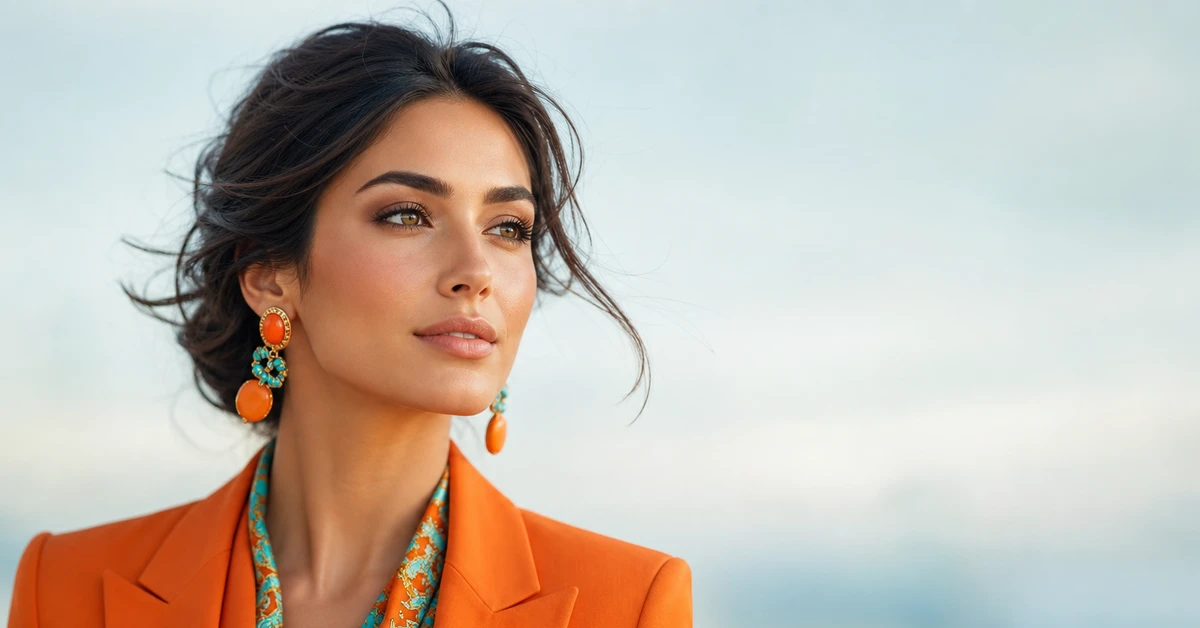
Orange is the color clients apologize for liking. They'll pull a rust jacket out of the wardrobe, hold it up, and immediately tell me why it "probably doesn't suit them", too loud, too autumnal, too much. Nine times out of ten the jacket is gorgeous and the only problem is they've been wearing it with black, which turns a beautiful terracotta into a traffic cone. Orange doesn't want black. It wants a deep blue, a soft cream, or an olive that lets its warmth breathe.
The other thing people get wrong is treating "orange" as one color. A clean coral, a burnt terracotta, a bright tangerine and a dusty apricot behave nothing alike, they flatter different people and demand different partners. Get the shade right for your coloring and the pairing right for the shade, and orange goes from the thing you're nervous about to the color people stop you in the street for.
What orange brings to an outfit
Orange is warmth made visible. It's the color of low autumn sun and terracotta tiles, and it carries an easy, confident energy that very few colors match, put someone in the right orange and they look healthy, lit-up and quietly self-assured. It's a warm color through and through, but it spans an enormous range: a soft peach or apricot is gentle and almost neutral, while a bright tangerine is pure volume. A deep terracotta or rust sits somewhere in between and behaves, in a wardrobe, almost like a rich brown.
The color-wheel logic is genuinely useful here. Orange's direct complement is blue, so anything from navy to cobalt gives you maximum contrast and the cleanest, most flattering pairing, which is exactly why navy-and-orange feels so right. Its analogous neighbours, red and yellow, sit either side of it, so they can either harmonize (a mustard with a rust is gorgeous) or clash and muddy if you push them too close in brightness.
One more thing worth knowing: the deeper and dustier your orange, the more forgiving it becomes. A muted terracotta slots into a wardrobe as easily as a caramel and reads grown-up rather than bold. The brighter and clearer the orange, the more deliberate you have to be about what surrounds it, which is why the pairings below matter most when your orange is at full volume.
The best colors to pair with orange
Here are the ten I reach for again and again, cool blues for contrast, deep greens and browns for a tonal autumn look, and a couple of warm partners for when you want orange to feel soft.
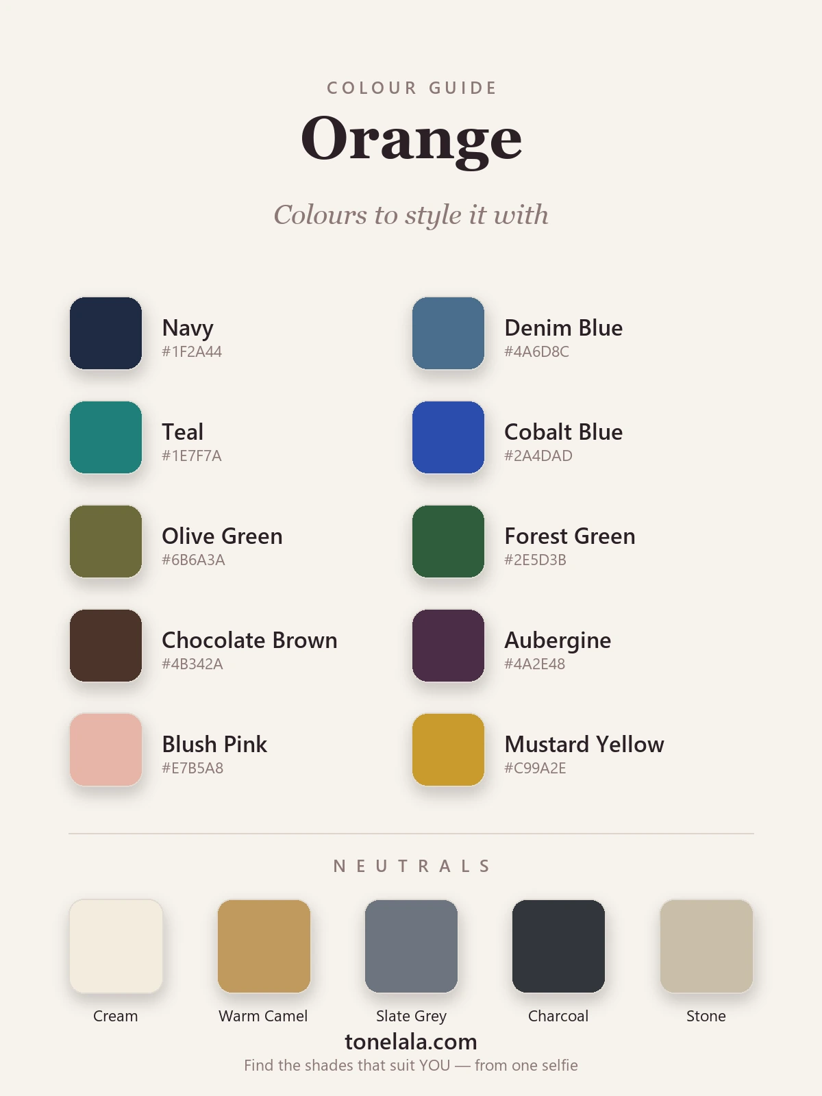
| Color | Hex |
|---|---|
Navy #1F2A44 |
The failsafe. Deep, cool and just across the wheel from orange, it gives all that warmth something solid to sit against, sharp without the harshness of black. |
Denim Blue #4A6D8C |
Orange's everyday best friend. A medium blue cools the heat and keeps the whole thing relaxed, a rust jumper and jeans is hard to beat. |
Teal #1E7F7A |
A richer, more unexpected take on the blue complement. Beautiful with terracotta and burnt orange, it looks considered rather than obvious. |
Cobalt Blue #2A4DAD |
High-energy and modern. Bright cool blue against bright warm orange is punchy and full of life, brilliant with a clear coral. |
Olive Green #6B6A3A |
The grown-up's choice. Muted, earthy green shares orange's warmth, so the two sit together like they were grown in the same soil. |
Forest Green #2E5D3B |
Deep, cool green reads almost as a neutral and makes warm orange look fresh and outdoorsy, very autumn-walk, very chic. |
Chocolate Brown #4B342A |
The chic alternative to black. Brown is orange's deeper, calmer cousin, so the pairing feels intentional and luxe rather than loud. |
Aubergine #4A2E48 |
When you want a little drama. A deep, dusky purple is cool enough to flatter orange's warmth and looks rich and slightly moody together. |
Blush Pink #E7B5A8 |
The soft one. A muted, peachy pink keeps orange gentle and pretty, lovely for a coral or apricot on warmer skin. |
Mustard Yellow #C99A2E |
Tonal warmth done right. Sitting one step round the wheel, a deep mustard harmonizes with orange instead of fighting it, golden and rich. |
Neutrals to wear with orange: Cream #F2ECDD to keep it warm and fresh, Warm Camel #C09A5E to lean into its golden side, Slate Gray #6E7480 and Charcoal #33363B to calm it for work and everyday, and Stone #C9BEA9 for a soft, modern backdrop.
Is YOUR best shade of orange warm or cool?
Find your color season →Orange outfit formulas
- Everyday: a rust or terracotta jumper with blue denim and cream trainers. The cool denim cools the heat, the cream keeps it soft, and it takes about four seconds to put together.
- The quiet-luxury one: a burnt-orange knit with chocolate-brown wide-leg trousers and camel loafers. Tonal, warm and very expensive-looking for almost no effort, gold hoops finish it.
- Workwear: a slate-gray or navy suit with a coral or apricot blouse underneath. Gray and navy mute the orange just enough to read polished, so it works for the office without disappearing.
- Evening: a tangerine or coral dress with an aubergine or navy coat over the top and gold jewelry. Let the complement do the heavy lifting and keep everything else deep and simple.
If you take one rule from this section, make it this: let orange be the loudest thing you're wearing and keep everything else a notch quieter and deeper. The moment a second piece competes at the same brightness, the outfit loses its anchor.
Colors and styling to avoid with orange
- Bright red and hot pink right beside it. They're orange's near-neighbours on the wheel, so worn together they jostle for the same attention and the whole thing reads chaotic. Keep them to small accents, not the main pairing.
- Hard black, used carelessly. Black-and-orange is the most direct route to looking like a Halloween decoration, and a flat black can drain a warm orange near the face. Swap in chocolate, navy or charcoal and you keep the depth without the costume.
- Cold, flat gray. A steely blue-gray can deaden a warm terracotta and leave it looking dirty rather than rich. Reach for a warmer stone or a soft slate instead, or let cream do the lightening.
Wearing orange for your coloring
The single biggest reason orange "doesn't suit" someone is almost always the wrong orange, not orange itself. A warm, golden terracotta or rust glows on deep, warm coloring, think True Autumn and Deep Autumn types, but the same shade can look heavy and muddy on someone light and cool. Flip it round: a clear coral or bright tangerine lifts brighter, fresher coloring like Bright Spring, yet can overwhelm a soft, muted complexion. Same color family, opposite results.
Your best pairings shift with your coloring too. A deep, warm person can carry terracotta with chocolate, olive and forest green; a light, bright person tends to look better in coral with navy, teal and cream. If you want to know exactly where you sit, the color analysis guides walk through each season, and a personal analysis pins down your precise shade of orange, and the colors that make your face come alive rather than wash it out.
Putting it together
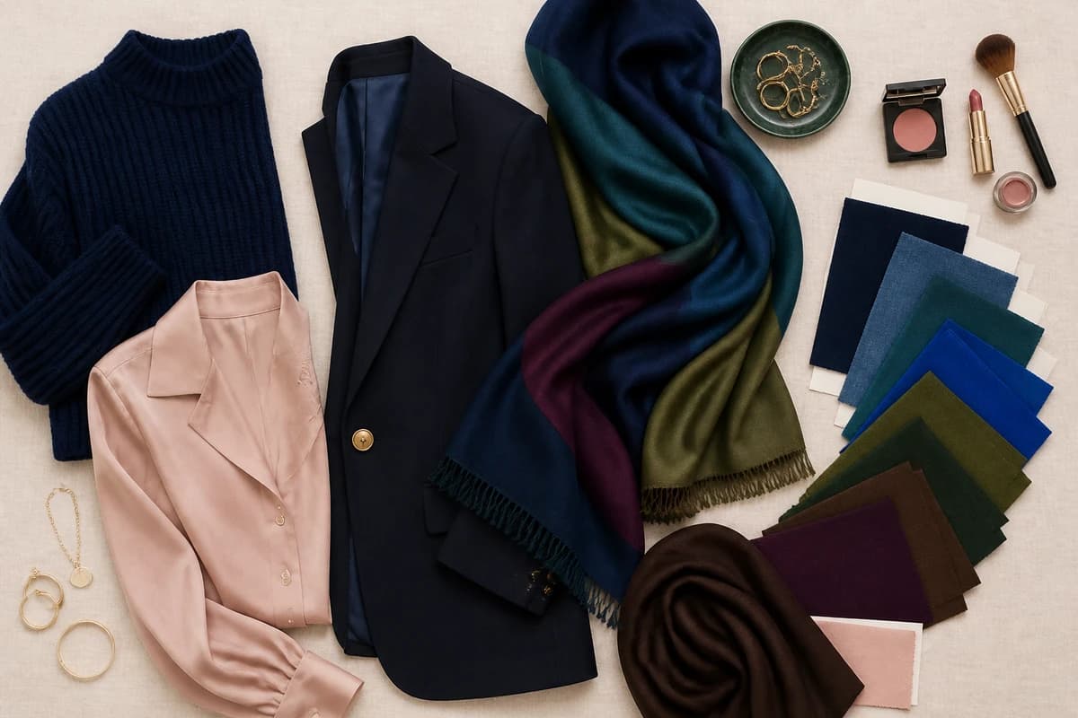
Treat orange as the star and give it a deeper, cooler co-star: navy or denim when you want easy, teal or aubergine when you want interesting, chocolate or olive when you want warm and grown-up. Keep one neutral close to your face, cream, camel or slate, and let the orange do the talking from there. Worn like that, it stops being the color you apologize for and becomes the one people remember you in.
Frequently asked questions
What colors go with orange?
Orange looks best with cool blues, navy, denim, teal and cobalt, which sit opposite it on the color wheel and give it crisp contrast. For a warmer, earthier outfit, pair it with olive, forest green, chocolate brown, mustard and blush, and reach for aubergine when you want a little drama. Cream, camel, slate gray, charcoal and stone are the neutrals that hold it all together.
What color best complements orange?
On the color wheel, orange's true complement is blue, so navy, denim and cobalt give you the most flattering, high-contrast pairing, navy especially is the easy, grown-up choice. Teal sits just to one side and looks a touch more unexpected. If you want the opposite mood, chocolate brown and olive keep orange warm and tonal rather than punchy.
What colors should you not wear with orange?
Be careful with bright red and hot pink sitting right next to orange, they're close neighbours on the wheel, so worn together they compete and the outfit loses its anchor. A flat, cool gray can deaden a warm orange, and a hard black-and-orange combination tips into Halloween fast. None are truly banned, but navy, cream and olive are far more forgiving.
What neutrals go with orange?
Cream and stone keep orange warm and soft, camel leans into its golden side, and slate gray or charcoal calm it down for everyday and workwear. White works but can look a little stark against a deep terracotta, an off-white or cream usually flatters more, especially when the orange is near your face.
How do I wear orange for my skin tone?
It comes down to which orange, not whether you can wear it. Warm, golden and terracotta oranges glow on warm and deep coloring (Autumn and warm Spring types), while clear coral and bright tangerine flatter brighter, cooler coloring. A personal color analysis tells you your exact shade of orange and the pairings that light up your face rather than drain it.
Related guides
How to Wear Beige: Outfit Ideas & Color Pairings
A stylist's guide to wearing beige, 10 color pairings with hex codes, the best neutrals, outfit formulas by occasion and what to avoid.
How to Wear Brown: Outfit Ideas & Color Pairings
How to wear brown without looking dull: 10 color pairings with hex codes, 5 neutrals, outfit formulas by occasion, and the right shade for your coloring.
How to Wear Red: Outfit Ideas & Color Pairings
How to wear red without it wearing you, a stylist's outfit formulas, the 10 best colors to pair with red (plus neutrals)
How to Wear Navy: Outfit Ideas & Color Pairings
A stylist's guide to wearing navy, 10 color pairings with hex codes, 5 neutrals, outfit formulas by occasion, and the right shade of navy for your coloring.
How to Wear Lavender: Outfit Ideas & Color Pairings
A stylist's guide to wearing lavender, 10 color pairings and 5 neutrals with hex codes, outfit formulas by occasion, and the right shade for your coloring.
How to Wear Coral: Outfit Ideas & Color Pairings
A stylist's guide to wearing coral, 10 pairing colors with hex codes, the best neutrals, outfit formulas, and how to find your most flattering coral.
Prefer in person? Find color analysis near you
Browse local color analysts by city, or get the same season, palette and best-colors breakdown online from one selfie.
See your colors on a photo of you
Upload one selfie and ToneLala reveals your season, your full palette, and your best hair, makeup, jewelry and outfits, styled on you.