In a sentence: True Spring and Light Spring share the same warm, golden, clear undertone, the difference is intensity, with True Spring fuller and brighter and Light Spring paler and softer. Skip to the distinguishing palette or find out which you are.
True Spring vs Light Spring: How to Tell the Difference
By ToneLalaUpdated July 13, 2026
Contents
I draped a client last month who'd been typed two different ways by two different people, one analyst called her True Spring, another swore she was Light Spring. Both were half right, which is exactly why these two get muddled so often. She had the warm, golden skin of a Spring without question. The argument was only ever about how much color she could carry.
That's the whole story of True Spring versus Light Spring. They sit right next to each other on the color wheel of seasons, they share the same sunny warmth, and they both love clear color over anything dusty. What pulls them apart is value and saturation, how light the coloring is, and how much pure pigment it can hold near the face. Get those two dials right and the choice between them stops feeling like a coin toss.
True Spring vs Light Spring: the core difference
Every season is read on three dials, undertone, value and chroma. True Spring and Light Spring agree on one of them completely and split on the other two.
- Undertone. Both are warm. True Spring is the most purely golden of all the Springs, no hint of cool anywhere in it. Light Spring is warm too, but it leans a shade towards neutral, so its warmth reads a touch fresher and less golden. In practice, both want gold over blue, the undertone alone won't separate them.
- Value. This is the first real divide. Value is simply how light or dark the coloring is overall. Light Spring is light: pale, luminous, the whole palette sitting up near the top of the scale. True Spring is light-to-medium: still sunlit, but with a little more body and depth to it. Stand the two side by side and True Spring has the deeper colors of the pair.
- Chroma. This is the second divide, and the one people miss. Chroma is how saturated, or pure, a color is. True Spring runs bright and full, colors at their clearest, most vivid strength. Light Spring is bright as well, but a notch softer and more delicate, as if the same colors were lit by a paler morning sun rather than midday.
Add it up and you get the simplest possible summary: same warmth, different intensity. True Spring carries more saturation and a touch more depth, which gives it medium contrast. Light Spring is lighter and gentler, which gives it low-to-medium contrast. When someone can't decide between the two, value and chroma are nearly always the missing piece, not undertone.
The colors that tell them apart
These are the shades that actually do the separating. The first five lean True Spring, full, saturated, with real punch. The last five lean Light Spring, paler, softer, more delicate. Put a True Spring color and its Light Spring cousin next to each other and you can almost see the difference in volume.
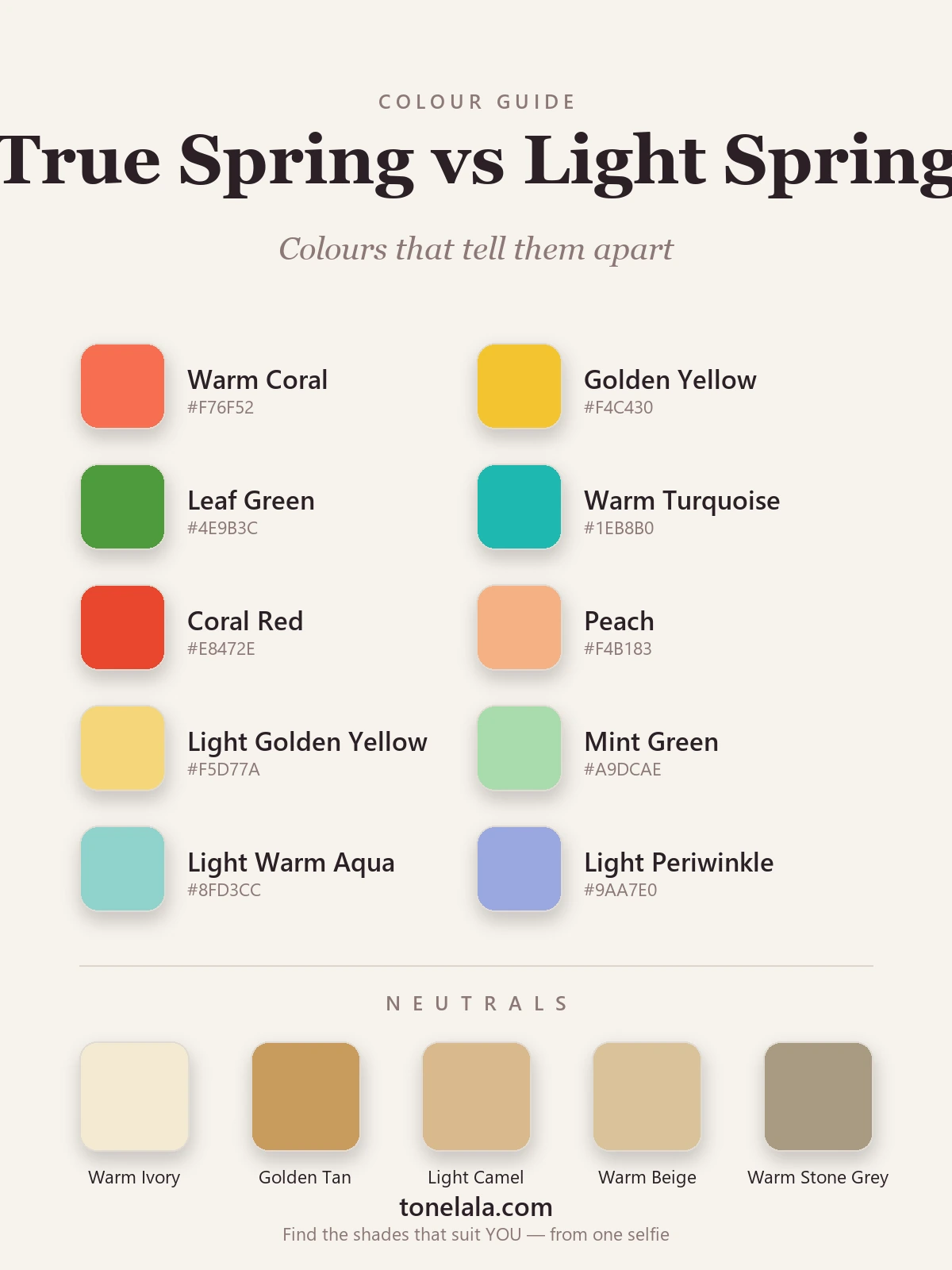
| Color | Hex | Flatters |
|---|---|---|
| Warm Coral | #F76F52 |
True Spring, full, vivid coral with real saturation |
| Golden Yellow | #F4C430 |
True Spring, clear, deep golden yellow at full strength |
| Leaf Green | #4E9B3C |
True Spring, fresh green with body and depth |
| Warm Turquoise | #1EB8B0 |
True Spring, saturated warm turquoise, not a pastel |
| Coral Red | #E8472E |
True Spring, the brightest, fullest warm red of the two |
| Peach | #F4B183 |
Light Spring, soft, pale, sunlit peach |
| Light Golden Yellow | #F5D77A |
Light Spring, golden yellow turned down and lightened |
| Mint Green | #A9DCAE |
Light Spring, delicate, airy green |
| Light Warm Aqua | #8FD3CC |
Light Spring, pale warm aqua, gentle not vivid |
| Light Periwinkle | #9AA7E0 |
Light Spring, soft, light blue-violet |
Shared neutrals: both seasons stay warm and skip black entirely, Warm Ivory #F3E9D2 as the "white", Golden Tan #C99B5E, Light Camel #D8B98C, Warm Beige #D9C39A, and Warm Stone Gray #A99B83 for a softer cool option. True Spring can wear the golden tan a little deeper; Light Spring tends to prefer the lighter camel and ivory closest to the face.
Still not sure, True Spring or Light Spring?
Find your color season →How to tell which you are
The dials are easier to read at a mirror than they sound. A few honest tests will get you most of the way.
- Drape full against pale. Take one hue, golden yellow is perfect, in a fully saturated version and a soft, light version. Hold each next to your bare face in daylight and watch your skin, not the fabric. If the full, vivid version lights you up, you're True Spring. If it overwhelms you and the pale one looks more harmonious, you're Light Spring.
- Check your contrast in black and white. Photograph yourself with no makeup, then turn the image greyscale. True Spring shows a clear medium contrast between hair, skin and eyes. Light Spring reads softer and more blended, with everything sitting in a similar light tone.
- See what washes you out. This is the most telling of all. A Light Spring put in fully saturated color looks swallowed by it, the garment shouts louder than the face. A True Spring put in pale pastels looks faded and slightly washed out, as if the color gave up halfway. Whichever failure sounds like you, you've found your answer from the other side.
- Watch the jewelry, but only a little. Both seasons wear gold beautifully, so metals won't separate them the way they separate a Spring from a Summer. What you can notice: True Spring carries a brighter, fuller gold with ease, while Light Spring often looks happiest in a lighter, softer gold. Useful as a tiebreaker, not a verdict.
If you're True Spring / If you're Light Spring
If you're True Spring, lean into saturation. Your skin has enough warmth and body to carry color at full volume, so the worst thing you can do is mute yourself into pastels. Warm coral, golden yellow and leaf green at their clearest are where you come alive, and a warm camel or leaf green plays the role of "dark" far better than black ever could. The full breakdown, with hex codes and what to avoid, is in the True Spring guide.
If you're Light Spring, keep it light and clear. Your coloring is delicate, so the trick is freshness rather than force, peach, light golden yellow and light warm aqua flatter you precisely because they're pale and clean, not turned down and dusty. Saturated color at full strength tends to wear you instead of you wearing it. Everything you need, palette and pitfalls included, is in the Light Spring guide.
The reliable way to settle it
Here's the honest part. Value and chroma are genuinely hard to judge on your own face, because the lighting in your bathroom, the color of your walls and whatever you happen to be wearing all skew what you see. People talk themselves into the wrong season all the time, usually a Light Spring convinced she "can't do bright," or a True Spring quietly fading herself out in beige.
A photo-based analysis sidesteps all of that. It reads your undertone, your value and your contrast directly from a clear image of your face, under conditions that don't lie to you, and tells you which side of the line you sit on, including when you're a borderline case who can borrow from both. If you'd like to stop guessing, that's the route I'd point you to. You can also browse the wider library of color analysis guides to see how every season relates to the next, which makes the True Spring and Light Spring distinction click into place far faster than reading either one alone.
Frequently asked questions
What's the difference between True Spring and Light Spring?
Both are warm and bright, so they share a family resemblance. Value and chroma separate them. True Spring is light-to-medium and fully saturated, golden yellow, warm coral, leaf green at full strength. Light Spring is paler and a touch softer, peach, light golden yellow, light warm aqua. Same warmth, different intensity: True Spring is fuller and brighter, Light Spring is lighter and more delicate.
Am I True Spring or Light Spring?
Hold a fully saturated warm color, like a clear golden yellow or warm coral, against your bare face. If it lights you up and your features hold their own against it, you're likely True Spring. If the same color seems to overwhelm you and a paler version feels more like you, you're likely Light Spring. The deciding factor is whether full brightness flatters you or wears you.
Which is warmer, True Spring or Light Spring?
True Spring is the warmer of the two. It's the most purely golden of all the Spring seasons. Light Spring is warm as well, but it leans slightly towards neutral, so its warmth reads fresher and gentler rather than deeply golden.
Which is brighter or deeper, True Spring or Light Spring?
True Spring is both brighter and a touch deeper. Its colors carry more chroma and a little more body, which gives it medium contrast. Light Spring sits paler and lower in contrast, still clear, but lighter and quieter overall.
Can you be both True Spring and Light Spring?
No, you have one season, but you can sit on the border between them. True Spring and Light Spring are direct neighbours on the value and chroma dials, so many people land somewhere in between and can borrow gently from both. A photo-based analysis reads exactly where you fall.
How can I tell True Spring from Light Spring at home?
Drape a full-strength warm color next to a pale version of the same hue and watch your face, not the fabric. Check your contrast in a black-and-white photo: medium contrast leans True Spring, low contrast leans Light Spring. And notice what tires you, if vivid color drains you, you're probably Light Spring; if pale color leaves you flat, you're probably True Spring.
Related guides
True Spring vs True Autumn: How to Tell the Difference
True Spring vs True Autumn, explained by a color analyst, how they differ on value and chroma, the colors that separate them, and how to tell which you are.
Bright Spring vs Light Spring: How to Tell the Difference
Bright Spring vs Light Spring: one runs on saturation, the other on lightness. Learn the undertone, value and chroma tells, and how to know which you are.

Light Summer vs Light Spring: How to Tell the Difference
A color analyst on Light Summer vs Light Spring, how they differ on undertone, value and chroma, the colors that separate them
True Summer vs Light Summer: How to Tell the Difference
A color analyst on True Summer vs Light Summer, how they differ on value and chroma, the colors that separate them, and how to tell which one you are.

Bright Spring vs True Spring: How to Tell the Difference
A color analyst on Bright Spring vs True Spring, how they differ on undertone, value and chroma, the colors that separate them

True Spring Color Palette: The Complete Guide (with Hex Codes)
A color analyst's complete True Spring guide, your palette with hex codes, best neutrals and metals, colors to avoid
Prefer in person? Find color analysis near you
Browse local color analysts by city, or get the same season, palette and best-colors breakdown online from one selfie.
See your colors on a photo of you
Upload one selfie and ToneLala reveals your season, your full palette, and your best hair, makeup, jewelry and outfits, styled on you.