In a sentence: True Summer and True Winter are both cool, so the difference is value and chroma, True Summer is medium and soft-but-clear, True Winter is deep, bright and high-contrast. Skip to the distinguishing palette or find out which you are.
True Summer vs True Winter: How to Tell the Difference
By ToneLalaUpdated July 13, 2026

Contents
I draped a woman last spring who'd been told twice she was a Winter, and she'd dutifully filled her wardrobe with black and true red. None of it was wrong, exactly, she was clearly cool, but the red sat a fraction too loud on her, and the black cut a hard line under her chin. When I swapped in a soft slate blue and a dusty raspberry, her face came forward and the color stepped back. She wasn't a Winter at all. She was a True Summer who'd been reading her coolness as proof of Winter, and missing the two dials that actually decide it.
That mix-up happens constantly. True Summer and True Winter share the single trait people notice first, both are genuinely, unmistakably cool, so it's easy to stop there and guess. But undertone is the one thing these two seasons agree on. Everything that separates them lives on the other two dials, value and chroma, and those are far harder to read on your own face.
True Summer vs True Winter: the core difference
Every one of the twelve seasons sits on three dials: undertone (cool or warm), value (light or dark), and chroma (bright or muted). True Summer and True Winter land on the same end of the first dial and split hard on the other two.
- Undertone. Both are cool, so this won't separate them, and that's exactly the trap. True Winter is the most purely cool season of all twelve, sitting at the icy, blue-based extreme. True Summer is cool too, just a softer, gentler version of it. If you're testing warm-versus-cool to tell these apart, you're measuring the one thing they have in common.
- Value. Here they part ways. True Summer is medium: neither pale nor deep. True Winter is deep, with a darkness that gives it real weight. Hold a near-black against the two and the Winter face can carry it; the Summer face gets pulled down by it.
- Chroma. The other half of the split. True Summer is soft-but-clear: cooled and gently calmed, still obviously color but never blaring. True Winter is bright: saturated, crystalline jewel tones with nothing muted about them. Stack deep value on top of high chroma and you get Winter's defining trait: very high contrast.
Picture a clear cool blue. Soften it with a bead of gray and keep it medium, and you have True Summer, polite, cooled, still plainly blue. Now take that same blue the other way: deepen it, sharpen the saturation, let it ring out like a sapphire. That's True Winter. One cool family, dialled to two completely different volumes.
The colors that tell them apart
Both palettes are cool, so a few shades sit close to the border. These are the colors that actually separate the two, the soft, medium cool shades True Summer wears with ease, and the deep, vivid jewel tones True Winter carries that would swamp a Summer.
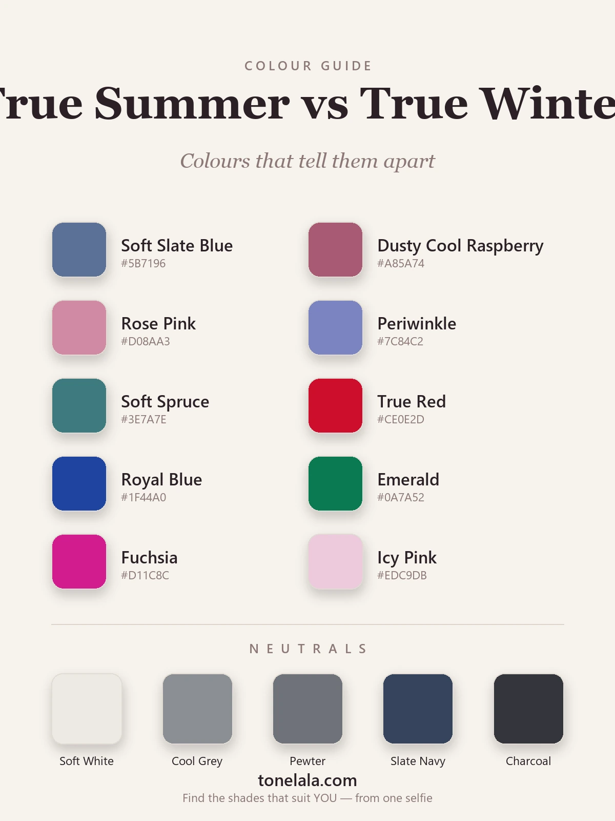
| Color | Hex | Flatters |
|---|---|---|
| Soft Slate Blue | #5B7196 |
True Summer, cooled, medium, gently muted |
| Dusty Cool Raspberry | #A85A74 |
True Summer, a berry with the volume turned down |
| Rose Pink | #D08AA3 |
True Summer, soft cool pink, never electric |
| Periwinkle | #7C84C2 |
True Summer, softened cool blue-violet |
| Soft Spruce | #3E7A7E |
True Summer, cool blue-green, clear but quiet |
| True Red | #CE0E2D |
True Winter, saturated, blue-based and bold |
| Royal Blue | #1F44A0 |
True Winter, deep, ringing cool blue |
| Emerald | #0A7A52 |
True Winter, vivid cool jewel green |
| Fuchsia | #D11C8C |
True Winter, high-chroma cool pink |
| Icy Pink | #EDC9DB |
True Winter, pale but crisp, lit from within |
Shared neutrals: Soft White #EDEAE3, Cool Gray #8A8E94, Pewter #6E727A, Slate Navy #36435C, and Charcoal #34353B, both seasons lean on cool, clean basics, though True Summer keeps to the softer end and True Winter reaches further into black.
The pattern is easy to spot once you've seen it. The True Summer side looks cooled and held at a polite volume, color with the edge taken off. The True Winter side keeps every bit of its intensity, deep and vivid and crisp, the kind of color that needs a strong face to stand up to it.
Still not sure, True Summer or True Winter?
Find your color season →How to tell which you are
Skip the warm-versus-cool test here. It's the standard opening move in color analysis, and it's useless for this pair, because both are cool. What you're really measuring is how much depth and brightness your face can take before the color starts wearing you. A few practical tests:
- The brightness drape. Hold a saturated jewel tone to your jaw, a true blue-red, an emerald, a clear fuchsia. Then hold a softer, grayer cool shade like slate blue or dusty raspberry. If the bright one looks striking and balanced, you're True Winter. If it overwhelms you and the muted one looks more harmonious, you're True Summer. Do it in daylight, never under warm indoor bulbs.
- The black-and-white test. Put true black and stark white together near your face. On a True Winter the pairing looks crisp and effortless, the contrast has something to push against. On a True Summer the same combination feels heavy and a little severe, casting shadows and pulling focus off the face. This one test does a lot of the work.
- What washes you out. True Summer gets overpowered by deep, saturated color, it doesn't lift the face, it shouts over it. True Winter wears that same intensity and looks more defined, not less. If clear bright colors leave the garment looking louder than you, you're on the softer, Summer side.
- The contrast clue. Look at the gap between your hair, skin and eyes in a plain daylight photo. True Winter coloring tends to read high-contrast, dark hair, bright eyes, a clear difference between the three. True Summer reads gentler, with the three values closer together. High built-in contrast leans Winter; soft, blended contrast leans Summer.
Run these together rather than leaning on one. Any single test can mislead, it's the agreement across all of them that tells the truth.
If you're True Summer / If you're True Winter
If you lean True Summer, your home is softness held at medium. Build around cooled, gently muted shades, slate blue, dusty raspberry, rose pink, periwinkle, and keep the very dark and very bright colors out of the wardrobe. Your basics aren't black and stark white; they're cool gray, pewter and a soft slate navy. The full breakdown, with every hex code, is in the True Summer guide.
If you lean True Winter, you can carry depth and brightness that would overwhelm most seasons, as long as it stays cool and crisp. Reach for the true reds, royal blues and emeralds that a Summer finds too strong, and lean into black and true white as the high-contrast pairing that looks effortless on you. The complete palette is in the True Winter guide.
The reliable way to settle it
Here's the honest part: value and chroma are genuinely hard to judge in your own bathroom mirror. Lighting lies, makeup skews the result, and most of us carry an idea of ourselves that doesn't quite match what the camera sees. The line between "soft and medium" and "deep and bright" is subtle when both seasons are cool, which is exactly why this pair trips so many people into the wrong one.
A photo-based analysis takes the guesswork out. It reads your undertone, value and contrast from a clear picture of your own face, then places you on the right side of the line, and builds the palette on a photo of you rather than a generic swatch card. If you want to understand the whole system first, the rest of our color analysis guides walk through every season and how they relate. But if you just want the answer, the fastest route is to find out which you are.
Frequently asked questions
What is the difference between True Summer and True Winter?
Both are genuinely cool, so undertone won't separate them, value and chroma do. True Summer is medium and soft-but-clear, flattered by cooled, gently muted colors like slate blue and dusty raspberry. True Winter is deep, bright and very high-contrast, flattered by saturated icy jewel tones and the crisp black-and-white most seasons can't wear. Soft and medium points to Summer; deep and vivid points to Winter.
Am I True Summer or True Winter?
Drape a saturated jewel tone like a true blue-red or emerald against your face, then a softer, grayer cool shade. If the bright color reads striking and balanced, you lean True Winter. If it overwhelms you and the softer one looks more harmonious, you lean True Summer. Undertone is cool for both, so it comes down to how much depth and brightness your face can carry.
Which is cooler, True Summer or True Winter?
Both are cool, but True Winter is the more extreme cool, it sits at the icy, blue-based end of the dial and is the most purely cool season of all twelve. True Summer is also clearly cool, but its coolness is softer and a touch warmer-feeling because the colors are muted rather than crystalline.
Which is deeper, True Summer or True Winter?
True Winter is deeper. Depth and high contrast are its signature, it carries true red, royal blue and emerald, and wears black and true white with ease. True Summer is medium in value with low-to-medium contrast, so very dark or very bright colors overpower it and softer cool shades flatter it instead.
Can you be both True Summer and True Winter?
No, you're one or the other, but you can sit near the border and read as a blend. Someone close to the line between the cool Summers and cool Winters can wear a few colors from each, and an analysis simply points to whichever direction flatters you most so you lead with your truest colors.
How do I tell True Summer and True Winter apart?
Test depth and brightness, not warmth, since both are cool. Hold a saturated jewel tone to your face, then a soft grayed cool shade. If the bright color looks balanced you're True Winter; if the muted one looks more harmonious you're True Summer. A black-and-white pairing settles it too, striking on Winter, heavy on Summer. A photo-based analysis reads your value and contrast objectively.
Related guides

Deep Winter vs True Autumn: How to Tell the Difference
A color analyst on Deep Winter vs True Autumn, how they differ on undertone, value and chroma, the colors that separate them, and how to tell which you are.

Soft Autumn vs True Summer: How to Tell the Difference
A color analyst on Soft Autumn vs True Summer, the two dials that separate them, the colors that tell them apart, and how to decide which you are.

Soft Summer vs True Summer: How to Tell the Difference
Soft Summer vs True Summer, explained by a color analyst: how they differ on undertone, value and chroma, the colors that separate them

True Winter vs Bright Winter: How to Tell the Difference
A color analyst on True Winter vs Bright Winter, how undertone, value and chroma differ, the colors that tell them apart, and how to decide which you are.

True Summer vs Light Summer: How to Tell the Difference
A color analyst on True Summer vs Light Summer, how they differ on value and chroma, the colors that separate them, and how to tell which one you are.

Deep Winter vs True Winter: How to Tell the Difference
Deep Winter vs True Winter, explained by a color analyst: how they differ on undertone, value and chroma, the colors that separate them
Prefer in person? Find color analysis near you
Browse local color analysts by city, or get the same season, palette and best-colors breakdown online from one selfie.
See your colors on a photo of you
Upload one selfie and ToneLala reveals your season, your full palette, and your best hair, makeup, jewelry and outfits, styled on you.