In a sentence: Value is how light or deep a color (or your coloring) is, and contrast is the size of the gap between your lightest and darkest features, get both right and your colors stop fighting you. Skip to the value scale or find your season.
Value and Contrast in Color Analysis
By ToneLalaUpdated July 6, 2026

Contents
Take any outfit photo you love, drain the color out of it, and look at what's left. You'll see a pattern of lights and darks, a value structure, and nine times out of ten that structure is the real reason the outfit works, not the colors themselves. Most people obsess over whether a shade is warm or cool and never think about whether it's the right depth for them, or whether they've accidentally paired a feature-flattering soft beige with a face that wants a bit of drama. That's the gap I want to close here.
Value and contrast are the two least-talked-about dimensions of color analysis, and in my experience they're the ones that make the biggest visible difference once you understand them. Undertone gets all the attention because it's easy to name, warm, cool, neutral. But I've watched clients wear the technically "correct" temperature of a color and still look slightly off, and the culprit is nearly always value or contrast. Once you can see those two things, you stop guessing and start dressing with a logic that actually matches your face.
What value means in color analysis
Value is simply how light or dark something is, with the color itself stripped away. Imagine a gray scale running from white at the top to black at the bottom, every color you can name sits somewhere on that ladder. A pale primrose yellow and a soft powder blue look like completely different colors, but in terms of value they're almost twins: both sit high up, near the light end. Navy and burgundy look different too, yet both live near the bottom, deep and dark. That's value: not which color, but how light or deep.
When analysts talk about your value, they mean where your overall coloring sits on that same ladder. Picture three people. One has fair skin, light blonde hair and pale blue eyes, everything about her reads light, so she's high on the value scale. Another has deep brown skin, black hair and dark eyes, everything reads deep, so she's low on the scale. A third has medium skin and mid-brown hair, landing comfortably in the middle. None of these is better or worse; they're just different depths, and they each call for colors that sit at a matching depth. A naturally light person tends to look airy and fresh in light-to-medium colors and a touch overwhelmed by heavy, inky darks. A naturally deep person can carry rich, saturated darks that would swallow someone lighter.
What contrast means, and why it matters more than you'd think
If value is about depth, contrast is about the gap. Specifically, it's the distance in value between the lightest and darkest parts of your own coloring, usually your skin, your hair and your eyes. This is where two people who share the same skin depth can need completely different outfits.
Picture pale skin with jet-black hair. The jump from the light skin to the dark hair is enormous, so that's high contrast. Now picture pale skin with light blonde hair and light eyes, everything is light, the jumps are tiny, so that's low contrast, even though the skin is identical. A third common pattern is medium skin with medium-brown hair and warm hazel eyes: everything clusters in the middle with no dramatic leaps, which reads low to medium contrast.
Here's why it's the dimension I care about most when I'm styling someone. Your face already has a built-in contrast level, and the clothes you put next to it carry their own contrast. When the two match, the outfit and the face look like they belong together. When they don't, one overpowers the other. A low-contrast person in a sharp black-and-white outfit ends up looking faded, the clothes are shouting and the face can't compete. A high-contrast person in head-to-toe oatmeal looks washed out, because their face has drama the outfit refuses to echo. Matching outfit contrast to facial contrast is one of those small adjustments that makes people ask if you've changed your hair.
The value scale, illustrated
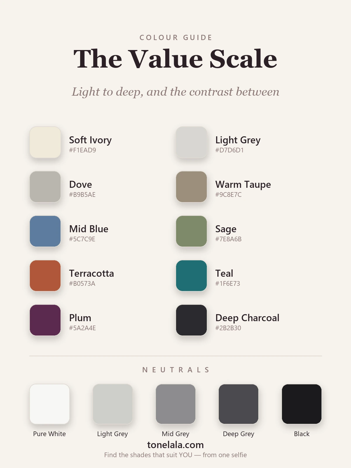
The palette below runs light to deep so you can see value rather than just read about it. The colors move from soft ivory at the light end, through the medium middle, down to deep plum and charcoal, and the neutral strip is a pure gray-scale ladder from white to black, which is value with no color at all. Squint at it and the individual hues blur, but the light-to-dark structure stays perfectly clear. That structure is exactly what you're trying to read in your own coloring.
| Color | Hex | Where it sits |
|---|---|---|
Soft Ivory #F1EAD9 |
Light | The top of the scale, airy, gentle, flatters light and low-contrast coloring. |
Light Gray #D7D6D1 |
Light | Barely-there depth; a soft, quiet neutral for delicate, blended palettes. |
Dove #B9B5AE |
Light-medium | A grayed neutral edging toward the middle, easy and tonal. |
Warm Taupe #9C8E7C |
Medium | True middle ground; reads neither light nor deep, the most universal value. |
Mid Blue #5C7C9E |
Medium | A medium-depth color that suits medium coloring without overpowering it. |
Sage #7E8A6B |
Medium | Soft, mid-value green, the kind of muted depth low-contrast people wear beautifully. |
Terracotta #B0573A |
Medium-deep | Starts to carry real weight; a color with body that medium-to-deep coloring can hold. |
Teal #1F6E73 |
Deep | Rich and saturated, needs some natural depth to balance it near the face. |
Plum #5A2A4E |
Deep | A deep jewel value that flatters deep coloring and reads luxe rather than heavy on it. |
Deep Charcoal #2B2B30 |
Deep | The bottom of the scale; powerful on deep, high-contrast coloring, draining on light. |
The neutral ladder: Pure White #F7F7F4, Light Gray #CFCFCB, Mid Gray #8C8C8F, Deep Gray #4A4A4F and Black #1A1A1D. Five steps with no color in them, this is value distilled. The gap between the white and the black is maximum contrast; pairing two neighbouring grays is low contrast. That's the whole idea, in a strip.
Not sure where YOUR coloring sits on the scale?
Find your color season →How to assess your own value and contrast
The single best tool here is your phone, and the trick is to take color out of the equation entirely. Photograph your bare, makeup-free face in soft, even daylight, by a window is ideal, with no harsh overhead light throwing shadows. Then convert that photo to black and white. The moment color disappears, value is all that's left, and it becomes obvious in a way it never is in color.
For value, look at the overall lightness of the greyscale image. Does your whole face-and-hair read pale and light, sitting near the top of the scale? Deep and dark, near the bottom? Or somewhere in the comfortable middle? Try not to overthink it, your first impression is usually right.
For contrast, look at the differences within that same black-and-white photo. Compare your hair to your skin to your eyes and brows. If there are big jumps, dark hair against light skin, dark brows framing a pale face, you're high contrast. If everything melts into a similar shade of gray with no strong borders, you're low contrast. A quick gut check: if a stranger glanced at the greyscale photo, would the first thing they noticed be the drama of light against dark, or the softness of everything blending together? Most people are somewhere in between, and that's completely normal, medium contrast is the most common result of all.
One honest caveat: a single phone photo and a squint will get you most of the way, but lighting, screen calibration and your own bias all nudge the result. It's why analysts assess value and contrast alongside undertone and chroma rather than in isolation, the three dimensions confirm and correct each other.
How value and contrast fit the seasons
Value and contrast aren't a separate system, they're two of the building blocks the twelve seasons are made from, working together with undertone and chroma. This is why simply knowing you're "warm" or "cool" only gets you halfway: it names your temperature but says nothing about your depth or your contrast.
Watch how value sorts the seasons. The light, airy values belong to the Light Spring and Light Summer families, gentle, low-contrast coloring that suits soft, light palettes and tends to look overwhelmed by black. The deep values belong to the Deep Winter and Deep Autumn families, rich coloring that can carry saturated darks with ease. Contrast does its own sorting: the highest-contrast coloring of all sits in Winter, which is exactly why true Winters can wear stark black-and-white when most people can't, while the soft, blended, low-contrast Summers look their best in tonal outfits where nothing jumps. Same logic, four very different outcomes. If you want to place yourself, the color analysis guides walk through each season in detail.
Putting it together
Once you can see value and contrast, getting dressed gets quieter and more certain. Match the depth of your colors to your own, light colors if you're light, rich darks if you're deep, the easy middle if you sit there. Then match the contrast of your outfit to your face: bold light-and-dark pairings if your coloring is high contrast, soft tonal blends if it's low. Those two moves, on top of getting the temperature right, are what separate an outfit that's technically correct from one that genuinely lifts you. The fastest way to nail all of it at once, your undertone, your value, your contrast and your chroma, read together, is a personal analysis, which hands you a palette built for the exact depth and contrast of your face, so you never have to squint at a black-and-white selfie again.
Frequently asked questions
What does value mean in color analysis?
Value is how light or dark a color is, independent of which color it is. A pale lemon and a soft baby blue can share the same light value; navy and forest green can share the same deep value. In personal color analysis, your own value is how light or deep your overall coloring reads, pale skin with light hair sits high on the value scale, deep skin with black hair sits low. It's one of the three dimensions analysts use, alongside undertone (warm or cool) and chroma (soft or bright).
What is contrast in color analysis?
Contrast is the size of the gap in value between the lightest and darkest parts of your coloring, usually your skin, hair and eyes. Pale skin with very dark hair is high contrast because the jump from light to dark is large. Medium skin with medium-brown hair and hazel eyes is low contrast because everything sits close together in value. High-contrast coloring tends to suit bold light-and-dark combinations, while low-contrast coloring looks best in tonal, blended outfits.
How do I find my contrast level?
Take a clear, well-lit photo of your bare face and hair, then turn it black and white. Color drops away and only value is left. If your hair, skin and eyes look very different in lightness, stark dark hair against pale skin, you're high contrast. If they all blur into a similar gray with no strong jumps, you're low contrast. Most people land somewhere in the middle. Doing this with a photo removes the guesswork that undertone and color usually add.
Is value or undertone more important when choosing colors?
Both matter, but they answer different questions. Undertone (warm or cool) tells you the right temperature of a color; value and contrast tell you the right depth and how to combine colors. You can wear the correct temperature and still look off if the value is wrong for you, a light, soft person in head-to-toe black, or a deep, high-contrast person in muted pastels. Getting value and contrast right is often what makes an outfit finally 'click' once the undertone is sorted.
Why do some color combinations wash me out even when the colors suit me?
It's usually a contrast mismatch rather than a color problem. If your coloring is low contrast and you wear a sharp black-and-white outfit, the clothes carry more contrast than your face does, so the outfit looks stronger than you and your features fade. If you're high contrast and wear an all-over soft beige, the opposite happens, the outfit looks washed out next to you. Matching the contrast of your outfit to the contrast of your coloring is the fix, and it's exactly what a personal analysis pins down.
Related guides
Color Analysis for Gray Hair
A color analyst on color analysis for gray hair, how going silver shifts your palette and contrast, plus the best colors, makeup and metals (with hex codes).
Personal Color Analysis: The Complete Guide
A color analyst's complete guide to personal color analysis, the 4, 12 and 16 season systems, undertone, value and chroma, and how to find yours.

The Monk Skin Tone Scale Explained
A color analyst explains the 10-shade Monk Skin Tone Scale, how it improves on Fitzpatrick, how to find your shade

True Winter Celebrities
A color analyst on True Winter celebrities, the cool, deep, high-contrast look, why the lists disagree, the palette they share, and how to type yourself.

Deep Winter Celebrities
A color analyst on Deep Winter celebrities, who likely fits the cool, deep, high-contrast season, why the lists disagree
True Summer Celebrities
A color analyst's look at the soft, cool, smoky palette often linked to True Summer celebrities, plus how to tell if you share the season.
Prefer in person? Find color analysis near you
Browse local color analysts by city, or get the same season, palette and best-colors breakdown online from one selfie.
See your colors on a photo of you
Upload one selfie and ToneLala reveals your season, your full palette, and your best hair, makeup, jewelry and outfits, styled on you.