In a sentence: the Monk Skin Tone Scale is a 10-shade scale of skin color, light at Monk 1, deep at Monk 10, built to represent the global range more fairly than the old six-type Fitzpatrick scale; it tells you your depth but not your undertone, so it's the first dial in a color analysis, not the whole answer. See the ten shades or find your season.
The Monk Skin Tone Scale Explained
By ToneLalaUpdated July 7, 2026
Contents
A foundation counter once told a client of mine she was "medium," handed her three bottles, and every one of them turned faintly orange by lunchtime. The word medium was doing far too much work, it was trying to cover a quarter of all the skin on earth. That gap, between the blunt labels we reach for and the actual range of human skin, is exactly the problem the Monk Skin Tone Scale set out to fix.
Most color tools were never built to describe skin evenly. The Fitzpatrick scale, the one most of us have bumped into, was designed to predict sunburn, not to name a complexion, and it squeezes an enormous span of deeper skin into a couple of boxes. The Monk scale takes a different starting point: ten shades, spaced to reflect how skin color actually varies around the world. Here's where it came from, how it improves on what came before, how to find your own shade, and the part that matters most for getting dressed, what it does and doesn't tell you about your colors.
What the Monk Skin Tone Scale is
The scale was created by Dr Ellis Monk, a sociologist at Harvard who studies how skin color shapes lived experience, and released openly by Google in 2022 as part of an effort to make technology, cameras, search results, beauty filters, work fairly across all skin tones. It's deliberately simple to use: ten shades, numbered 1 to 10, running from the lightest to the deepest.
What makes it useful isn't the count alone but the spacing. Earlier scales clustered their detail at the lighter end and left everything from tan to deep brown sharing a handful of labels. Monk's ten shades are spread to give roughly even steps across the whole range, with proper resolution in the middle and deeper tones where people are most often misjudged, the very stretch my "medium" client fell into. Each shade has a defined color, so a Monk 6 means the same thing to a camera engineer, a foundation chemist and a color analyst.
One thing to be clear about from the start: the scale measures depth: how light or deep skin is, and nothing else. It doesn't claim to capture undertone, and it isn't a medical tool. Hold that in mind, because it's the key to using it well rather than expecting too much of it.
How it improves on the Fitzpatrick scale
If you've ever filled in a skincare form, you've probably met the Fitzpatrick scale. Dermatologist Thomas Fitzpatrick devised it in 1975 to answer a specific clinical question, how does this person's skin respond to ultraviolet light?, and it sorts people into six types by how readily they burn or tan.
That makes it excellent for what it was built for and awkward for everything else. Two limits stand out:
- It describes behavior, not color. A Fitzpatrick type tells you about sunburn risk, not the shade you'd match a foundation to. Two people who both "tan easily and rarely burn" can look quite different.
- It's coarse where it matters most. Six types, with the deepest skin tones compressed into roughly the last two, means a vast range of brown skin gets flattened into a couple of categories. People in that range are routinely under-served by tools calibrated on it.
The Monk scale answers both. Ten shades instead of six give nearly double the resolution, and crucially that extra detail lands in the middle and deeper range rather than being piled at the light end. And because each Monk shade is a defined color rather than a sun-reaction category, it describes how skin looks, which is what you actually need when you're choosing clothing, makeup or a camera setting. Neither scale is wrong; they answer different questions. For naming a complexion fairly, Monk is the sharper instrument.
The ten shades
Here's the scale laid out as a reference, ten graduated shades from light to deep, plus a set of neutral foundation-style tones to anchor the steps in between.
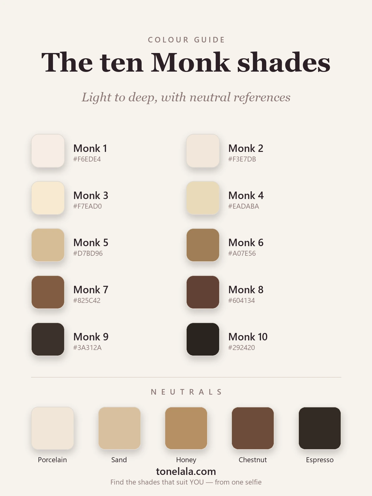
The ten Monk shades, light to deep
| Shade | Hex | Reads as |
|---|---|---|
| Monk 1 | #F6EDE4 |
Very light |
| Monk 2 | #F3E7DB |
Light |
| Monk 3 | #F7EAD0 |
Light, warm |
| Monk 4 | #EADABA |
Light-medium |
| Monk 5 | #D7BD96 |
Medium |
| Monk 6 | #A07E56 |
Tan to olive-brown |
| Monk 7 | #825C42 |
Medium-deep |
| Monk 8 | #604134 |
Deep |
| Monk 9 | #3A312A |
Deep, rich |
| Monk 10 | #292420 |
Deepest |
Neutral references: Porcelain #F1E6D8, Sand #D8C0A0, Honey #B68F63, Chestnut #6E4C39 and Espresso #332A24 sit alongside the numbered shades as familiar anchors, the kind of names a foundation range uses, so you can place yourself by feel as well as by number. These are illustrative steps, not official Monk values; the point is to show how evenly the depth climbs from one end to the other.
Metals: depth alone doesn't decide gold versus silver, that's an undertone question, so both belong on the chart. As a rough start, warm complexions of any depth tend to glow in gold and cool ones in silver, but read your own undertone before you commit. If you're unsure which way you lean, our guide to gold vs silver, and which suits you walks through the test.
Curious which colors actually light up your skin?
Find your color season →How to find your Monk shade
Finding your shade is refreshingly low-tech, and the method matters more than the swatch.
- Bare skin, daylight. Go makeup-free and self-tan-free, and stand near a window in bright but indirect light. Artificial bulbs skew warm and will push you a shade or two off.
- Read the inside of your forearm. The inner arm is shielded from sun, so it shows your skin's truer baseline than your face or the back of your hand, which catch more weathering.
- Find the shade you disappear into. Compare your skin to the ten and pick the one it melts against, not the one you wish you were. People reliably read themselves a shade lighter than they are; resist it.
- Take more than one reading. Surface tone drifts with sun and season, so check on a couple of different days and take the shade that keeps coming up.
A caution worth repeating: the Monk scale captures depth, full stop. It will tell you that you're, say, a Monk 5, but not whether you're a warm Monk 5 or a cool one. That second question is undertone, and it's the one that decides whether camel or charcoal is your friend. If you've not pinned yours down, our guide on how to find your undertone runs through the vein, jewelry and white-paper tests I use on clients.
What your Monk shade means for your colors
Here's where a color analyst gets excited and also a little cautious. Your Monk shade is genuinely useful, it names your depth, and depth is one of the three dials that decide your palette. A deep Monk 9 can carry rich, saturated color that would swamp a light Monk 2, while lighter shades often look freshest in clearer, less weighty tones. Knowing your depth already tells you how much color your skin can hold.
But depth is only one dial of three, and this is the part the scale can't do for you:
- Undertone: warm, cool or neutral, decides the temperature of every color you wear. Two people on an identical Monk 6 will suit opposite reds if one is golden-warm and the other blue-cool.
- Contrast: the gap between your skin, hair and eyes, decides how bold your combinations should be. High contrast carries crisp pairings; low contrast prefers blended ones. There's more on this in our guide to value and contrast in color analysis.
Put those together and you get a season rather than a shade. Depth plus a warm undertone and softness might land you in True Autumn; the same depth with a cool undertone and high contrast points toward True Winter. The Monk scale gets you cleanly through the first door; undertone and contrast open the rest. You can see how all three combine across our color analysis guides, or skip the guesswork and start your own analysis, which reads your depth, undertone and contrast from a photo and hands you an actual palette.
Why a fairer scale matters
It's tempting to file the Monk scale under "tech housekeeping," but the reason it exists is human. When a beauty range stocks forty foundations clustered at the light end, or a camera brightens darker faces into a smudge, or a search for "skin tone" returns one narrow slice of humanity, the cost lands on real people. A scale with even steps and proper depth at the darker end is a small, concrete way of saying every complexion deserves to be described as precisely as any other.
For your wardrobe, the takeaway is friendlier still: depth is your first dial, and the Monk scale is the clearest way to read it. Find the shade you disappear into, then layer undertone and contrast on top, and "what suits me" stops being a counter assistant's guess and starts being a palette built around the skin you're actually in.
Frequently asked questions
What is the Monk Skin Tone Scale?
The Monk Skin Tone Scale is a 10-shade scale of human skin color developed by Harvard sociologist Dr Ellis Monk and published by Google in 2022. It runs from very light (Monk 1) to deep (Monk 10) and was designed to represent the global range of skin tones more fairly than older scales, particularly across darker and middle tones. It's used in tech, beauty and research to describe skin color in a consistent, inclusive way.
What is the difference between the Monk Skin Tone Scale and the Fitzpatrick scale?
The Fitzpatrick scale has six types and was built in 1975 to predict how skin reacts to UV light, so it describes sunburn risk more than color, and it bunches most deeper skin into just two categories. The Monk Skin Tone Scale has ten shades spread more evenly across the full range, with extra resolution in the middle and deeper tones where Fitzpatrick is coarsest. Monk describes how skin looks; Fitzpatrick describes how it behaves in the sun.
How do I find my Monk skin tone?
Look at the inside of your forearm in bright, indirect daylight, with no makeup or self-tan, and compare your bare skin to the ten shades. Pick the single swatch your skin disappears into rather than the one you'd like to be. Take a few readings on different days, because surface tone shifts with sun and season. Your Monk shade describes your depth, how light or deep your skin is, but not your undertone, which is the separate warm-versus-cool question.
Does my Monk skin tone tell me which colors suit me?
It tells you part of the story, your depth, which helps you judge how light or deep your clothing colors should be. But color analysis needs two more things the Monk scale doesn't capture: undertone (warm, cool or neutral) and contrast (the gap between your skin, hair and eyes). Two people on the same Monk shade can suit very different palettes if one is warm and the other cool, so the scale is a starting point, not a color verdict.
Is the Monk Skin Tone Scale better than other skin tone scales?
For describing the global range of skin color fairly, it's a clear step up from the six-type Fitzpatrick scale, because ten shades capture far more of the middle and deeper range. It isn't meant to replace dermatological tools that assess sun sensitivity, and on its own it doesn't measure undertone. Think of it as the most inclusive way to name how light or deep a skin is, and a useful first dial in a fuller color analysis.
Related guides
Best Jewelry Metal for Your Skin Tone
A color analyst's guide to the best jewelry for your skin tone, when gold, silver or rose gold flatters your undertone, with the metal test and hex codes.
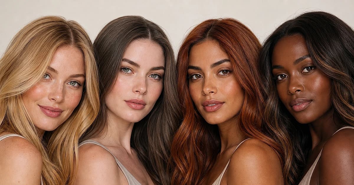
Hair Color for Your Skin Tone: The Complete Match Chart
A color analyst's chart of the most flattering hair colors for every skin tone and undertone, fair, medium, olive, tan and deep, warm and cool, plus the shades that wash you out.
What Is My Skin Undertone
A color analyst explains what your skin undertone is, how to find it with simple at-home tests, and the colors that flatter cool, warm and neutral undertones.
Skin Tone Chart: Find Your Shade & Undertone
A color analyst's skin tone chart to find your shade (fair to deep) and undertone (warm, cool or neutral) with simple at-home tests, and your color season.
How to Find Your Foundation Shade & Undertone
A color analyst's guide on how to find your foundation shade, matching depth and undertone, where to swatch, the daylight check and the mistakes to skip.
Gold vs Silver: Which Suits You
A color analyst on whether gold or silver jewelry suits you, three quick undertone tests, why one metal lifts your face, and what to wear if you're neutral.
Prefer in person? Find color analysis near you
Browse local color analysts by city, or get the same season, palette and best-colors breakdown online from one selfie.
See your colors on a photo of you
Upload one selfie and ToneLala reveals your season, your full palette, and your best hair, makeup, jewelry and outfits, styled on you.