In a sentence: Color draping is the core technique of personal color analysis, holding colored fabrics under your chin, one against another, and reading what each does to your face until your undertone, depth and contrast point to a single season. See the test colors analysts use or find your season.
What Is Color Draping
By ToneLalaUpdated July 7, 2026
Contents
A length of bright coral goes up under the chin, then a length of cool fuchsia, and the change in the face is immediate, with one, the skin looks lit from within; with the other, a faint grayness settles in around the mouth. That swap, repeated dozens of times with carefully chosen fabrics, is the whole of color draping. It looks almost too simple to be a profession. Watch it done well and you realize the skill is entirely in the seeing.
I drape clients for a living, and the question I hear most is some version of "but how can a piece of fabric tell you anything?" Fair question. The short answer is that your skin is never judged on its own, it's always judged next to whatever sits beside it. Draping just makes that comparison deliberate, controlled and repeatable, so the color that genuinely flatters you stops being a matter of opinion and becomes something you can see plainly, side by side.
What color draping actually is
Color draping is the method professional analysts use to identify your most flattering palette, and, ultimately, your color season. The analyst seats you in neutral light with no makeup and your hair covered, then holds solid lengths of colored fabric up to your face in quick succession, studying what each one does to your skin, your eyes and the shadows of your face.
The reason it works comes down to a simple bit of perception: any color placed next to your skin is being compared to it constantly by anyone looking at you. When a drape shares your skin's underlying temperature and quality, the two harmonize, your face looks clear, even and rested, and your eyes seem to brighten. When it clashes, the fabric throws its opposite onto your skin: a too-warm color adds yellow and makes you look sallow, a too-cool one can leave you gray, and the wrong depth either washes you out or overpowers you. Draping isn't reading the fabric. It's reading your face's reaction to the fabric.
How the draping process works, step by step
Good draping is methodical. It's not "try on lots of colors and pick a favorite", it's a process of elimination that narrows the field by half at every stage.
- Set the conditions first. No makeup, hair pulled back or covered, a neutral gray or white cape, and daylight-balanced lighting. Anything colored near your face, a red jumper, a warm lamp, would contaminate the read, so all of it goes.
- Settle undertone with warm-versus-cool pairs. The analyst drapes two versions of the same color at once: a warm, orange-based red beside a cool, blue-based red; a golden yellow beside a lemon yellow. One will smooth your skin, the other will pull at it. Repeated across several hues, a clear pattern emerges, your skin consistently prefers either the warm or the cool side.
- Test depth. With temperature settled, the analyst compares light, delicate colors against deep, rich ones to see whether your coloring wants softness or saturation. A deep, contrasted face is overwhelmed by pastels; a light, gentle face is flattened by very dark drapes.
- Test chroma. Finally, clear, bright drapes go up against soft, muted, grayed ones. Bright coloring looks dull under muddy colors; soft coloring looks harsh and tired under anything too vivid.
- Confirm the season. By now only one family of colors has flattered you at every stage. The analyst confirms it by draping that season's palette as a set and checking that the whole thing sits beautifully, then often drapes gold against silver to note your best metal.
Each round removes options rather than adding them, which is why a thorough draping is so convincing: by the end, the answer has been arrived at by ruling everything else out.
The test colors analysts reach for
A draping kit isn't a random box of fabric. It's a calibrated set built so each color has a clear warm and cool counterpart to test against. Here are the kinds of paired drapes that do the heavy lifting in a session.
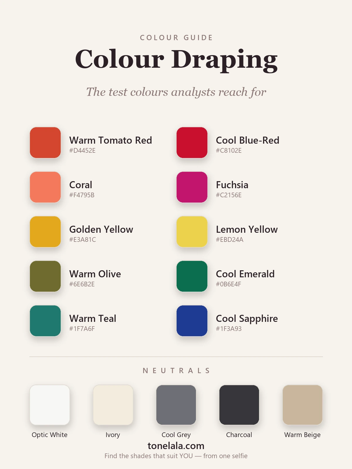
| Color | Hex |
|---|---|
Warm Tomato Red #D4452E |
An orange-based red, drape it to see if warmth lifts your skin or makes it ruddy. Flatters warm seasons, drags on cool. |
Cool Blue-Red #C8102E |
The same red pulled blue. Tested directly against the tomato, it instantly shows which temperature your skin prefers. |
Coral #F4795B |
A soft warm drape that separates warm-bright (Spring) faces, which glow, from cool faces, which dull beneath it. |
Fuchsia #C2156E |
Coral's cool opposite. Where coral flatters, fuchsia clashes, and vice versa. A classic warm-versus-cool pair. |
Golden Yellow #E3A81C |
Yellow is the most revealing drape there is. Golden yellow flatters warmth and exposes coolness fast. |
Lemon Yellow #EBD24A |
The cool, blue-based yellow. Set beside golden yellow, the two settle undertone almost on their own. |
Warm Olive #6E6B2E |
A muddy, warm green that tests softness, it flatters Soft Autumn coloring and sallows cool, bright faces. |
Cool Emerald #0B6E4F |
A clear blue-green that lights up cool, bright coloring and reads cold and harsh on warm, soft skin. |
Warm Teal #1F7A6F |
Sits between the greens and blues; useful for telling warm-neutral from cool-neutral when the read is close. |
Cool Sapphire #1F3A93 |
A deep, true blue with no warmth, a strong depth-and-temperature check for cool, deep coloring. |
The neutrals that matter: Optic White #F7F7F4 and Ivory #F3ECDD are draped against each other constantly, crisp white flatters cool coloring while ivory suits warm, so the pair is a quick temperature read in itself. Cool Gray #6E7076 and Charcoal #36363B test depth and how much darkness your face can carry, and Warm Beige #C9B79C checks whether earthy neutrals warm your skin or muddy it.
Curious which drapes would flatter YOU?
Find your color season →Why lighting and setup decide everything
I can't overstate this part. Color is just light reflected off a surface, so the light you drape in dictates what you see, and the wrong light will quietly send you to the wrong season. Warm tungsten bulbs add a yellow cast that makes everyone look like a Spring or Autumn; cool fluorescents add blue or green and fake a Winter. Neither tells the truth.
That's why proper draping uses neutral, daylight-balanced lighting, roughly 5000 to 6500 kelvin, and a plain gray or white backdrop, so the only variable changing your face is the drape itself. The same logic explains the no-makeup, covered-hair rule: foundation has its own undertone, and a warm or cool hair color is effectively a giant drape framing your face. Strip all of it back and you're reading your actual skin, which is the entire point.
What draping reveals, and what you do with it
The output of a draping session isn't just "you suit blue." It's your season: a complete palette of colors that share your undertone, depth and contrast, drawn from the four seasonal families and their sub-types. Cool, deep, high-contrast coloring lands in Winter; cool and soft in Summer; warm and rich in Autumn; warm and light in Spring, with finer divisions inside each.
If you want to see how those palettes actually look, the color analysis guides break down every season, and the four cornerstones are a good place to start, the winter color palette and summer color palette for cool coloring, the autumn color palette and spring color palette for warm. Once you know your season, draping has done its job: you have a palette of colors that reliably flatter you, the right neutrals to build a wardrobe on, and the confidence to ignore everything else on the rail.
Putting it together
Strip away the mystique and color draping is a controlled experiment run on your own face, compare colors in matched warm-and-cool pairs, hold the lighting and setup steady, and watch which drapes make your skin look its best until only one season's palette is left standing. That's how a length of fabric can tell you something real: it isn't the fabric talking, it's your skin answering. You don't need a full kit and a studio to benefit from the same logic, either. A photo-based personal color analysis applies the exact same comparison, calibrated colors tested against your face, the differences read carefully, and hands you the finished palette, so you can stop guessing at color for good.
Frequently asked questions
What is color draping in color analysis?
Color draping is the technique a personal color analyst uses to find your most flattering palette. They hold lengths of colored fabric up under your chin, one after another, and watch what each one does to your face. The right colors make your skin look clear and even and your features sharper; the wrong ones cast shadows, sallowness or redness. By comparing dozens of drapes in pairs, the analyst narrows down your undertone, depth and contrast, and lands on your color season.
How does the color draping process actually work?
It works by comparison, not by looking at a single color in isolation. The analyst drapes two versions of the same color, say a warm tomato red against a cool blue-red, and watches the differences in your face: which one smooths your skin, which one drags it down. They move through warm-versus-cool pairs first to settle your undertone, then test depth (light versus deep) and chroma (soft versus bright). Each round eliminates half the options until only one season's palette consistently flatters you.
What fabrics and colors are used for draping?
Analysts use solid, matte fabric drapes in carefully calibrated colors, usually a full set covering warm and cool versions of every hue, plus light, deep, soft and bright variations. The fabric is kept matte and non-reflective so it doesn't bounce light onto the face, and drapes are always tested against a neutral gray or white background in consistent daylight-balanced lighting. Many analysts also drape silver and gold to check which metal suits your skin.
Why is lighting so important for color draping?
Because color is only ever what the light lets you see. Warm indoor bulbs add yellow, cool fluorescents add blue or green, and either one will lie to you about how a color sits on your skin. Proper draping uses neutral, daylight-balanced light (around 5000–6500K) and a neutral backdrop so the only thing changing your face is the drape itself. Get the lighting wrong and even a skilled analyst can reach the wrong season.
Can color draping be done online or with photos?
Yes, and it's how many people get analyzed now. Instead of physical fabric, the same comparison logic is applied to well-lit photos of your face, where calibrated digital colors are tested against your skin and the differences read by a trained eye or analysis system. The principle is identical to in-person draping: compare colors in pairs, watch what each does to your face, and narrow to a season. You can start a photo-based analysis at tonelala.com/onboarding.
Related guides
What Is Color Analysis
A color analyst explains what color analysis is, the 4 and 12 season systems, undertone, value and chroma, and what your result actually gives you.
Color Analysis Test: How to Find Your Colors
A color analyst's guide to the color analysis test, the vein, jewelry and draping checks you can do at home, plus how an accurate photo analysis works.
Best Jewelry Metal for Your Skin Tone
A color analyst's guide to the best jewelry for your skin tone, when gold, silver or rose gold flatters your undertone, with the metal test and hex codes.
Gold vs Silver: Which Suits You
A color analyst on whether gold or silver jewelry suits you, three quick undertone tests, why one metal lifts your face, and what to wear if you're neutral.
Olive Skin Undertones: Warm, Cool and Neutral Olive Explained
Olive skin is a green-gray cast that can sit over a warm, neutral or cool undertone. Five daylight tests to tell which olive you are, with the colors, makeup, hair and seasons for each.
Which Skin Tones Suit Ash Brown Hair? A Color Analyst's Guide
Ash brown flatters cool and neutral skin and washes out warm skin. A color analyst explains exactly who suits it, which ash brown to choose, and the warm-skin workaround.
Prefer in person? Find color analysis near you
Browse local color analysts by city, or get the same season, palette and best-colors breakdown online from one selfie.
See your colors on a photo of you
Upload one selfie and ToneLala reveals your season, your full palette, and your best hair, makeup, jewelry and outfits, styled on you.