In a sentence: Both are warm, clear Springs, but Bright Spring is brighter and higher in contrast with a slight neutral edge, while True Spring is the most purely golden Spring and a touch softer. Skip to the distinguishing palette or find out which you are.
Bright Spring vs True Spring: How to Tell the Difference
By ToneLalaUpdated July 14, 2026

Contents
These two get muddled more than almost any other pair I drape, and it's easy to see why. Both are Springs, warm, clear, fresh, never dusty, and they share a big chunk of palette. Hand someone a warm coral or a leaf green and it'll flatter a Bright Spring and a True Spring alike, so the colors people reach for first are exactly the ones that can't tell them apart.
The split only shows up at the edges. Bright Spring lives a notch higher on the brightness dial and carries a faint neutral-cool edge, which lets it hold electric, high-contrast color without tipping over. True Spring is the warmest of the three Springs, golden right through, and sits a step gentler. Once you drape the colors at those edges, the most saturated brights against the most golden warms, the line between them stops being fuzzy.
Bright Spring vs True Spring: the core difference
Every season is read on three dials, undertone, value and chroma, and these two agree on most of it. Here's where they line up and where they part:
- Undertone: both warm, but not equally. True Spring is purely warm, all gold and no blue. Bright Spring is warm-leaning-neutral: warm at its core, with a slight neutral edge. That edge is the quiet difference that does most of the work: it's what allows Bright Spring to go more vivid and a touch cooler than True Spring ever can.
- Value: both light-to-medium, with Bright Spring sitting a hair deeper. Neither is a genuinely dark season, so this dial barely separates them; it mostly shows up as contrast rather than depth.
- Chroma: this is the real divider. Bright Spring is one of the brightest, clearest seasons of all twelve, very high chroma. True Spring is bright, but a step calmer: vivid and clean, yet gentler than the electric intensity Bright Spring wants.
Add it up and it comes down to contrast. Bright Spring is high-contrast: warmth turned right up, almost electric, happiest in saturated color and crisp light-against-dark pairings. True Spring is medium-contrast: warmth at its most golden and sunlit, vivid but blended, where the brightest, sharpest colors start to feel like a lot. Same warm, clear family, one dialled to electric, the other to golden.
The colors that tell them apart
These are the shades that actually separate the two seasons. The shared Spring colors won't, so this palette leans on the edges, the electric, higher-contrast brights that suit Bright Spring, and the softer, more purely golden tones that belong to True Spring.
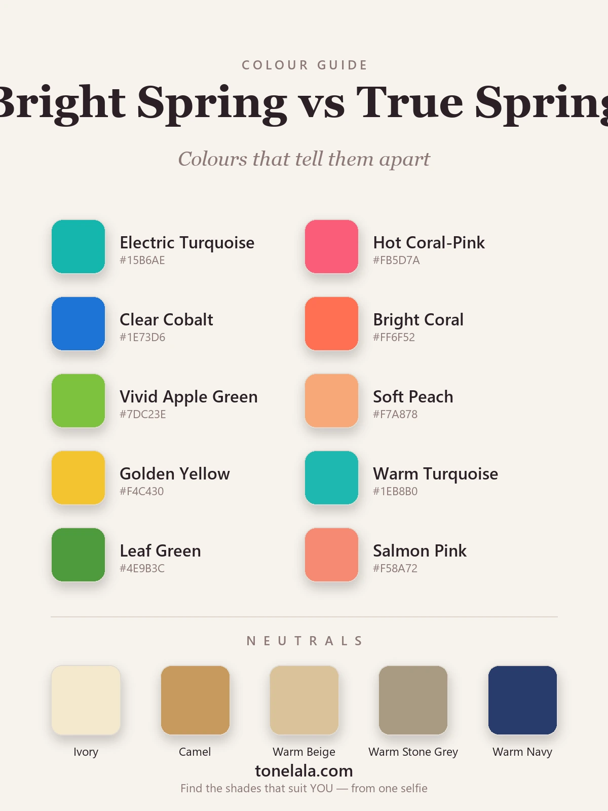
| Color | Hex | Flatters |
|---|---|---|
| Electric Turquoise | #15B6AE |
Bright Spring, too charged for True Spring |
| Hot Coral-Pink | #FB5D7A |
Bright Spring, the cool-warm edge True Spring can't hold |
| Clear Cobalt | #1E73D6 |
Bright Spring, high-contrast and a touch cool |
| Bright Coral | #FF6F52 |
Bright Spring, vivid, high-energy version |
| Vivid Apple Green | #7DC23E |
Bright Spring, sharper, more electric green |
| Soft Peach | #F7A878 |
True Spring, gentle and purely golden |
| Golden Yellow | #F4C430 |
True Spring, warm and sunlit, not neon |
| Warm Turquoise | #1EB8B0 |
True Spring, the calmer, golder turquoise |
| Leaf Green | #4E9B3C |
True Spring, softer, warmer green |
| Salmon Pink | #F58A72 |
True Spring, warm, blended coral-pink |
Shared neutrals: Ivory #F4E9CE (the "white" for both, true bright white reads a little cold), Camel #C79A5E, Warm Beige #D9C39A, Warm Stone Gray #A99B83 for a softer option, and Warm Navy #283B6B when either season wants depth without reaching for black.
Still not sure, Bright Spring or True Spring?
Find your color season →How to tell which you are
Since both are warm, warmth alone won't decide it. Test brightness and contrast instead:
- Drape the extremes, not the middle. Hold your most electric colors, electric turquoise, hot coral-pink, clear cobalt, against your face, then your most golden ones, peach, golden yellow, salmon. A Bright Spring sharpens under the electric ones: skin clears, eyes brighten. A True Spring finds those colors a touch hard, and lights up under the warmer, gentler shades.
- Read your own contrast. Stand in good daylight and look at the gap between your hair, skin and eyes. Real contrast, clearly defined features, eyes that pop against the skin, leans Bright Spring. A softer, more blended look, where everything melts together, leans True Spring.
- Watch the cool edge. Bright Spring can carry a slightly cool, charged color like a clear cobalt or a coral-pink without going gray. On a True Spring, that same cool edge pulls the skin down a fraction. If purely golden colors always feel safest and the cool-bright ones feel risky, you're likely True.
- Notice what washes you out. Both fade under muted, dusty tones, but the tells differ at the top end. If even your brightest warm colors feel slightly flat and you crave more punch, you may be a Bright Spring wearing True Spring shades. If the brightest colors overwhelm you and softer warm ones feel like a relief, you're sitting on the True side.
If you're Bright Spring / If you're True Spring
If you're Bright Spring, lean into the intensity. Your coloring is high-energy and wants color that keeps pace, saturated coral, electric turquoise, clear cobalt, vivid apple green, anchored by warm neutrals and finished with gold. The most common mistake is toning it down into "tasteful" muted shades, which is exactly what drains this season. Full guidance and the complete palette with hex codes are in the Bright Spring guide.
If you're True Spring, stay golden and clear. Your best colors glow with warmth rather than crackle with electricity, warm coral, golden yellow, peach, leaf green, warm turquoise, with ivory and camel as your neutrals and no black near the face. Where a Bright Spring reaches for the most charged version of a color, you want the sunlit one. The full palette, neutrals and makeup notes live in the True Spring guide.
The reliable way to settle it
Here's the honest part: undertone, value and contrast are genuinely hard to judge in your own bathroom mirror. Lighting shifts warmth, a recent dye job changes your contrast, and the eye adjusts to whatever you wore yesterday. I've had clients certain they were one season walk out as the other, simply because they'd never seen the two palettes draped side by side under steady light.
A photo-based analysis reads all three dials at once, undertone, value, and the contrast level that's doing most of the dividing here, from a clear image of your own face, rather than asking you to guess. If you'd like that read done properly, you can find out which you are, and the wider set of color analysis guides is there whenever you want to go deeper on either season.
Frequently asked questions
What is the difference between Bright Spring and True Spring?
Both are warm, clear Spring seasons, so they share a lot of colors. The difference is chroma and contrast. Bright Spring is one of the brightest seasons of all and carries a slight neutral-cool edge, so it can hold electric, high-contrast color. True Spring is the most purely warm Spring, golden through and through, and a touch softer and gentler. Put simply: Bright Spring is warmth turned up to vivid, True Spring is warmth at its most golden.
Am I Bright Spring or True Spring?
Hold a very bright, high-contrast color like electric turquoise or hot coral-pink against your face, then a warmer golden one like golden yellow or peach. If the electric color sharpens your features and lights your eyes, you lean Bright Spring. If the brightest colors feel sharp or hard and the golden, slightly softer ones glow on you, you lean True Spring. A photo-based analysis settles it by reading your undertone, value and contrast directly.
Which is warmer, Bright Spring or True Spring?
True Spring is the warmer of the two. It is the most purely golden of all three Springs, with no cool edge anywhere. Bright Spring is warm too, but warm-leaning-neutral, that slight neutral edge is exactly what lets it carry colors that are more vivid and electric than a True Spring can wear.
Which has more contrast, Bright Spring or True Spring?
Bright Spring has the higher contrast. It sits among the brightest, clearest seasons, so it suits saturated, high-energy color and crisp light-against-dark combinations. True Spring is medium-contrast, clear and vivid, but a step calmer, with colors that blend more gently than a Bright Spring's.
Can you be both Bright Spring and True Spring?
No, you have one season, but you can sit on the border between them. The two are neighbours on the chroma and contrast dials, so many warm, clear people land close to the line. When you do, one of the two will still flatter you a little more, and a proper analysis is the reliable way to confirm which way you lean.
How do I tell Bright Spring from True Spring?
Test brightness and contrast, not just warmth, since both are warm. Drape your most electric, saturated colors against your softer golden ones and watch which family makes your skin clearer and your eyes brighter. Notice your own contrast too: high contrast between hair, skin and eyes points to Bright Spring, while a gentler, more blended look points to True Spring.
Related guides
True Spring vs True Autumn: How to Tell the Difference
True Spring vs True Autumn, explained by a color analyst, how they differ on value and chroma, the colors that separate them, and how to tell which you are.

Bright Spring vs Light Spring: How to Tell the Difference
Bright Spring vs Light Spring: one runs on saturation, the other on lightness. Learn the undertone, value and chroma tells, and how to know which you are.
Bright Winter vs Bright Spring: How to Tell the Difference
A color analyst on Bright Winter vs Bright Spring, how undertone, value and chroma differ, the colors that separate them, and how to tell which one you are.
True Winter vs Bright Winter: How to Tell the Difference
A color analyst on True Winter vs Bright Winter, how undertone, value and chroma differ, the colors that tell them apart, and how to decide which you are.

True Spring vs Light Spring: How to Tell the Difference
True Spring vs Light Spring, explained by a color analyst: how undertone, value and chroma differ, the colors that separate them

True Spring Celebrities
A color analyst's look at the warm, bright, golden palette often linked to True Spring celebrities, plus how to tell if you share the season.
Prefer in person? Find color analysis near you
Browse local color analysts by city, or get the same season, palette and best-colors breakdown online from one selfie.
See your colors on a photo of you
Upload one selfie and ToneLala reveals your season, your full palette, and your best hair, makeup, jewelry and outfits, styled on you.